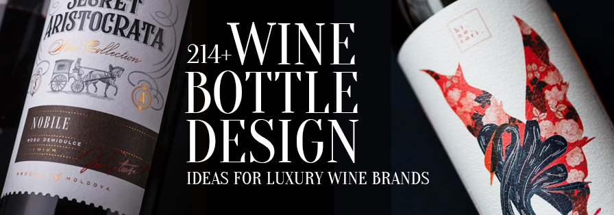

A wine bottle does so much more than just hold wine. Before anyone even reads the tasting notes, checks the vintage, or uncorks the bottle, they have already judged its shape, colour, label, texture, and overall presence.
That makes wine bottle design a surprisingly strategic exercise. A premium bottle does not necessarily need to be heavy, ornate, or covered in gold foil. What makes it feel expensive is design consistency: the bottle shape, label, typography, colour, material, and finishing are all you need to communicate the same positioning.
So, what makes a wine bottle look premium? Let’s uncork the details.
Table of Contents
What Actually Makes a Wine Bottle Look Premium?
Luxury is rarely created by one design element. It is usually the result of several small decisions working together.
a) Bottle Shape: The Silhouette Is Your First Impression
Bottle shape immediately establishes your wine’s visual language. For example, the good old Bordeaux bottles have straight sides and pronounced shoulders, while the Burgundy bottles are typically broader with gently sloping shoulders. Alsace or Rhine bottles are somehow taller and slimmer. These traditional forms can also give consumers an immediate clue about the wine style or region!
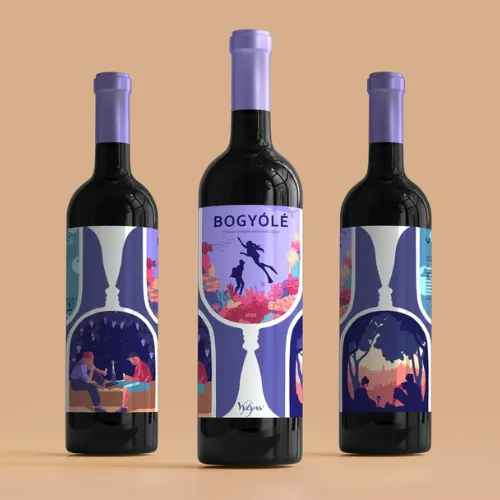
For a premium wine, the silhouette should always feel intentional rather than decorative for the sake of being different. A sculpted shoulder, elongated neck, unusual base, asymmetric profile, or subtle groove can become a recognisable brand asset.
Design idea: Keep the bottle silhouette simple and make one structural detail memorable.
Source: https://in.pinterest.com/
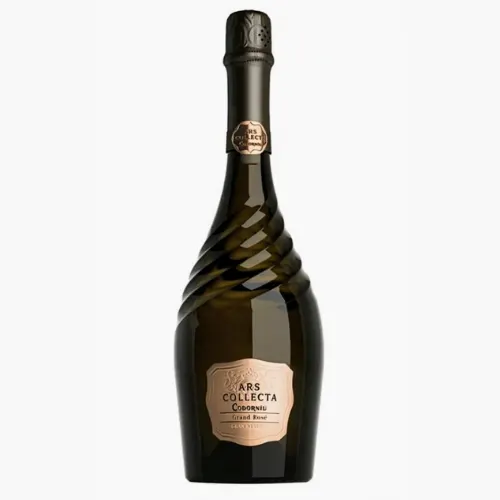
Source: https://in.pinterest.com/
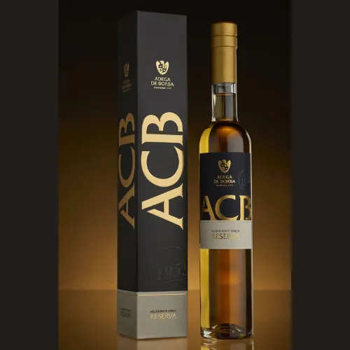
Source: https://in.pinterest.com/
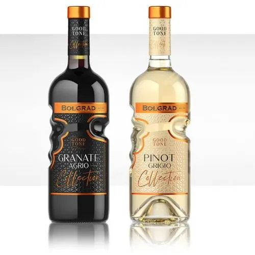
Source: https://in.pinterest.com
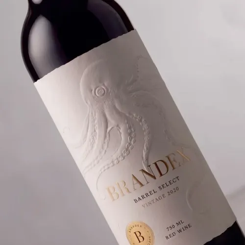
b) Label Material: Let the Fingers Notice It Too
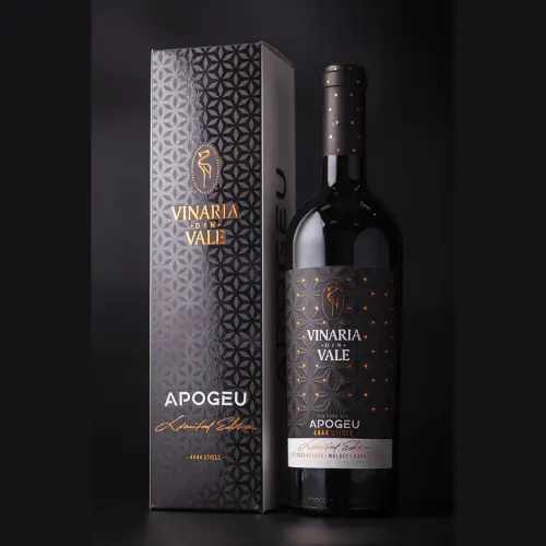
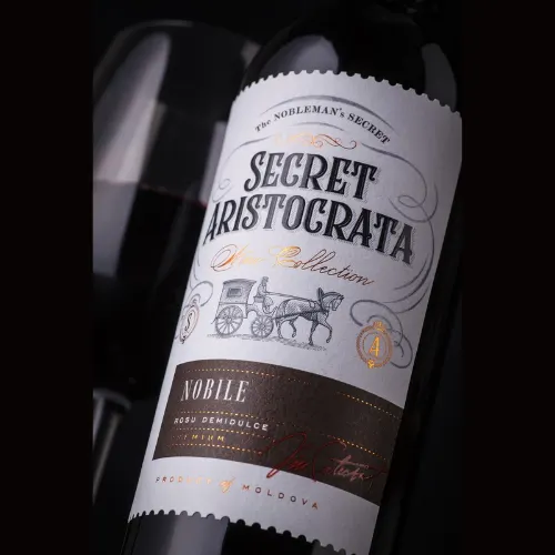
A premium label should work visually and physically. Cotton papers, textured stocks, uncoated papers, natural fibres, vellum-inspired materials, embossed stocks, and subtly rough surfaces can give the bottle a handcrafted character.
The key is restraint. A heavily textured paper combined with metallic foil, embossing, multiple colours, and elaborate illustrations can quickly become visually noisy.
For heritage wines, tactile paper can communicate craftsmanship. For contemporary wines, smooth or translucent substrates can create a cleaner, more fashion-forward personality.
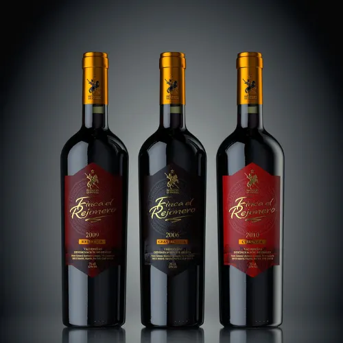
Source: https://in.pinterest.com/
Source: https://in.pinterest.com/
Source: https://in.pinterest.com/
Source: https://in.pinterest.com
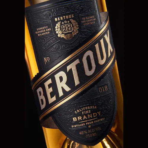
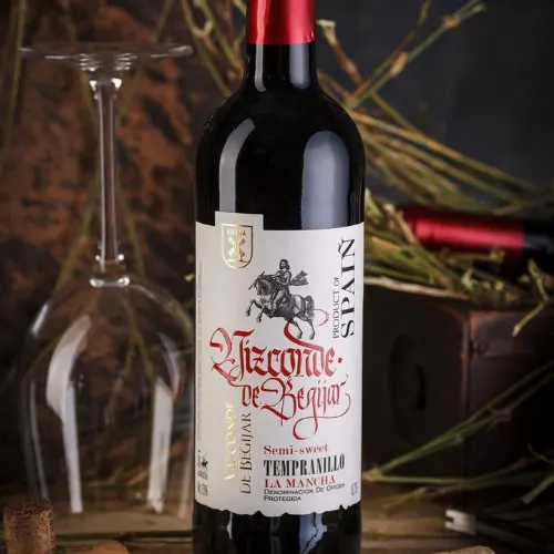
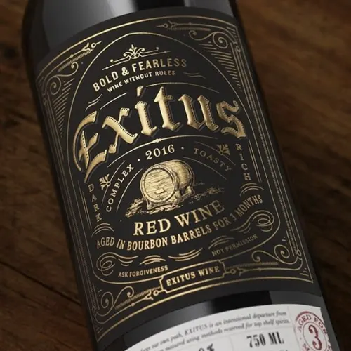
c) Typography: Give the Wine a Voice
Typography is the best way to indicate whether the wine actually feels traditional, modern, artistic, rebellious, or even luxurious.
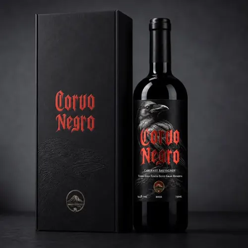
If you choose a refined serif, it suggests heritage and craftsmanship. On the other hand, a high-contrast editorial serif can create a fashion-led appearance. Minimal sans-serif typography can make your wine bottle feel contemporary. However, hand lettering depicts intimacy, while custom typography can actually turn your winery name into a distinctive visual signature.
One useful rule is simple: the more distinctive the bottle structure or artwork becomes, the more controlled the typography should be!
Source: https://in.pinterest.com/
Source: https://in.pinterest.com/
Source: https://in.pinterest.com/
Source: https://in.pinterest.com
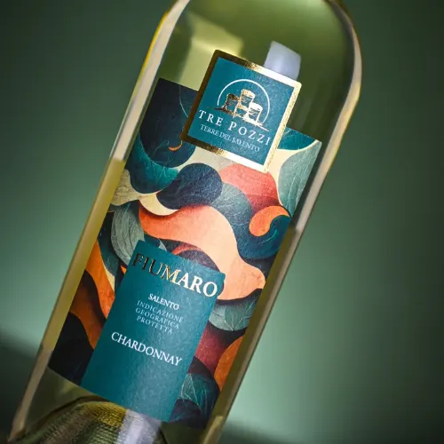
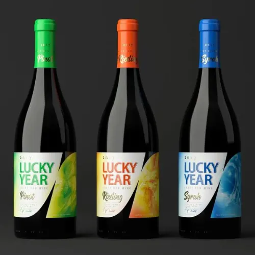
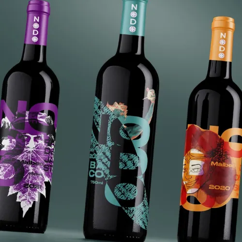
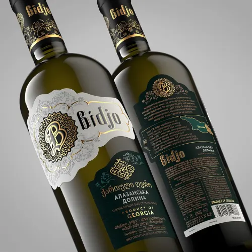
d) Colour Palette: Premium Does Not Mean Black and Gold
Deep burgundy, forest green, charcoal, cream, ivory, navy, muted terracotta, dusty rose, copper, and antique gold can all work beautifully for premium wines.
But colour should support the positioning rather than imitate luxury clichés.
Research has found that wine-label colours can influence consumers’ sensory expectations. In one study, red and black labels were associated with stronger expectations of tangy flavours, while red and orange were associated more with fruity and floral expectations.
Source: https://in.pinterest.com/
Source: https://in.pinterest.com/
Source: https://in.pinterest.com/
Source: https://in.pinterest.com
e) Printing & Finishing: Where the Premium Details Hide
This is where any ordinary label can become extremely tactile and memorable.
Consider these elements for your next wine packaging:
1. Blind embossing
2. Debossing
3. Gold or silver foil
4. Copper foil
5. Spot UV
6. Raised varnish
7. Letterpress
8. Die-cut labels
9. Metallic inks
10. Soft-touch coatings
11. Micro-patterns
12. Transparent elements
13. Textured varnishes
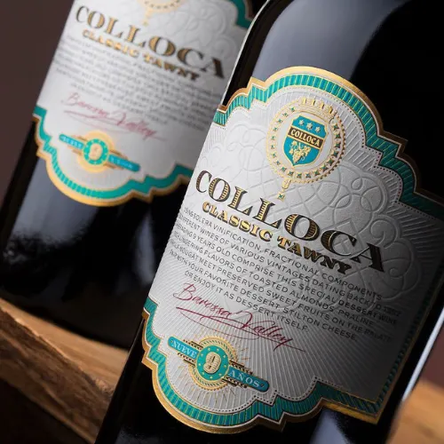
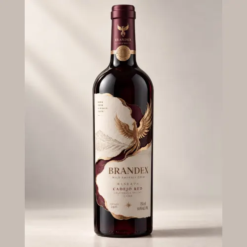
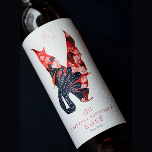
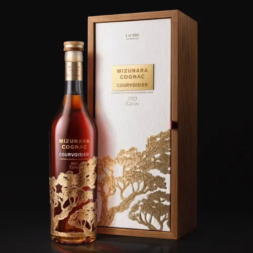
The best finishes should always have a purpose. Embossing is the ideal way to highlight a crest or grape illustration. Foil can actually draw attention to the winery name. A die-cut can reinforce the bottle silhouette.
Source: https://in.pinterest.com/
Source: https://in.pinterest.com/
Source: https://in.pinterest.com/
Source: https://in.pinterest.com
The 11-Step Route From Wine Concept to Shelf-Ready Bottle
Bottle design should not begin with “Which colour looks nice here?” Always start with your brand.
Step 1: Lock the Brand Positioning First
Define the wine in a sentence. Is it heritage-driven, ultra-modern, organic, collectable, youthful, terroir-focused, celebratory, or experimental?
Every subsequent design decision should answer your brand positioning in as detailed a way as possible.
Step 2: Spy on the Shelf, Not Just Pinterest
Study competing wine brands out there. Look at their bottle silhouettes, label proportions, colour palettes, typography, closures, and finishing.
The goal is never to copy the category. It is to identify specifically where the category is visually crowded and where your bottle can actually stand out among the rest.
Step 3: Pick the Right Bottle Family
Choose between various established silhouettes such as Bordeaux, Burgundy, Rhine/Alsace, Champagne, or even some contemporary custom forms.
Standardised bottle shapes remain common worldwide, making silhouette an important early brand cue.
Step 4: Build the Silhouette
Now refine your bottle’s height, width, shoulders, neck length, base proportions, and overall balance. This is where you can get creative.
A premium silhouette is always the best to look at from across a shelf and still feel distinctive when viewed as a small thumbnail online.
Step 5: Choose the Glass Colour
Clear glass can showcase rosé and lighter wines. On the other hand, green and darker glass can actually create a traditional or protective appearance, while unusual glass colours can become a strong contemporary branding device.
Step 6: Treat the Shoulder and Neck as Design Space
Do not stop designing at the main label. Consider other aspects as well.
For example, capsules, neck labels, engraved details, printed neck bands, wax-like closures, and even subtle grooves can extend your brand identity upward.
Step 7: Give the Base and Punt a Purpose
The punt can remain understated, or it can truly become part of the entire experience through embossing, glass decoration, or a distinctive structural detail.
Just remember: a deeper punt does not automatically make a bottle more premium.
Step 8: Add Decoration With Intention
Glass embossing, screen printing, ceramic decoration, etching, and various other such techniques can instantly create a memorable physical identity.
Choose the technique according to your current production budget, volume, bottle material, and desired visual effect.
Step 9: Design the Bottle and Label as One Object
This is one of the most important principles in premium packaging.
Do not design a beautiful label and then simply stick it onto a beautiful bottle. The two should interact.
A curved label can follow the bottle’s shoulders. A transparent label can allow the glass colour to become part of the artwork. An embossed bottle motif can continue into the label illustration.
Step 10: Test It in 3D Before Production
Flat artwork can be deceptive. A label that looks perfect on an artboard may appear distorted around a curved bottle.
Create realistic 3D mockups and inspect the bottle from the front, side, three-quarter angle, shelf distance, and thumbnail size.
Step 11: Finish the Production Artwork Properly
Before sending the design to production, confirm all the important aspects. This includes everything such as dimensions, bleed, dielines, colour specifications, paper stock, adhesive requirements, foil areas, embossing/debossing layers, barcode placement, legal information, and even printer specifications.
A luxury design that cannot be reproduced accurately is not a finished design.
214+ Wine Bottle Design Ideas to Get the Creative Pour Started
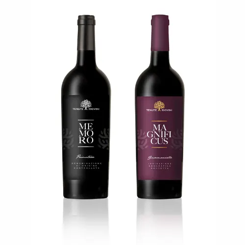
Instead of treating these as rigid templates, use them as combinations. Pair a bottle idea with a label material, typography direction, colour palette, or finishing technique to create hundreds of possible routes.
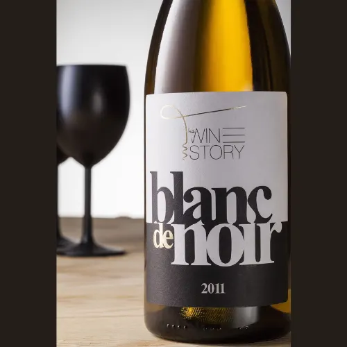
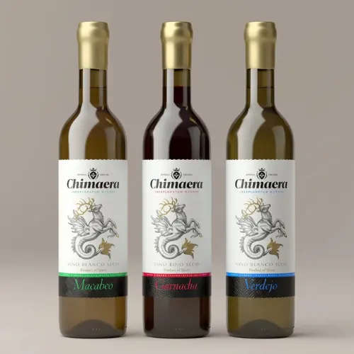
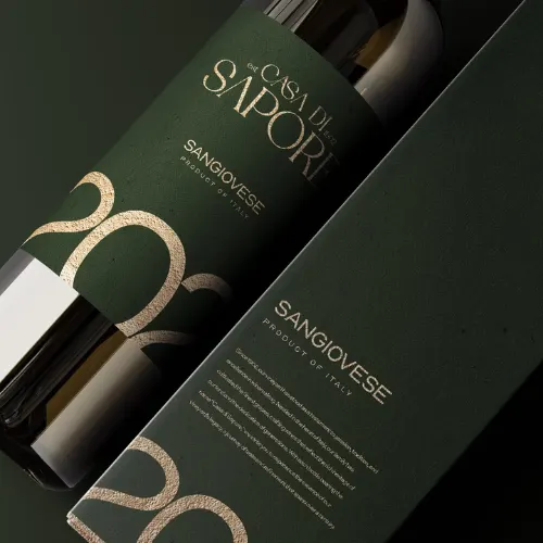
A. Minimalist Wine Bottle Ideas
Source: https://in.pinterest.com/
Source: https://in.pinterest.com/
Source: https://in.pinterest.com/
Source: https://in.pinterest.com
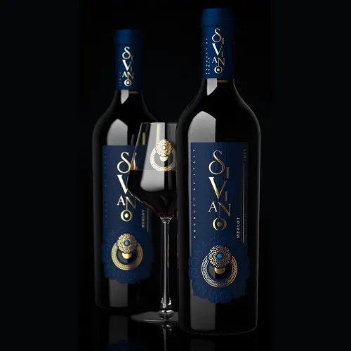
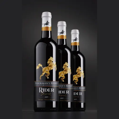
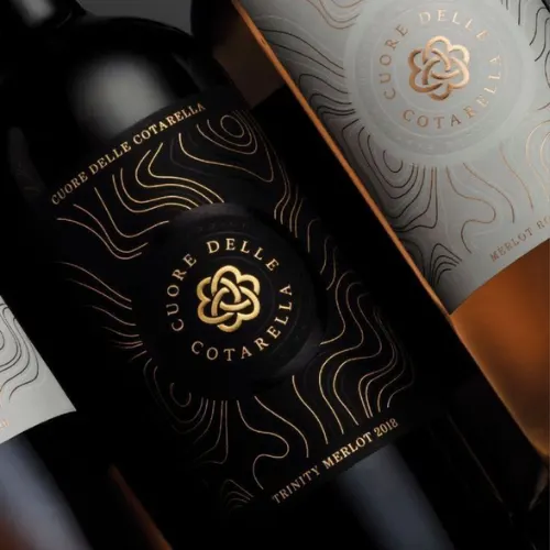
B. Luxury Wine Bottle Idea
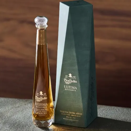
Source: https://in.pinterest.com/
Source: https://in.pinterest.com/
Source: https://in.pinterest.com/
Source: https://in.pinterest.com
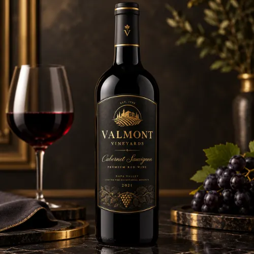
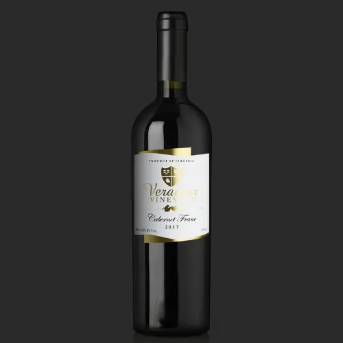
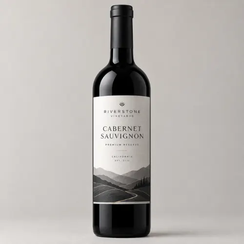
C. Black, Red & White Directions
Source: https://in.pinterest.com/
Source: https://in.pinterest.com/
Source: https://in.pinterest.com/
Source: https://in.pinterest.com
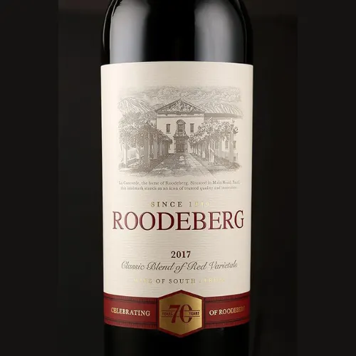
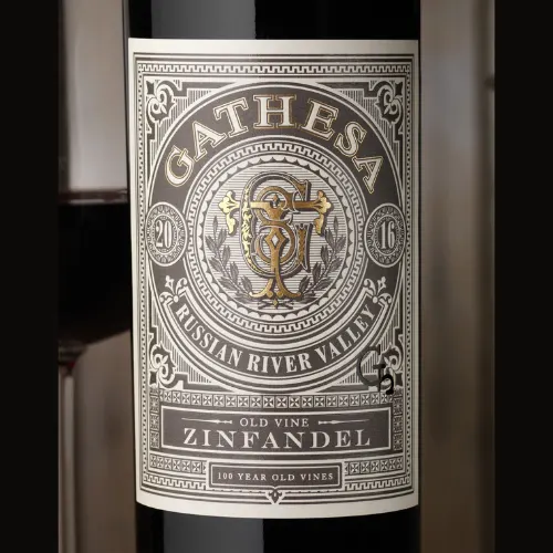
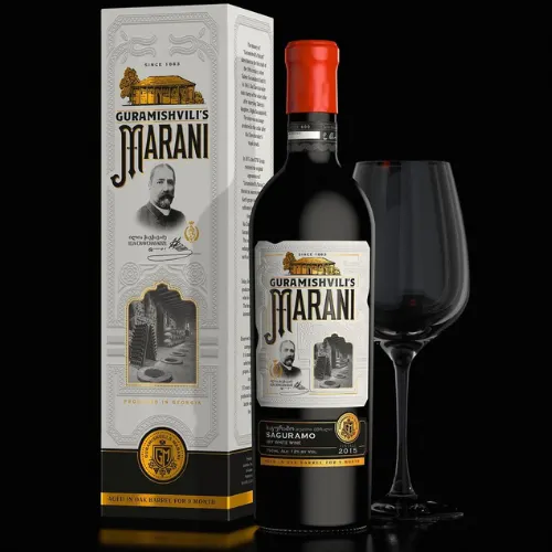
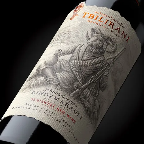
D. Heritage-Inspired Luxury Winery Concepts
Source: https://in.pinterest.com/
Source: https://in.pinterest.com/
Source: https://in.pinterest.com/
Source: https://in.pinterest.com
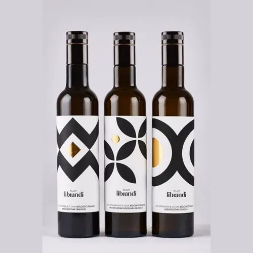
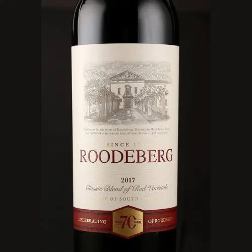
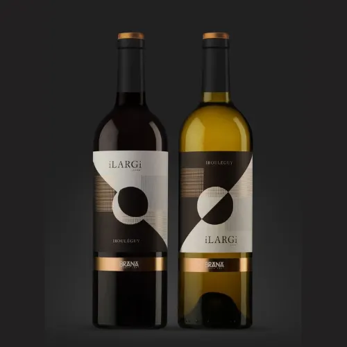
E. Geometric and Contemporary Wine Bottle Ideas
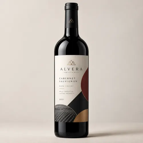
Source: https://in.pinterest.com/
Source: https://in.pinterest.com/
Source: https://in.pinterest.com/
Source: https://in.pinterest.com
The Big Design Lesson: Premium Is a System, Not a Decoration
The strongest wine packaging designs do not simply make the bottle “look expensive.” They make the brand easier to understand.
Research on wine packaging has consistently found that consumers use multiple packaging cues, including bottle shape, colour, closure, and label design, when making purchase decisions. More recent research also continues to show that visual attributes such as illustration, label colour, and label shape can influence perceived wine quality, although their effects vary across consumer groups and contexts.
That is why there is no universal formula for a luxury wine bottle.
A heritage Cabernet may need restraint and tradition. A contemporary rosé may benefit from transparency and colour. A limited-edition wine may need a collectable object-like silhouette. An organic wine may communicate its positioning through tactile natural materials and understated decoration.
The bottle should make the same promise that the wine delivers.
Ready to Turn Your Wine Into a Shelf Magnet?
Great wine deserves packaging that can hold its own before the bottle is even opened. At DesignerPeople, strategic branding, packaging design, visual storytelling, and production-focused thinking can come together to create wine packaging that feels distinctive without losing sight of the product, audience, or market.
Whether you are launching a premium wine, refreshing an established winery identity, or developing a limited-edition collection, the right bottle design can turn packaging into part of the brand experience. And our team at DesignerPeople is your best bet here. We have worked with countless brands before and helped them become the all-time favourite brand in this industry. So, what’s stopping you now?
Because when the bottle is the first thing your customer sees with their eyes, it’s better to leave the right impression!

As a passionate entrepreneur and creative brand consultant with experience of 18 years in digital, branding and packaging industry, it is my honest effort to put my experiences and knowledge of industry towards readers. A chartered accountant by degree but a marketing personality in blood has motivated her to take in designing industry as a career. With her fun-loving personality and sharp branding skills, she is a great motivational speaker on her YouTube channel, an active member in various business channels offline as well as online. Do connect me personally via my LinkedIn and I love to share my expertise with you.