The global superfoods market is valued between $193 billion and $202 billion. It is currently growing at a CAGR OF 6.1% from 2025 to 2030.
Walk into any supermarket, organic store, or health food aisle today, and one thing becomes instantly clear. Superfoods are everywhere.
Starting from your everyday chia seeds and quinoa to spirulina, moringa, matcha, protein blends and more, consumers are now actively looking for products that support healthier lifestyles. But here’s the challenge: most shoppers don’t spend ten minutes reading every package on the shelf. They make quick decisions based on what catches their eye and what feels trustworthy.
That’s where packaging design becomes so incredibly important.
For superfood brands, packaging isn’t just about protecting the product. It’s often the first opportunity to communicate nutrition, quality, transparency, sustainability, and credibility. All within a few seconds!
A well-designed superfood package can make a product feel premium, science-backed, natural, and worth adding to a daily routine. On the other hand, confusing or outdated packaging can make even the best product go unnoticed.
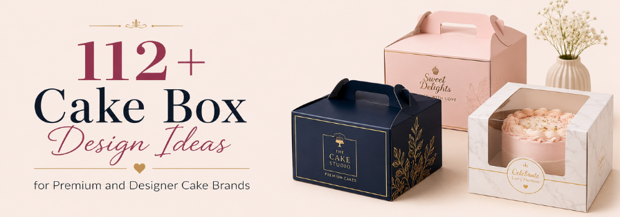
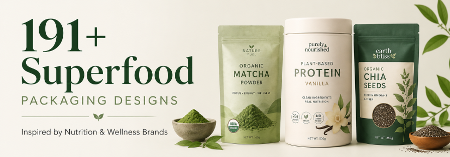
In today’s crowded wellness market, great packaging is one of the strongest tools your brand has to stand out. Thus, let’s discuss more in this comprehensive guide that covers 191+ superfood packaging designs that you can use for your next launch.
Table of Contents
Why Superfood Packaging Has to Work Much Harder Than Ordinary Food Packaging
Most regular food products are purchased based on taste, familiarity, or convenience.
Superfoods are different.
Consumers often buy them because of specific health goals. They want better nutrition, immunity support, fitness benefits, gut health improvements, or overall wellness.
That means superfood packaging has a bigger job to do.
It needs to explain benefits clearly, communicate trust instantly, showcase product quality, and make complicated nutritional information easy to understand. Research from NielsenIQ’s packaging and consumer behavior insights shows that packaging plays a significant role in helping consumers evaluate products and make purchase decisions at the shelf. At the same time, it must still look attractive on a crowded shelf filled with competing wellness brands.
Simply put, superfood packaging isn’t just selling food.
It’s selling a healthier lifestyle.
Superfood Categories That Need Shelf-Ready Packaging to Stand Out
Not all superfoods are marketed in the same way. Different categories attract different audiences and purchasing motivations, which means every food packaging design needs to reflect those differences.
Let’s look at some of the most popular superfood categories.
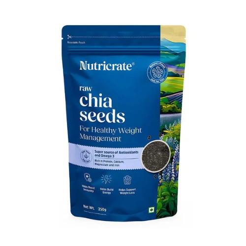
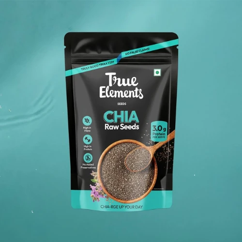
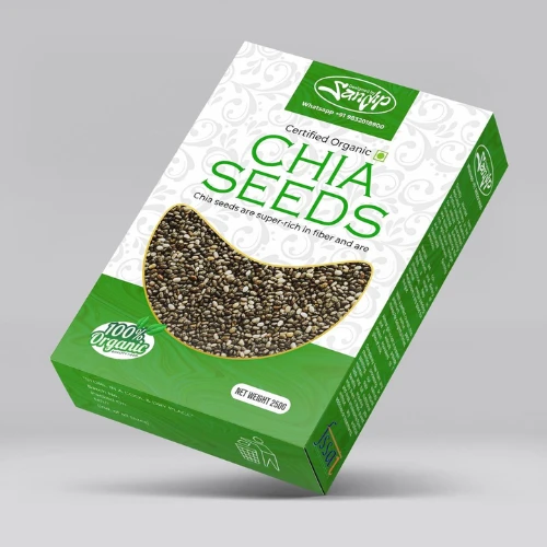
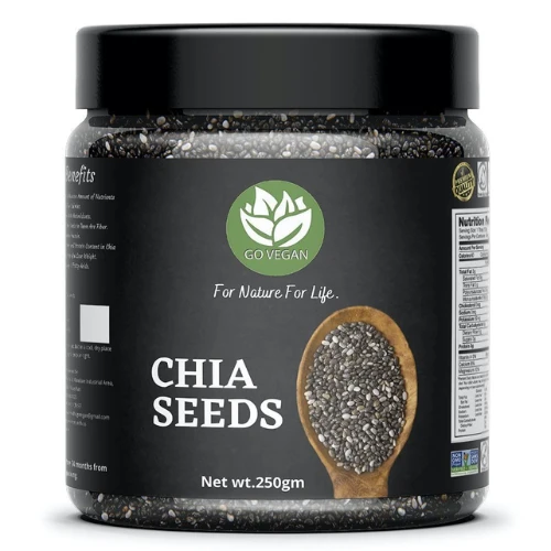
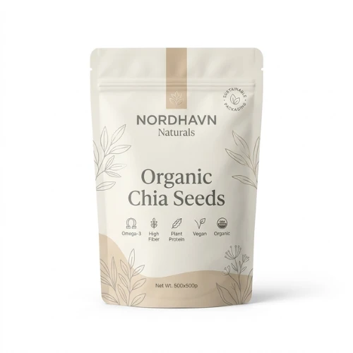
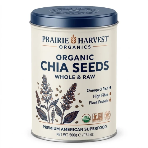
Chia Seeds: Small Seeds with Big Health Claims
Chia seed packaging usually focuses on nutrition, versatility, and clean eating.
Consumers often associate chia seeds with weight management, fibre intake, and healthy breakfast routines. Packaging should feel clean, modern, and informative while clearly highlighting nutritional benefits and serving suggestions.
Source: https://in.pinterest.com/
Source: https://in.pinterest.com/
Source: https://in.pinterest.com/
Source: https://in.pinterest.com
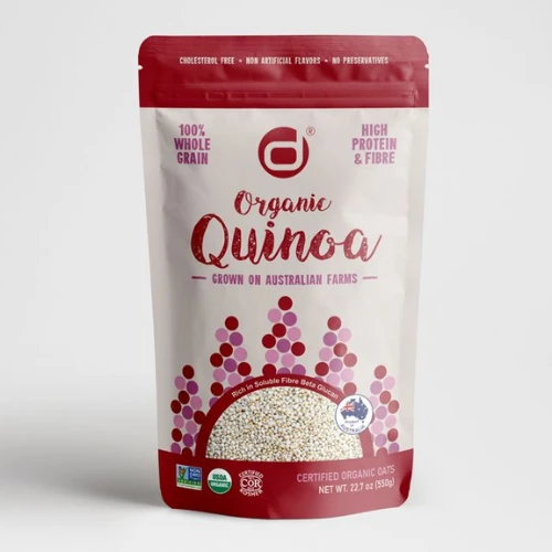
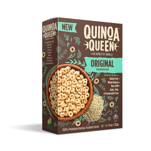
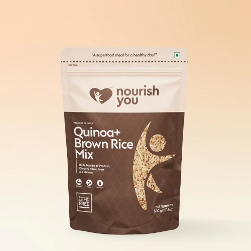
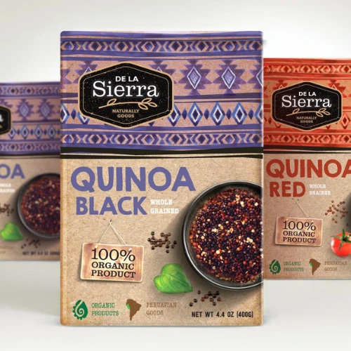
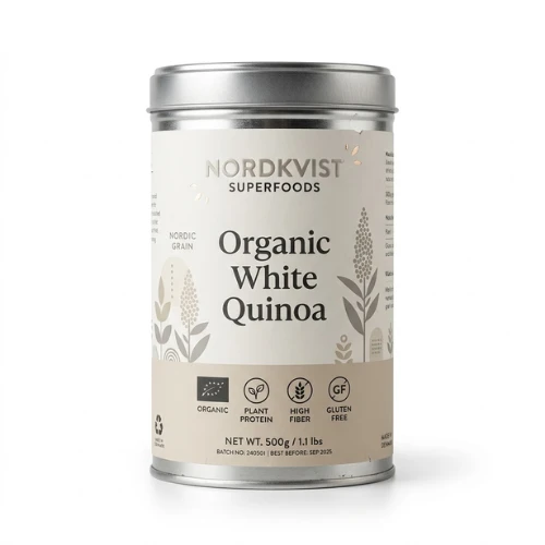
Quinoa: The Global Health Food Favourite
Quinoa buyers are often looking for protein-rich alternatives to traditional grains.
Packaging typically works best when it communicates absolute premium quality, nutritional value, and cooking simplicity. Since quinoa has nowadays become an everyday staple in wellness-focused households, clear product education is extremely important.
Source: https://in.pinterest.com/
Source: https://in.pinterest.com/
Source: https://in.pinterest.com/
Source: https://in.pinterest.com
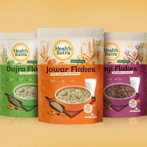
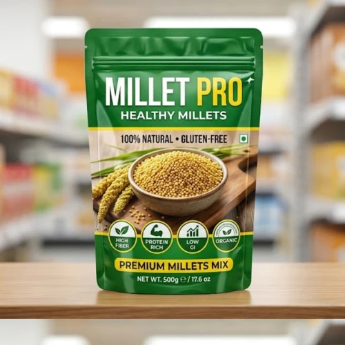
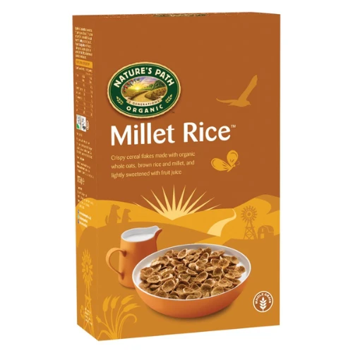
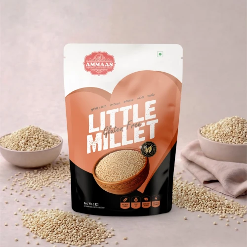
Millets: Traditional Nutrition with a Modern Revival
Millets have experienced a huge comeback, especially in India, over the past few years.
Packaging needs to strike the right balance between heritage and modern health positioning. Brands often combine traditional agricultural storytelling with contemporary design elements to appeal to both older and younger consumers.
Source: https://in.pinterest.com/
Source: https://in.pinterest.com/
Source: https://in.pinterest.com/
Source: https://in.pinterest.com
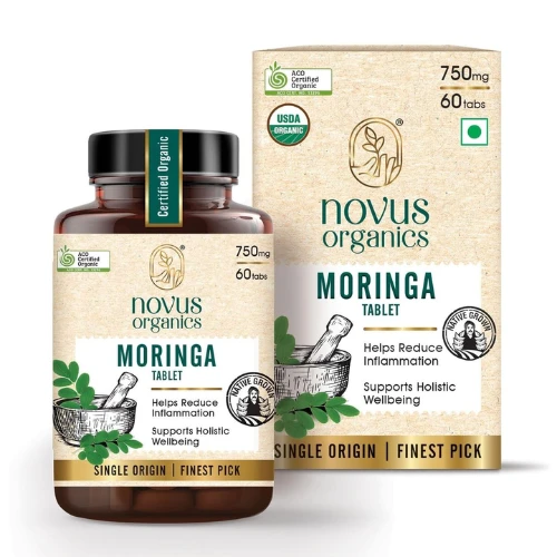
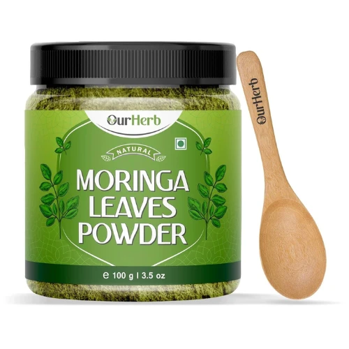
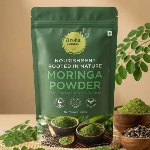
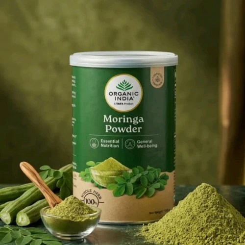
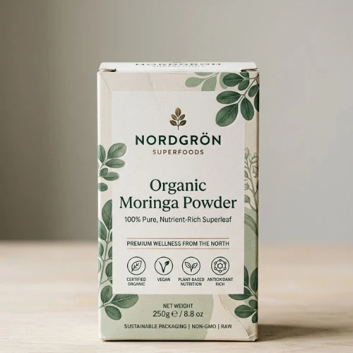
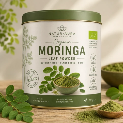
Moringa: The Green Superfood Gaining Popularity
Moringa is packed with countless nutritional benefits, but many consumers are still kind of unfamiliar with it.
That means packaging has to educate apart from the usual selling. Clear benefit communication, ingredient transparency, and wellness-focused visuals help moringa products feel more approachable.
Source: https://in.pinterest.com/
Source: https://in.pinterest.com/
Source: https://in.pinterest.com/
Source: https://in.pinterest.com
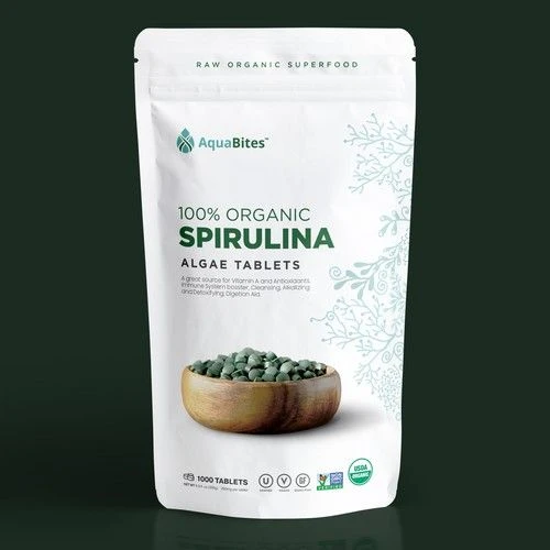
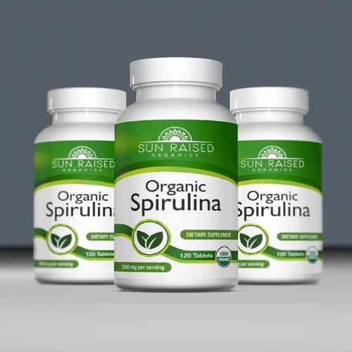
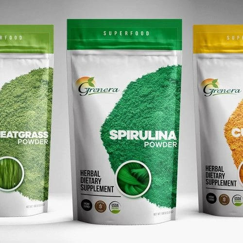
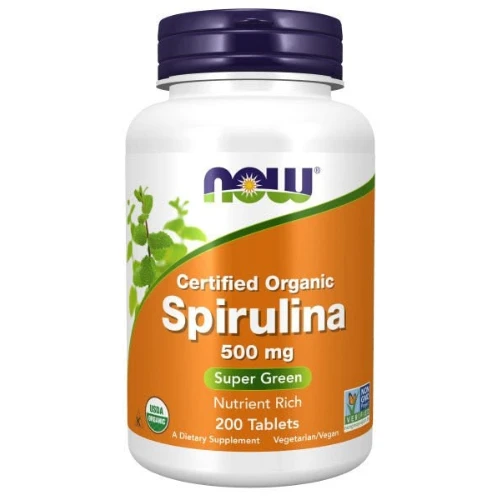
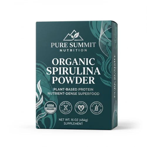
Spirulina: Science Meets Wellness
Spirulina is highly nutritious but often intimidating to first-time buyers.
Packaging works best when it simplifies information and focuses more on the benefits rather than just overwhelming consumers with so much scientific jargon. Clean layouts and strong educational cues can make a huge difference.
Source: https://in.pinterest.com/
Source: https://in.pinterest.com/
Source: https://in.pinterest.com/
Source: https://in.pinterest.com
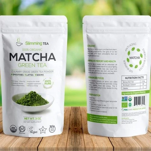
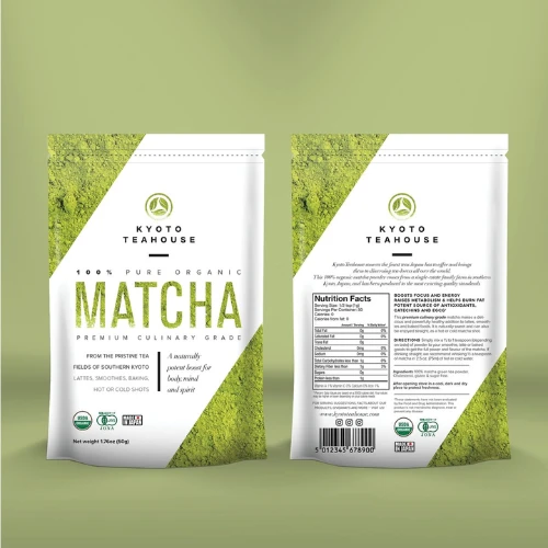
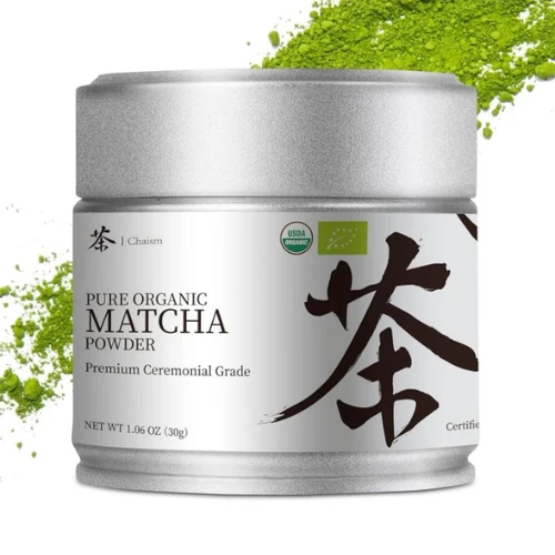
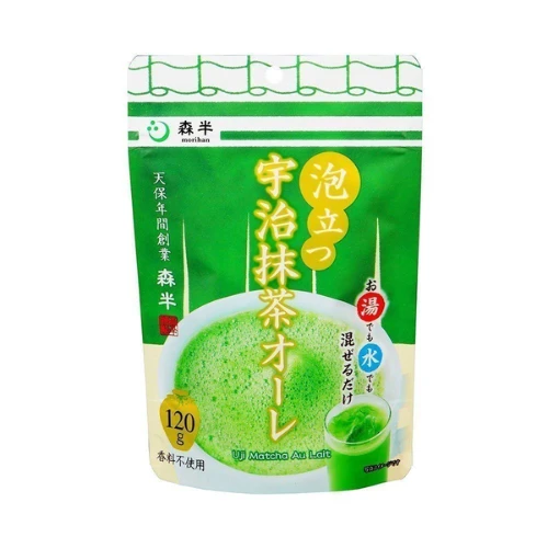
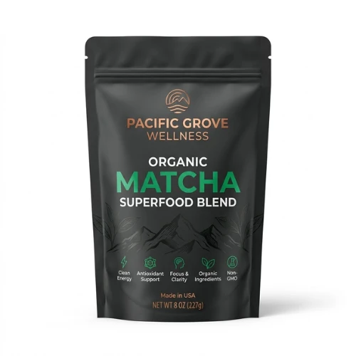
Matcha: Premium Wellness in Every Scoop
Matcha is supposed to look simple, clear and absolutely classy!
Packaging for matcha is usually more inclined toward minimalist aesthetics, premium finishes, and sophisticated design cues. Consumers now expect matcha packaging to feel much more refined, calming, and high-quality.
Source: https://in.pinterest.com/
Source: https://in.pinterest.com/
Source: https://in.pinterest.com/
Source: https://in.pinterest.com
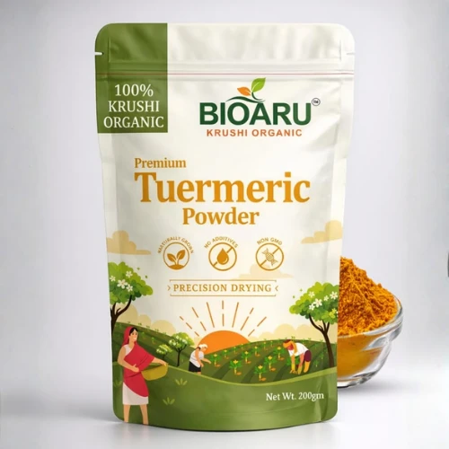
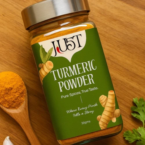
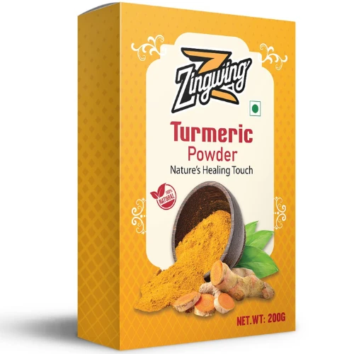
Turmeric: The Golden Star of Functional Nutrition
Turmeric products are directly connected to immunity, anti-inflammatory benefits, and traditional wellness practices. Add these aspects to your packaging too.
Focus more on combining modern health messaging with cultural authenticity. This actually helps create stronger emotional connections.
Source: https://in.pinterest.com/
Source: https://in.pinterest.com/
Source: https://in.pinterest.com/

Source: https://in.pinterest.com
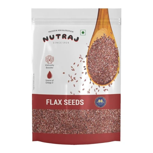
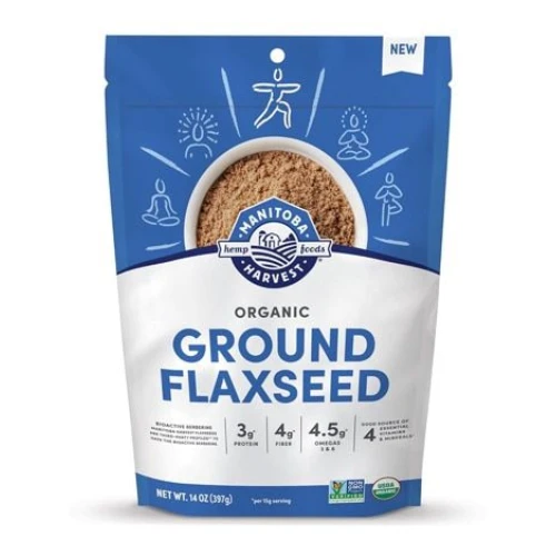
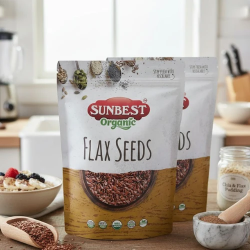
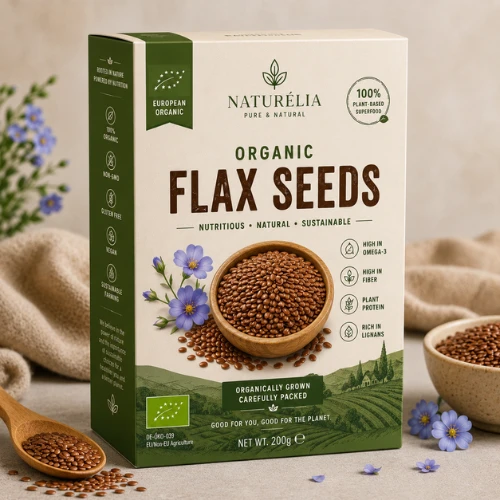
Flax Seeds: Everyday Wellness Made Simple
Flaxseed buyers usually appreciate practical health solutions a lot.
Packaging here should always feel approachable, informative, and easy to understand while highlighting key nutritional benefits such as fibre and omega fatty acids.

Source: https://in.pinterest.com/
Source: https://in.pinterest.com/
Source: https://in.pinterest.com/
Source: https://in.pinterest.com
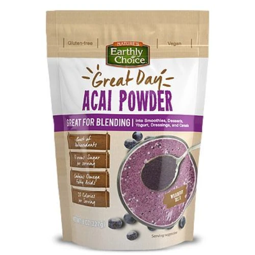
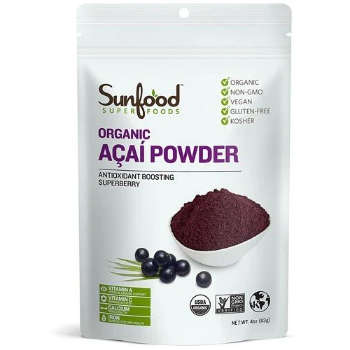
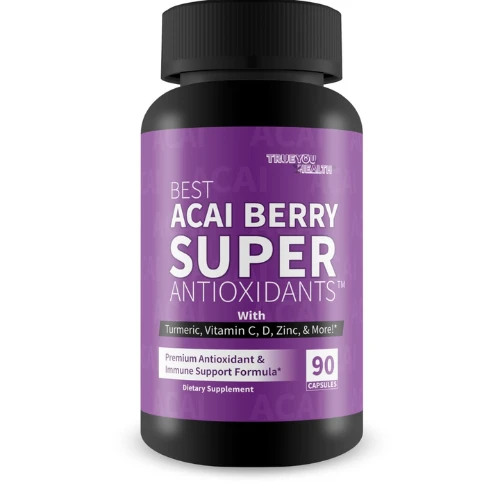
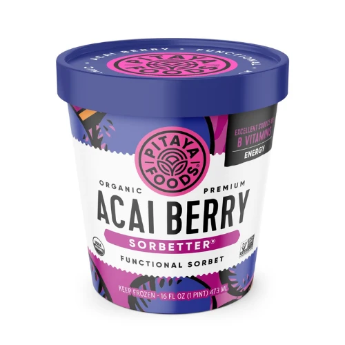
Acai: Bringing Exotic Wellness to the Shelf
Acai products often rely heavily on premium positioning.
Vibrant visuals, rich colours, and strong storytelling about origin and antioxidants help create excitement and differentiation.
Source: https://in.pinterest.com/
Source: https://in.pinterest.com/
Source: https://in.pinterest.com/
Source: https://in.pinterest.com
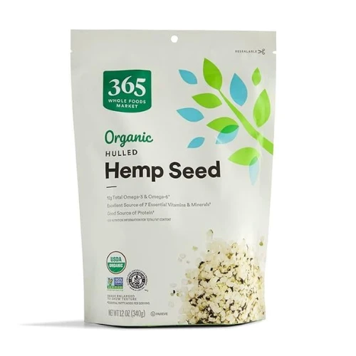
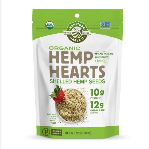
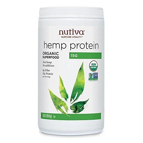
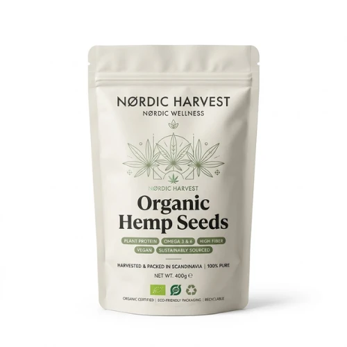
Hemp Seeds: Modern Nutrition for Health-Conscious Consumers
Hemp products often require extra educational support because many consumers are still learning about their benefits.
Packaging should emphasise nutrition, protein content, and wellness advantages while maintaining a trustworthy appearance.
Source: https://in.pinterest.com/

Source: https://in.pinterest.com/
Source: https://in.pinterest.com/
Source: https://in.pinterest.com
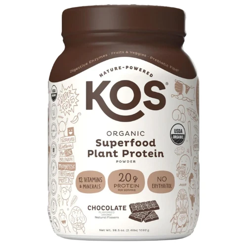
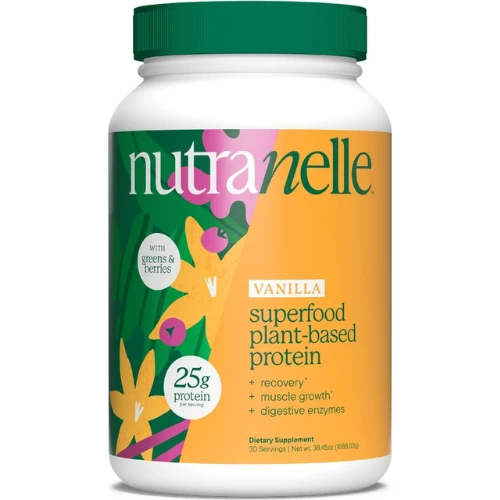
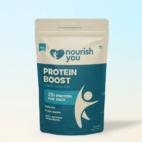
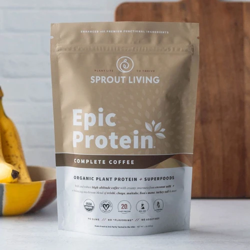
Protein Blends: Performance Meets Nutrition
Protein packaging serves a massive audience base, from fitness enthusiasts to busy professionals. The hype around protein products is very evident.
Strong visual hierarchy, clear nutritional messaging, and performance-driven branding are the best ways to impact purchase decisions.
Source: https://in.pinterest.com/
Source: https://in.pinterest.com/
Source: https://in.pinterest.com/
Source: https://in.pinterest.com
What Makes Superfood Packaging Successful in Today’s Wellness Market?
The wellness industry is growing rapidly, which means competition is increasing too.
The brands winning shelf space aren’t always the ones with the most ingredients. Often, they’re the ones communicating value more effectively through design.
Here are some elements that consistently appear in successful superfood packaging.
A Clean Visual Identity That Feels Trustworthy
Consumers usually associate clean design with product purity. That’s the magic of clean packaging.
Overcrowded layouts, excessive graphic design, and confusing messaging can make packaging feel less credible. Strong wellness brands typically use various kinds of simple layouts that allow important information to breathe.
When the design feels organised, consumers naturally feel more confident about the product.
Nutrition Information That’s Easy to Understand
Health-conscious consumers actively look for nutritional details.
The challenge is presenting that information clearly without overwhelming buyers. Well-organised labels help consumers quickly understand what they’re getting and why it matters.
The easier the information is to digest, the easier purchasing decisions become.
Sustainable Packaging That Matches Wellness Values
Many superfood consumers care deeply about sustainability.
Using recyclable materials, eco-friendly packaging solutions, or reduced-plastic alternatives helps brands align with the values of their target audience.
Packaging should actively support the wellness story, not somehow contradict it.
Transparent Product Windows That Build Confidence
People love seeing what they’re buying.
Transparent windows allow consumers to evaluate product quality instantly. They create honesty, transparency, and confidence without requiring extra explanation.
For many superfood categories, seeing the actual product can be a powerful selling tool.
Colour Palettes That Feel Healthy and Natural.
Colours play a huge role in consumer perception.
Greens, earthy neutrals, soft whites, warm browns, and botanical-inspired palettes often create associations with health, purity, and natural ingredients.
The colour choices can communicate wellness before consumers even read a single word.
Premium Typography That Supports Credibility
Typography influences how professional a product feels.
Strong superfood packaging inclines more towards clean, highly readable fonts that feel modern without appearing sterile. Good typography improves both shelf visibility and consumer trust.
Certifications Displayed Clearly
Organic certifications, non-GMO labels, vegan badges, and quality seals can truly influence buyers’ purchase decisions.
These trust signals should always be quickly visible and easy to identify without overwhelming the design.
Consumers nowadays want reassurance quickly.
Designing Superfood Packaging That Builds Trust and Keeps Customers Coming Back
Getting a first purchase is important.
Getting a second purchase is where real brand growth happens.
Great superfood packaging helps create both.
1. Make Health Benefits Easy to Understand
Many wellness brands make the mistake of overcomplicating their messaging.
Consumers shouldn’t have to decode scientific terminology to understand why a product matters.
Clear benefit statements help shoppers quickly connect the product to their goals.
Whether it’s protein support, immunity, digestion, or energy, the value should be immediately obvious.
2. Use Certifications to Build Instant Confidence
Trust matters even more than you can imagine in the wellness industry.
Certifications provide third-party validation that reassures consumers they’re making a reliable choice.
When displayed clearly, these certifications can effectively reduce any kind of hesitation and strengthen purchasing confidence.
3. Keep Ingredient Transparency Front and Centre
Today’s consumers read labels more carefully than ever before.
They want to know everything about the product, such as:
1. what’s inside
2. where it comes from
3. how it’s sourced
4. and what makes it different
Packaging that openly shares this information often builds stronger long-term trust.
4. Tell One Consistent Brand Story Across Every Product
A strong superfood brand should feel recognisable across every SKU.
Whether customers buy chia seeds, protein blends, or turmeric powder, they should immediately recognise the same visual identity, design language, and brand personality.
Consistency creates familiarity.
And familiarity builds loyalty.
5. Use QR Codes to Continue the Conversation
Modern packaging doesn’t need to stop at the label. There are so many ways to make it more creative and engaging.
QR codes can connect consumers to:
1. recipes
2. sourcing information
3. wellness tips
4. educational videos
5. nutrition guides
6. or community content
These extra touchpoints can significantly build stronger brand engagement beyond the usual strategies, giving the right edge to your business.
6. Make Sustainability Visible
If your brand invests in eco-friendly practices, don’t keep it hidden.
Consumers increasingly reward brands that communicate environmental responsibility clearly and authentically.
Simple sustainability messaging can become a powerful differentiator.
7. Design for Shelves and Screens Equally Well
Today’s consumers often discover products online before buying them in stores.
That means packaging must perform in both environments.
Strong visual hierarchy, readable typography, and recognisable branding help products stand out whether they’re sitting on a retail shelf or appearing as a tiny product image on an e-commerce website.
The best superfood packaging works beautifully in both worlds.
Explore Packaging Styles Inspired by Leading Wellness Brands Around the World
Scandinavian Wellness Packaging
Soft colours, minimal layouts, clean typography, and uncluttered design create a calm and trustworthy wellness experience that feels premium without appearing overly complicated or intimidating.
Source: https://in.pinterest.com/
Source: https://in.pinterest.com/
Source: https://in.pinterest.com/
Source: https://in.pinterest.com
Japanese Minimalist Packaging
Japanese-inspired wellness packaging focuses so much more on simplicity, precision, and balance. Starting from clean structures, subtle details, and restrained design choices. All of these create a sophisticated sense of quality and authenticity.

Source: https://in.pinterest.com/

Source: https://in.pinterest.com/
Source: https://in.pinterest.com/
Source: https://in.pinterest.com
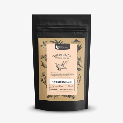
Australian Health Food Packaging
Australian wellness brands often combine natural textures, earthy palettes, sustainability messaging, and approachable visuals that feel fresh, relaxed, and closely connected to nature.
Source: https://in.pinterest.com/
Source: https://in.pinterest.com/
Source: https://in.pinterest.com/
Source: https://in.pinterest.com
American Functional Nutrition Packaging
American nutrition brands typically emphasise performance, benefits, and convenience. Strong visual hierarchy, bold claims, and clear nutritional communication help products stand out quickly.
Source: https://in.pinterest.com/
Source: https://in.pinterest.com/
Source: https://in.pinterest.com/
Source: https://in.pinterest.com
European Organic Product Packaging
European wellness packaging often blends premium aesthetics with organic authenticity. Elegant typography, natural materials, and understated design create a sophisticated yet approachable appearance.

Source: https://in.pinterest.com/

Source: https://in.pinterest.com/
Source: https://in.pinterest.com/
Source: https://in.pinterest.com
Final Thoughts
The wellness market is becoming more competitive every year.
Consumers have endless choices, which means packaging often becomes the deciding factor between products that get noticed and products that get ignored.
The strongest superfood brands understand that packaging isn’t simply a container. It’s a trust-building tool. It’s a storytelling platform. And it’s often the first interaction consumers have with the brand.
At DesignerPeople, we help nutrition, wellness, health food, and superfood brands create packaging that combines strategy, shelf impact, and consumer psychology. From organic product packaging to complete wellness brand identity systems, we design packaging that helps products stand out, build trust, and drive repeat purchases.
Because in today’s health-conscious world, great packaging doesn’t just make products look good. It actually helps consumers feel good about choosing them, too.
Author: Anush Malik

Being a strategist’s head and a long term visionary personality aims to achieve excellence in branding, packaging and digital marketing field. My 15 years of design experience and masters degree ais my strength which keeps me motivated and keep me going positively. I have participated in extensive branding design conquests in India, USA, Australia and New Zealand with winning zeal. My objective is to encourage start-ups and hence involves actively in the articles which will act as a productive intake of knowledge for them. Do connect me personally via my LinkedIn and I love to share my expertise with you.