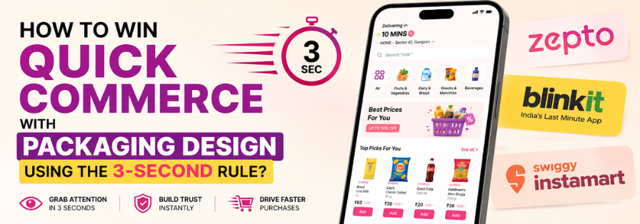

Imagine a customer scrolling through Blinkit, Zepto, Instamart, or BigBasket. Hundreds of products, including your brand, flash across their screen in seconds.
They aren’t carefully reading all the descriptions.
They aren’t comparing every feature across different options.
They are simply scrolling through all the options, spotting, and deciding based on the most attractive design.
This is where the 3-Second Rule of Packaging Design comes into play.
The rule is simple: if shoppers cannot instantly understand who you are, what you sell, and why they should care within three seconds, you have now likely lost the sale.
In traditional retail stores, consumers could pick up products, read labels, and inspect packaging. Quick commerce has completely changed that behaviour. Today, products are often viewed as tiny thumbnails on mobile screens before landing in a customer’s cart.
The opportunity is massive. According to a report by Mint, India’s quick commerce market is expected to surpass $9-10 billion in Gross Merchandise Value (GMV) by 2026, growing at more than 60% year-over-year. Quick commerce already contributes approximately 16-17% of India’s total e-commerce sales, while over 11,500 D2C brands are competing for consumer attention online.
In such a crowded digital marketplace, great packaging is no longer just about aesthetics. It is more about visibility, recognition, trust, and conversion.
So how do successful brands win the battle for attention? Let’s explore.
Table of Contents
9 Packaging Design Secrets That Make Shoppers Stop Scrolling
Here’s a quick breakdown of all the packaging design secrets that our expert packaging designers follow to curate the most interactive designs that steal the spotlight every time.
1. Make Your Brand Impossible to Miss
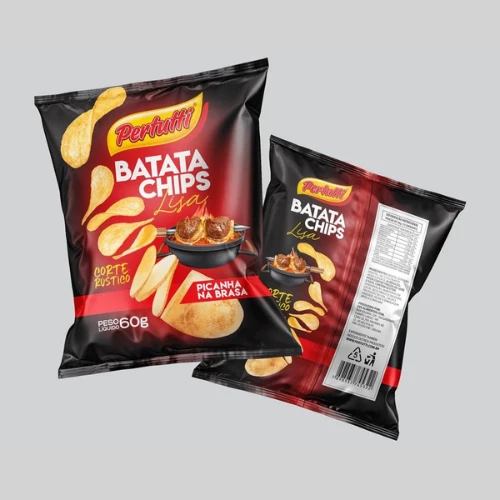
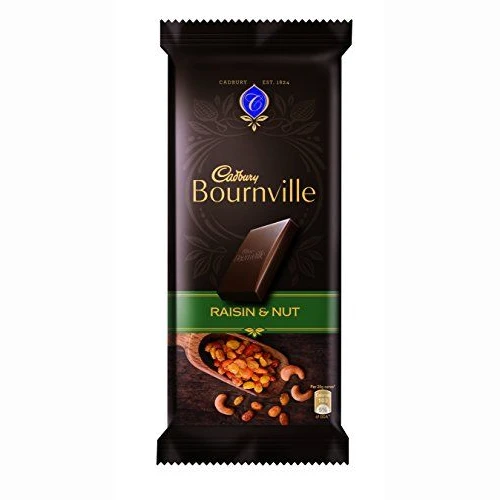
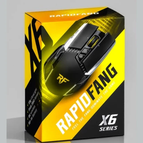
The biggest mistake many brands make is hiding their logo.
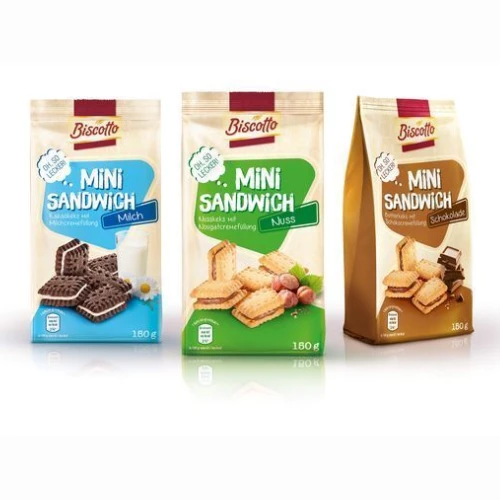
When consumers browse quick commerce apps, they often make purchasing decisions based on brand familiarity. If your logo is tiny, buried, or difficult to read, you’re losing valuable recognition.
Your brand name should be:
● Clearly visible
● High contrast
● Positioned prominently
● Legible even in thumbnail size
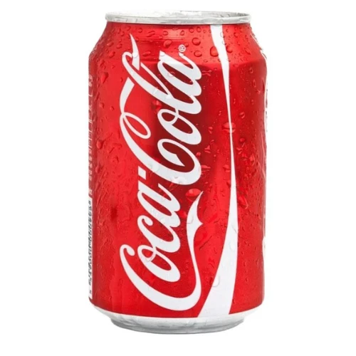
Think of brands like Amul, Coca-Cola, or Paper Boat. Even when viewed from a distance, consumers instantly recognise them.
The goal isn’t simply visibility. The goal is instant recall.
Source: https://in.pinterest.com/
Source: https://in.pinterest.com/
Source: https://in.pinterest.com/
Source: https://in.pinterest.com
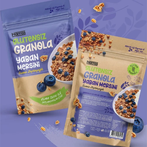
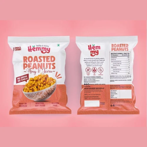
2. Show the Product Before Explaining It
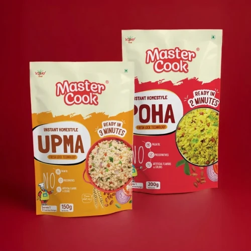
People process visuals much faster than text.
A customer should immediately understand what they’re buying without needing to zoom in or read descriptions.
For example:
● A granola pack should clearly showcase granola.
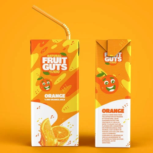
● A juice pack should prominently display fruits.
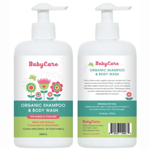
● A baby-care product should instantly communicate gentleness and safety.
The faster consumers identify the product category, the higher the chances of conversion.
According to various packaging and consumer behaviour studies, visual recognition often occurs in milliseconds, making imagery one of the strongest purchase triggers.
Source: https://in.pinterest.com/
Source: https://in.pinterest.com/
Source: https://in.pinterest.com/
Source: https://in.pinterest.com
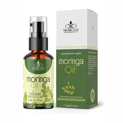
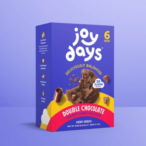
3. Let Colours Do the Selling
Colours communicate emotions before words ever can.
Research shows that 62%–90% of a consumer’s initial product evaluation is based on colour alone, making colour one of the most influential packaging elements in purchase decisions.
Different colours create different expectations:
● Green = Natural, organic, healthy
● Blue = Trustworthy, professional
● Red = Energy, urgency, excitement
● Yellow = Optimism and positivity
● Black = Premium and luxury
On quick commerce platforms, colour also plays another critical role: differentiation.
If every competitor uses blue packaging, a strategic use of orange or yellow can instantly help your product stand out.
Remember: the goal isn’t just to look attractive. The goal is to become impossible to ignore.
Source: https://in.pinterest.com/
Source: https://in.pinterest.com/
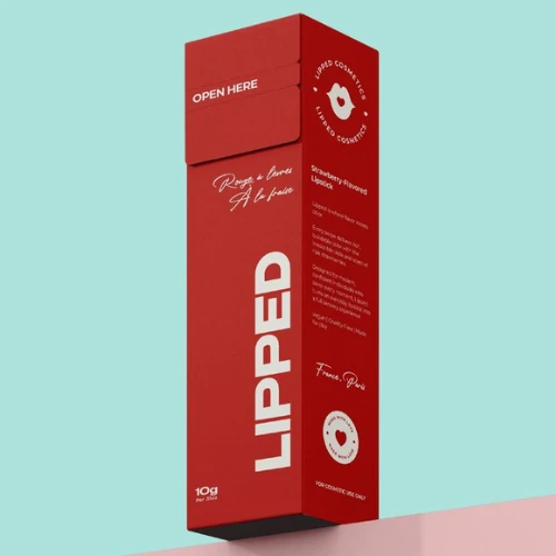
Source: https://in.pinterest.com/
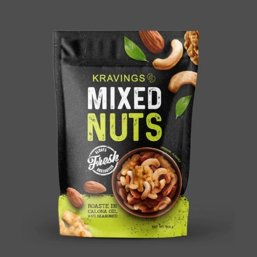
Source: https://in.pinterest.com
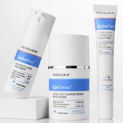
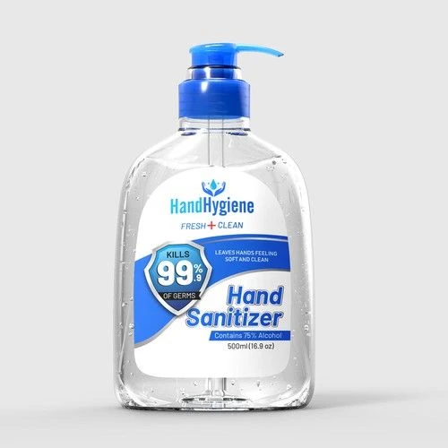
4. Stick to One Message, Not Ten
Consumers don’t have time to read a wall of text.
The most effective packaging communicates one powerful message immediately.
Examples:
● “High Protein”
● “100% Natural”
● “Sugar Free”
● “Dermatologist Tested”
● “Kills 99.9% Germs”
Trying to communicate five benefits simultaneously often results in communicating none.
Choose your strongest selling point and give it centre stage.
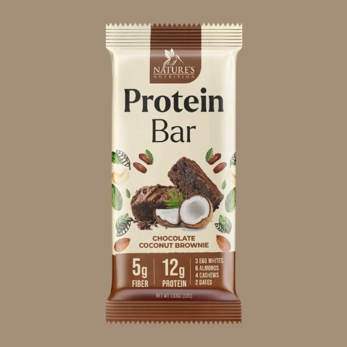
Source: https://in.pinterest.com/
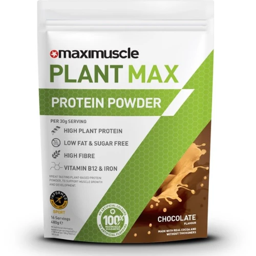
Source: https://in.pinterest.com/
Source: https://in.pinterest.com/
Source: https://in.pinterest.com
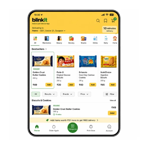
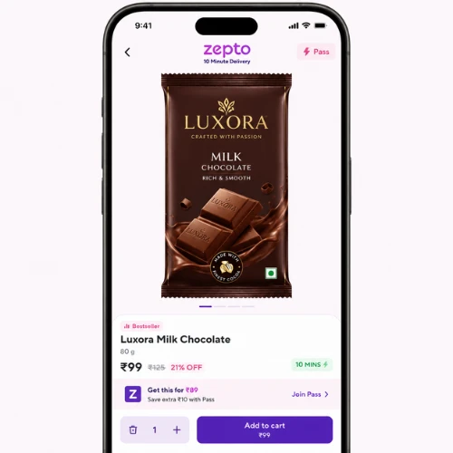
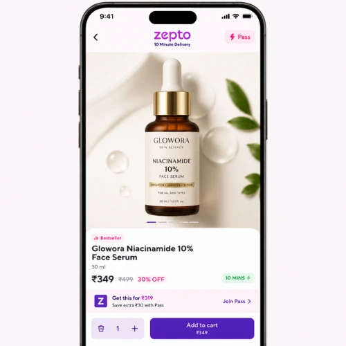
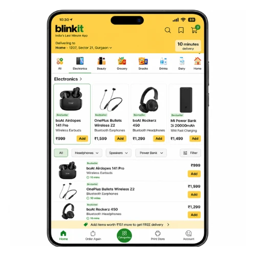
5. Design for Tiny Mobile Screens, Not Store Shelves
Traditional packaging was designed for physical shelves.
Quick commerce packaging must perform on a smartphone screen.
Before finalising your design, zoom out until the packaging appears thumbnail-sized.
Ask yourself:
● Can you read the brand name?
● Can you identify the product?
● Can you understand the category?
● Is the key message visible?
If not, simplify.
Because on Blinkit and Zepto, your packaging is essentially functioning as a tiny digital billboard for your brand.
Source: https://in.pinterest.com/
Source: https://in.pinterest.com/
Source: https://in.pinterest.com/
Source: https://in.pinterest.com
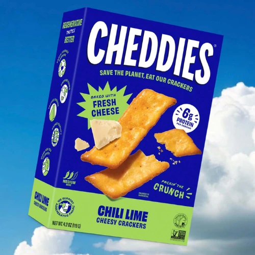
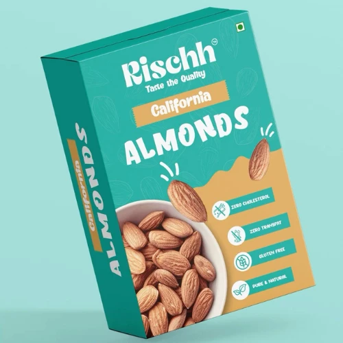
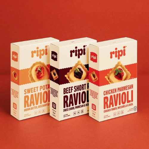
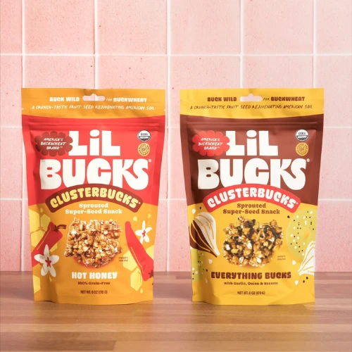
6. Say More with Fewer Words
Modern consumers always appreciate clarity.
Short messaging performs way better than long explanations.
Compare:
“A nutritious snack formulated with multiple ingredients to provide sustained energy”
vs.
“Protein-Packed Energy”
The second version wins instantly, right?
Every word on your packaging should earn its place.
Source: https://in.pinterest.com/
Source: https://in.pinterest.com/
Source: https://in.pinterest.com/
Source: https://in.pinterest.com
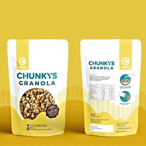
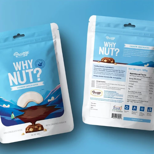
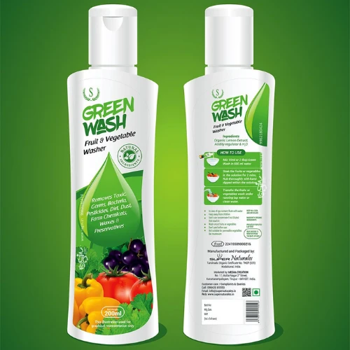
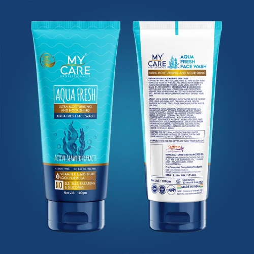
7. Build Trust at First Glance
Trust always drives more purchases, especially online.
Since customers cannot physically inspect products, packaging must communicate credibility quickly.
Trust-building elements include:
● Certifications
● Quality badges
● Awards
● Safety symbols
● Ingredient transparency
● Customer ratings (wherever applicable)
For healthcare, baby care, and food products, trust indicators can significantly influence buying decisions.
Consumers often use these visual cues as shortcuts when making fast decisions.
Source: https://in.pinterest.com/
Source: https://in.pinterest.com/
Source: https://in.pinterest.com/
Source: https://in.pinterest.com
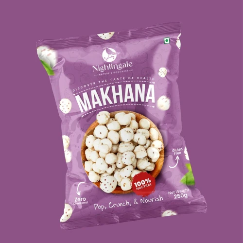
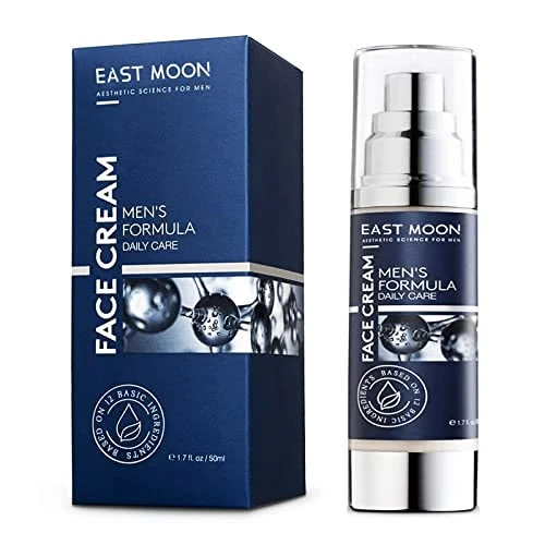
8. Look Different from Everyone Else
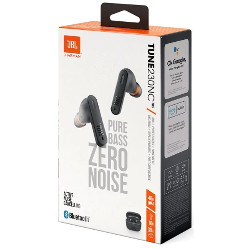
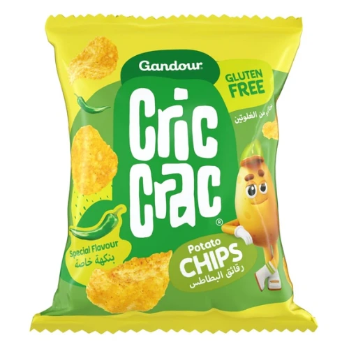
One of the fastest ways to disappear is to look exactly like your competitors.
Audit your category.
Study the top 20 products appearing on quick commerce platforms.
Then identify:
● Common colors
● Common layouts
● Common typography styles
● Common imagery
Now do something strategically different.
The brands winning attention today are often the ones breaking category conventions while remaining instantly understandable.
Source: https://in.pinterest.com/
Source: https://in.pinterest.com/
Source: https://in.pinterest.com/
Source: https://in.pinterest.com
9. Create Packaging People Want to Photograph
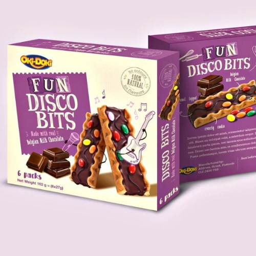
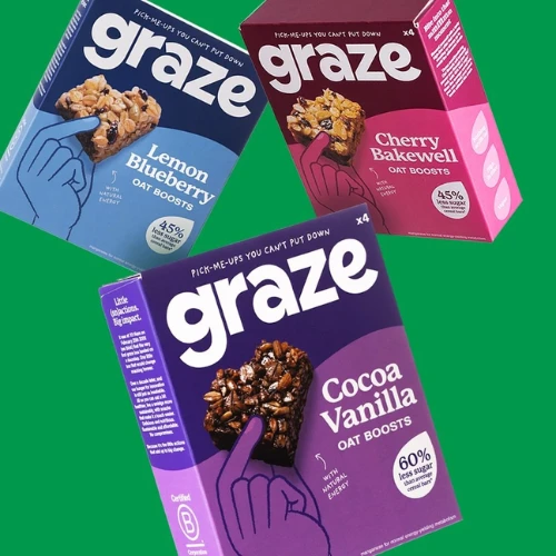
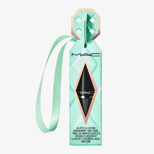
Packaging is now increasingly becoming shareable content.
According to Dotcom Distribution research, 40% of consumers have shared a product photo or video on social media, while 40% are more likely to recommend products delivered in premium branded packaging.
Instagram-worthy packaging extends marketing beyond the usual platform.
Great packaging can truly generate:
● User-generated content
● Social shares
● Unboxing videos
● Organic recommendations
According to packaging marketing studies, any visually distinctive packaging can significantly increase brand recall and social engagement.
When customers voluntarily share your packaging, you have transformed it into a marketing channel.
That’s a powerful competitive advantage.
Source: https://in.pinterest.com/
Source: https://in.pinterest.com/
Source: https://in.pinterest.com/
Source: https://in.pinterest.com
The Attention-Grabbing Packaging Checklist: What Consumers Notice in Under 3 Seconds
Consumers don’t analyse packaging systematically.
Instead, their brains rapidly scan visual cues.
Here are the elements that matter most:
Logo Placement
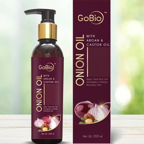
Your logo is often the first step toward building trust and recall.
Think about how consumers shop on Blinkit or Zepto. Many buyers aren’t necessarily searching for a specific product. They’re searching for familiar brands.
If your logo is too small, hidden in a corner, or blended into the background, you’re making consumers work harder than necessary.
Strong logo placement should:
● Be visible even in thumbnail view
● Maintain readability on mobile screens
● Have sufficient contrast from the background
● Occupy a prominent position on the pack
A useful rule of thumb: shrink your packaging image to 2-3 cm wide on your screen. If your logo disappears, it needs more prominence.
Source: https://in.pinterest.com/
Source: https://in.pinterest.com/
Product Photography: Show, Don’t Explain
People process images thousands times faster than just boring text.
That’s why product imagery often becomes the deciding factor in quick-commerce environments.
A customer should instantly recognise:
● The flavor
● The category
● The ingredients
● The product format
For example:
A mango drink should prominently feature juicy mangoes.
A protein bar should showcase ingredients, texture or flavour.
A baby lotion should visually communicate softness and care.
The best product photography creates immediate understanding while triggering desire.
The fewer questions consumers have to ask, the faster they move toward purchase.
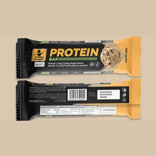
Source: https://in.pinterest.com/
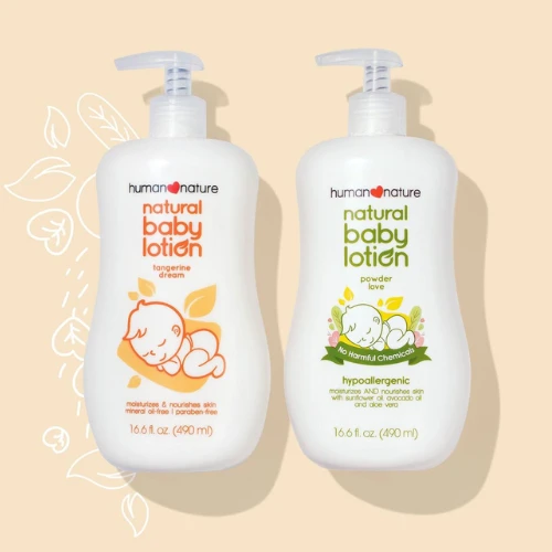
Source: https://in.pinterest.com/
Typography: Readability Always Wins
Beautiful typography means nothing if consumers can’t read it.
One of the most common packaging mistakes is choosing decorative fonts that look attractive in presentations but fail in real-world conditions.
Remember:
Your packaging may appear as a tiny thumbnail on a six-inch mobile screen.
Typography should help consumers instantly identify:
● Brand name
● Product name
● Variant
● Key benefit
Simple, bold, and high-contrast fonts typically outperform complicated typefaces in quick-commerce environments.
If consumers have to zoom in to read your packaging, you have already lost valuable attention.
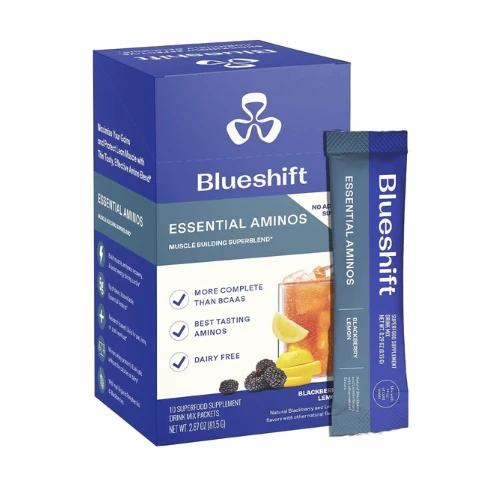
Source: https://in.pinterest.com/
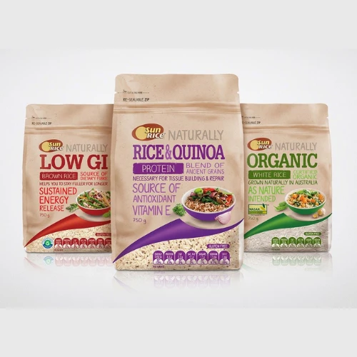
Source: https://in.pinterest.com/
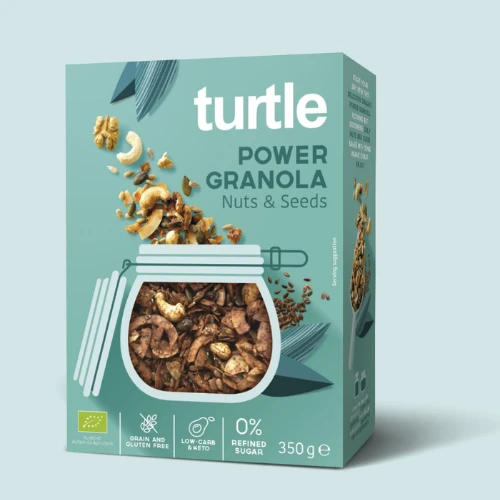
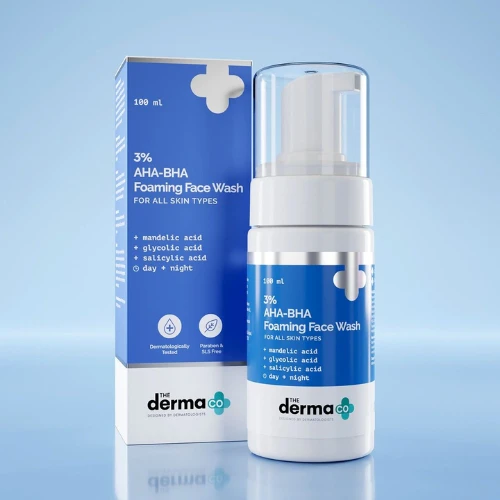
Icons: Tiny Visuals That Communicate Big Benefits
Icons are the shortcut language of modern packaging.
Instead of reading lengthy descriptions, consumers often scan icons to understand product benefits.
Popular examples include:
● Vegan
● Organic
● Sugar-Free
● High Protein
● Cruelty-Free
● Dermatologically Tested
● Recyclable
These symbols help reduce cognitive effort.
The easier it is for consumers to understand your product, the more likely they are to click.
However, always avoid cluttering packaging with too many icons. Only highlight benefits that genuinely influence your buying decisions.
Source: https://in.pinterest.com/
Source: https://in.pinterest.com/
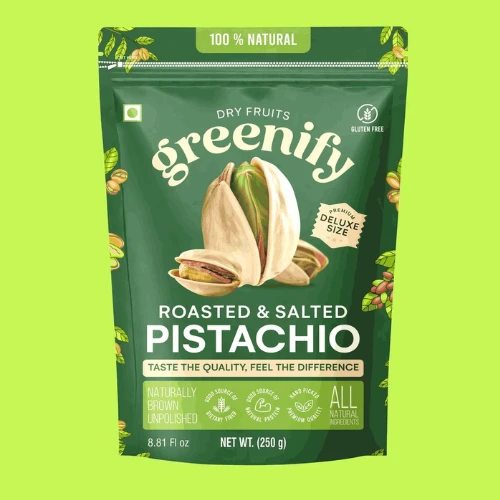
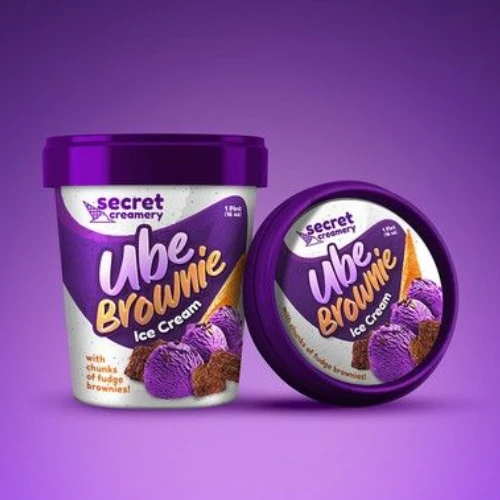
Colours: The Fastest Way to Influence Perception
Before consumers read a single word, they experience your packaging colour, which communicates meaning instantly.
For example:
● Green suggests health, nature, sustainability, and freshness.
● Blue conveys consistent trust, reliability, and safety.
● Red creates urgency, excitement, and appetite stimulation.
● Purple directly signals premium quality and innovation.
● Black creates a luxury perception.
Beyond psychology, colour also helps products stand out within crowded product grids.
A unique colour strategy can dramatically improve discoverability when competing against dozens of similar products.
Source: https://in.pinterest.com/
Source: https://in.pinterest.com/
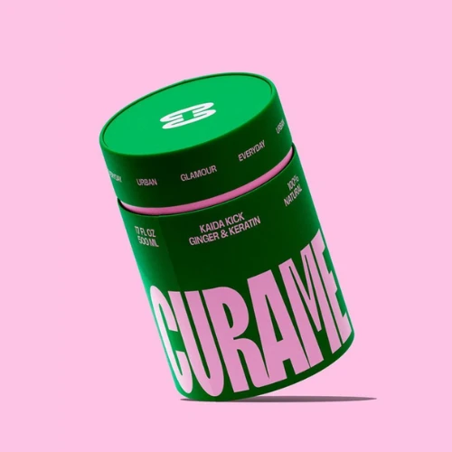
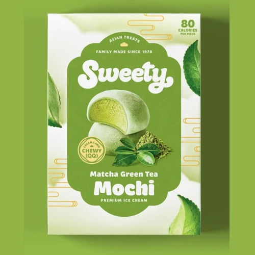
Contrast: The Secret Weapon of Visibility
Many packaging designs fail because everything blends together.
Strong contrast helps important information stand out immediately.
Contrast can be created through:
● Light versus dark colors
● Bold versus thin typography
● Large versus small elements
● Bright accent colors
Without contrast, consumers don’t know where to look.
With contrast, you guide their attention exactly where you want it to go.
Source: https://in.pinterest.com/
Source: https://in.pinterest.com/
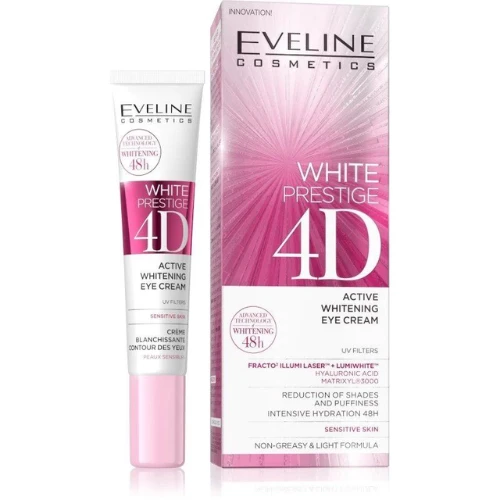
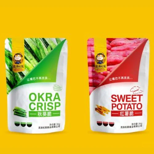
White Space: The Most Underrated Packaging Element
Many brands believe more information equals better communication.
In reality, the opposite is often true.
White space helps:
● Improve readability
● Reduce visual clutter
● Direct attention to important messages
● Create a premium appearance
Think of white space as breathing room for your design.
When everything is shouting, nothing gets heard.
Source: https://in.pinterest.com/
Source: https://in.pinterest.com/
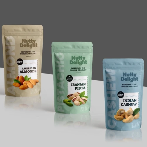
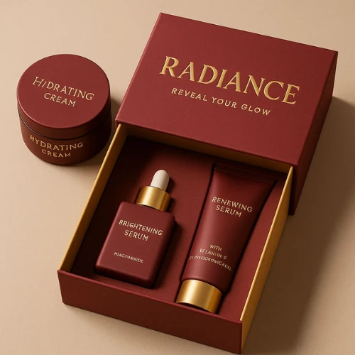
Material Finish: The Offline Experience Still Matters
Although quick-commerce purchases begin digitally, the physical unboxing experience still influences customer satisfaction and repeat purchases.
Premium finishes such as:
● Matte laminations
● Soft-touch coatings
● Spot UV
● Embossing
● Metallic foils
Can elevate perceived value significantly.
This is particularly important for premium foods, cosmetics, wellness products, and gifting categories.
A memorable tactile experience increases the likelihood of more repeat purchases and recommendations.
Source: https://in.pinterest.com/
Source: https://in.pinterest.com/
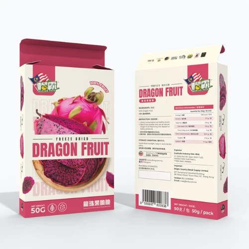
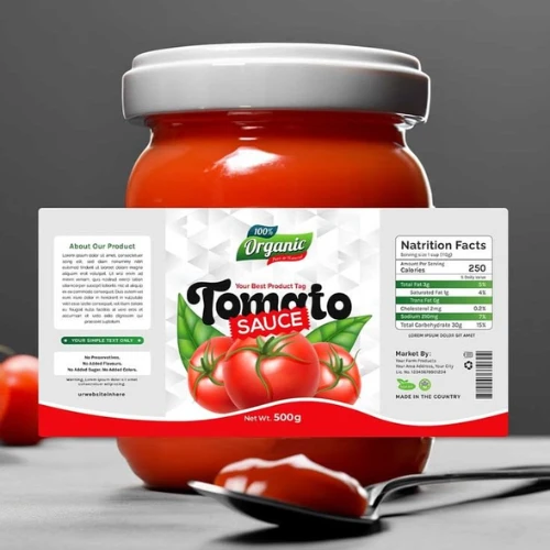
Labels: Small Details That Build Credibility
Labels directly communicate professionalism and trust, which are integral for boosting brand loyalty.
Well-designed labels always help consumers quickly identify:
● Ingredients
● Certifications
● Manufacturing details
● Usage instructions
● Expiry information
Messy labels often create doubts about product quality.
Clear labels are bound to create confidence.
And confidence drives more conversions.
Source: https://in.pinterest.com/
Source: https://in.pinterest.com/
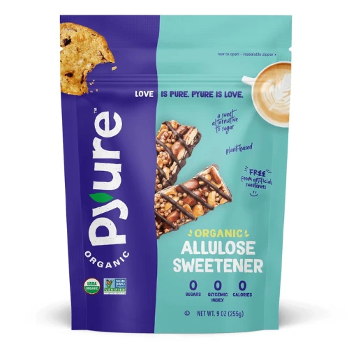
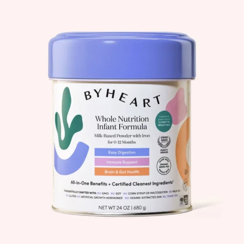
Callouts: Direct Attention to What Matters Most
Callouts are various visual highlights specifically designed to grab consumer attention immediately.
Examples include:
● NEW
● BESTSELLER
● LIMITED EDITION
● IMPROVED FORMULA
● NO ADDED SUGAR
These small visual elements act like attention magnets.
When used strategically, they help consumers identify the most compelling reason to choose your product.
Source: https://in.pinterest.com/
Source: https://in.pinterest.com/
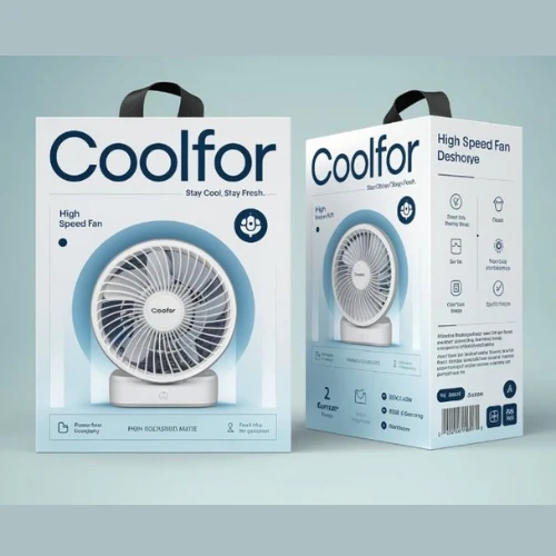
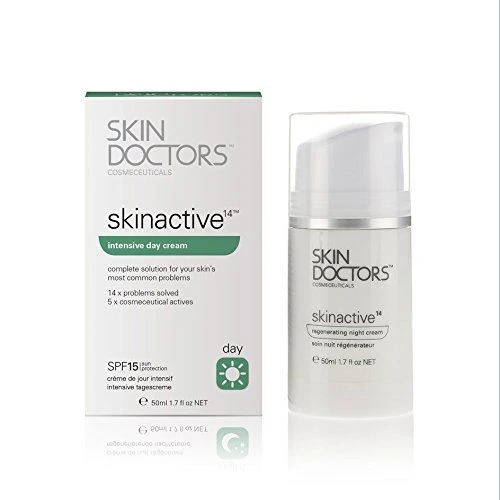
Product Name: Eliminate All Guesswork
This sounds obvious, but many brands tend to get it wrong.
The product name should instantly answer:
“What exactly am I buying?”
Any fancy naming conventions may sound creative internally but tend to create confusion externally.
Clarity always wins.
Consumers should identify the product category within seconds.
Source: https://in.pinterest.com/
Source: https://in.pinterest.com/
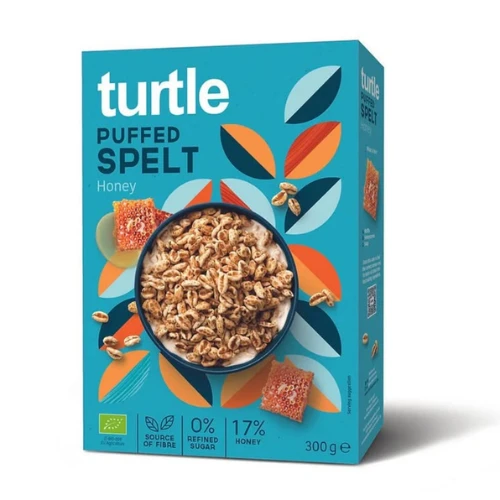
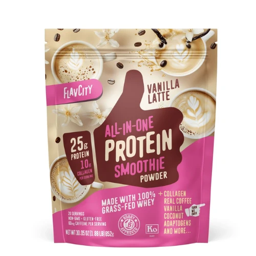
USP Placement: Put Your Strongest Benefit Front and Centre
Your USP (Unique Selling Proposition) is often the ultimate deciding factor between a click and a scroll.
Yet many brands hide their strongest benefit in secondary text.
Your most important selling point should appear prominently on the front pack.
Examples:
● 25g Protein
● 100% Natural
● Pediatrician Recommended
● Chemical-Free Cleaning
● Ayurvedic Formula
The faster consumers understand the value, the faster they make purchase decisions.
The most successful quick-commerce packaging doesn’t try to communicate everything. It communicates the right thing immediately.
Source: https://in.pinterest.com/
Source: https://in.pinterest.com/
Does Your Packaging Pass the 3-Second Test? Here’s How to Find Out
Many packaging designs look fantastic in boardrooms, presentations, and mockups.
Then they fail miserably on Blinkit.
Why?
Because attractive packaging and effective packaging aren’t always the same thing.
Before launching a product, every brand should test whether its packaging can survive the realities of quick-commerce shopping.
Here are some proven methods.
Conduct a Thumbnail Test
This is the simplest and most important test.
Shrink your packaging image to the size it appears on a marketplace listing.
Then ask:
● Can I identify the brand?
● Can I identify the product?
● Can I understand the category?
● Can I spot the main benefit?
If the answer is no, consumers will struggle too.
Run a Mobile Visibility Test
Different devices display products differently.
Test your packaging on:
● Small Android screens
● Large Android screens
● iPhones
● Tablets
What looks perfect on a designer’s monitor may become unreadable on mobile devices.
Always optimise for the smallest screen first.
Use the Five-Second Recall Method
This test reveals whether your packaging creates memorable impressions.
Show consumers your packaging for five seconds.
Then remove it and ask:
● Which brand did you see?
● What product was it?
● What benefit did it offer?
● What colour was the pack?
Strong packaging creates strong recall.
Weak packaging disappears from memory almost instantly.
Compare Against Competitors
Open Blinkit or Zepto and place your packaging alongside ten direct competitors.
Then ask:
● Which product grabs attention first?
● Which design feels most trustworthy?
● Which pack communicates fastest?
Your competitors aren’t just competing on price.
They are competing for attention.
And attention is often won visually.
Conduct A/B Testing Before Launch
Instead of guessing which design works best, test multiple options.
Evaluate:
● Click-through rates
● Conversion rates
● Add-to-cart rates
● Repeat purchase rates
Small design changes can produce surprisingly large improvements in sales performance.
Gather Real Consumer Feedback
Design teams often become too familiar or monotonous with their own work.
It’s time to get creative and think out of the box for your designs. Consumers can actually provide you with so many fresh perspectives.
Ask questions like:
● What stands out first?
● What feels confusing?
● What benefit do you notice immediately?
● Would you click this product?
These answers often reveal so many blind spots that internal teams might miss and cost so many potential opportunities.
Use Heatmaps and Eye-Tracking Studies
Advanced brands like DesignerPeople increasingly use various kinds of heatmap tools and eye-tracking research.
These studies reveal:
● Where consumers look first
● Which elements attract attention
● Which areas get ignored
This data helps optimise visual hierarchy on your packaging designs for maximum impact.
Monitor Marketplace Performance After Launch
Packaging optimisation shouldn’t stop after launch.
Track metrics such as:
● Product page views
● Click-through rates
● Cart additions
● Conversion rates
● Repeat purchases
The market constantly changes.
Consumer expectations evolve.
Winning brands continuously refine their packaging based on performance data.
Real Brands, Real Results: Packaging Examples Winning in Quick Commerce
The best way to understand successful quick-commerce packaging is to study brands already doing it well.
Let’s examine what works, why it works, and what lessons other brands can apply.
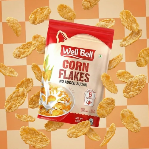
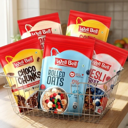
Food Category: Well Bell
Well, Bell recognised that today’s shoppers make decisions faster than ever.
As the brand expanded into modern retail channels, it redesigned its packaging to improve visibility, shelf impact, and consumer understanding.
What Works?
● Clean front-facing layouts
● Strong visual hierarchy
● Modern typography
● Better benefit communication
Why It Works
Consumers can quickly identify:
● What the product is
● What benefit does it offer
● Why is it different
The packaging reduces cognitive effort and simplifies decision-making.
Key Lesson for Brands
Don’t overcrowd your packaging.
The fastest communicator often wins.
Source: https://in.pinterest.com/
Source: https://in.pinterest.com/
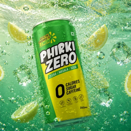
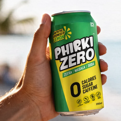
Beverage Category: Phirki Zero
Phirki Zero is one of the most interesting examples of packaging built specifically for quick commerce.
According to industry reports, the brand sold approximately 2.5 lakh units within two months, with nearly 80% of sales coming from quick-commerce platforms.
What Works?
● Bold typography is visible in thumbnails.
● Distinctive colors
● Highly recognisable visual identity
● Strong digital-shelf visibility
Why It Works
The brand understands that consumers first encounter products digitally.
Every design decision prioritises visibility on mobile screens.
Key Lesson for Brands
Design for the digital shelf first. Not the physical shelf.
Source: https://in.pinterest.com/
Source: https://in.pinterest.com/
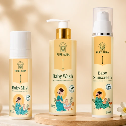
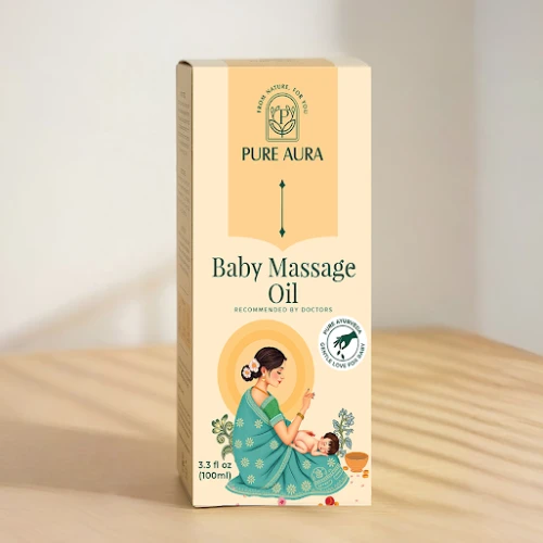
Baby Care Category: Pure Aura
Baby-care purchases involve a high level of trust.
Parents often make quick decisions with baby products because they barely have time to think and decide everything. But remain highly cautious about product safety.
What Works?
● Soft and calming color palette
● Premium aesthetics
● Safety-focused communication
● Clean visual structure
Why It Works
The packaging instantly communicates:
● Safety
● Care
● Reliability
● Gentleness
These emotional triggers matter so enormously in baby-care categories.
Key Lesson for Brands
Trust signals should never be treated as secondary design elements.
Source: https://in.pinterest.com/
Source: https://in.pinterest.com/
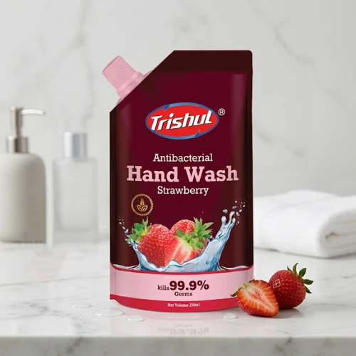
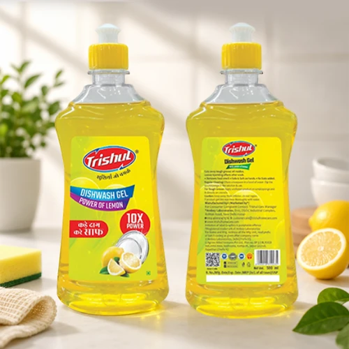
Household Products Category: Trishul Home Care
Household products compete in crowded and highly functional categories.
Consumers want immediate clarity.
What Works?
● Bold product identification
● Clear benefit communication
● Category-specific colors
● Functional packaging design
Why It Works
Consumers don’t need to guess what the product does.
The packaging communicates utility immediately.
Key Lesson for Brands
When selling utility products, clarity always outperforms creativity.
Source: https://in.pinterest.com/
Source: https://in.pinterest.com/
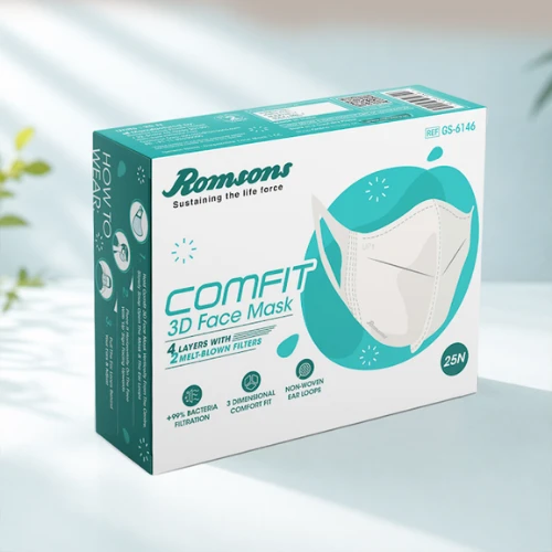
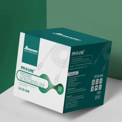
Healthcare Category: Romsons
Healthcare packaging carries unique responsibilities.
Consumers expect professionalism, credibility, and accuracy.
What Works?
● Structured layouts
● Strong information hierarchy
● Medical-grade visual language
● Trust-building certifications
Why It Works
The packaging reassures consumers before they even read detailed information.
It communicates expertise, safety, and reliability.
Key Lesson for Brands
In healthcare, trust is often the primary selling point.
Your packaging design should always reinforce confidence at every touchpoint.
Source: https://in.pinterest.com/
Source: https://in.pinterest.com/
Wrapping Up
Quick commerce has fundamentally changed the rules of packaging design.
Today, consumers aren’t standing in aisles comparing products. They are now scrolling through thumbnails, making split-second decisions, and adding products to carts in moments.
The brands winning this race are not necessarily the biggest brands. They are the brands that communicate the fastest.
If your packaging can clearly answer three questions within three seconds:
● Who are you?
● What do you sell?
● Why should I choose you?
You have already gained a significant competitive advantage.
At DesignerPeople, we help brands create packaging that performs both on physical shelves and digital marketplaces. From FMCG and healthcare to food, beverages, personal care, and D2C products, our packaging solutions are built to capture attention, increase recall, and drive conversions.
Because in the age of Blinkit and Zepto, great packaging isn’t just design. It is your fastest salesperson.
Author: Anush Malik

Being a strategist’s head and a long term visionary personality aims to achieve excellence in branding, packaging and digital marketing field. My 22 years of design experience and masters degree is my strength which keeps me motivated and keep me going positively. I have participated in extensive branding design conquests in India, USA, Australia and New Zealand with winning zeal. My objective is to encourage start-ups and hence involves actively in the articles which will act as a productive intake of knowledge for them. Do connect me personally via my LinkedIn and I love to share my expertise with you.