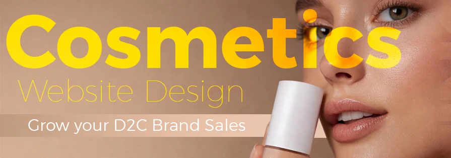
Picture the last time you found a new skincare or makeup brand.
You probably Googled it, glanced at the website, and judged it in seconds.
That’s exactly what your customers do, too.
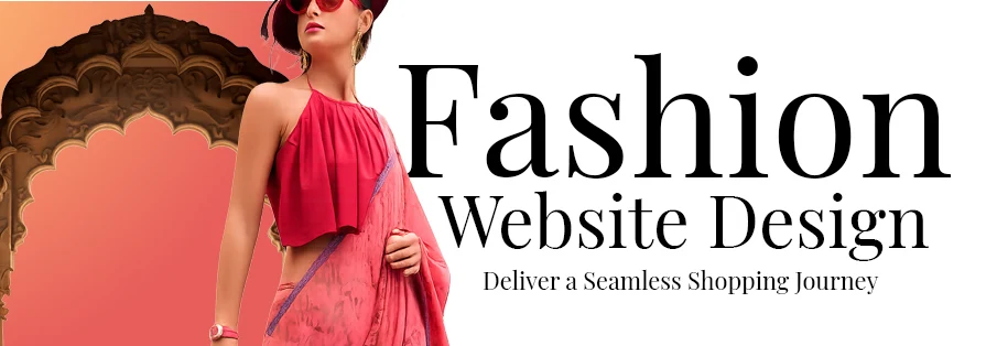
In the beauty industry, your website is more than a product list. It is your digital storefront, your brand voice, your vibe, your personality. All in one.
No matter if it is on Shopify, WooCommerce, or another platform, if your site feels outdated, cluttered, or confusing, people just leave!
But when a cosmetics website actually looks beautiful, feels smooth, and tells a story? That’s when people stay, explore, and eventually buy.
Platforms like Shopify, WooCommerce, and even Webflow have made it easier than ever to build stunning beauty websites. But design still makes all the difference. And this is where you can upgrade your sales big time!
We have compiled 486+ stunning cosmetic website design ideas to attract more makeup and skincare junkies to your website this year.
Because in beauty, if it doesn’t look good, it doesn’t sell. Let’s get started!
Table of Contents
Why Your Cosmetics Website Design Can Make or Break Your Brand?
Let’s not sugarcoat it. Your website design directly impacts how people eventually see your brand.
A clean, well-designed site instantly feels way more trustworthy than others. It quickly tells customers, “Hey. We are professionals. You can rely on us.” On the other hand, a messy or outdated site raises doubts, even if your products are amazing.
In the beauty space, visuals are indeed everything. Customers want to see textures, shades, results, and aesthetics. Your website needs to make them imagine how the product will look and feel.
Good design also makes shopping easier. When navigation is smooth and everything feels intuitive, people are way more likely to stay longer and explore more products.
And let’s not forget. A strong website always improves conversions. The easier and more enjoyable the experience, the higher the chances of turning visitors into buyers!
Different Styles of Cosmetics Websites That Are Totally Winning Right Now
Not every beauty brand looks the same, and that’s a good thing!
Here are some popular website styles that are working really well right now.
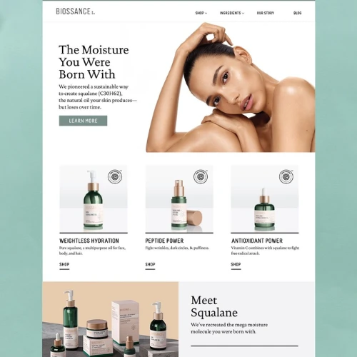
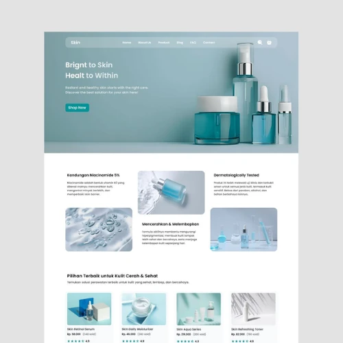
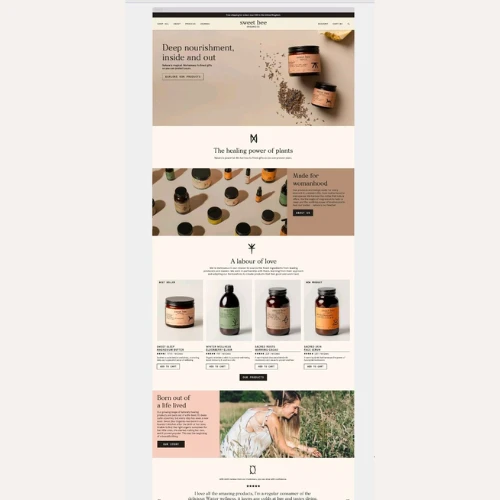
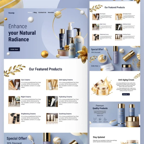
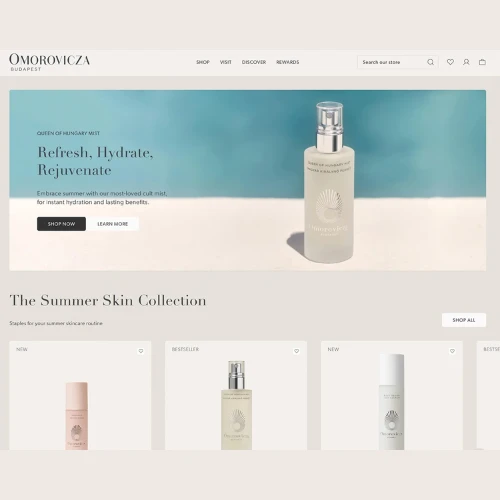
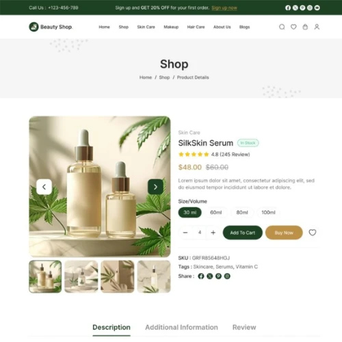
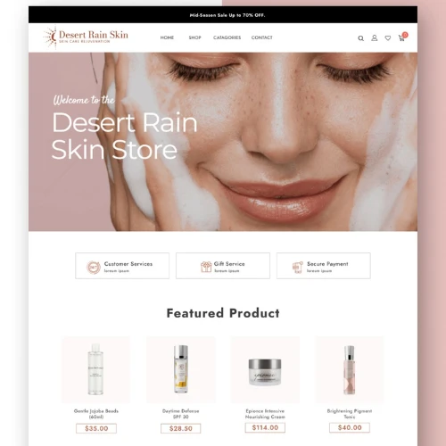
a) Skincare Websites That Feel Clean, Calm & Trustworthy
Skincare brands usually go for a soft, minimal look.
Think neutral tones, lots of white space, gentle fonts, and calming visuals. The goal is to make the website feel soothing. Almost like skincare itself.
These websites focus heavily on ingredients, benefits, and routines. They are now less about glam and more about trust.
Source: https://in.pinterest.com/
Source: https://in.pinterest.com//p>
Source: https://in.pinterest.com/
Source: https://in.pinterest.com
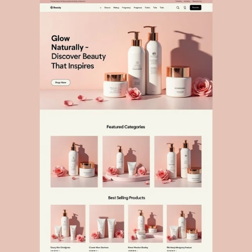
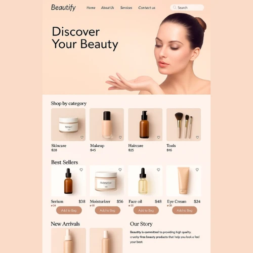
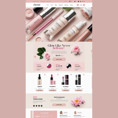
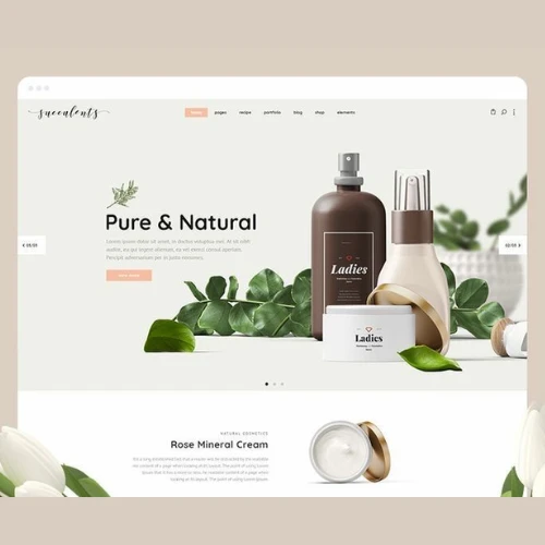
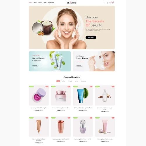
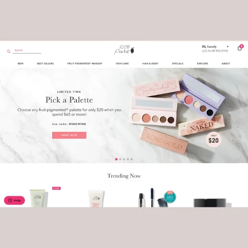
b) Makeup Websites That Are Bold, Fun & Full of Personality
Makeup brands? Completely different vibe!
Here you will see so many bold colours, high-contrast graphic design, and dramatic product shots. The goal is to grab attention instantly.
These websites often feel energetic and trendy. Just like the makeup lovers out there!
Source: https://in.pinterest.com/
Source: https://in.pinterest.com/
Source: https://in.pinterest.com/
Source: https://in.pinterest.com
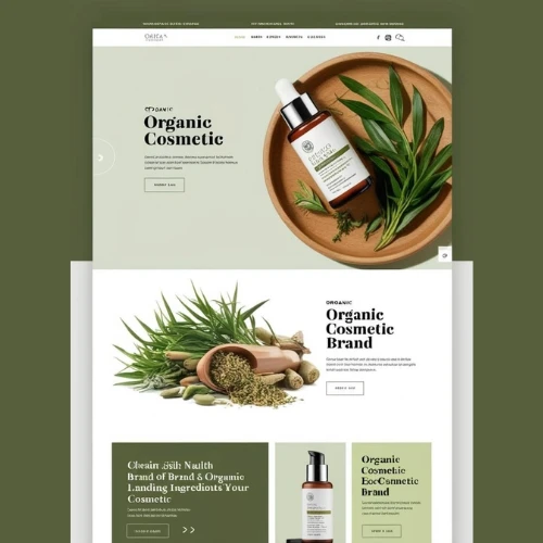
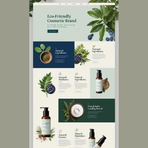
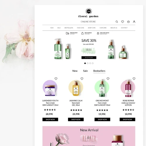
c) Organic Beauty Websites That Feel Natural & Honest
Brands focused on natural or organic products usually lean into earthy tones and botanical visuals.
Textures, leaves, soft greens, and browns. Everything feels so grounded and authentic with these brands.
The website designs often reflect purity and sustainability.
Source: https://in.pinterest.com/
Source: https://in.pinterest.com/
Source: https://in.pinterest.com/
Source: https://in.pinterest.com
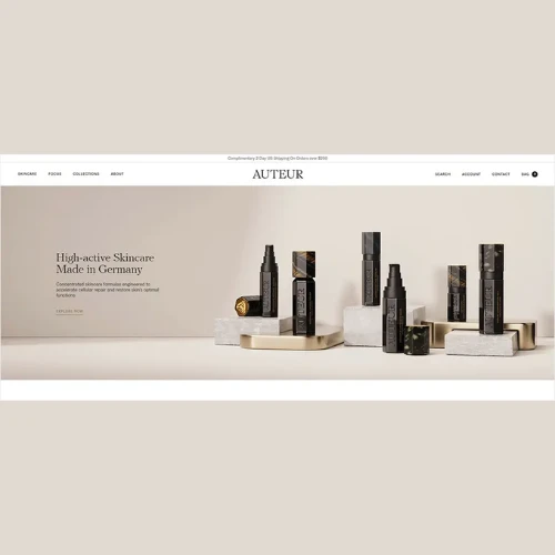
d) Luxury Beauty Websites That Scream Premium
Luxury cosmetics websites go all out on elegance.
Dark backgrounds, gold accents, slow animations, and high-end photography create a premium feel.
Everything is intentional, though. Even the smallest detail!
Source: https://in.pinterest.com/
Source: https://in.pinterest.com/
Source: https://in.pinterest.com/
Source: https://in.pinterest.com
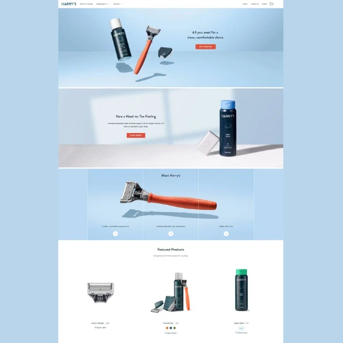
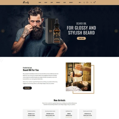
e) Men’s Grooming Websites That Feel Clean & Modern
Men’s grooming brands usually keep things simple.
Minimal design, darker tones, and straightforward messaging create a clean, masculine look without really overcomplicating things.
Source: https://in.pinterest.com/
Source: https://in.pinterest.com/
Source: https://in.pinterest.com/
Source: https://in.pinterest.com
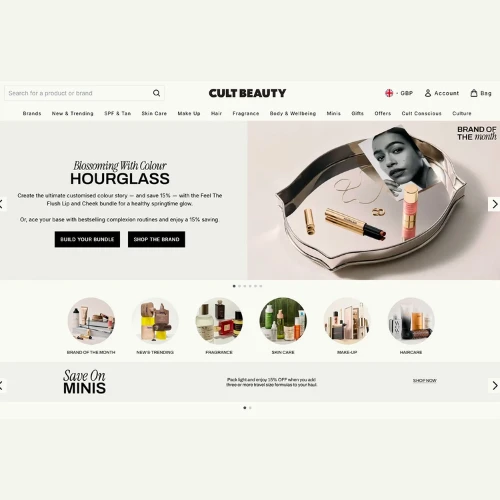
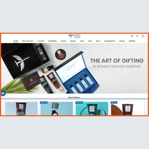
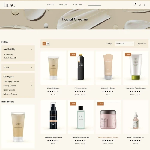
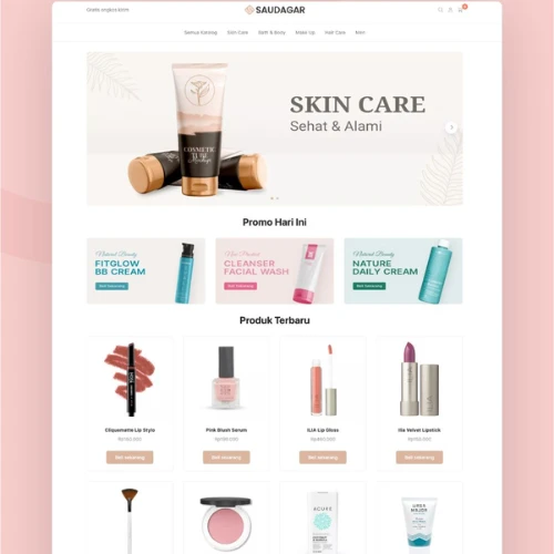
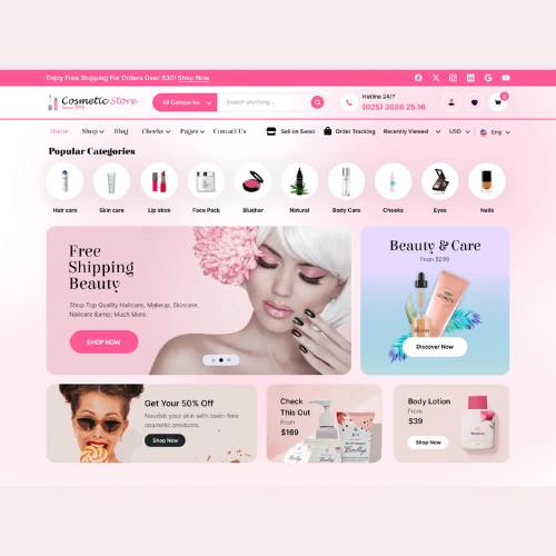
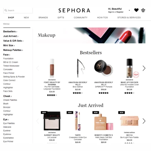
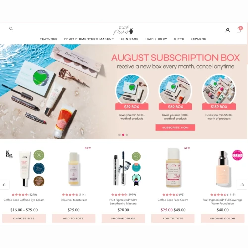
f) Beauty E-commerce Platforms That Focus on Functionality
Marketplaces and multi-brand stores always prioritise usability over everything.
Filters, categories, quick views, and a smooth checkout experience matter most here.
Platforms like Shopify and WooCommerce are commonly used to build such high-performing stores. But, it is important that you also use creativity to make your ecommerce website design more functional and easier to navigate for the users!
Source: https://in.pinterest.com/
Source: https://in.pinterest.com/
Source: https://in.pinterest.com/
Source: https://in.pinterest.com
How to Design a Cosmetics Website That Actually Converts (Not Just Looks Pretty)
Let’s be honest for a second.
A lot of beauty websites look stunning… but don’t really sell.
Why? Because they focus only on aesthetics and forget the actual goal.
Getting people to explore, trust, and finally buy.
A high-converting cosmetics website is a blend of beauty, usability, and psychology. It should feel good, look good, and work smoothly. All at once!
Here’s how to actually get that right.
1. Start with Clarity: Know Your Brand & Your Audience
Before you even open Shopify or WooCommerce, pause and think.
Who are you designing for?
A luxury anti-ageing brand targeting 35+ women will look completely different from a bold Gen-Z makeup brand. And that difference should be visible instantly on your website.
Your colours, fonts, imagery, and even the tone of your content should reflect your audience.
If someone lands on your homepage and can’t figure out your vibe in 5 seconds, that’s a problem.
Clarity first. Design later!
2. Choose a Layout That Feels Like Beauty (Not Chaos)
This is where many brands go wrong.
They try to show everything at once. Products, offers, banners, sliders and the result feels so overwhelming.
Beauty websites need space to breathe.
Always use clean sections, soft spacing, and structured layouts. Let each product or category have its moment.
Think of your website like a well-organised vanity table. Not just any cluttered drawer.
When things look clean, people feel more comfortable exploring.
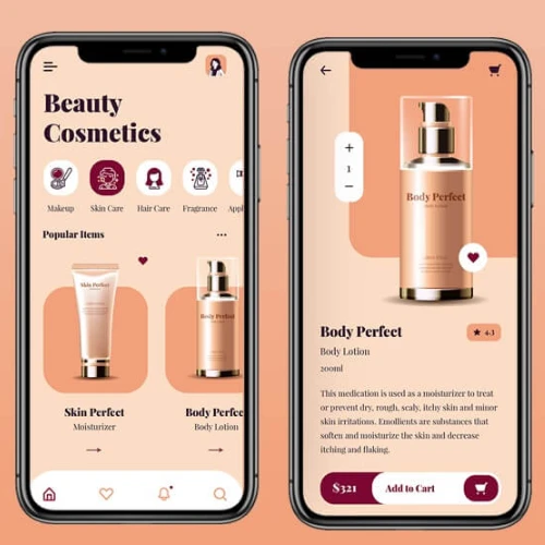
3. Invest in High-Quality Visuals (Because This Is What Actually Sells)
In cosmetics, visuals aren’t just important—they are super critical.
Since your customer can’t touch or try your product, your images need to do all the convincing.
That means:
1. Clear product shots
2. Texture close-ups
3. Swatches on real skin tones
4. Lifestyle images with models
The more real and relatable your visuals feel, the easier it is for customers to imagine using your product!
Bad visuals don’t just look unprofessional. They kill trust almost instantly.
Source: https://in.pinterest.com/
Source: https://in.pinterest.com/
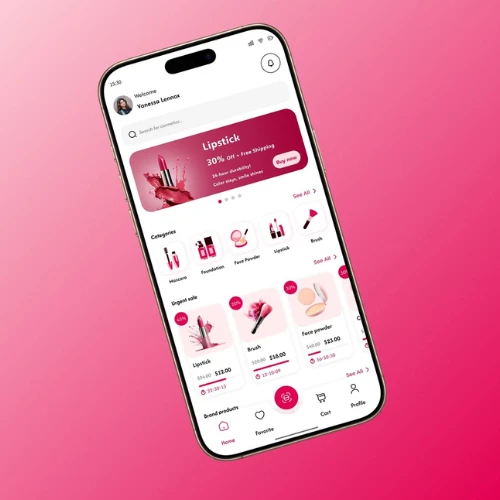
4. Design for Mobile First (Because That’s Where Your Customers Are)
Most beauty shoppers browse on their phones, not desktops. That’s something you can’t overlook.
So your website needs to feel perfect on mobile.
That means:
1. Easy-to-tap buttons
2. Smooth scrolling
3. Quick-loading images
4. Simple navigation
If users have to zoom, struggle, or wait. They leave right away.
Mobile experience is now essential. It is your main experience.
Source: https://in.pinterest.com/
Source: https://in.pinterest.com/
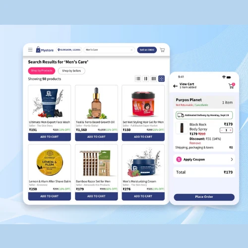
5. Make Navigation Feel Effortless (No One Likes to Hunt for Products)
Think about how you shop online.
You don’t really want complications, right? You just want things to just work seamlessly and fast.
Your categories should be clear:
Skincare, Makeup, Haircare, Bestsellers, New Arrivals. Simple and obvious.
Filters should help users narrow things down quickly (skin type, shade, concern, price).
The easier it is to find products, the longer people stay and the more they buy!
6. Use CTAs That Actually Guide People (Don’t Be Vague)
Your website should gently guide users at every step.
Instead of those usual generic buttons, go for clear call-to-actions:
“Shop Skincare Routine”
“Find Your Shade”
“Explore Bestsellers”
These small changes make such a big difference.
Because when users know what to do next, they are more likely to take action right away.
Source: https://in.pinterest.com/
Source: https://in.pinterest.com/
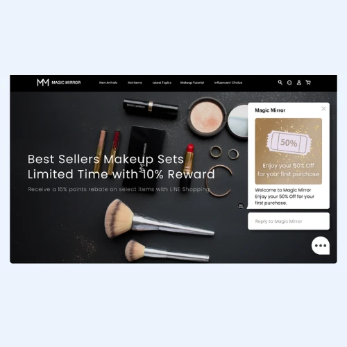
7. Add Live Chat (Because Doubts = Lost Sales)
Here’s something most brands ignore.
Customers often have questions like:
“Will this suit my skin type?”
“Which shade should I pick?”
“Is this product safe for sensitive skin?”
If they don’t get answers quickly, they leave.
Live chat solves this instantly. Even a simple chatbot can help guide users and reduce hesitation. Simple but so helpful!
Source: https://in.pinterest.com/
Source: https://in.pinterest.com/
8. Introduce Subscription Options (Make Life Easy for Customers)
Skincare isn’t a one-time purchase. It is a complete routine.
So why not make it easier?
Offer subscription options for products people use regularly. You can do this for products like cleansers, serums, or even moisturisers.
Customers love convenience, and you get consistent repeat sales.
Win-win!
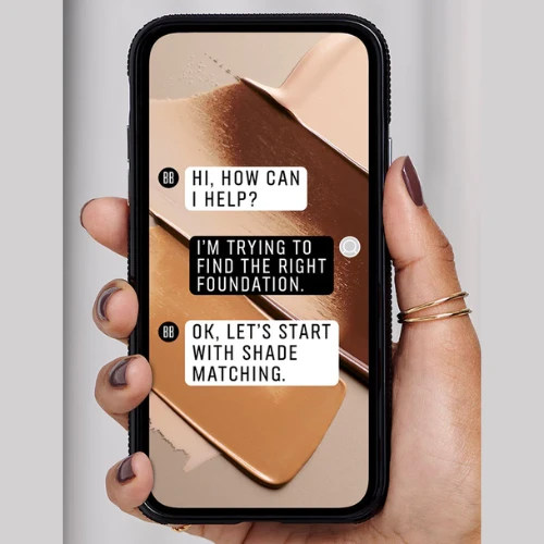
9. Add Virtual Try-On Tools (Because People Want to “See” Before Buying)
This is one of the coolest features in beauty websites right now.
Virtual try-ons let users see how a lipstick shade or foundation looks on their face. Right from their phone.
It removes doubt and builds confidence.
And when customers actually feel confident, they are far more likely to buy.
10. Highlight Benefits Clearly (Don’t Make People Read Too Much)
Nobody really wants to read long paragraphs while shopping.
Instead, break things down visually.
Use some creative icons, short lines, or just highlights like:
“Hydrates for 24 hours”
“Suitable for sensitive skin”
“Dermatologically tested”
Make it easy to scan and understand.
Because clarity always converts!
11. Speed Up Your Website (Slow = Lost Customers)
A slow website is one of the biggest conversion killers.
If your page ultimately takes more than a few seconds to load, users won’t wait. For sure!
Optimise your images, use lightweight design elements, and ensure your platform (such as Shopify or WooCommerce) is always well configured.
Fast websites don’t just feel better. They also perform better.
Source:https://in.pinterest.com/
Source:https://in.pinterest.com/
12. Build Trust with Reviews, Certifications & Real Proof
At the end of the day, people trust other customers more than brands.
So show real reviews. Add ratings. Include before-and-after images if possible.
Also highlight all the brand certifications like:
Cruelty-free
Dermatologically tested
Organic ingredients
And more…
These small trust signals quickly reduce hesitation and encourage users to buy.
Source: https://in.pinterest.com/
Source: https://in.pinterest.com/
Ready to Build a Beauty Website That Actually Works?
A great cosmetics website isn’t just about looking pretty. It is all about creating an experience people enjoy.
When your website feels smooth, visually stunning, and easy to use, customers don’t just browse. They buy.
From choosing the right platform like Shopify or WooCommerce to crafting the perfect design, every detail matters.
If you are truly serious about building a beauty brand that stands out online, you need more than just a basic website. You need a strategy.
At DesignerPeople, we create cosmetics websites that don’t just look beautiful but actually convert visitors into customers. From design to user experience, we help your brand shine where it matters most.
Connect with our expert designers today! Because in the beauty industry, your website should glow just as much as your products.
Author: Megha Malik

As a passionate entrepreneur and creative brand consultant with experience of 14 years in digital, branding and packaging industry, it is my honest effort to put my experiences and knowledge of industry towards readers. A chartered accountant by degree but a marketing personality in blood has motivated her to take in designing industry as a career. With her fun-loving personality and sharp branding skills, she is a great motivational speaker on her YouTube channel, an active member in various business channels offline as well as online. Do connect me personally via my LinkedIn and I love to share my expertise with you.