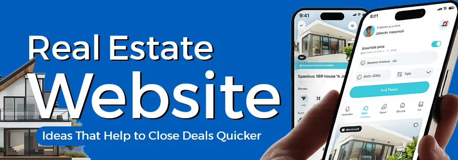
In today’s scroll-happy world, your real estate website isn’t just any random digital brochure. It is now your 24/7 deal closer. Before a buyer ever calls you or steps into a site visit, they have already judged your credibility based on your website.
Harsh? Yes.
True? Absolutely.
Think about it. If your site feels outdated, slow, or confusing, users won’t really stick around long enough to explore your properties. But if it is smooth, visually appealing, and easy to navigate, you’ve already built trust before saying a word.
A well-designed real estate website doesn’t just look good. It guides users, sparks emotion, and subtly pushes them toward taking action. Whether that’s booking a visit, making an enquiry, or shortlisting a property, design surely plays a massive role in that journey.
So if you are serious about closing deals faster, it’s time to rethink your website strategy with the best real estate website design ideas. Let’s get started right away.
Table of Contents
How Your Website Design Can Make or Break Your Property Deals?
Let’s not sugarcoat it. People don’t really take long to form an opinion anymore. The moment someone lands on your website, they have already started judging your business. And in real estate, where trust matters so much, that first impression can either work in your favour or against you!
If your homepage feels cluttered, the images aren’t great, or it is hard to figure out where to click, it immediately creates hesitation. Even if you are offering amazing properties, that initial confusion or doubt can actually push people away before they even explore further.
But when a website design feels clean, simple, and easy to navigate, everything changes. Visitors feel more at ease. They are more likely to stay, browse through listings, and actually take an interest in what you are offering. It creates a sense of confidence without you having to say anything.
Good design quietly does a lot behind the scenes. It makes your business look more trustworthy and professional from the very beginning. It ensures people can move around your website without really getting frustrated or lost. And it naturally encourages them to take action, whether that’s checking property details, making an enquiry, or booking a visit.
Another thing you can never ignore is mobile browsing. Most people are scrolling through property options on their phones while commuting, during breaks, or just casually at home. If your website doesn’t work smoothly on mobile, feels slow, or looks awkward, chances are they will leave and check someone else instead.
At the end of the day, your website isn’t just about looking good.
It directly affects how people perceive your brand, how long they stay on your site, and whether they decide to reach out. And in a competitive space like real estate, that can make a real difference in how many deals you actually close.
Website Styles That Turn “Just Browsing” into “Let’s Book a Visit”
Not all real estate websites feel the same, and that’s a good thing. Different audiences need different experiences. Let’s break down some styles that are currently working really well.
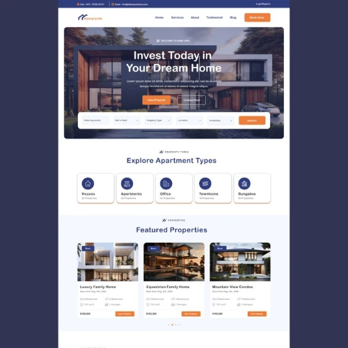
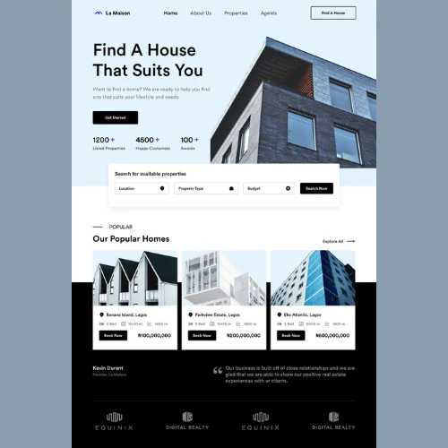
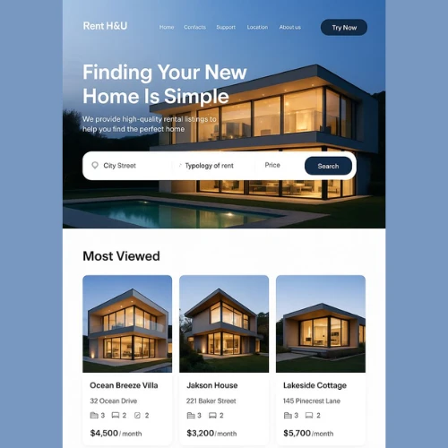
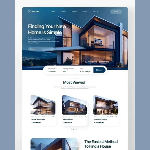
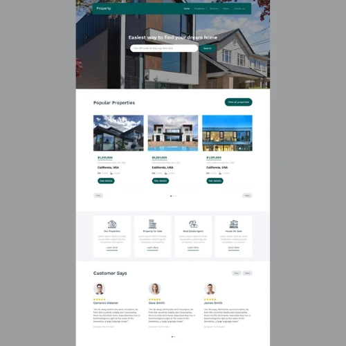
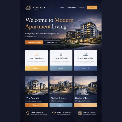
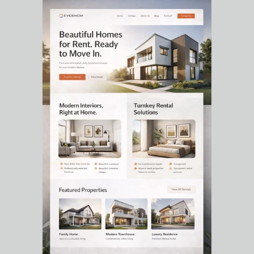
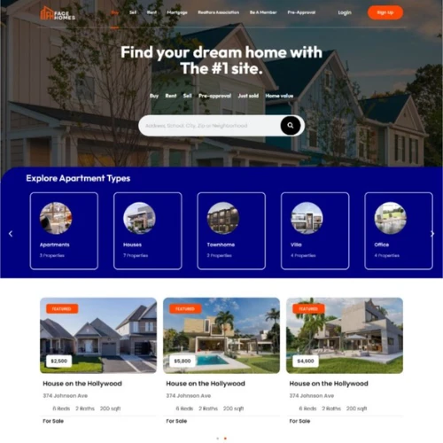
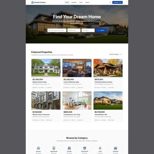
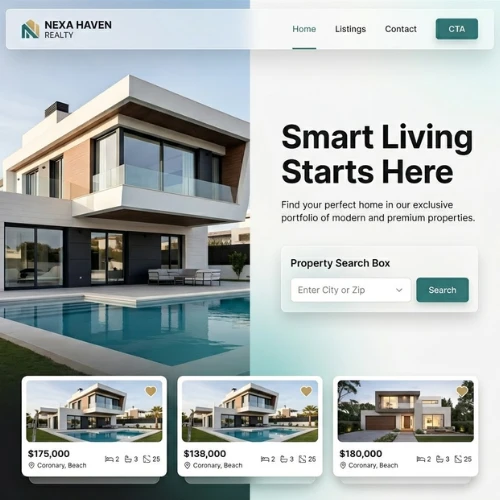
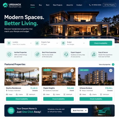
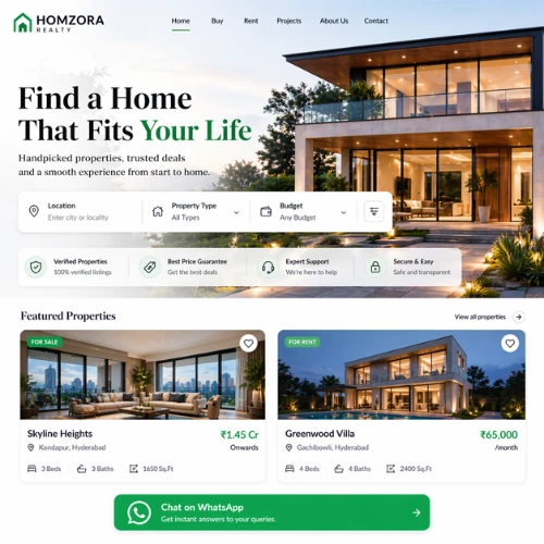
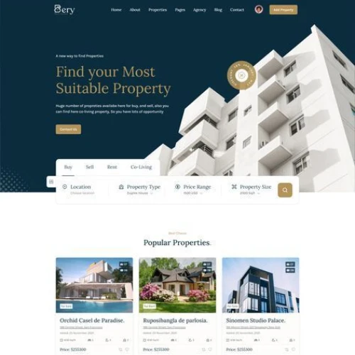
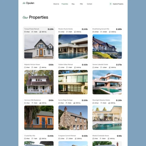
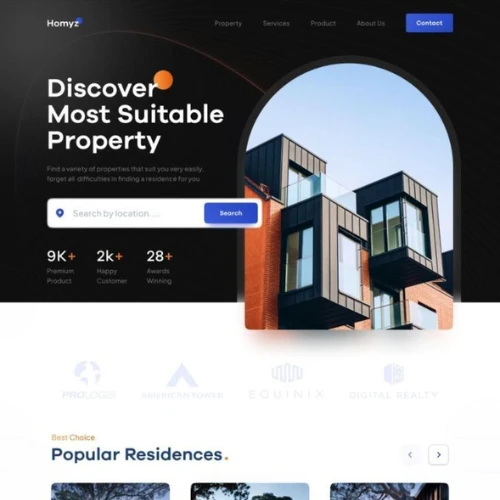
a) Clean, Minimal Property Websites That Always Feel Effortless
Sometimes, less really is more.
Minimal websites indeed strips away possible distractions and let the properties take centre stage. This is very important.
Think lots of white space, simple fonts, and a focus on high-quality images.
Why this works:
1. Users don’t really feel overwhelmed.
2. Navigation becomes super intuitive.
3. Listings always stand out clearly.
This style is absolutely perfect for individual agents or small property portfolios where clarity matters more than complexity.
Source: https://in.pinterest.com/
Source: https://in.pinterest.com/

Source: https://in.pinterest.com/
Source: https://in.pinterest.com
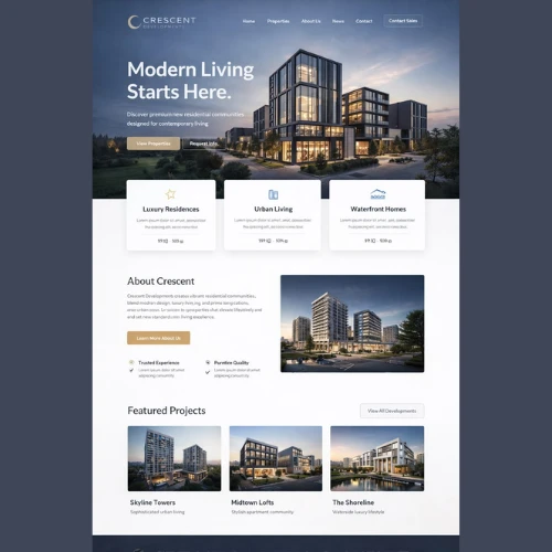
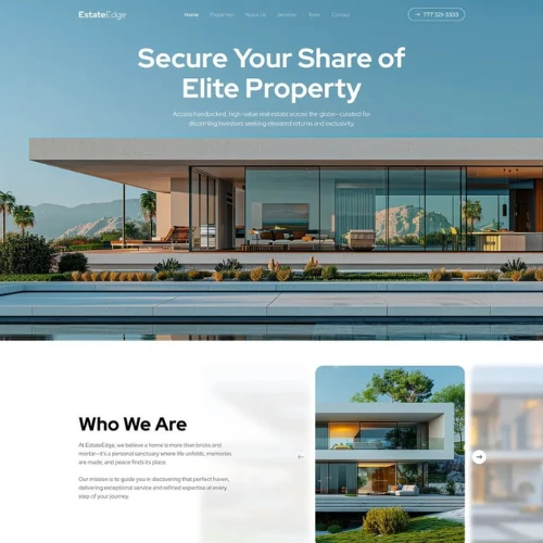
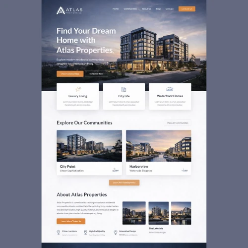
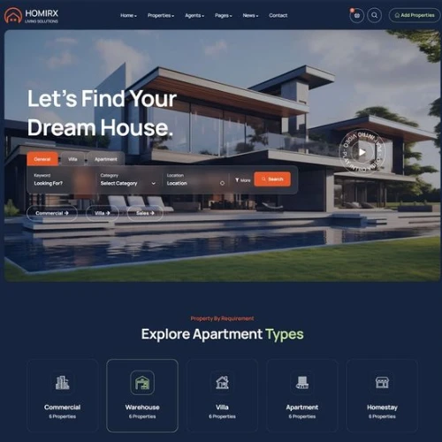
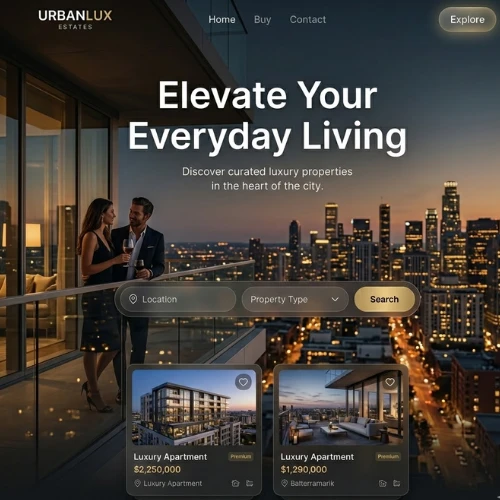
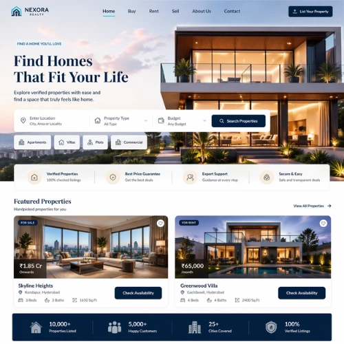
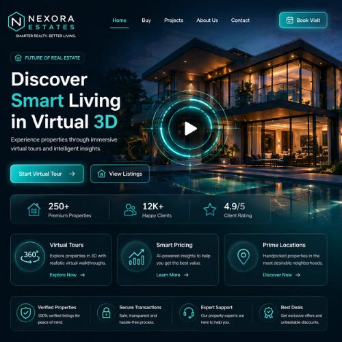
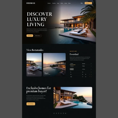
b) Premium Developer Websites That Feel Like a Dream
If you are selling high-value projects, your website needs to feel expensive.
These websites use:
1. Cinematic visuals
2. Smooth animation
3. Large typography
4. Luxury colour palettes (black, gold, deep neutrals)
The goal? To create aspiration.
Users should feel like they are truly stepping into a premium lifestyle right through your website, not just browsing a property. It is less about information and more about emotion and desire!
Source: https://in.pinterest.com/
Source: https://in.pinterest.com/
Source: https://in.pinterest.com/
Source: https://in.pinterest.com
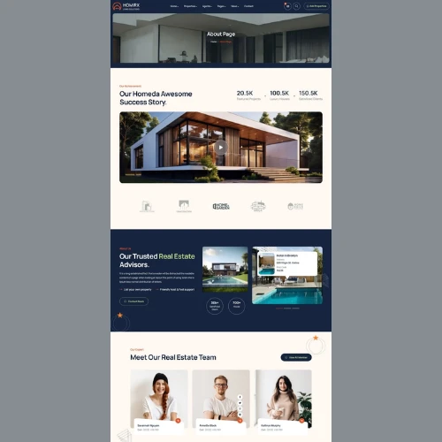
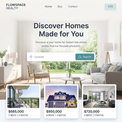
c) Local Agency Websites That Feel Warm & Trustworthy
For local real estate agencies, trust is everything.
These websites focus on:
1. Real team photos
2. Client testimonials
3. Local market insights
4. Friendly, easy-to-understand and approachable language
It now feels less corporate and more personal. Something like you are dealing with someone who actually knows the area.
And honestly, isn’t that exactly what most buyers want?
Source: https://in.pinterest.com/
Source: https://in.pinterest.com/
Source: https://in.pinterest.com/
Source: https://in.pinterest.com
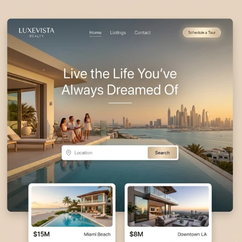
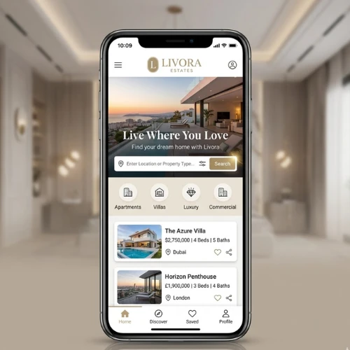
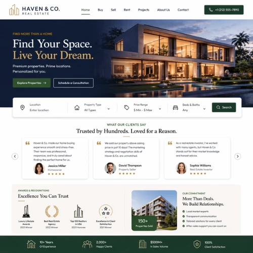
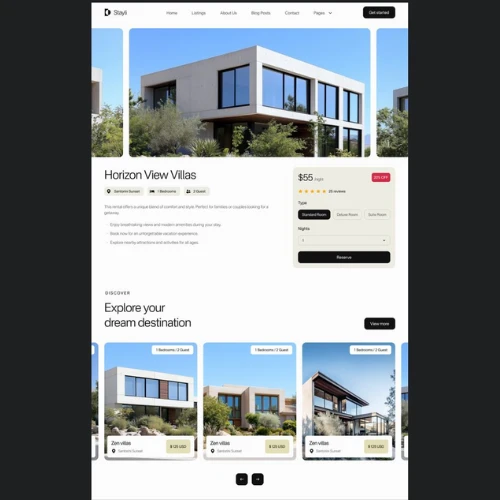
d) Luxury Property Websites That Scream Sophistication
Luxury listings deserve a different level of presentation.
These websites go all in with:
1. Full-screen videos
2. High-end photography
3. Interactive galleries
4. Smooth scrolling experiences
Everything is designed to feel exclusive.
Because when someone is buying a luxury property, they are not just buying a home. They are buying a lifestyle.
Source: https://in.pinterest.com/
Source: https://in.pinterest.com/
Source: https://in.pinterest.com/
Source: https://in.pinterest.com
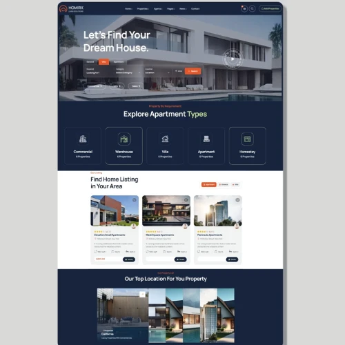
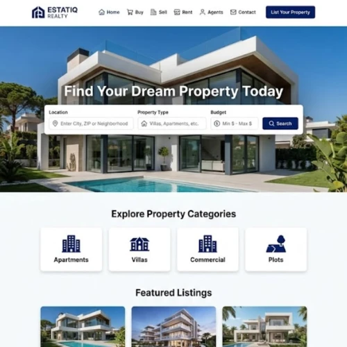
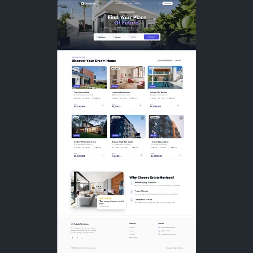
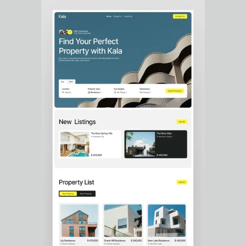
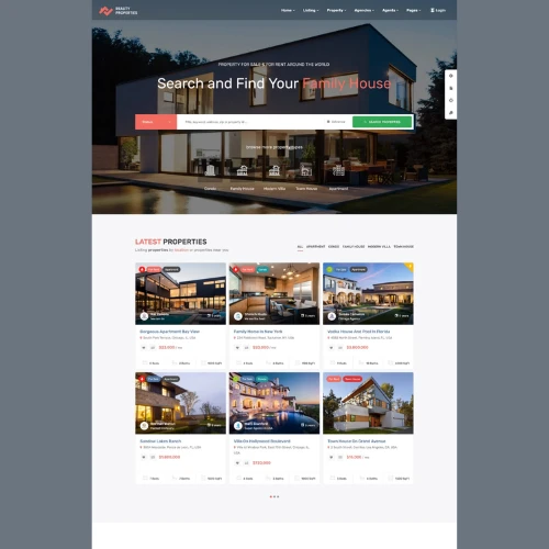
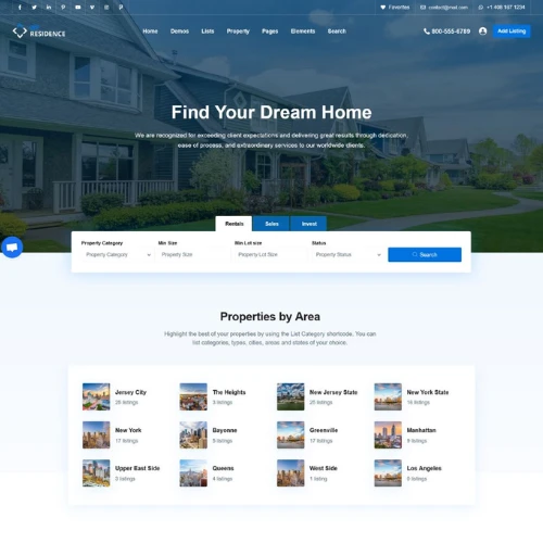
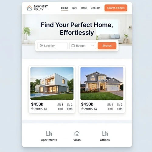
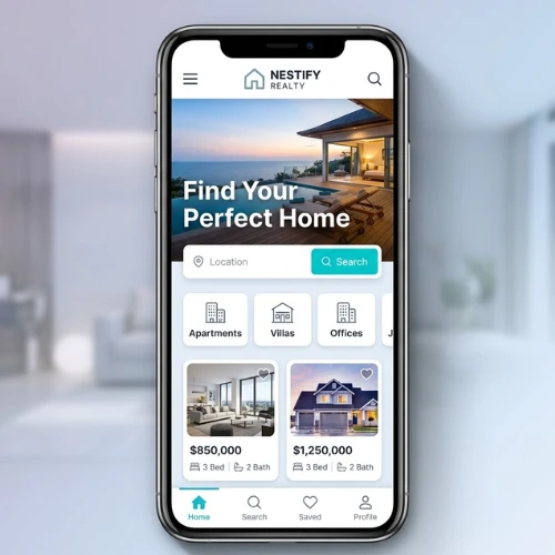
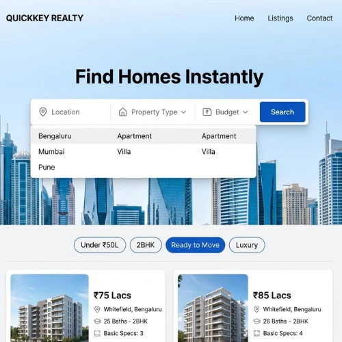
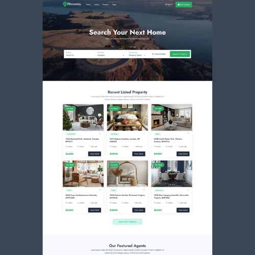
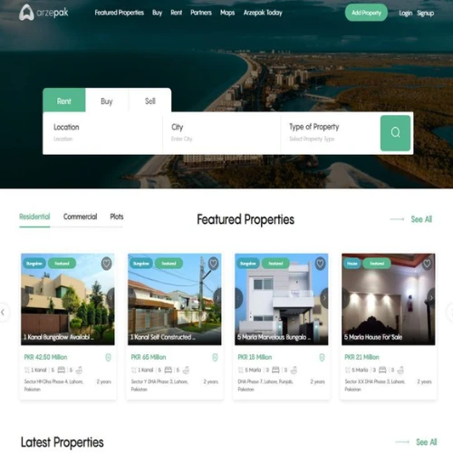
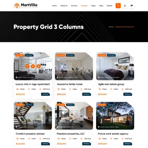
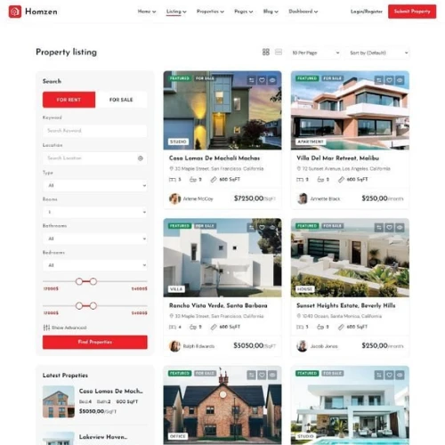
e) Rental & Listing Platforms Built for Speed
When users are browsing multiple listings, speed truly matters more than aesthetics. They are actively looking at multiple areas before finalising.
These platforms focus on:
1. Fast loading
2. Smart filters
3. Clear property cards
4. Map integrations
Think about all the platforms where users can quickly shortlist, compare, and move on. This makes the entire process super smooth.
Source: https://in.pinterest.com/
Source: https://in.pinterest.com/
Source: https://in.pinterest.com/
Source: https://in.pinterest.com
f) Data-Driven Investment Websites That Mean Business
For investors, emotions take a backseat. Data is king.
The best real estate websites highlight all the critical metrics like:
1. ROI calculators
2. Market trends
3. Price comparisons
4. Location analytics
Clean dashboards and structured layouts work best here.
Because serious buyers always want facts, not fluff.
Source: https://in.pinterest.com/
Source: https://in.pinterest.com/
Source: https://in.pinterest.com/
Source: https://in.pinterest.com
How to Design a Real Estate Website That Actually Brings You Leads (Not Just Random Clicks That Go Nowhere)
Getting traffic to your website isn’t the hard part anymore. The real challenge? Turning those visitors into actual enquiries, calls, and site visits.
A lot of real estate websites look decent on the surface, but they fail where it really matters. Conversion!
If you want your website to work like a lead-generation machine (instead of just sitting there looking pretty), here’s what you need to get right:
1. Start with Absolute Clarity
Before you even think about colours, layouts, or fancy animations, take a step back and ask yourself one simple question: Who is this website actually for?
Are you targeting:
1. First-time homebuyers who need guidance?
2. High-end luxury clients looking for exclusivity?
3. Investors who care more about numbers than aesthetics?
Each of these audiences behaves differently, and your website needs to reflect that.
For example, a luxury buyer expects a premium, almost cinematic experience. But a budget buyer wants quick information, pricing clarity, and easy navigation.
The biggest mistake people make? Trying to appeal to everyone.
Instead, be specific. When your positioning is clear, everything else, including design, content, and tone, falls into place naturally.
Source: https://in.pinterest.com/
Source: https://in.pinterest.com/
2. Design a Layout That Feels Effortless to Navigate (Because No One Has Patience Anymore)
Users don’t “explore” websites the way they used to. They scan. They skim. They decide within seconds whether to stay or leave.
So your layout needs to guide them without making them think.
A good real estate website should:
1. Show key listings right away.
2. Make filters easily accessible.
3. Keep menus simple and predictable.
4. Avoid clutter at all costs.
Your website should always feel like a well-organised showroom, not a randomly crowded warehouse.
If a user has to click too many times or feels lost at any point, you have probably already lost them.
Source: https://in.pinterest.com/
Source: https://in.pinterest.com/
3. Use High-Quality Visuals That Sell the Lifestyle
Real estate is emotional. People aren’t just buying square footage. They are buying a future, a lifestyle, a feeling.
And your visuals play a huge role in that.
Instead of just uploading basic images, focus on:
1. Bright, well-lit professional website design photos
2. Wide-angle shots that show space properly
3. Drone views to highlight surroundings
4. Video walkthroughs for immersion
Even small details like lighting, angles, and image clarity can completely change how a property is perceived in their eyes. Be very creative here.
If the visuals don’t impress, your potential buyers won’t even bother reading the details! That’s the truth.
Source: https://in.pinterest.com/
Source: https://in.pinterest.com/
4. Think Mobile First
Take a moment and think about your own behaviour. When you casually browse properties, where do you do it? Most likely on your phone.
That’s exactly how your users behave, too.
So instead of designing for desktop and then “adjusting” for mobile, flip the approach.
Your mobile experience should:
1. Load quickly (even on slower networks)
2. Have large, easy-to-tap buttons.
3. Display content in a clean, scroll-friendly way
4. Avoid cluttered layouts
A frustrating mobile experience is one of the fastest ways to lose a potential lead, especially when they are casually browsing during commute hours or late at night.
Source: https://in.pinterest.com/
Source: https://in.pinterest.com/
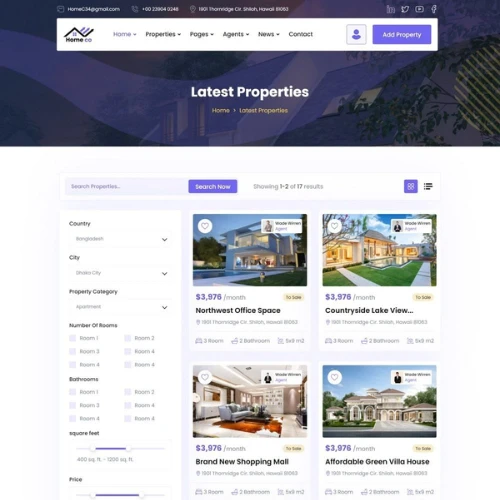
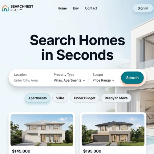
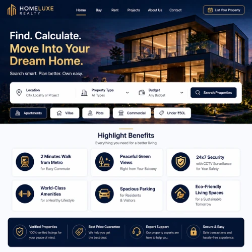
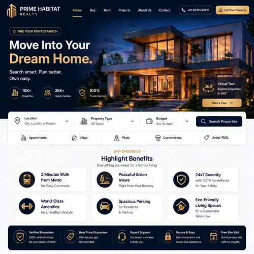
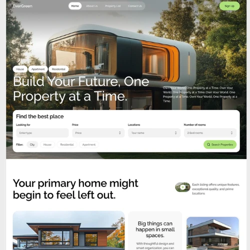
5. Make Property Search Feel Effortless (This is Where Most Conversions Happen)
Search is the heart of any real estate website.
If users can’t quickly find what they are actually looking for, they won’t really stick around. It is that simple.
Your search experience should:
1. Be visible immediately (don’t hide it)
2. Offer practical filters like budget, location, BHK, etc.
3. Show relevant results quickly.
4. Allow easy comparison between listings.
Also, don’t overcomplicate filters. Too many options can confuse users instead of helping them.
The goal is simple — help users go from “just browsing” to “this looks perfect” as quickly as possible!
Source: https://in.pinterest.com/
Source: https://in.pinterest.com/
6. Use CTAs That Feel Natural and Encourage Action (Without Sounding Pushy)
A lot of websites get this wrong. Either the call-to-action buttons are too generic (“Submit”), or they’re buried somewhere users don’t notice.
Your CTAs should feel like the next logical step.
Instead of those boring CTAs that do nothing, try something like:
1. “Book a Site Visit”
2. “Check Availability”
3. “Get Price Details”
4. “Talk to an Expert”
And more…
Also, always place them strategically, like:
1. On property pages
2. After key information
3. Within scrolling sections
When done right, CTAs don’t really feel like pressure. They actually feel helpful.
Source: https://in.pinterest.com/
Source: https://in.pinterest.com/
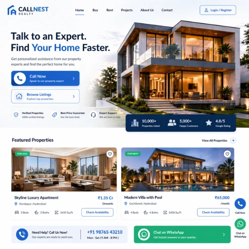
7. Make It Super Easy for People to Reach You (Because Timing Matters a Lot)
In real estate, interest can be very momentary.
A user might be highly interested right now, but if they can’t reach you instantly, that interest can fade quickly.
That’s why your website should offer multiple ways to connect:
1. Click-to-call buttons
2. WhatsApp chat
3. Quick enquiry forms
4. Callback request options
The easier you make it to reach your experts, the higher your chances of capturing that lead in the moment!
Source: https://in.pinterest.com/
Source: https://in.pinterest.com/
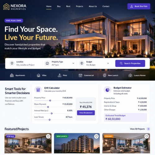
8. Add Smart Tools That Help Users Make Decisions Faster
Sometimes users hesitate because they are unsure about finances or comparisons.
You can reduce that hesitation by adding simple tools like:
1. EMI calculators
2. Budget estimators
3. Property comparison features
4. Location insights
These additional tools don’t just add value. They keep users engaged longer and help them move closer to a decision.
Source: https://in.pinterest.com/
Source: https://in.pinterest.com/
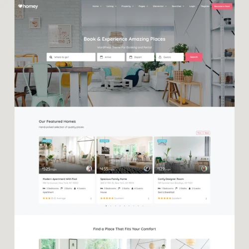
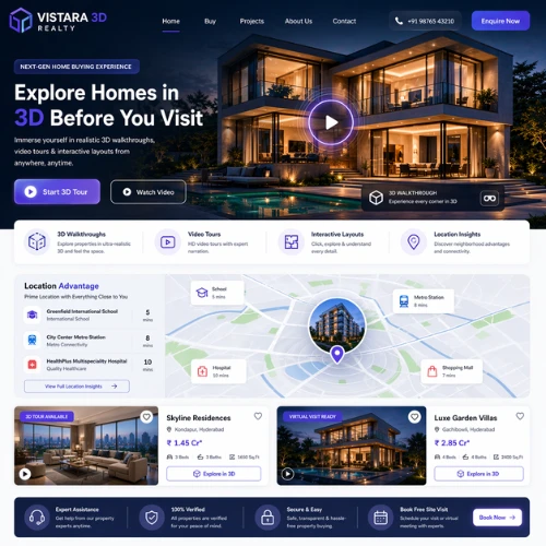
9. Bring the Property Experience Online with Virtual Tours
Not every buyer has the time (or location advantage) to visit properties physically.
That’s where virtual experiences come in.
3D walkthroughs, video tours, and interactive layouts allow users to:
1. Explore spaces remotely
2. Understand layouts better
3. Feel more confident before visiting.
It is especially useful for outstation or NRI buyers. And it instantly makes your website feel more advanced.
Source: https://in.pinterest.com/
Source: https://in.pinterest.com/
10. Highlight Benefits Clearly
There’s a difference between listing information and actually selling a property.
Instead of just stating facts, frame them in a way that matters to the user.
For example:
1. “Near Metro Station” becomes “2 Minutes Walk from Metro for Easy Commute”
2. “Park Facing” becomes “Peaceful Green Views Right from Your Balcony”
Just a small shift, but it makes a big difference in how users perceive value.
Source: https://in.pinterest.com/
Source: https://in.pinterest.com/
11. Keep Your Website Fast, Smooth, and Frustration-Free
Speed is something most people ignore, until it starts affecting results.
A slow website:
1. Increases bounce rate
2. Reduces engagement
3. Kills conversions
Optimise everything:
1. Compress images but don’t compromise on the quality
2. Use reliable hosting
3. Minimize unnecessary scripts or content
Because even a delay of a few seconds can cost you a potential lead.
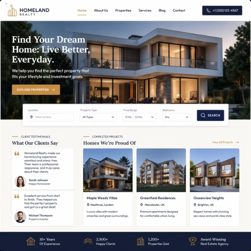
12. Build Trust with Real Proof (Because That’s What Seals the Deal)
At the end of the day, real estate branding is built on trust.
And your website should reinforce that at every step.
Include:
1. Genuine client testimonials
2. Case studies or success stories
3. Completed project showcases
4. Awards, certifications, or recognitions
People trust people. The more real proof you show, the more confident users feel about reaching out.
Source: https://in.pinterest.com/
Source: https://in.pinterest.com/
Listed Below Are 231+ Real Estate Website Design Ideas You Should Totally Check Out
Source: https://in.pinterest.com/
Source: https://in.pinterest.com/
Source: https://in.pinterest.com/
Source: https://in.pinterest.com
Source: https://in.pinterest.com/
Source: https://in.pinterest.com/
Source: https://in.pinterest.com/
Source: https://in.pinterest.com
Source: https://in.pinterest.com/
Source: https://in.pinterest.com/
Wrapping It Up
At the end of the day, your real estate website isn’t just about looking good. It is also about performing well.
A great design builds trust, keeps users engaged, and gently pushes them toward taking action. And in a competitive market, that’s exactly what you need to stand out.
If you are planning to revamp your real estate website or build one from scratch, don’t settle for something average.
Our expert designers at DesignerPeople can help you create a website that not only looks stunning but also converts visitors into real leads. From strategy to execution, they understand what makes real estate websites actually work.
Because in this industry, good design doesn’t just impress clients. It closes the most profitable deals!
Author: Anush Malik

Being a strategist’s head and a long term visionary personality aims to achieve excellence in branding, packaging and digital marketing field. My 15 years of design experience and masters degree ais my strength which keeps me motivated and keep me going positively. I have participated in extensive branding design conquests in India, USA, Australia and New Zealand with winning zeal. My objective is to encourage start-ups and hence involves actively in the articles which will act as a productive intake of knowledge for them. Do connect me personally via my LinkedIn and I love to share my expertise with you.