One cannot imagine a traditional feast in Kerala without Matta rice. The rice grown in the Palakkad district of Kerala is known for its coarseness and health benefits. Think of Kerala, and the first thing you'll have in your mind would be that meal served over a banana leaf; that's Sadhya, and Matta is the rice that accompanies every Sadhya meal.
Mr Joju, a businessman based out of Kerala, has been in this rice market for a long time. His company specializes in producing Palakkad Matta rice. When he approached Designerpeople, he had a basic package for his product. He wanted to set a new identity with a unique new package but something the locals could relate to. Also, he desired to imbibe the celebration mode of rice in packaging design.
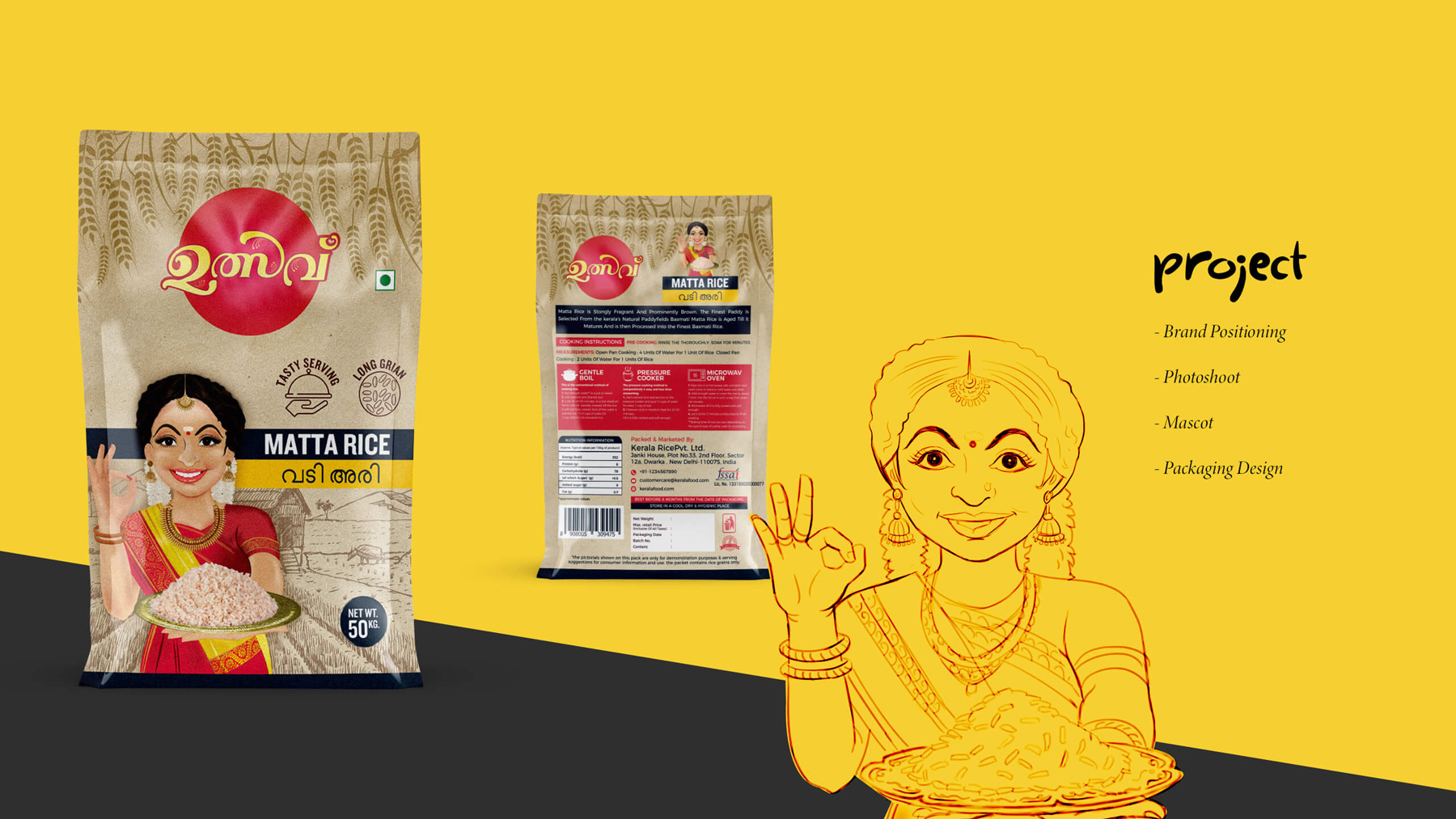
As it was a package design project, we first started with the elements that we would be highlighting. To avoid the mess and confusion that we might get into because of so many elements to cover and deliver to the package, we started the project by prioritizing things. The caricature was something that was our top priority.
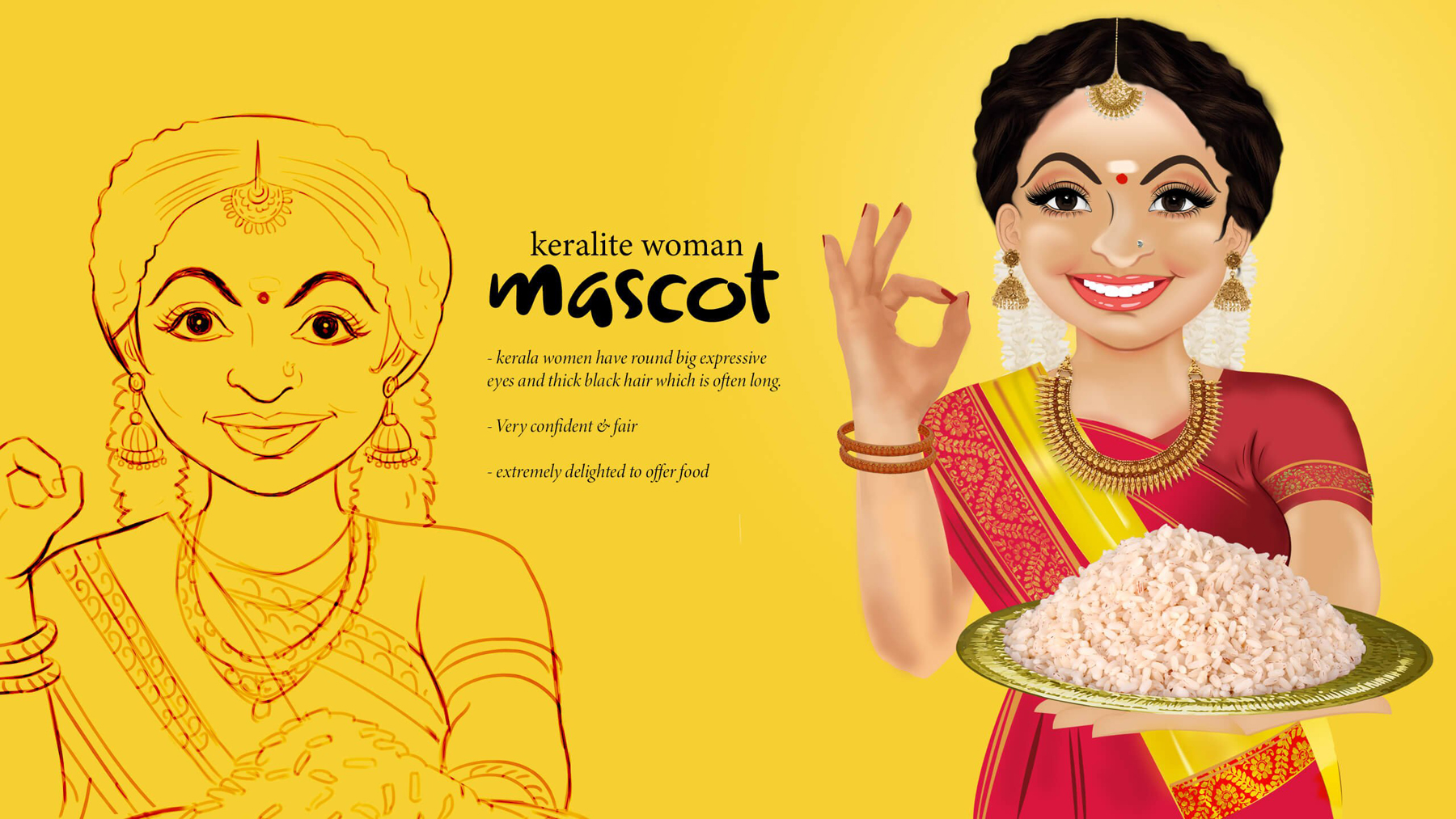
The client wanted a young modern Keralite lady who is traditional enough and manages a house too. We started adding elements to the caricature when we initiated the research part.
When we thought about facial expressions, our eyes were our prime focus. We wanted to make expressive, bright eyes with thick eyebrows but not too thick to make them look unpleasant. We wanted a cheerful smile for the caricature to reflect a welcoming nature.
Thinking about the body and hand gestures, we wanted to make her look attractive and curvy, a common trait of Keralite women. We tried to make the product look credible enough, so we used the hand gesture saying "super" to highlight the product's quality.
As the product was rice, we even experimented with the serving platter. We took glass plates, ceramic plates, metal wares, etc., but finally, a bronze-gold round plate was something that suited the best and was approved by the client. Also, the golden metal plate complements the festive and royal look of the product. Also, to maintain that traditional feel, we focused on minute details like her bindi size, that "gajra" around her hair bun, the intricate design over her saree pallu, etc.
Finally, our designers sketched down all these attributes, and we curated this beautiful woman. Initially, we made a basic sketch and shared it with our client. We made multiple changes to the feedback we got. When the sketch got approved, we started filling in the colour. Finally, we got a happy & calm face with positivity in her smile, standing out there with a welcoming attitude with a "super" hand gesture assuring our product's quality.
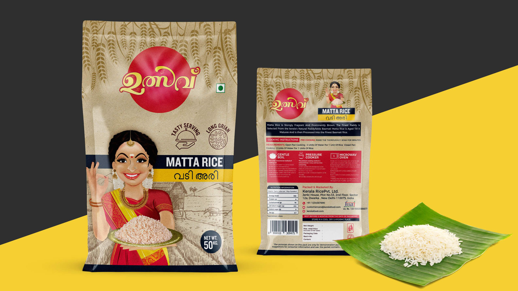
"Tasty Serving" & "Long-Grain" are the unique propositions we highlighted on the package's front. We strategically placed these punches to differentiate our product from the other available Matta rice options.
We highlighted the logo by placing it at the front of the package. That was essential for brand awareness among the locals. Unlike the caricature, we kept the package background very simple & soft. First, we pick the basic neutral beige tint (the colour of jute bags). Then we added a free-hand rough sketch of a farm in the background, representing the concept of farm to fork. We continued sketching out these elements using a darker shade of the same hue. We even made doodles using the rice grains over the top to maintain that continuity in the package.
The font style used is kept simple, straight & readable considering the local audience. To provide better ease and enhance connectivity for the local audience, we suggested using a local language, Malayalam (in his case), along with English.
One can see two different colour schemes in the entire package. One is for the vibrant, colourful, & cheerful caricature created with a red & yellow hue, as these are prominent in traditional events. The red colour is often used in the package front & back to enhance visibility, making the package retail friendly. And for the package, earthy & natural colour schemes were chosen to highlight the Matta rice's nature.
We have maintained the same continuity even on the back of the package. The package's back is highly informative, with a brief product description, nutritional details, cooking instructions in different mediums, different certifications, etc. All these things are placed appropriately without overcrowding the package.
MATTA