Pure Aura is a new Indian baby care brand built on one of the oldest bonds there is, the tender connection between a mother and her child. The brand was born from a simple desire, to wrap babies in warmth, love and the purest possible care, by blending the wisdom of Ayurveda with the rigour of modern science. Yet in a market crowded with harsh chemicals and artificial ingredients, finding products that are truly safe and gentle had become a daunting task for parents. Pure Aura set out to change that, with formulations that are free from harmful chemicals and rooted in natural goodness.
Our role as the design agency was to give that promise a face. The brief was clear and demanding in equal measure, to build packaging that feels as pure, gentle and trustworthy as a mother’s touch.
A baby’s skin is far more delicate than an adult’s, and a parent choosing what to put on it is making an emotional decision as much as a practical one. Pure Aura needed packaging design that could carry a promise of care and love at a single glance, and signal, without a single word, that the products inside were clean, natural and safe.
That created three distinct hurdles. First, Pure Aura was a brand new launch with no recognition, so the packaging had to earn trust instantly, both on a retail shelf and on a phone screen. Second, it needed to evoke the reassuring, time tested feeling of the way our daadis and naanis once cared for babies with simple home ingredients, while still looking modern and premium rather than old fashioned. Third, the design had to do two commercial jobs at once, attract first time customers who had never heard of the brand, and build the kind of lasting trust that turns a trial purchase into loyalty.
We approached the design as an act of storytelling rather than decoration, because in this category emotion is what drives the first purchase.
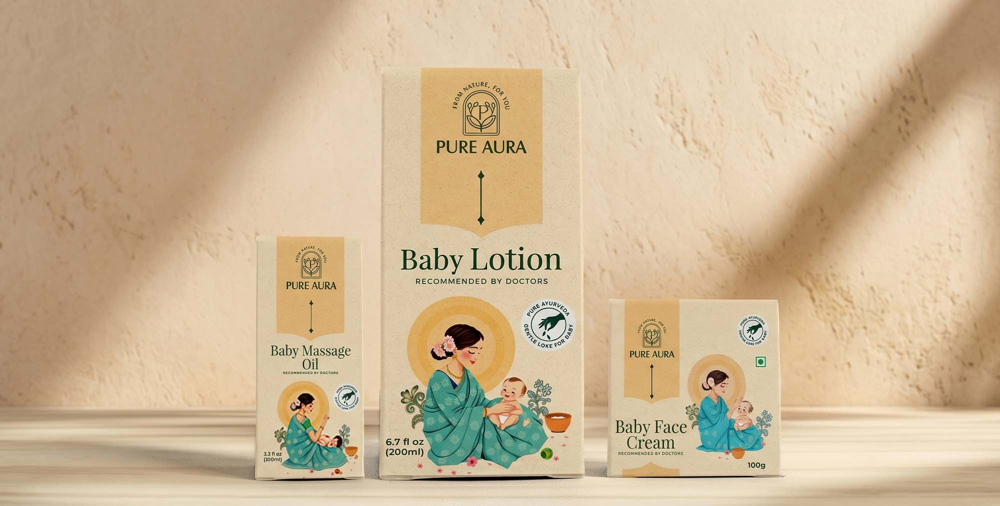
Since this was a first launch, clarity came first. We created a clean, minimalist logo built from fine art lines, paired with a prominent brand name so that Pure Aura reads clearly and confidently even at small sizes. Nothing competes for attention. The name and the feeling lead.
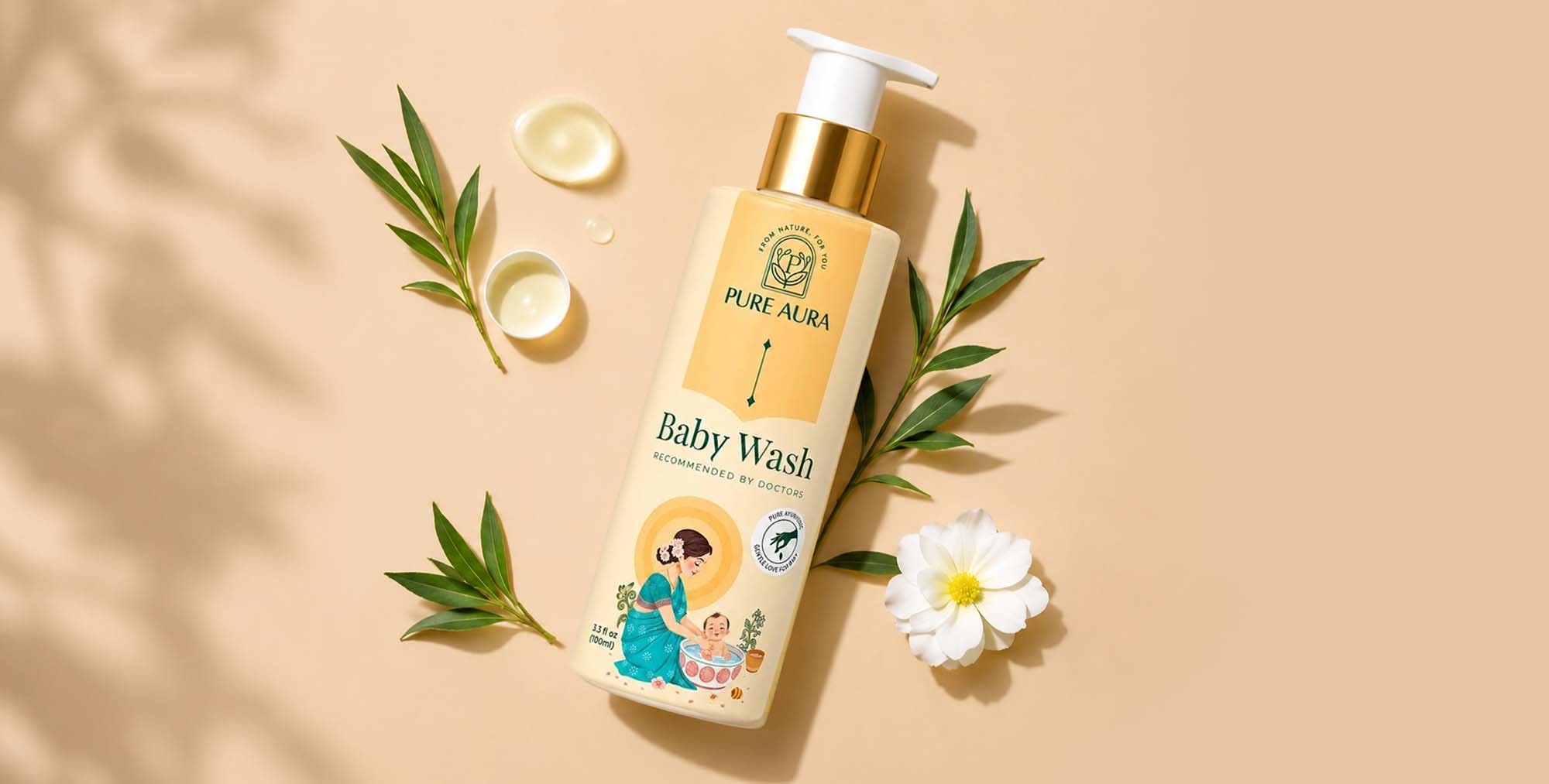
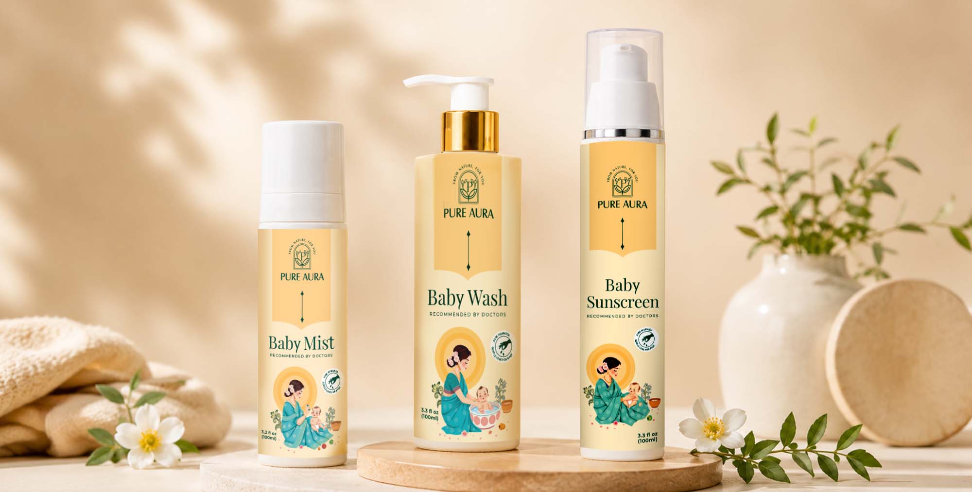
The emotional heart of the identity is its artwork. We drew inspiration from the Indian artists of the 1965 to 1975 era and their tender portrayals of a mother caring for her baby with natural ingredients. Behind the mother, we placed a soft halo glow that lends the scene an angelic, protective quality, speaking directly to a parent’s deepest instinct to shield their child. This single image does the emotional work that words cannot. It makes the promise of safety and love visible the moment a parent sees it.
The colour palette was chosen to feel both calming and credible. A warm beige anchors the brand design in softness and purity, while a sea green blue brings an earthy, natural tone that quietly signals the Ayurvedic, plant based formulations inside. Together they move Pure Aura away from the loud, primary coloured clutter of conventional baby products and toward something gentler, warmer and more premium, a look that mothers associate with trust rather than mass production.
Finally, to make the natural promise explicit, we added a clear Pure Ayurveda stamp to the packaging. It tells parents at a glance that the product is genuinely ayurvedic, turning an abstract claim into a visible, reassuring mark of authenticity.
The new identity gave Pure Aura a confident, coherent presence from its very first day on the market, and the response was fast. According to the brand, Pure Aura recorded close to Rs 8 crore in revenue within the first six months of launch, and now operates at a monthly revenue of roughly Rs 2 crore. On the strength of that momentum, the founders are projecting around Rs 50 crore for the coming financial year, and are preparing to extend the brand into women’s care within the next three months.
For a venture that began as a personal mission, founder Sagar Setia created Pure Aura after struggling to find safe, pure products for his own niece and nephew, that early trajectory is strong validation that purposeful design and a clearly told promise can build consumer trust quickly.
“The packaging captured exactly what Pure Aura stands for, purity, safety and a mother’s love, and customers felt it instantly,” says Sagar Setia, founder of Pure Aura. “The design has been central to how fast people have come to trust the brand.” The brand’s growth has also drawn committed backing from equity holder and brand influencer Dr. Imran Patel.
Pure Aura is an Indian baby care brand that blends Ayurvedic principles with modern technology to create gentle, chemical free products for delicate baby skin, spanning face care, body care and everyday essentials. The brand’s packaging and identity were designed to make its core promise, care as pure as a mother’s touch, visible at a glance.
PURE AURA