Be honest. How many times have you randomly picked up a perfume just because the bottle and label looked drop-dead gorgeous? Well, we all do it. Before we even smell the fragrance, our eyes (and sometimes even our fingertips) are already judging whether that little glass bottle is worth a place on our dresser!
That’s precisely why your perfume label design is such a big deal. Believe it or not, but if you really want to make your perfume bottle feel like a premium luxury indulgence, a strategic label design is the best way to go!
It ultimately sets the entire mood even before the first spritz. Interesting, right? And in a market where hundreds of bottles are fiercely fighting for attention, the right perfume label design can eventually turn your perfume from “just another fragrance” into a must-have statement piece.
So, if you are building a new fragrance brand, here are 98+ amazing label design ideas along with a brief guide on how you can curate the most interesting perfume labels for your brand! Let’s get started!
Table of Contents
Why Perfume Label Design is the Silent Deal-Maker?
Here’s the truth: you could have the most divine fragrance inside your bottle, but if the perfume label design looks cheap or boring, people will always walk right past it. Perfume is always an emotional purchase. People buy scents that mirror their identity, mood, or memories.
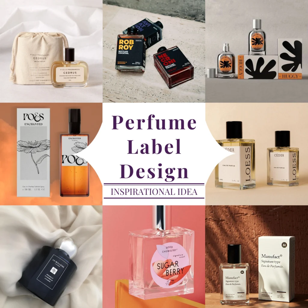
A premium perfume label design conveys trust, sophistication, and uniqueness. All in a single glance! It is ultimately no longer just a detail. It is the ultimate deciding factor that turns browsers into buyers in an overcrowded fragrance market! If you ignore label design for your perfume, you are basically whispering in a crowded room while others are shouting with style!
The Secret Recipe for a Perfume Label Design That Screams Utmost Luxury!
So what makes a perfume label truly irresistible? Well, let us break it down for you further!
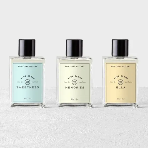
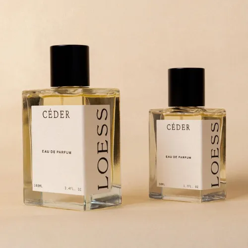
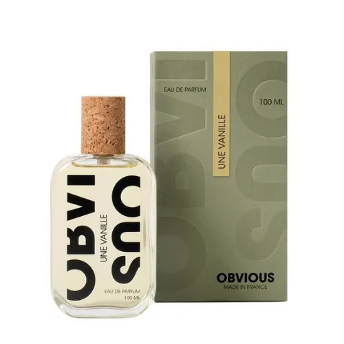
a) Fonts that Speak Way Louder Than Words
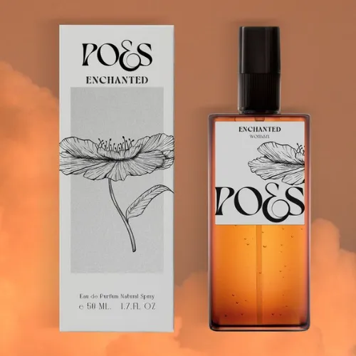
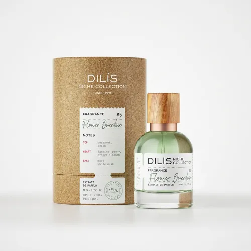
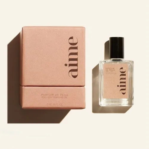
Typography is more than just letters. It is ultimately your brand personality printed on paper. Elegant serif fonts can instantly communicate sophistication, while bold sans-serifs add a modern, edgy feel. Playful handwritten styles also work beautifully for niche, artisanal scents.
The trick is to carefully pick a font for your perfume label design ever
ytime that mirrors your brand’s vibe. And always remember, readability is absolutely non-negotiable. No one should squint to figure out your perfume’s name ever!
Source: https://in.pinterest.com/
Source: https://in.pinterest.com//p>
Source: https://in.pinterest.com/
Source: https://in.pinterest.com
Source: https://in.pinterest.com/
Source: https://in.pinterest.com
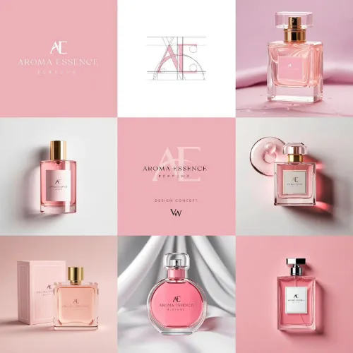
b) Color Palettes that Trigger Specific Emotions
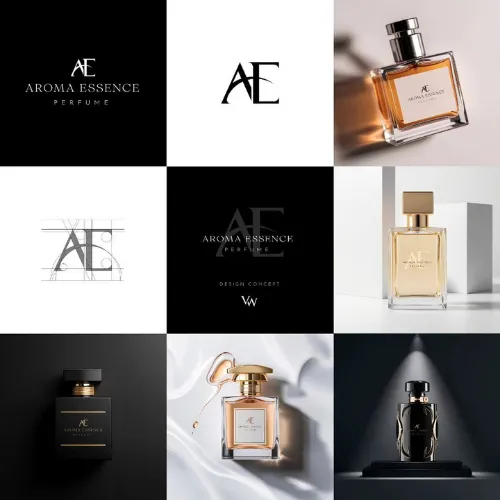
Black and gold radiate luxury, pastels evoke softness, while jewel tones like emerald or ruby suggest richness! Most of the purchase happens on emotional appeal. So, choose hues that align with your fragrance’s story.
For example, a floral scent may look divine with blush pinks and soft creams, while a woody, intense perfume could lean into earthy browns and metallic accents. You get the idea, right?
Source: https://in.pinterest.com/
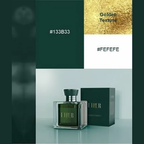
Source: https://in.pinterest.com//p>
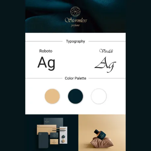
Source: https://in.pinterest.com/
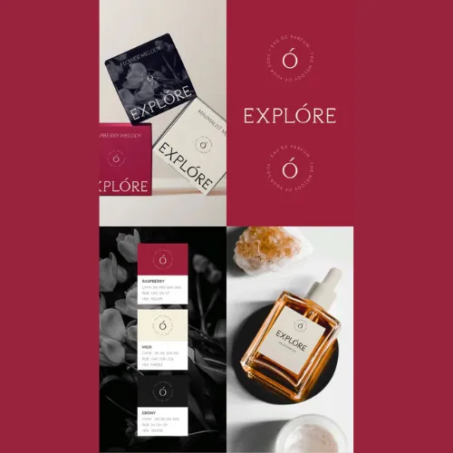
Source: https://in.pinterest.com
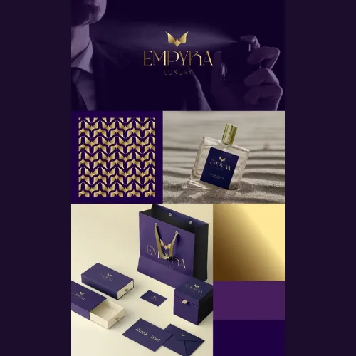
Source: https://in.pinterest.com/
Source: https://in.pinterest.com
c) Textures and Finishes that Invite Touch
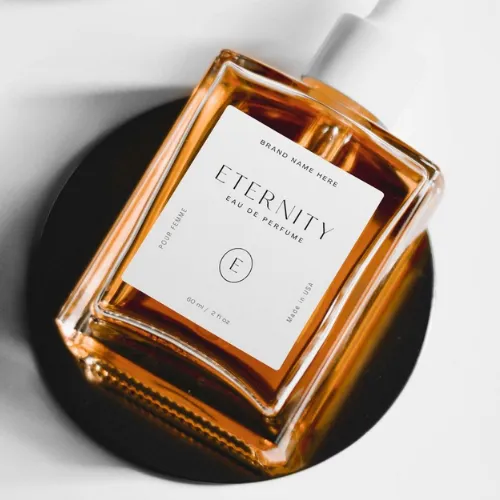
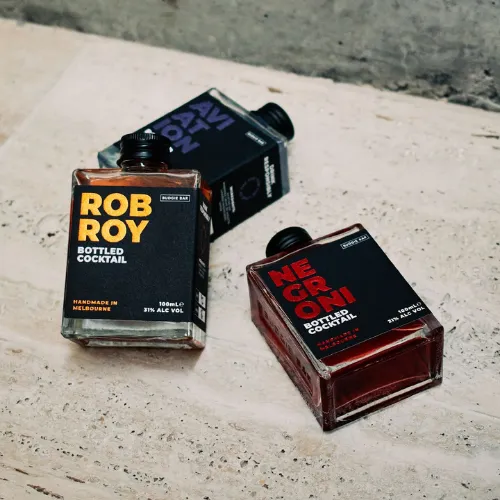
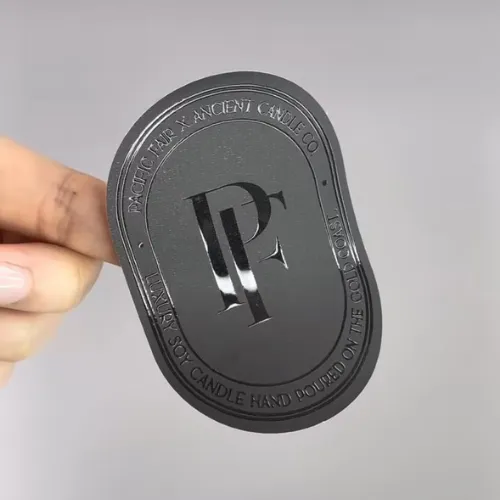
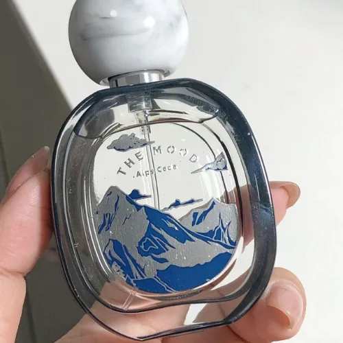
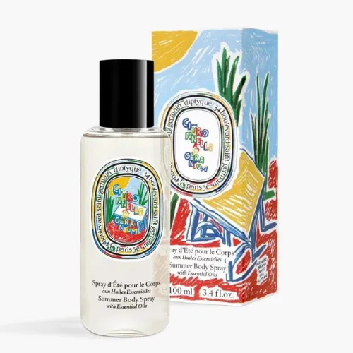
Matte labels have this soft, velvety feel that whispers sophistication! Glossy ones, on the other hand, catch the light and sparkle in a creative way that makes bottles look extra eye-catching on the shelf.
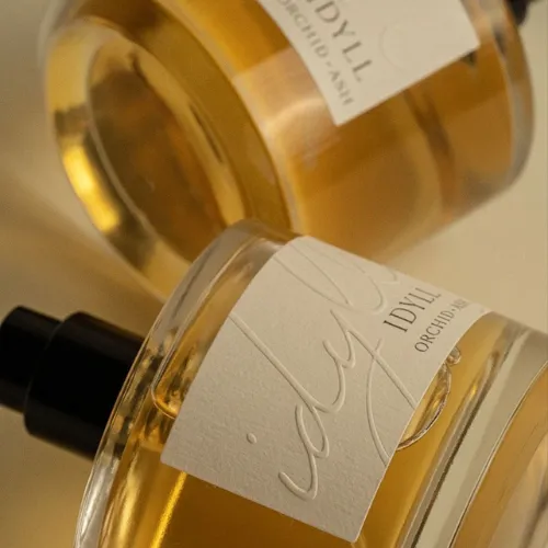
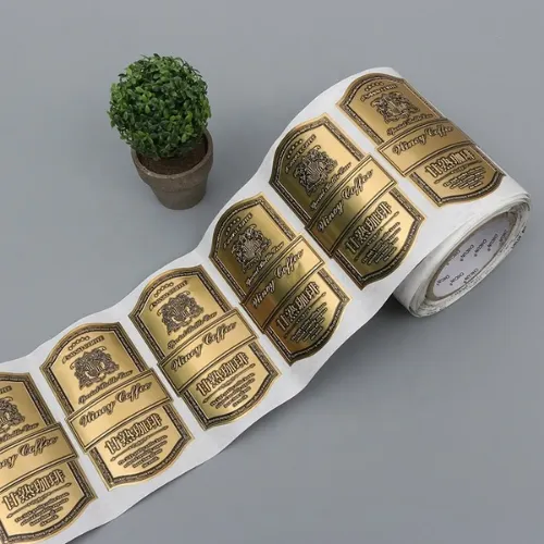
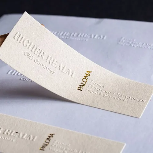
Why not also add a touch of gold or silver foil? Suddenly your perfume feels like it belongs in a luxury boutique! And if you really want people to pause and run their fingers over the bottle, embossing is the way to go! It adds that subtle texture people often connect with “premium.”
Sometimes, it is these tiny finish choices that make shoppers stop, notice, and remember your perfume!
Source: https://in.pinterest.com/
Source: https://in.pinterest.com//p>
Source: https://in.pinterest.com/
Source: https://in.pinterest.com
Source: https://in.pinterest.com/
Source: https://in.pinterest.com
d) Creative Shapes and Layouts (Because Squares are Boring)
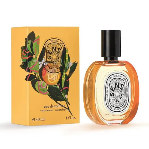
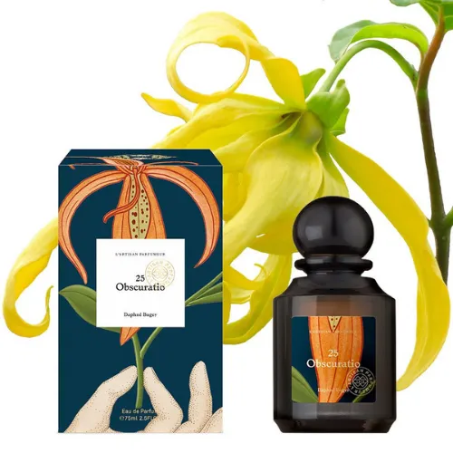
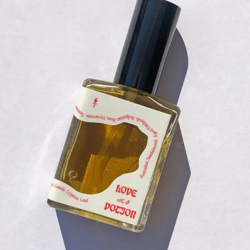
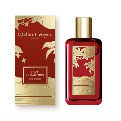
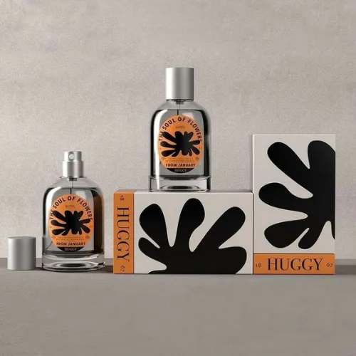
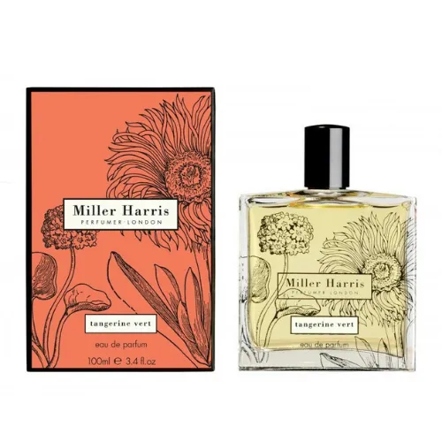
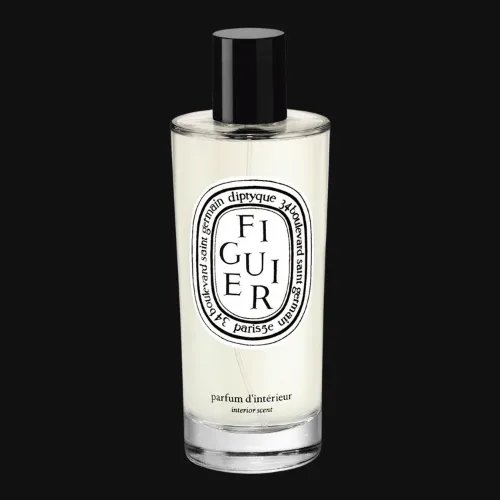
Most perfume labels play it safe with the usual square or rectangle, but where’s the mystery in that? Perfume is about seduction and surprise, so why not flirt with more playful shapes? An oval label instantly feels timeless and romantic (very vintage French vibes), while an offbeat, asymmetrical cut can scream modern and edgy.
Source: https://in.pinterest.com/
Source: https://in.pinterest.com//p>
Source: https://in.pinterest.com/
Source: https://in.pinterest.com
Source: https://in.pinterest.com/
Source: https://in.pinterest.com
e) Material Choices that Match the Message
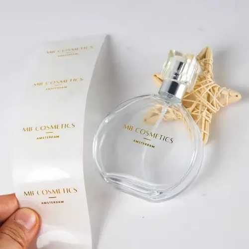
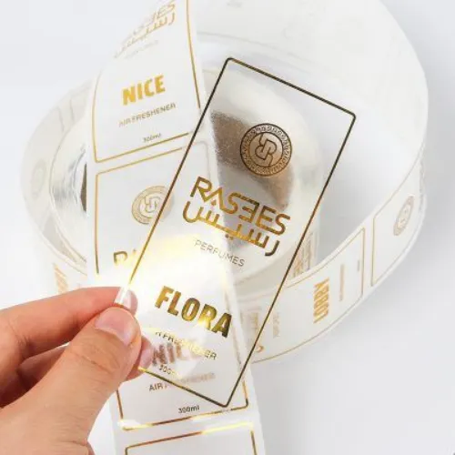
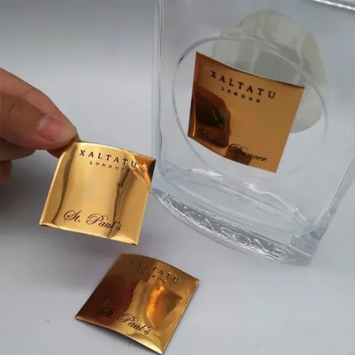
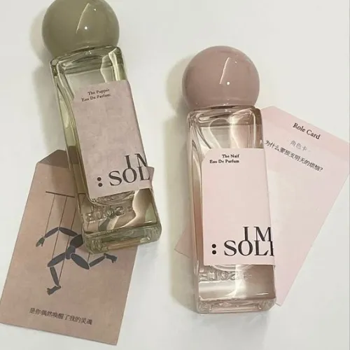
Paper, plastic, or even fabric (yes, fabric!). Your choice of material does way more than just “stick” to the bottle. It is like the outfit your perfume wears. A textured paper label feels handcrafted and artisanal, almost like you are holding a little piece of art. Transparent labels, on the other hand, give that dreamy barely there look, letting the glass do most of the talking.
Some high-end brands even mix luxe papers with eco-friendly inks because being sustainable doesn’t mean you can’t look glamorous! And here’s the secret: people don’t just see your labels, they feel them! The right texture under someone’s fingertips can instantly make your perfume feel more expensive and desirable!
Source: https://in.pinterest.com/
Source: https://in.pinterest.com//p>
Source: https://in.pinterest.com/
Source: https://in.pinterest.com
Source: https://in.pinterest.com/
Source: https://in.pinterest.com
f) The Unsexy but Vital: Compliance Details
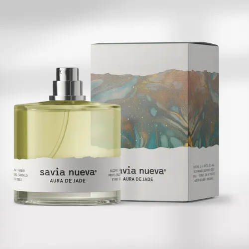
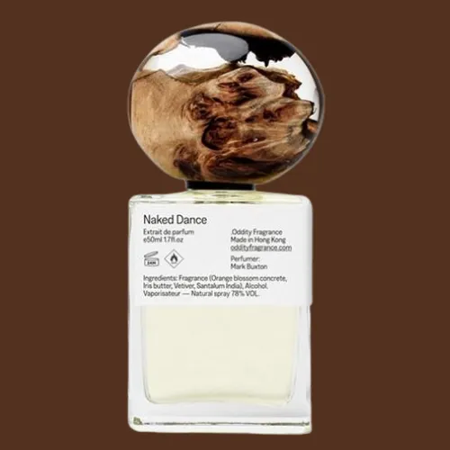
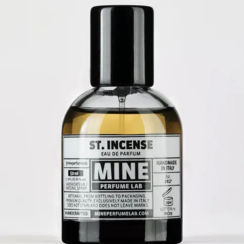
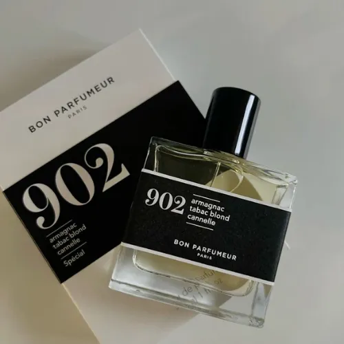
Let’s discuss about the unsexy little things like ingredients, batch numbers, barcodes, and safety icons. Not the part anyone really wants to design, but totally non-negotiable (unless you are looking for trouble with regulators)!
Here’s the trick: instead of simply dumping them on like afterthoughts, treat them like little fashion accessories. Minimalist icons, tiny elegant fonts, or tucking them neatly at the back of the bottle label design can actually make them blend in without spoiling the vibe.
Source: https://in.pinterest.com/
Source: https://in.pinterest.com//p>
Source: https://in.pinterest.com/
Source: https://in.pinterest.com
Rookie Mistakes That Can Ruin Your Perfume Label Design (and Brand)
Now that we have already covered the essentials, let’s talk about the potholes you absolutely want to avoid!
1.) Too Much Text, Too Little Space
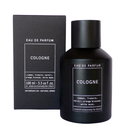
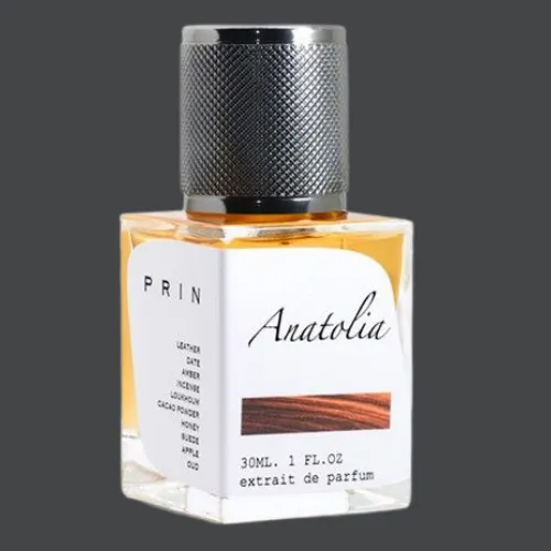
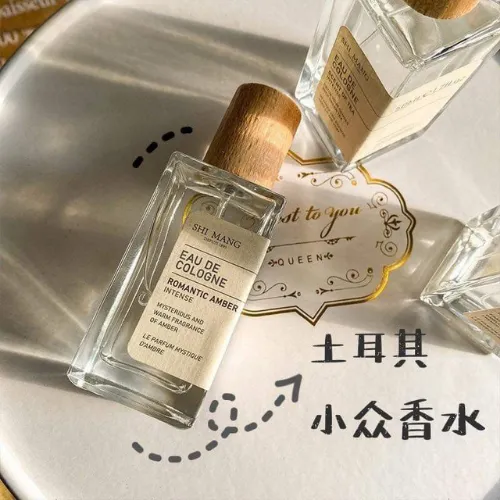
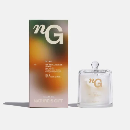
Perfume is all about elegance, not essays. Overloading labels with ingredients, marketing jargon, and irrelevant text makes the design feel messy. Keep it crisp and classy!
Source: https://in.pinterest.com/
Source: https://in.pinterest.com/
Source: https://in.pinterest.com/
Source: https://in.pinterest.com/
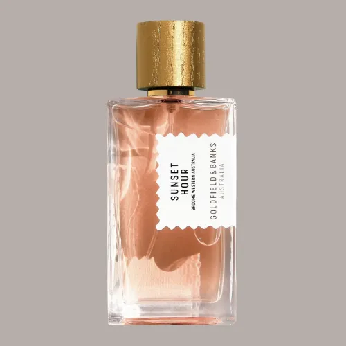
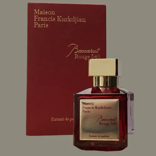
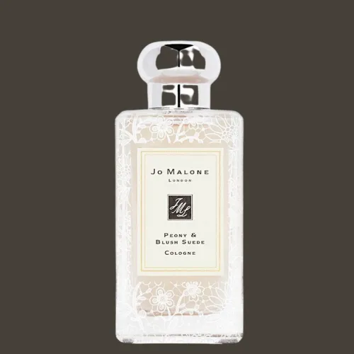
2.) Bad Contrast = Bad Experience
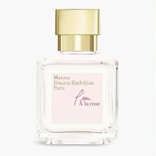
Gold letters on a light beige background might look fancy in theory, but if it is unreadable, you have already lost the customer! Contrast is the key here. Dark fonts on light shades or metallics on dark bases usually win!
Source: https://in.pinterest.com/
Source: https://in.pinterest.com/
Source: https://in.pinterest.com/
Source: https://in.pinterest.com/
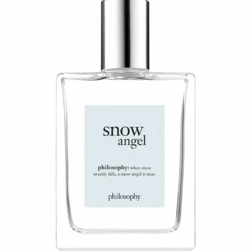
3.) Cheap Printing Materials
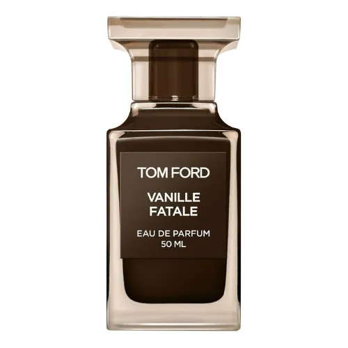
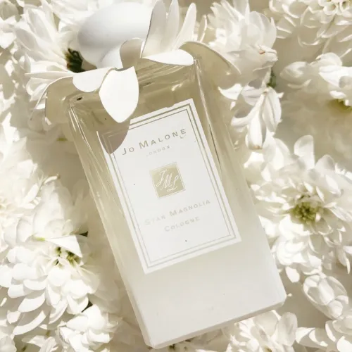
No matter how pretty your design, flimsy labels scream “low budget.” A peeling or smudging label can actually destroy brand credibility in seconds. Premium perfumes demand premium materials!
Source: https://in.pinterest.com/
Source: https://in.pinterest.com/
Source: https://in.pinterest.com/
Source: https://in.pinterest.com/
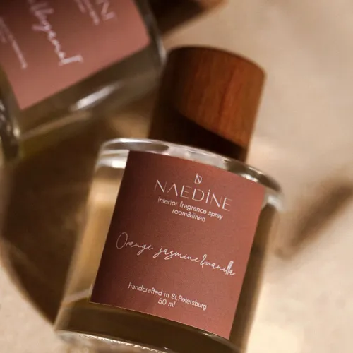
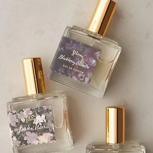
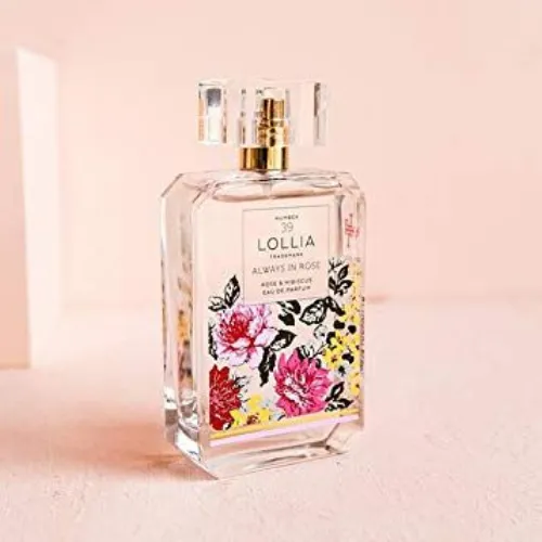
4.) Forgetting Legal Must-Haves
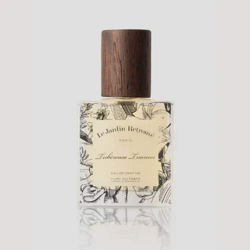
Skipping compliance details is so much more than just risky. It can land you in trouble with regulators and retailers. Beyond legality, missing these can also make your brand look super amateurish!
Source: https://in.pinterest.com/
Source: https://in.pinterest.com
Source: https://in.pinterest.com/
Source: https://in.pinterest.com
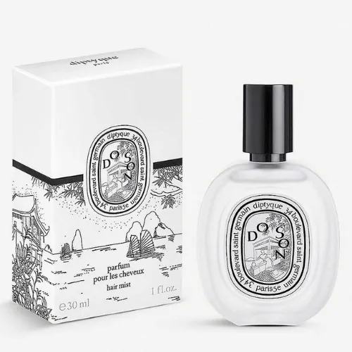
5.) Copy-Paste Trends Without Originality
Minimalist black-and-white labels are trending? Great. But if everyone does it, your bottle will quickly vanish in the crowd. Inspiration is fine. But, imitation is a trap. Infuse your unique story!
Source: https://in.pinterest.com/
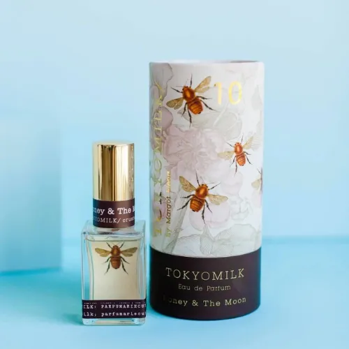
Source: https://in.pinterest.com
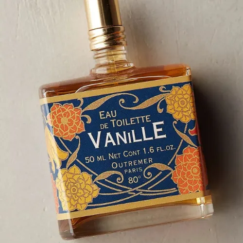
Source: https://in.pinterest.com/
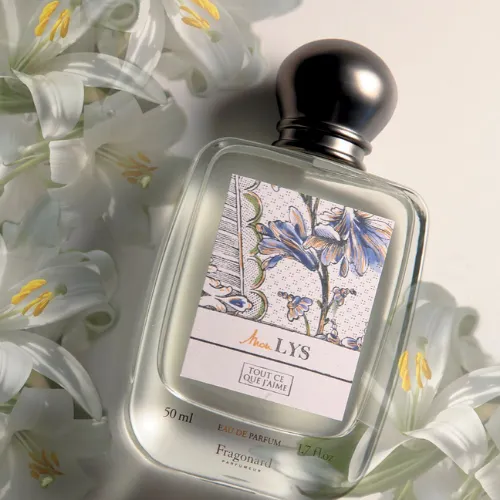
Source: https://in.pinterest.com
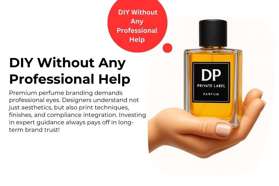
6.) Going DIY Without Any Professional Help
Premium perfume demands professional branding eyes. Designers understand not just aesthetics, but also print techniques, finishes, and compliance integration. Investing in expert guidance always pays off in long-term brand trust!
Why Labels Actually Decide Who Wins the Perfume Aisle?
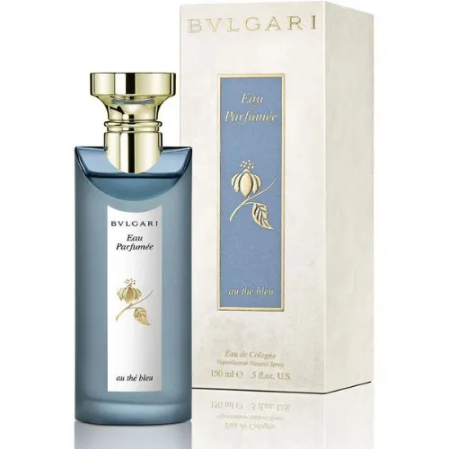
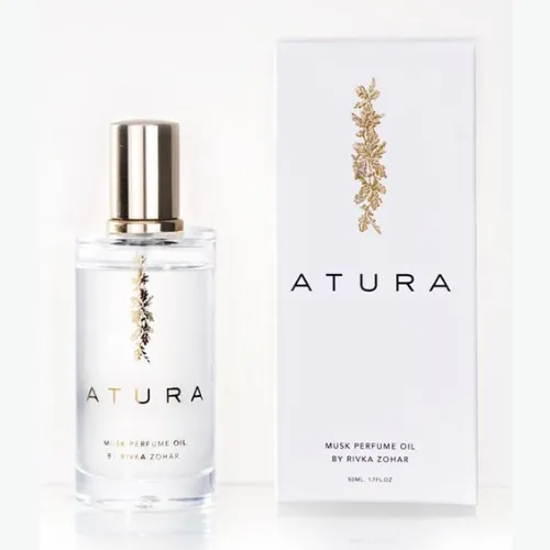
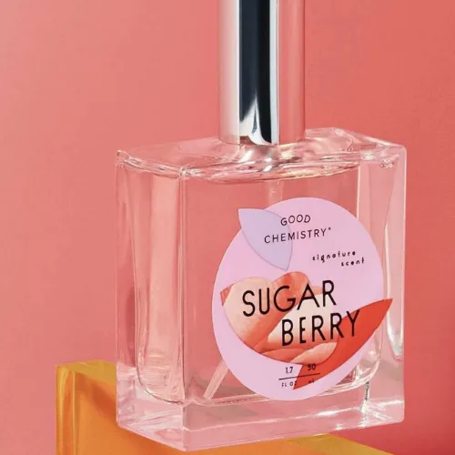
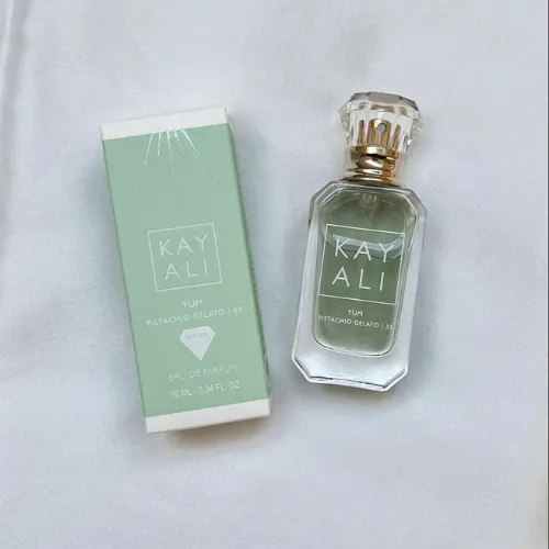
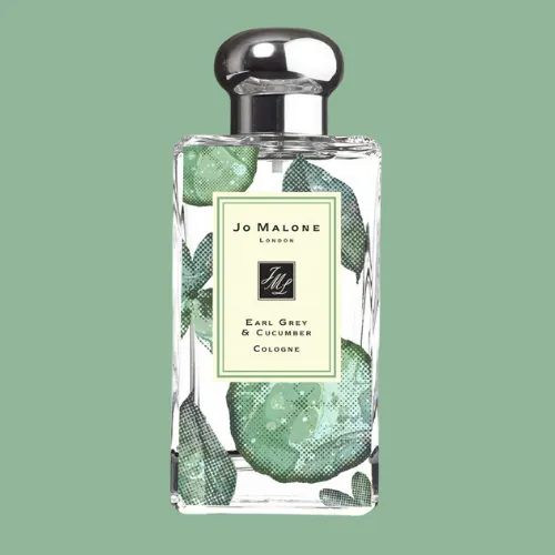
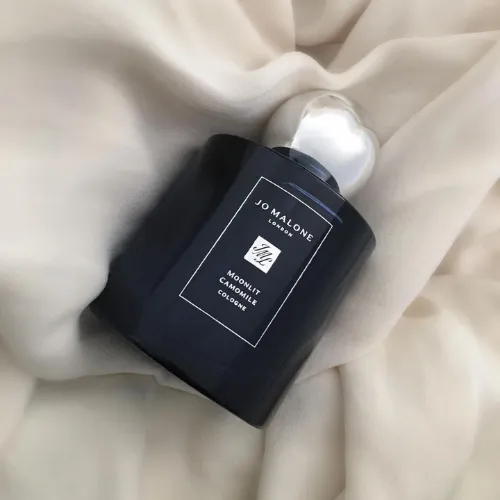
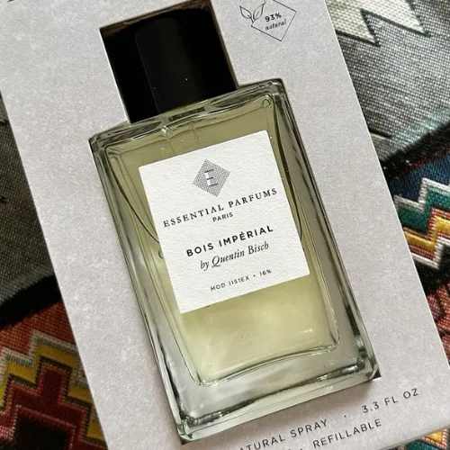
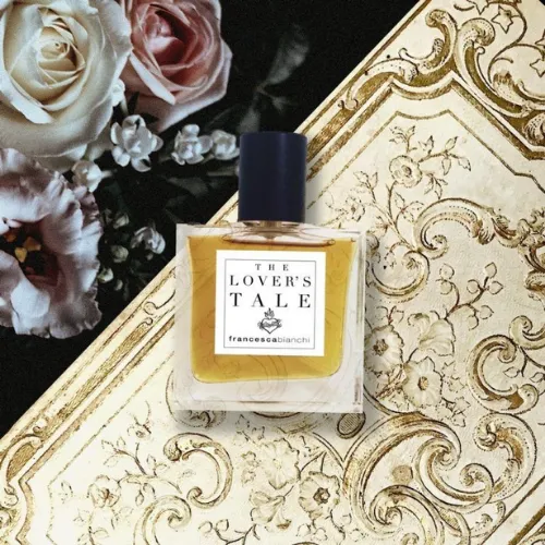
In today’s hyper-competitive fragrance market, a consumer’s decision often happens in less than 7 seconds and most of that judgment is ultimately based on visual cues! Yep, you heard that right! Labels do the heavy lifting of communicating luxury, uniqueness, and trust.
A premium-looking label makes the perfume inside feel more premium, too, justifying higher price tags. A poorly designed label will eventually undermine even the most exquisite scent. Simply put: labels don’t just decorate bottles. They sell them!
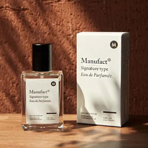
Source: https://in.pinterest.com/
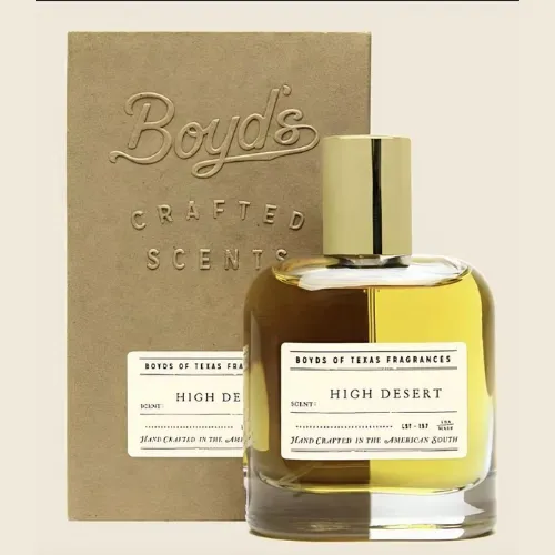
Source: https://in.pinterest.com/
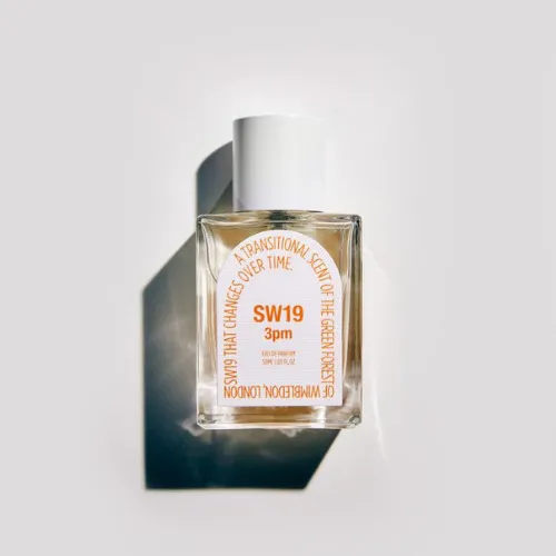
Source: https://in.pinterest.com/
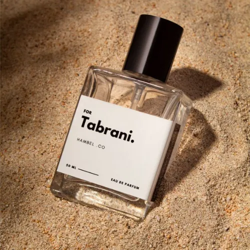
Source: https://in.pinterest.com/
Source: https://in.pinterest.com/
Source: https://in.pinterest.com/
Source: https://in.pinterest.com/
Source: https://in.pinterest.com/
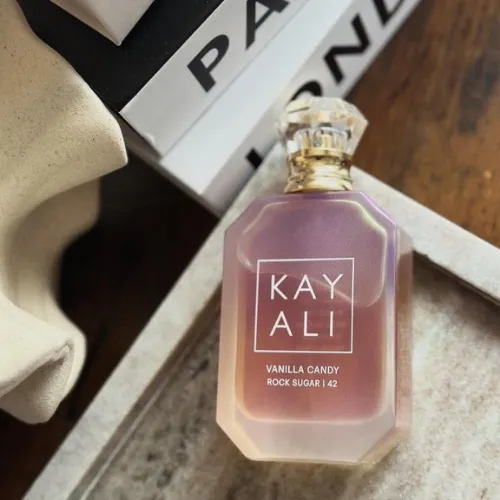
Source: https://in.pinterest.com/
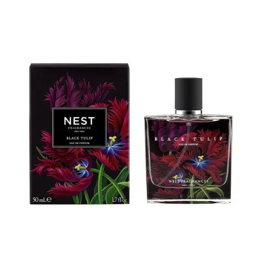
Source: https://in.pinterest.com/
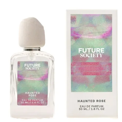
Source: https://in.pinterest.com/
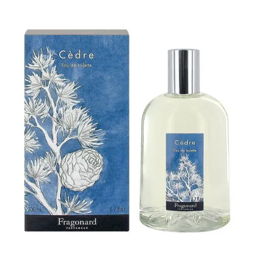
Source: https://in.pinterest.com/
Source: https://in.pinterest.com/
Source: https://in.pinterest.com/
Source: https://in.pinterest.com/
Source: https://in.pinterest.com/
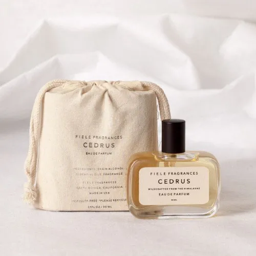
Source: https://in.pinterest.com/
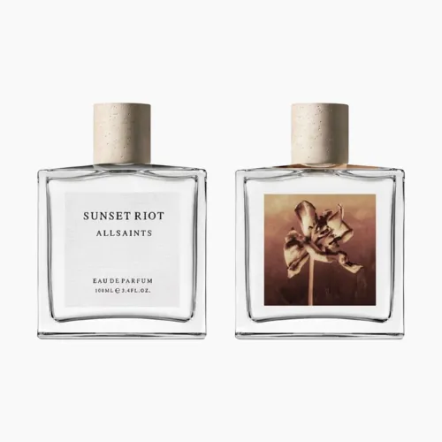
Source: https://in.pinterest.com/
Conclusion:
Perfume is so much more than a scent. It is an identity bottled up! And your label is the first conversation your brand has with a customer. From choosing the right typography and colours to avoiding common pitfalls, your label is your silent salesperson working 24/7 on the shelves.
So, the right design doesn’t just make bottles look premium. It eventually turns your perfume into a brand people trust, desire, and remember! So, are you ready to give your perfume bottles the premium makeover they deserve? Let our experts at DesignerPeople craft labels that make your fragrance truly irresistible!
Author: Megha Malik

As a passionate entrepreneur and creative brand consultant with experience of 14 years in digital, branding and packaging industry, it is my honest effort to put my experiences and knowledge of industry towards readers. A chartered accountant by degree but a marketing personality in blood has motivated her to take in designing industry as a career. With her fun-loving personality and sharp branding skills, she is a great motivational speaker on her YouTube channel, an active member in various business channels offline as well as online. Do connect me personally via my LinkedIn and I love to share my expertise with you.


