With over 22 years of experience in packaging design, DesignerPeople gives free consultations for supplements, ayurvedic medicines, and pharma packaging. We know what’s trending in the market, how people think when buying things, and how to create designs that look good and work great. With this knowledge, we’ve designed packaging for all kinds of products like health supplements, sanitary pads, face masks, sanitizers, ayurvedic products, and more.
In the pharma world, packaging isn’t just about keeping the product safe. It’s also about trust. Packaging needs to protect the product but also give customers the right info. Our clients have seen up to 30% growth in sales just by upgrading their packaging.
But here’s the thing—important stuff like expiry dates, ingredients, or storage info is often written too small or designed poorly. This can confuse people and make the product seem less trustworthy. At DesignerPeople, we focus on making designs that are clean, simple, and clear. We ensure all the important details are easy to read.
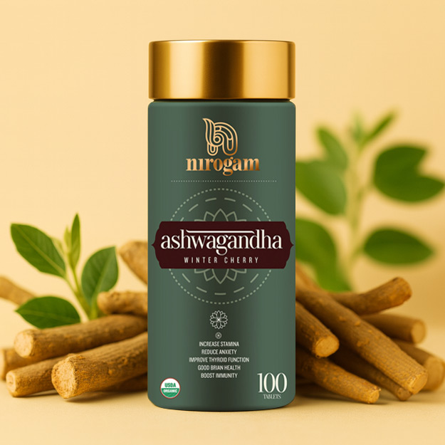
Ashwagandha Packaging
This Ashwagandha supplement packaging by Nirogam exemplifies a premium herbal aesthetic with its deep green and gold color palette, exuding trust and sophistication. The central label design resembles a diecut label, sharply framing the product name to emphasize tradition and quality. Overall, the layout and typography project a calm yet powerful vibe—perfect for a wellness product aimed at enhancing stamina, reducing anxiety, and boosting immunity.

Daily nutrition bottle package
This Daily 24 multivitamin bottle from The 69 Nutrition features a bold and modern design that utilizes dynamic curves and a clean color contrast of blue and green. The typography is clear and authoritative, lending it a strong shelf presence. The layout reflects a “Go Extra Miles” philosophy—clearly communicating the product's comprehensive nutrient content with “Essential Vitamins and Minerals with Exclusive Plant Concentrates,” making it a perfect daily health companion for those who demand more from their supplements.
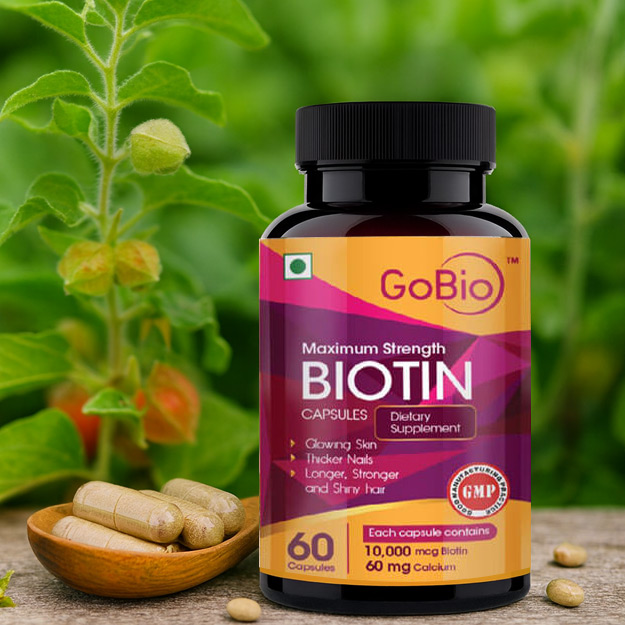
Energy capsule medical packaging
This GoBio Maximum Strength Biotin supplement packaging radiates vitality with its vibrant color gradient and dynamic design. The label’s bold typography and sleek structure perfectly reflect the promise of enhanced beauty and wellness. However, there is a minor typo in the benefit list: the word “Shiny” is misspelled as “Shirv” under the line “Longer, Stronger and Shirv hair.” Correcting this would further elevate the professionalism of an otherwise compelling and trustworthy presentation.
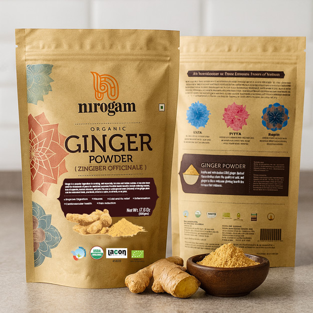
Ginger Powder Packaging
The Nirogam Organic Ginger Powder packaging impressively blends traditional Ayurvedic appeal with informative, modern design. The front showcases beautiful diecut label-inspired graphics with geometric floral motifs, invoking a natural and handcrafted aesthetic. The back adds educational value with an introduction to the three doshas—Vata, Pitta, and Kapha—enhancing customer engagement.
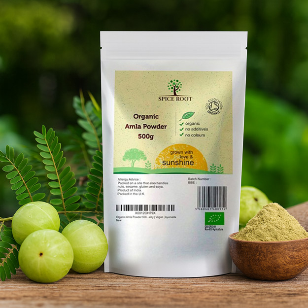
Organic Amla Powder Packaging
The Spice Root Organic Amla Powder packaging delivers a clean and trustworthy look, enhanced by its minimalist layout and organic color palette. The front highlights essential product benefits—“organic,” “no additives,” and “no colours”—in a straightforward checklist, adding to consumer confidence. The phrase “grown with love & sunshine” adds a warm, human touch that reinforces the product’s natural and nurturing essence.
Pharma packaging isn’t about big, flashy designs or loud claims. It’s about being real and building trust. A good pharma package works like a quiet salesperson, helping people feel confident without being pushy.
Funny thing is, just like medicines help people heal by subconscious mind, good packaging can make them feel better about what they’re buying too. A good pharma package tells people the product is safe, reliable, and high quality. It helps build trust, and trust is such a big part of healthcare.
We at DesignerPeople – One of Best Pharmaceutical Packaging Design Agency Ahmedabad are passionate about business branding and we deliver research-led designs which create the desired impact. Our basic formula to create a powerful packaging design for medical devices is:

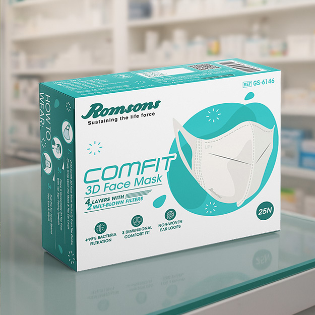
Romsons disposable paper box design
The Romsons Comfit 3D Face Mask packaging is clean, clinical, and highly informative. It highlights key features like 4-layer protection with melt-blown filters, 99% bacterial filtration, and a 3D comfort fit. The minimalist design with teal accents gives it a medical-grade look, while icons and visuals clearly convey its functionality and ease of use.
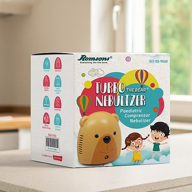
Romsons disposable paper box design
The packaging for the "Turbo Nebulizer – The Bear" cleverly integrates child-friendly design to transform a medical device into a friendly, playful product. The bear-shaped nebulizer and colorful, whimsical graphics featuring cheerful children and balloons make the experience less intimidating for young users. This thoughtful visual strategy helps ease the fear commonly associated with medical treatments in kids, ensuring both appeal and comfort.

Romsons kids mask pouch packaging
The Kare Mask Child packaging is unambiguously friendly for children with playful details to it such as doodles of animals, rainbows, and clouds that will attract both children and parents immediately. The bright typography and sunny illustrations give the air of fun while keeping the overall layout clear and informative.
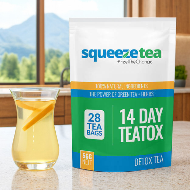
Creative tea pouch design
The packaging for Squeeze Tea's 14 Day Teatox exemplifies informative packaging, clearly communicating the product’s purpose, duration, and content at first glance. Bold typography emphasizes “14 DAY TEATOX” and “28 TEA BAGS,” while clean sections outline benefits like “100% Natural Ingredients” and “Detox Tea.” The color-blocked layout with green, blue, and orange enhances readability and reflects health, freshness, and energy — aligning perfectly with the detox theme.
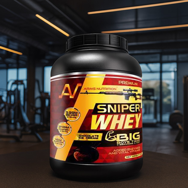
Big jar label design
The packaging for Sniper Whey protein powder delivers a bold impact, both visually and conceptually. With its striking red, yellow, and black color scheme, high-contrast fonts, and dynamic layout, the design instantly communicates strength, energy, and performance. Visuals like the rifle graphic, aggressive fonts, and statements like “BIG BOYS TAKE BIG SHOTS” amplify the power-centric branding. This packaging doesn’t just inform—it commands attention, aligning perfectly with the product’s target audience of serious fitness enthusiasts.
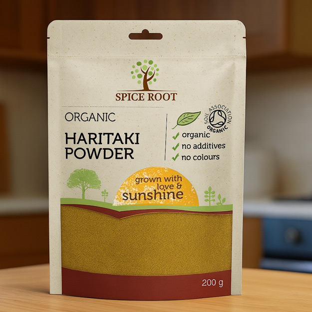
Organic Powder Packaging
The Spice Root Haritaki Powder packaging embraces a natural appeal with its earthy tones, minimalistic design, and wholesome messaging. Elements like the tree logo, hand-drawn sun illustration, and phrases like “grown with love & sunshine” reinforce its organic and eco-conscious identity. The clear checkmarks highlighting “organic,” “no additives,” and “no colours” directly assure the health-conscious consumer.
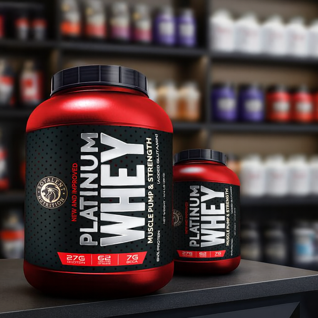
Whey protien powder pack design
The Platinum Whey packaging delivers a power packed visual punch with its bold typography, intense red-and-black color scheme, and strong contrasts. Key benefits like 27G Protein, 7G BCAA, and 62 Servings are prominently displayed, reflecting its focus on strength and performance. The dynamic layout, metallic fonts, and angled text positioning enhance the perception of energy and action.
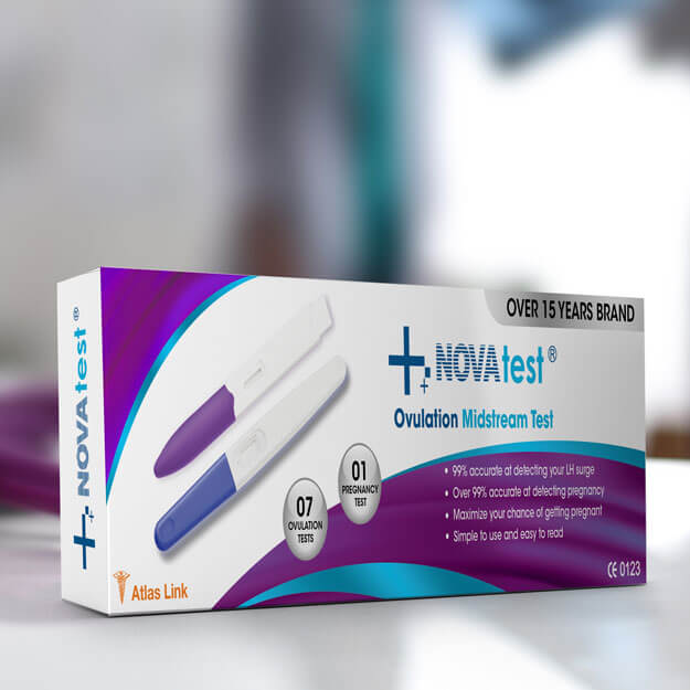
Nova medical paper box
The NOVAtest Ovulation Midstream Test packaging communicates clarity, reliability, and modernity, which are essential for a personal health diagnostic product. The clean white background is complemented by a vibrant swoosh of purple and teal, conveying a sense of vitality and femininity while remaining clinical and professional.
Established over two decades ago
Over 8000+ business served

