As it's said ", everything is created twice, first in mind and then in reality" with the same philosophy, Mr Kumar's imagination to bring some excellent healthy snacks with international standards initiated in his mind first. His passionate nature and enthusiastic approach to structuring his idea in the correct direction made him collaborate with us.
DesignerPeople experience in the international market and product design motivated him to approach us for his project. Looking at the present dry fruit market saturation in India, they wanted to venture with strong packaging, branding and innovative flavours to gain a competitive advantage in the Indian market.
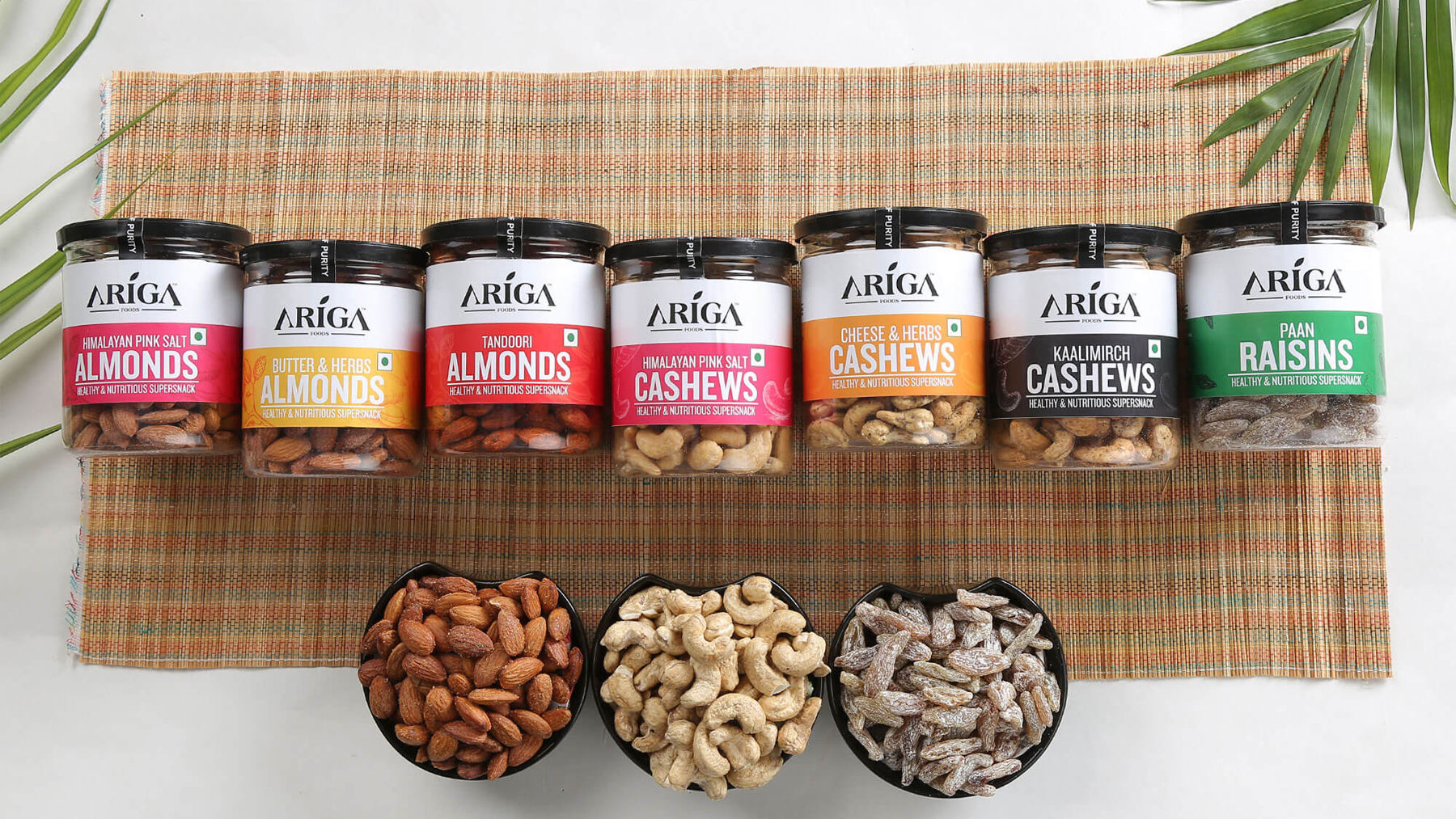
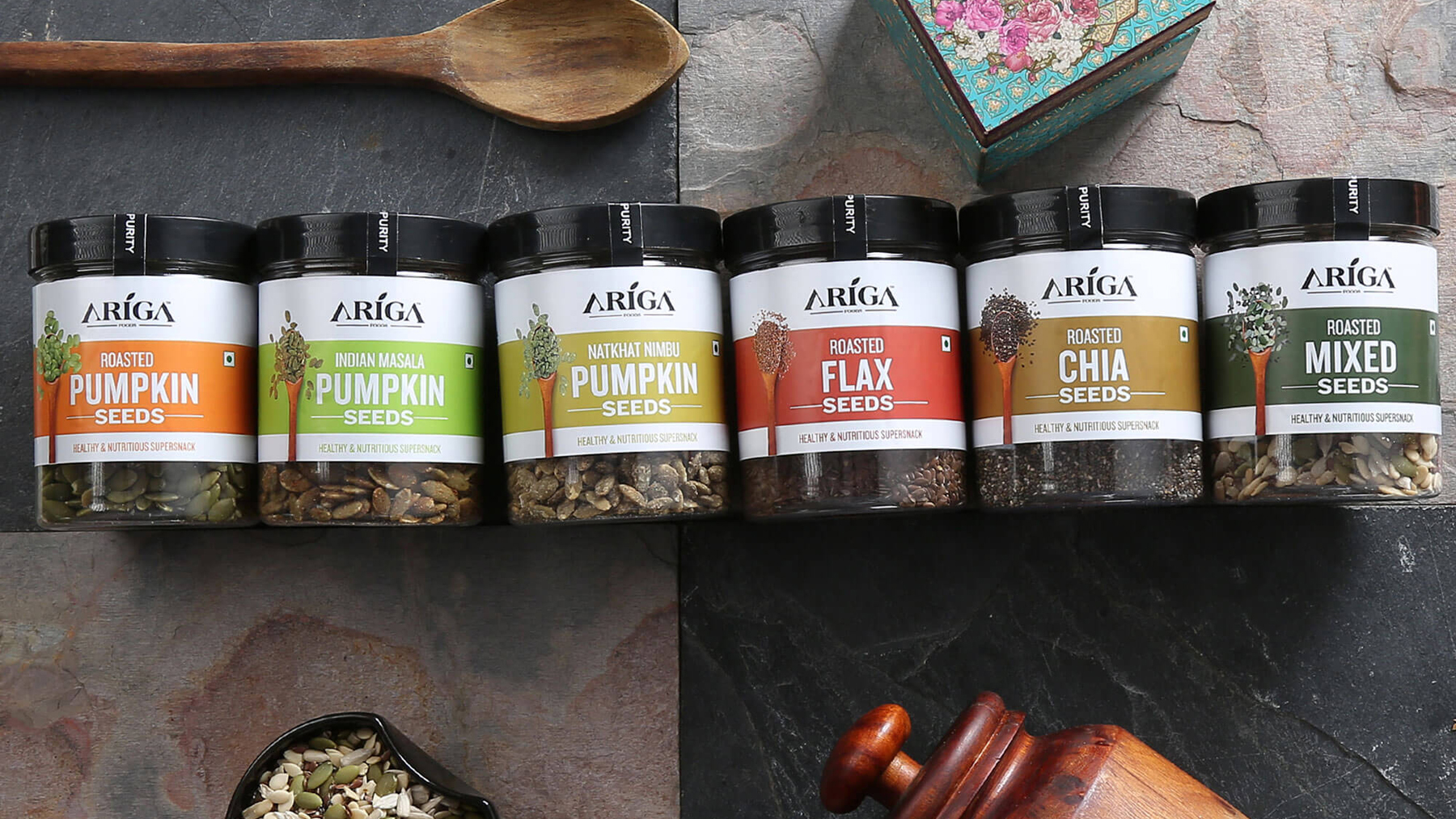
We started their project with the brand name, and then they associated us with their complete packaging label design for their three categories: Raw Dry Fruits, Flavoured Dry Fruits, and seeds.
DesignerPeople primary focus was to craft a brand name which justifies their brand objective of delivering authentic dry fruits wrapped in nutrients and goodness. Hence our team of brand name experts, with a lot of brainstorming, finalised the brand name "ARIGA", which was inspired by the word Organic (ORGANIC --> ARIGANIC---> ARIGA)
The brand logo was kept simplistic with an iconic leaf on the word "I", which communicates being natural and organic. The Sans font style gives a Premium and elegant look.
Our next major task was to introduce label packaging designs for their three categories, which will reflect the brand message. Our conceptualisation team studied and understood their requirement for an international look and feel in packaging.
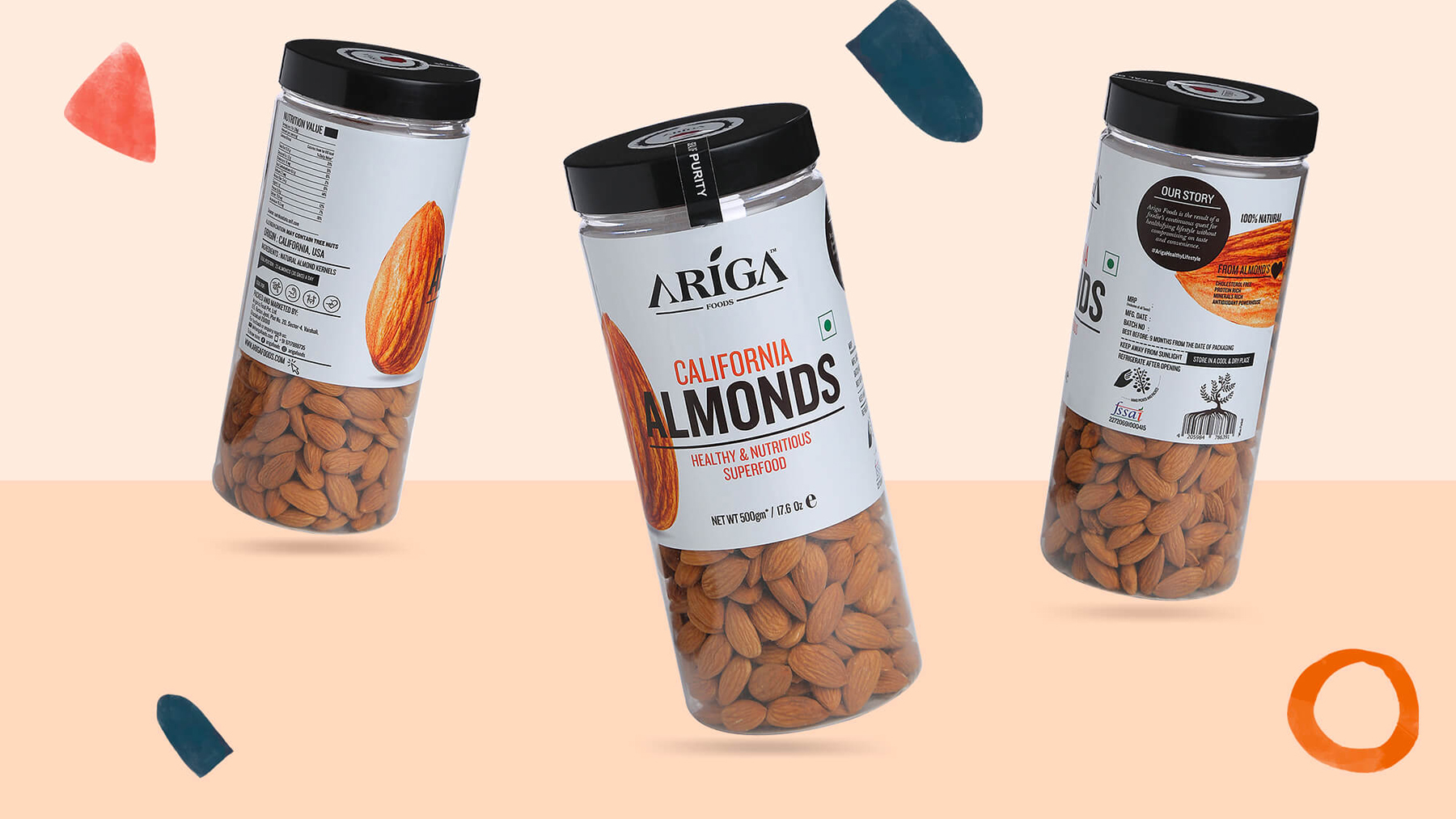
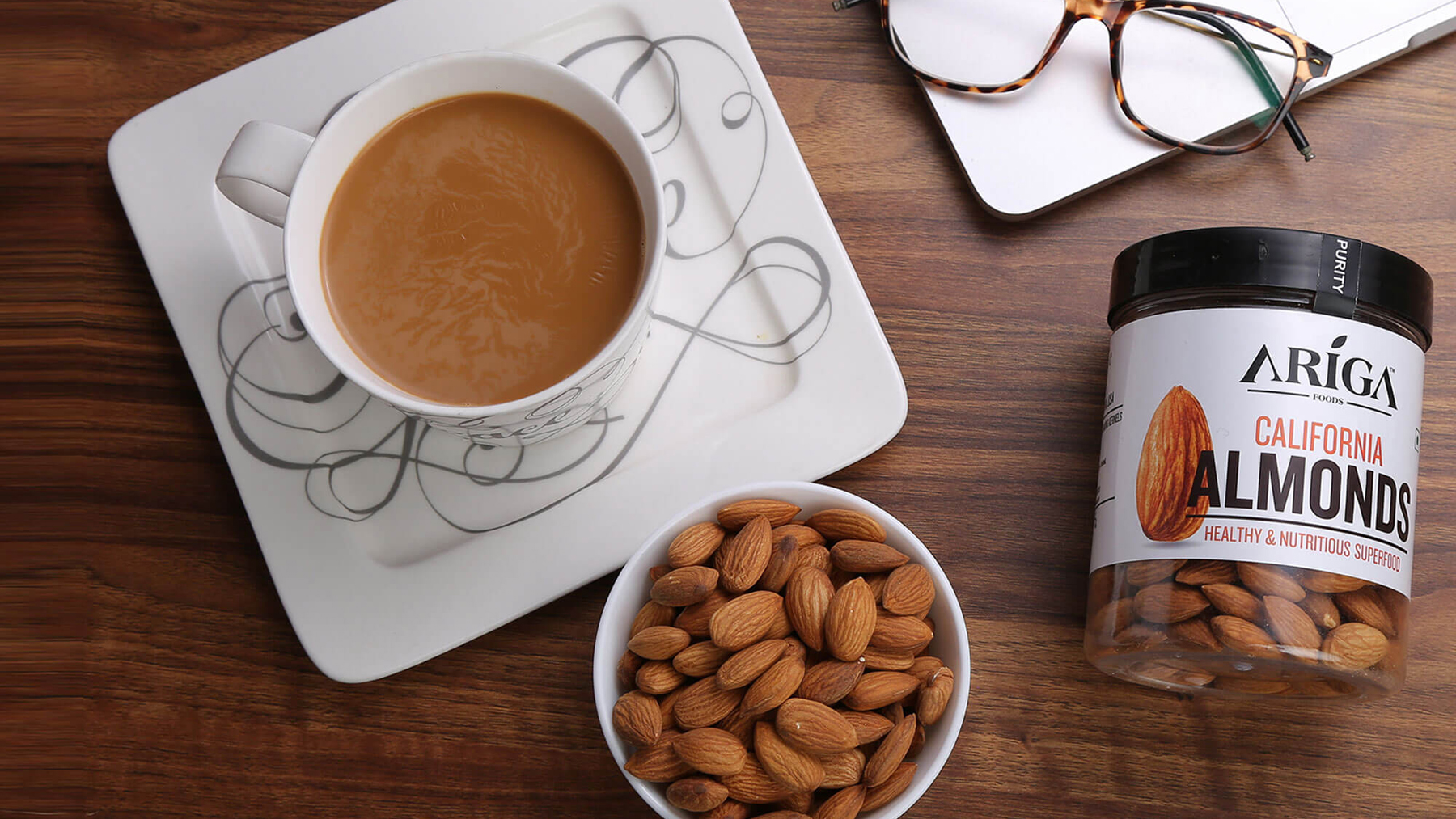
We established plain dry fruit packaging by considering the base white to represent purity and Raw as the brand personality. The extensive product image ensures mouth-watering and clear product recognition on a shelf and online sales.
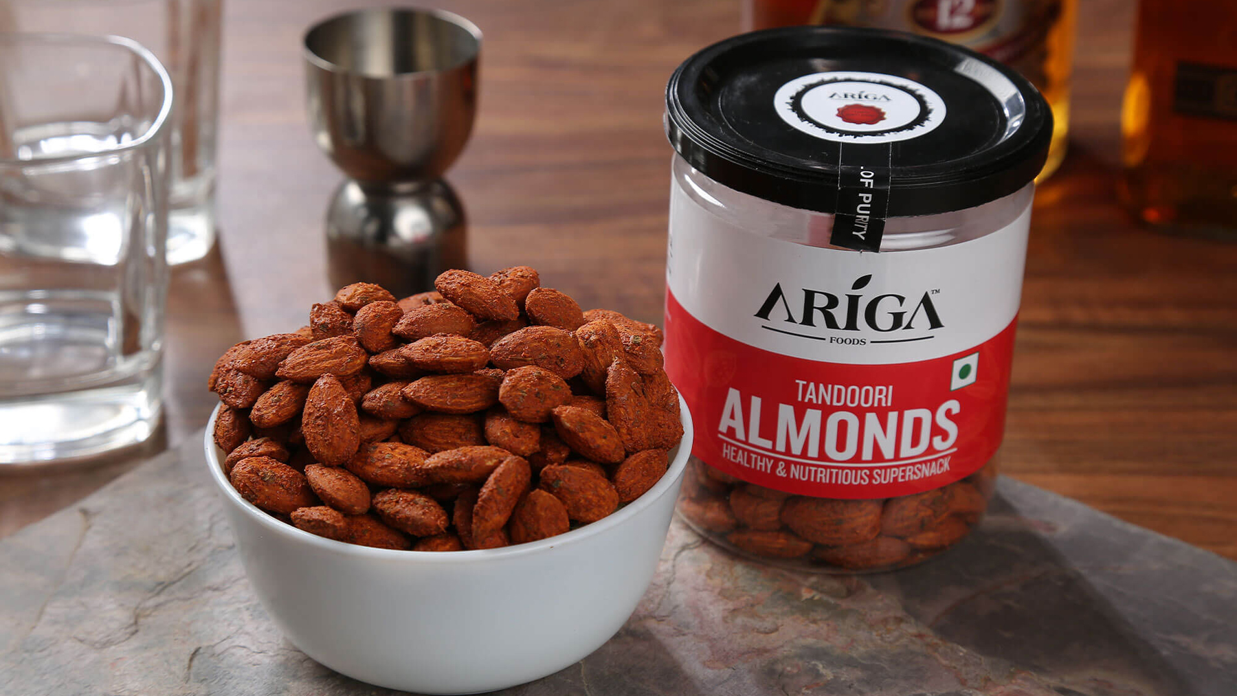
Flavoured dry fruit packaging design ensured to align shades as per flavours. The seeds design maintained the same brand identity of white along with a spoon image which indicates the brand proposition "a spoon full of seeds per day leads towards a healthy lifestyle.
The jar label is kept at a short height so that the actual product is visible, which will ensure quality, brand trust and purity among customers by displaying the actual product.
Looking at our work quality, we are in the process of starting an ARIGA social media project soon, and we are humbled to be associated with such a passionate client.
ARIGA