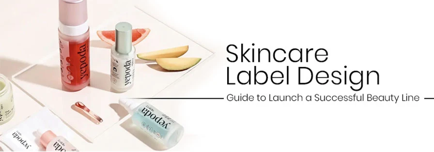
Launching a skincare line is super exciting. Formulas are perfected. Ingredients are sourced. Packaging bottles are selected.
And then comes the part most founders underestimate: the label design!
Your skincare label isn’t just any random sticker out there. It is now your brand’s first handshake. It is what customers judge before they ever test your serum, cream, or cleanser. In a crowded beauty market where shelves (and Instagram feeds) are overflowing, your label truly needs to do three things instantly:
1. Grab attention
2. Build trust
3. Feel premium
A well-designed label can make a random ₹499 product look like ₹1,999. On the other hand, a poorly designed one can do the opposite, even if your formula is incredible!
So if you are launching a beauty line and want it to look polished, desirable, and shelf-ready from day one, this guide will quickly walk you through inspiration, strategy, and execution, without any boring design jargon. Let’s start with what really makes a skincare label design look expensive!
Table of Contents
What Actually Makes a Skincare Label Design Look Premium (Not Cheap or DIY)?
Let’s be honest. Customers can instantly tell when a label looks “budget.”
But what makes something feel expensive? It is not gold foil alone. It is not fancy fonts. It is not heavy bottles.
Rather, it is a thoughtful design!
So, what are the key aspects you should consider to make your label feel premium? Keep reading with us.
a) First Impressions Matter: Your Visual Entry Point
Every strong skincare label design has a visual anchor. It could be:
1. A bold brand name
2. A clean and strategic logo placement
3. A striking colour palette
4. A unique typography style
When someone actually looks at your product from 3–4 feet away, what do they actually notice first? That’s your entry point.
Premium labels don’t clutter. They guide the eye intentionally. The brand name usually gets prime real estate. Supporting information then follows in hierarchy. There’s always some breathing space in the design.
If everything screams at once, nothing really stands out!
Source: https://in.pinterest.com/
Source: https://in.pinterest.com//p>
Source: https://in.pinterest.com/
Source: https://in.pinterest.com
Source: https://in.pinterest.com/
Source: https://in.pinterest.com//p>
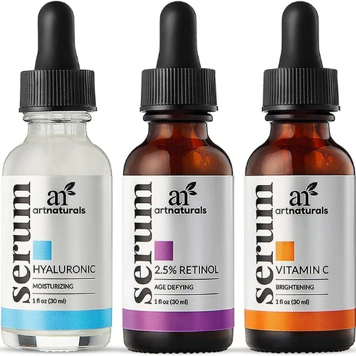
b) Colours That Feel Intentional, Not Random
Colour psychology is huge in skincare.
1. Soft neutrals = clean beauty, minimal, safe
2. Deep blacks and metallics = absolute luxury and performance
3. Pastels = feels gentle, soothing, skincare for sensitive skin
4. Earth tones = looks so organic and herbal
5. Bright bold tones = super youthful and fun
Premium labels don’t really use too many colours. They choose 1–3 shades and build consistency with the right thought.
So what cheapens a label? Random gradients, too many accent colours, and inconsistent brand palettes across products!
Source: https://in.pinterest.com/
Source: https://in.pinterest.com/
Source:https://in.pinterest.com/
Source: https://in.pinterest.com
Source: https://in.pinterest.com/
Source: https://in.pinterest.com
c) Fonts That Truly Feel Elegant, Not Confusing
Typography can ultimately make or break skincare packaging.
Here’s the rule: If customers struggle to read it, they will never trust it.
Luxury skincare brands often prefer these over the cluttered ones:
1. Clean serif fonts for elegance
2. Modern sans-serif fonts for minimalism
3. Subtle contrast between headline and body copy for better and strategic visual hierarchy
Always avoid overly decorative fonts. They may look pretty on Pinterest, but fail in real-life packaging sizes.
Your premium packaging design must always be readable!
Source: https://in.pinterest.com/
Source: https://in.pinterest.com
Source: https://in.pinterest.com/
Source: https://in.pinterest.com
Source: https://in.pinterest.com/
Source: https://in.pinterest.com/
d) Design Details That Elevate the Look
Small details add massive perceived value:
1. Embossing or debossing
2. Matte finish labels
3. Spot UV highlights
4. Minimal iconography
5. Soft-touch textures
And more…
These finishing touches create a tactile experience, and skincare is a sensory category. The moment someone holds your product, it should feel refined!
Source: https://share.google/eGJKEGAdcudMkfPe2
Source: https://share.google/qTiIi2LMdYeLGgg0p/p>
Source:https://in.pinterest.com/
Source: https://in.pinterest.com
Source: https://in.pinterest.com/
Source: https://in.pinterest.com/
e) Information That Feels Helpful, Not Legal
Yes, skincare labels need ingredients, instructions, warnings, and regulatory details.
But there’s a difference between:
“Water, Glycerin, Sodium…” dumped in a block
And:
Clearly structured ingredient lists, usage directions, skin type mentions, and benefit highlights.
Premium brands organise information logically:
1. What it is
2. Who it’s for
3. What it does
4. How to use
5. Ingredients
Now this feels supportive, not overwhelming!
Source: https://in.pinterest.com/
Source: https://in.pinterest.com//p>
Source: https://in.pinterest.com/
Source: https://in.pinterest.com
Source: https://in.pinterest.com/

Source: https://in.pinterest.com//p>
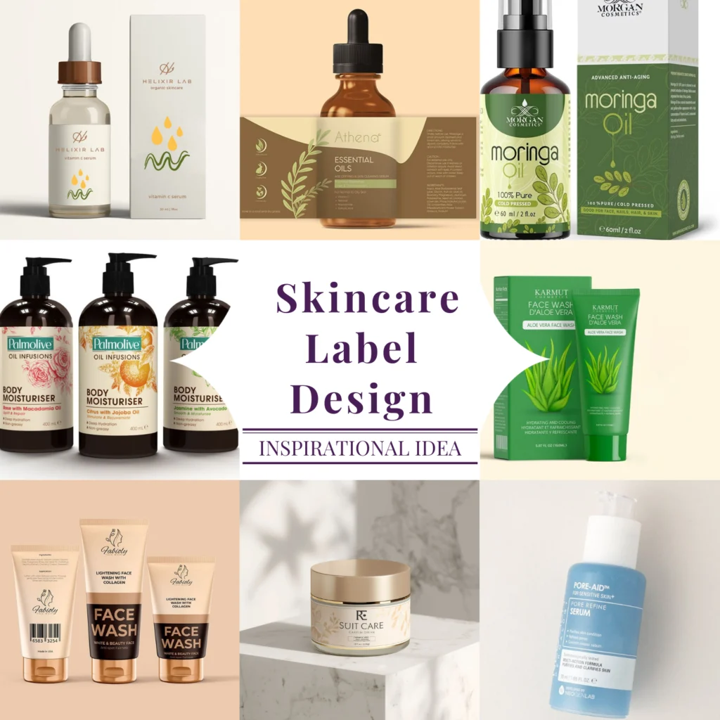
171+ Skincare Label Design Ideas (Organised for Real Inspiration)
When you are building a skincare brand, inspiration is important, but direction is even more important. It is very easy to collect 200 beautiful references and still feel confused about what actually fits your brand. The purpose of this section isn’t just to show aesthetic categories. It is to help you understand how different visual styles communicate different brand personalities.
Every label design language out there sends a message before a single word is read. The goal is to choose a direction that supports your positioning, price point, and target audience, not just what looks trendy this month!
Let’s explore the major label directions and what they really communicate in the skincare market.
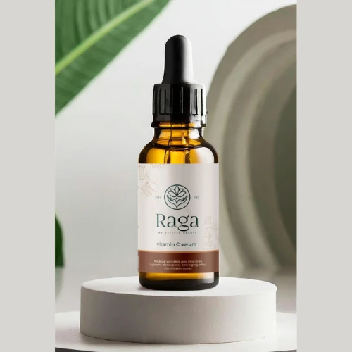
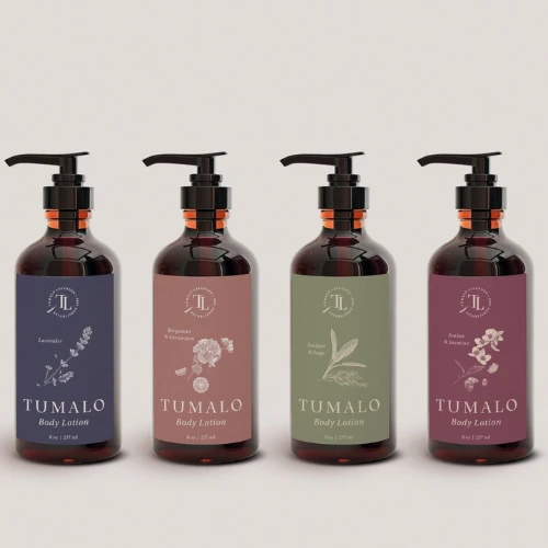
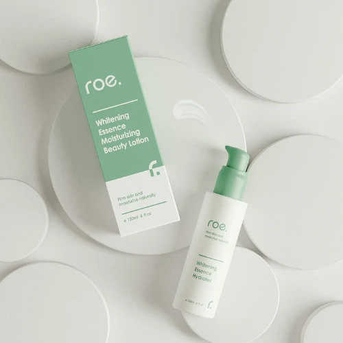
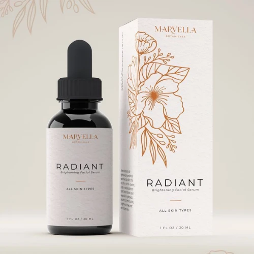
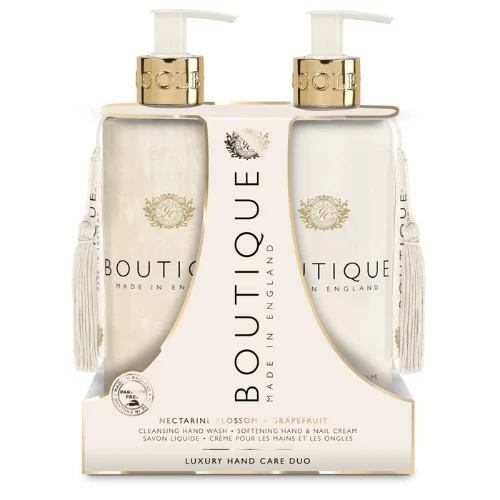
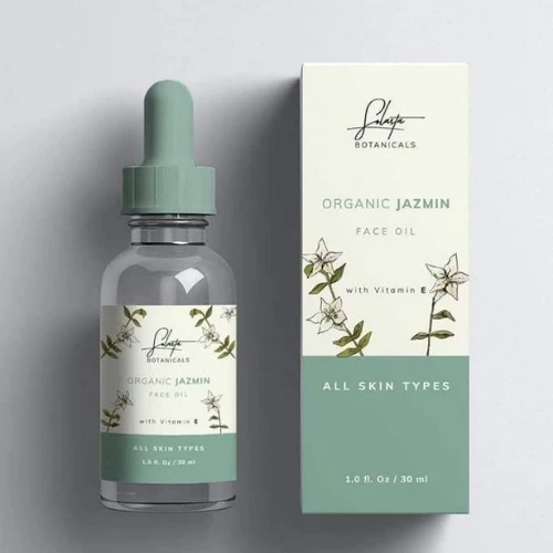
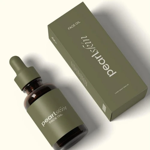
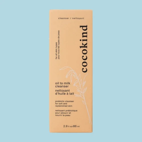
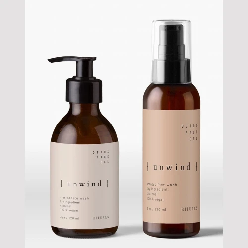
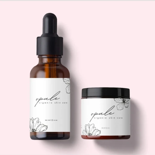
i) Minimalist Label Designs
Minimalist skincare labels are very often misunderstood as “simple” or “easy.” In reality, they are the hardest to execute well. Trust us.
Minimalism relies on restraint. It depends on spacing, hierarchy, proportion, and balance. A clean white background with black typography sounds basic, but if your alignment is slightly off or spacing feels cramped, the entire label immediately loses sophistication!
Transparent or frosted bottles are paired with subtle matte labels to elevate this style even further. The key is not adding more. It is knowing when to stop!
Source: https://in.pinterest.com/
Source: https://in.pinterest.com//p>
Source: https://in.pinterest.com/
Source: https://in.pinterest.com
Source: https://in.pinterest.com/
Source: https://in.pinterest.com//p>
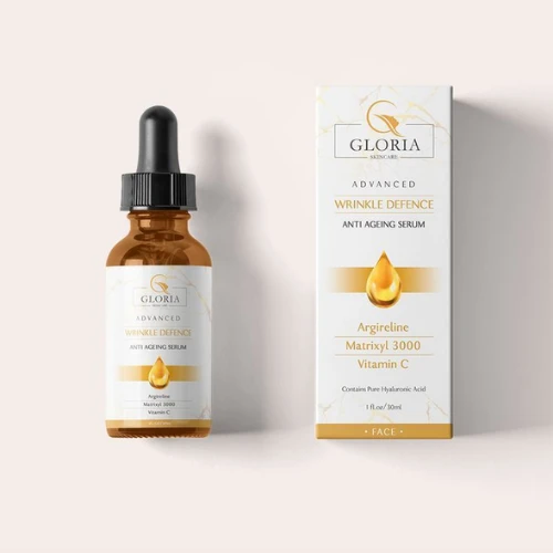
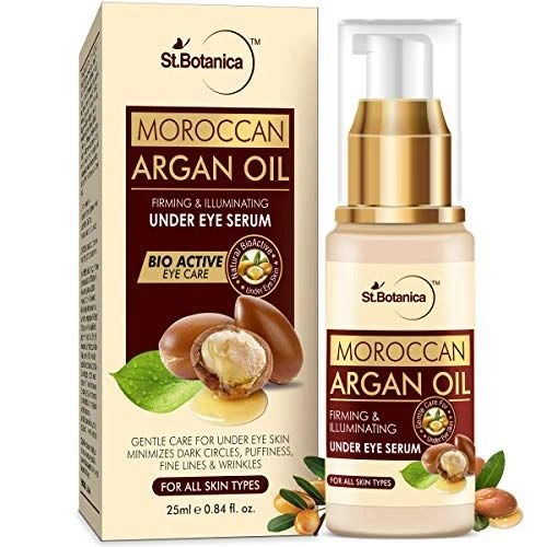
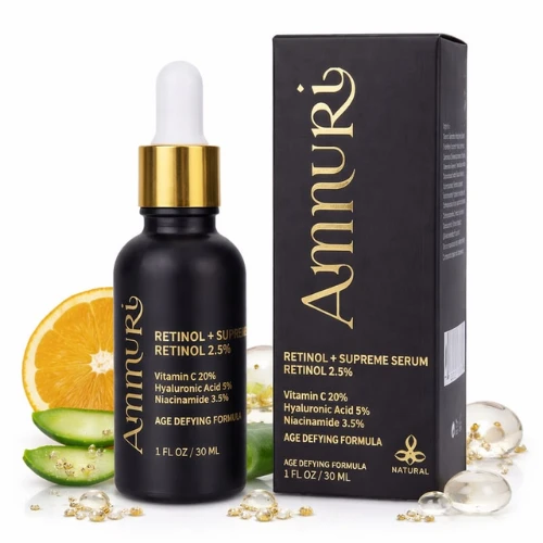
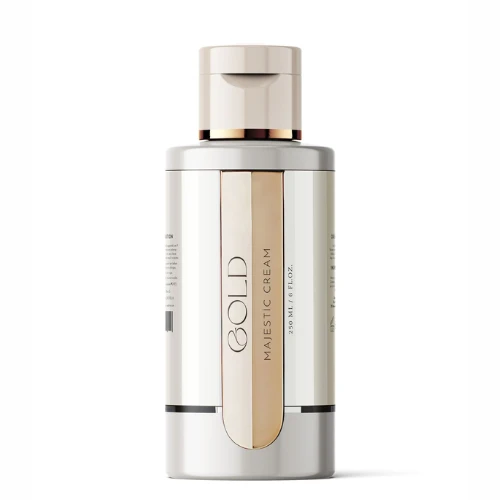
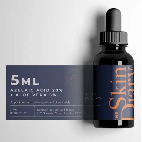
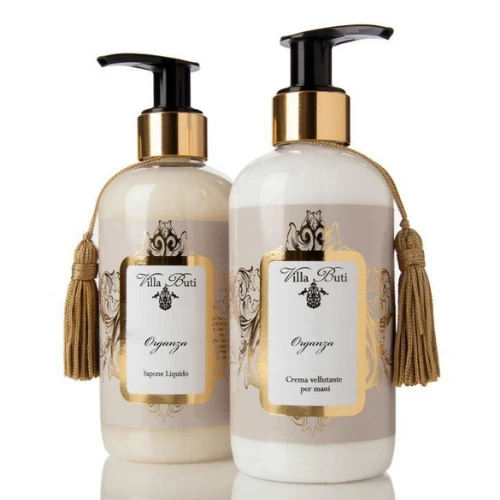
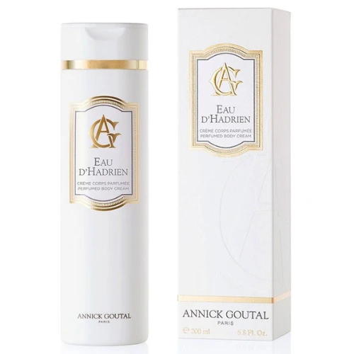
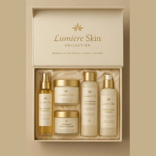
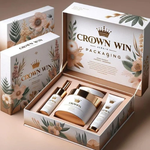
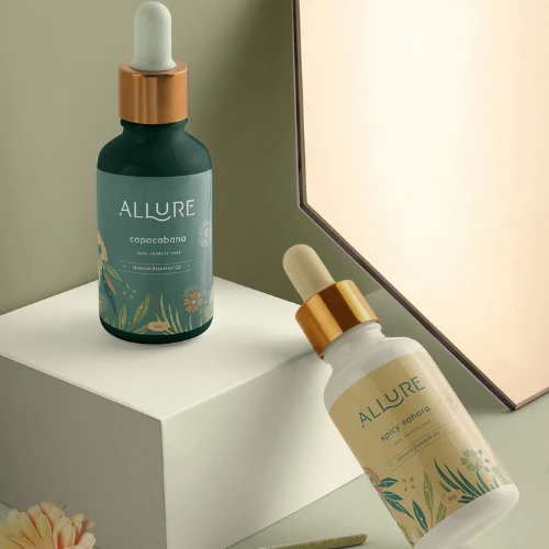
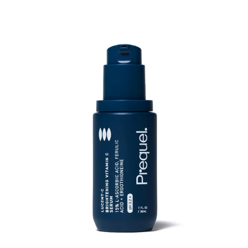
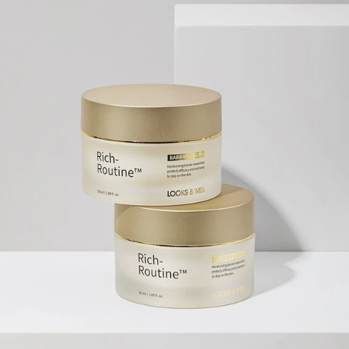
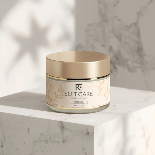
ii) Luxury & High-End Aesthetic Labels
Luxury skincare labels always communicate authority. They don’t really chase attention aggressively. They hold it!
High-end aesthetic labels often use deeper colour palettes like charcoal, emerald, navy, and burgundy paired with metallic accents like gold or silver. However, the elegance doesn’t come from foil alone. It comes from proportion and typography weight.
Luxury brands typically avoid overcrowding the front label with claims. Instead of shouting “10 BENEFITS!” they always focus on brand name, product type, and perhaps one refined descriptor. The assumption is that premium customers always value clarity and quiet confidence!
Luxury is not about decoration. It is all about controlled sophistication. Every element feels deliberate.
Source: https://in.pinterest.com/
Source: https://in.pinterest.com/
Source: https://in.pinterest.com/
Source: https://in.pinterest.com
Source: https://in.pinterest.com/
Source: https://in.pinterest.com/
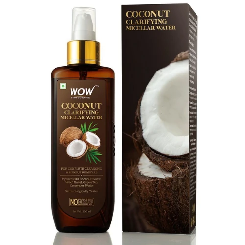
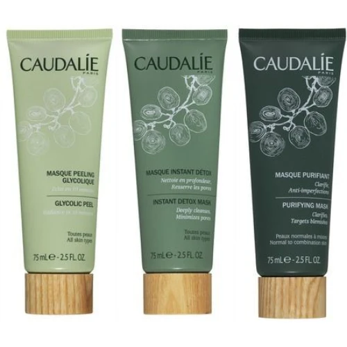
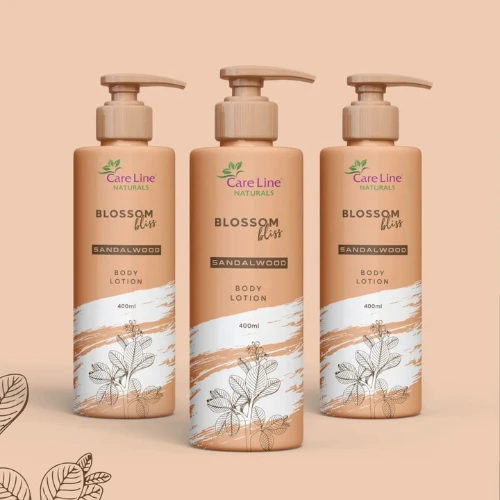
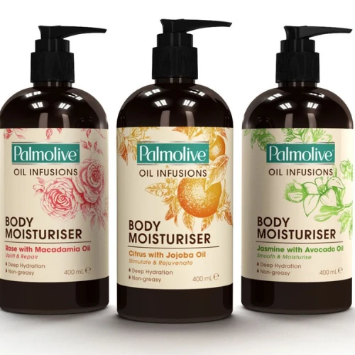
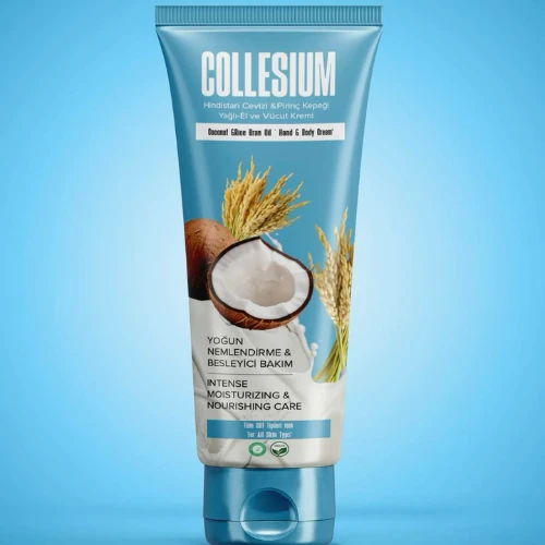
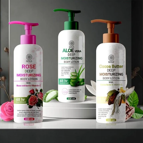
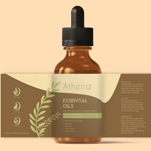
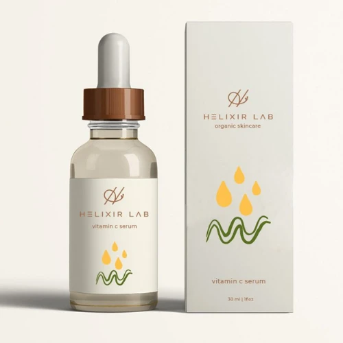
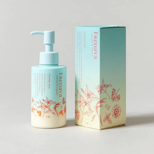
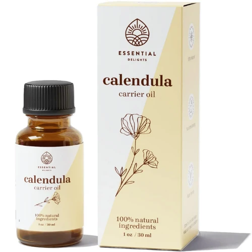
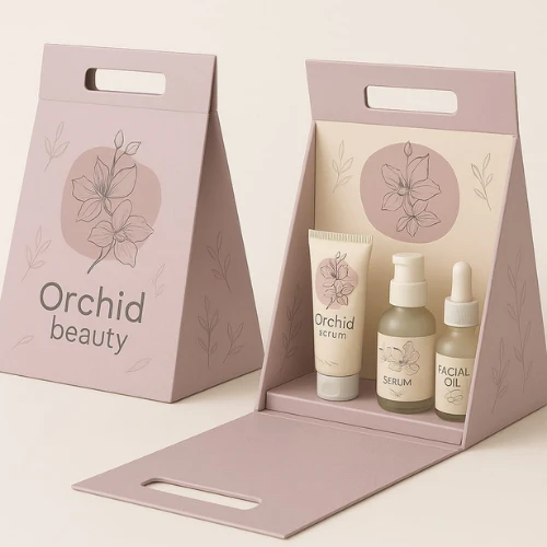
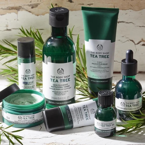
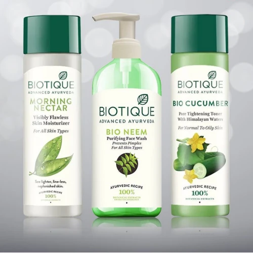
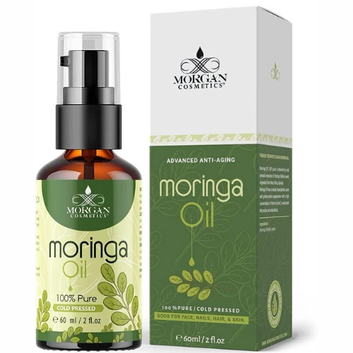
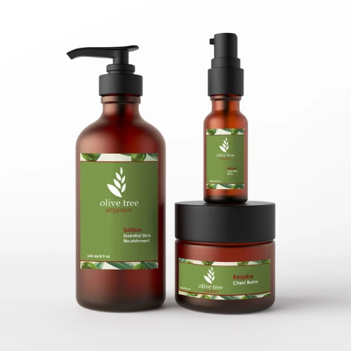
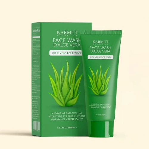
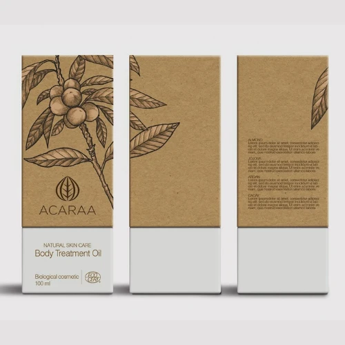
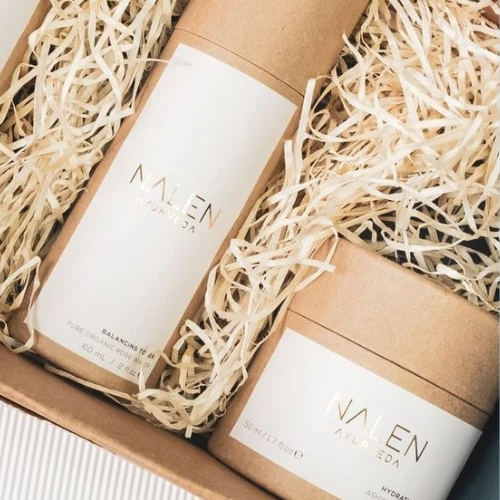
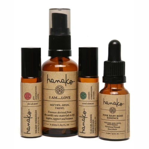
iii) Natural, Organic & Herbal Themes
Natural skincare branding needs to balance authenticity and modernity. If done poorly, it can feel outdated or overly rustic. If done well, it actually feels grounded and trustworthy.
Herbal and organic label designs typically draw from earthy colour palettes like muted greens, warm browns, clay tones, and soft neutrals. Botanical illustrations often appear, but the execution determines whether the label feels premium or homemade.
Texture always plays a subtle but powerful role here. Recycled paper finishes or slightly textured label stocks reinforce sustainability messaging without needing to overstate it.
The language used on these labels often emphasises ingredient sourcing, plant extracts, and traditional formulations. However, clarity must still remain. Too much information on the front can overwhelm the design.
The strongest natural skincare labels feel honest. They don’t overpromise.
Source: https://in.pinterest.com/
Source: https://in.pinterest.com//p>
Source: https://in.pinterest.com/
Source: https://in.pinterest.com
Source: https://in.pinterest.com/
Source: https://in.pinterest.com//p>
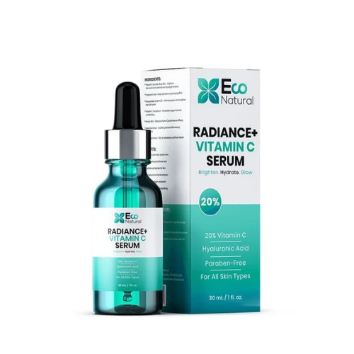
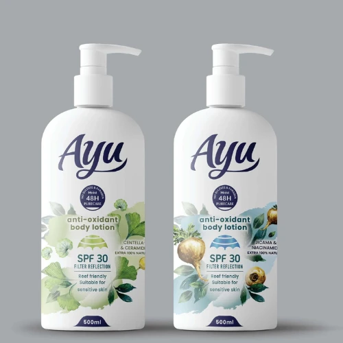
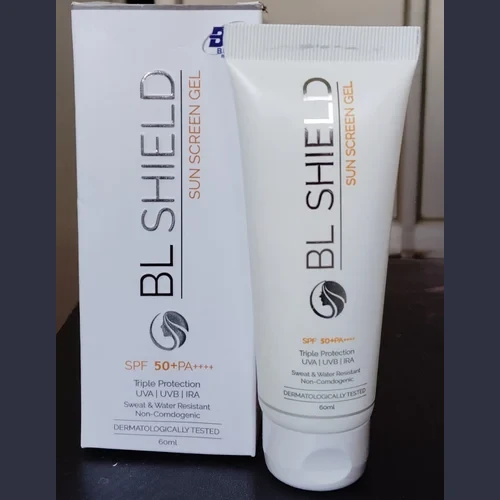
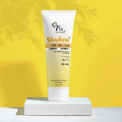
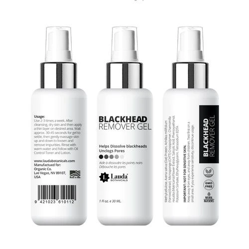
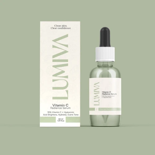
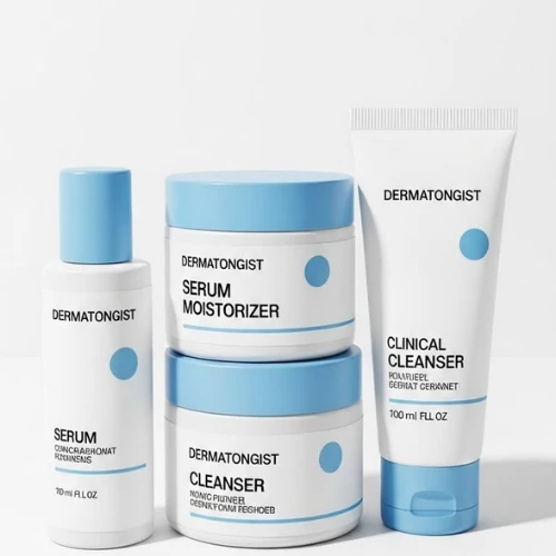
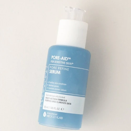
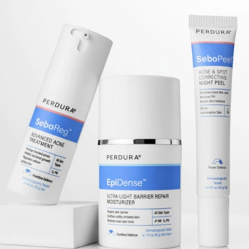
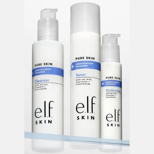
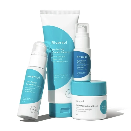
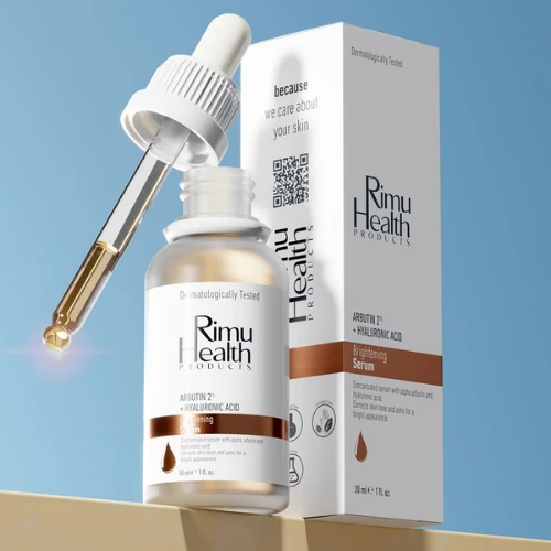
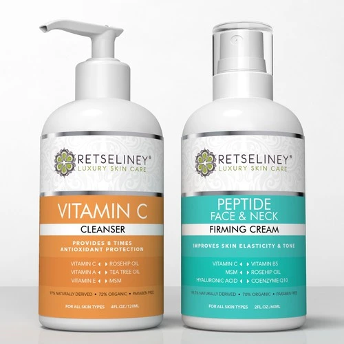
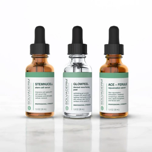
iv) Clinical & Dermatology-Inspired Labels
Clinical skincare design is always built on structure and clarity. This category truly leans heavily into trust-building through precision.
White backgrounds nowadays dominate only because they feel clean and scientific. Accent colours like blue, teal, or grey introduce subtle visual hierarchy. Typography is usually straightforward and highly legible. There is very little decorative styling!
These labels often highlight active ingredient percentages clearly. This appeals to ingredient-conscious consumers who are reading labels carefully and comparing formulations.
Layout becomes extremely important here. Information must flow logically. Active ingredients, skin concerns, and usage directions are presented in organised sections rather than scattered across the surface.
The challenge with clinical design is avoiding a medicinal look. If it feels too pharmaceutical, it can lose emotional warmth. The best brands in this category manage to combine scientific credibility with visual refinement.
Source: https://in.pinterest.com/
Source: https://in.pinterest.com//p>
Source: https://in.pinterest.com/
Source: https://in.pinterest.com
Source: https://in.pinterest.com/
Source: https://in.pinterest.com//p>
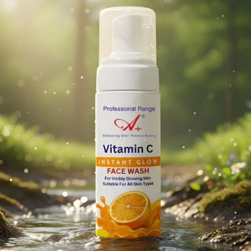
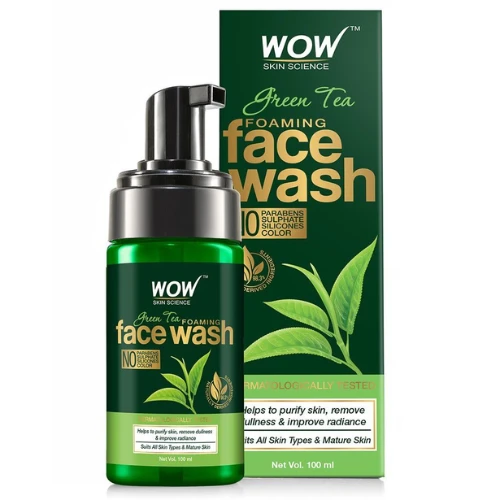
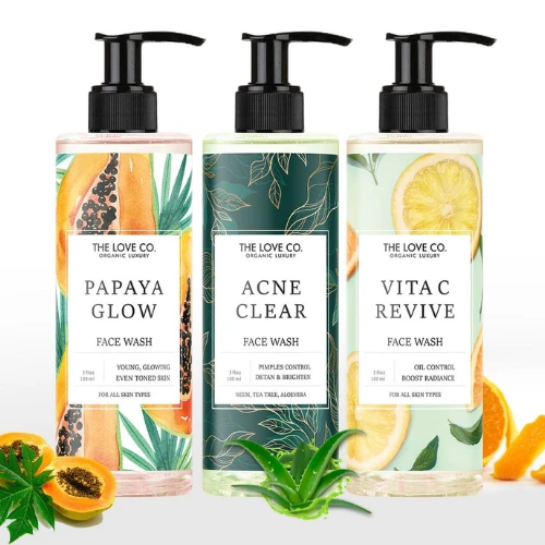
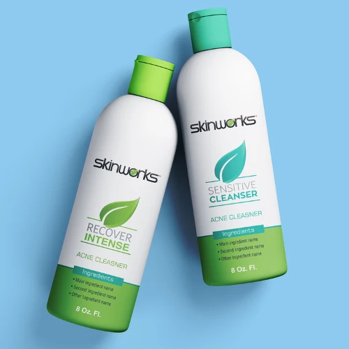
v) Bold & Youthful Label Concepts
Youth-focused skincare brands always operate differently. They prioritise more on personality and relatability!
Bright colours, unexpected typography pairings, and conversational product names create an energetic presence on shelves and social media feeds. This style is super effective for products that are meant to be fun additions to daily routines, such as lip balms, mists, sheet masks, and lightweight cleansers.
However, bold does not really mean chaotic. The strongest youthful labels still maintain hierarchy and readability. The energy comes from colour, confidence, and playful messaging, not from clutter.
Source: https://in.pinterest.com/
Source: https://in.pinterest.com/
Source:https://share.google/TVfmNOA37UscLrJ4O
Source: https://share.google/b9fIMEcPWBj3zBe4r
Source: https://in.pinterest.com/
Source: https://in.pinterest.com/
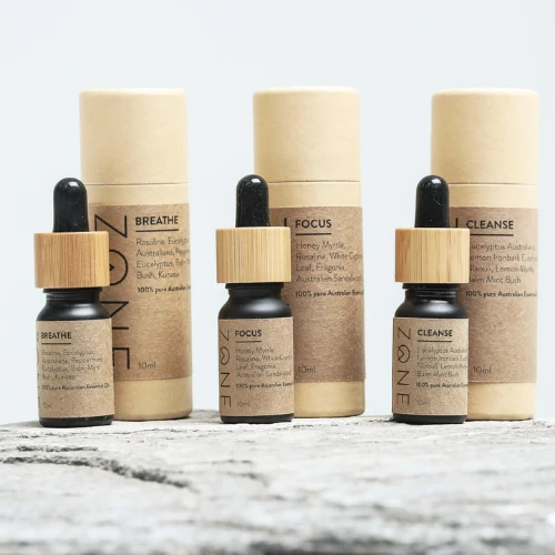
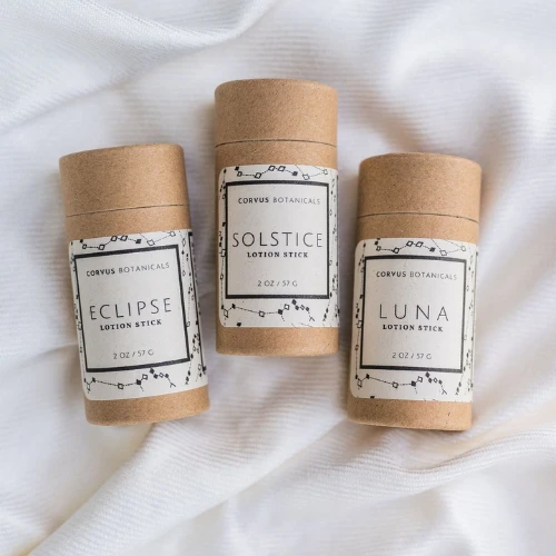
vi) Sustainable & Eco-Friendly Packaging Styles
Sustainable skincare packaging has moved from niche to mainstream. But consumers are increasingly sceptical of vague claims. Your design must always feel genuinely aligned with environmental values.
Eco-friendly label concepts often minimise ink coverage and embrace natural material finishes. Colours remain earthy and muted. Certifications, if applicable, should always be presented clearly but not aggressively!
Transparency builds trust in this category. If your product is refillable, that information should also be communicated clearly on the label. If you use recycled materials, explain it briefly and honestly.
Sustainable design isn’t just visual. It reflects a mindset. When done authentically, customers feel the integrity behind the brand!
Source: https://in.pinterest.com/
Source: https://in.pinterest.com//p>
Source:https://share.google/TVfmNOA37UscLrJ4O
Source: https://in.pinterest.com
Source: https://in.pinterest.com/
Source: https://share.google/KtNbCzwyoNV1Tc9iC/p>
vii) Transparent & Clean Beauty Looks
Clean beauty design often overlaps with minimalism but leans more heavily into transparency, both literally and emotionally.
Clear or frosted packaging paired with subtle typography creates an immediate sense of purity. When customers can see the product texture through the bottle, it builds subconscious trust.
These labels usually use light typography weights and minimal graphic design elements. The overall feeling is gentle and modern.
The challenge here lies in legibility. Light text on clear packaging must be carefully tested under real lighting conditions to ensure readability.
When executed correctly, transparent designs actually feel honest and premium without being loud!
Source: https://in.pinterest.com/
Source: https://in.pinterest.com//p>
Source:https://in.pinterest.com/
Source: https://in.pinterest.com
Source: https://in.pinterest.com/
Source: https://in.pinterest.com/
How to Design a Skincare Label That Actually Sells (Step-by-Step)
Designing a skincare label that looks beautiful is one thing. Designing one that converts, builds trust, and supports long-term brand growth is another.
This process requires clarity, patience, and structure.
Step 1: Define Your Brand Positioning
Before any design work begins, you must always be clear about who you are as a brand.
Are you targeting price-conscious college students or premium urban professionals? Are you positioning yourself as a luxury ritual or an everyday necessity? Are you clinical and science-led or rooted in tradition?
Positioning decisions influence everything here, like your colour palette, typography style, finish selection, tone of voice, and even packaging shape. When your positioning is unclear, labels look confused. When positioning is sharp, design choices become easier and more cohesive.
Step 2: Research Your Competitors and Trends
Competitor research is not about imitation. It is more about identifying patterns and opportunities!
Study what dominates your category visually. Are most brands using white backgrounds? Are pastel palettes oversaturated? Are certain fonts overused? Analyse these carefully.
Then analyse global markets as well. Korean skincare often emphasises soft gradients and clean transparency. French pharmacy brands lean toward clinical clarity. Japanese beauty brands are known for understated minimalism!
Understanding these patterns helps you identify where you can stand apart without feeling alien to customers.
Step 3: Create Mood Boards and Concepts
Before diving into the final artwork, strong brands invest time in visual exploration.
Mood boards surely allow you to experiment with colour systems, typography directions, textures, and layout ideas without really committing too early. You have to try this out. This stage encourages creative freedom while staying aligned with positioning.
Developing two or three clear concept directions and evaluating them objectively prevents rushed decisions. It also ensures alignment between all the founders, designers, and marketing teams before production begins!
Step 4: Prototype and Test Packaging
Digital mockups can surely be deceiving. A design that looks stunning on screen may feel underwhelming when printed.
Printing sample labels and physically applying them to bottles is essential. Observe how the label curves around the container. Check your readability under store lighting. View the product from a distance.
Place it beside your competitors on a shelf. Does it even stand out or disappear? Focus more here.
Step 5: Finalise Your Print-Ready Artwork
Once the design is approved, technical precision becomes critical.
Bleed areas, margin spacing, barcode placement, ingredient compliance, and regulatory font sizes must be handled correctly. Even minor technical errors can result in costly reprints.
Colour calibration for print also matters significantly. What appears vibrant on a screen may print darker or duller if not managed properly.
This final stage is where design meets production discipline. Attention to detail here protects both your budget and your brand reputation! Super important!
Should You DIY Your Skincare Label or Hire Professionals?
If you are testing a small batch, DIY tools may work temporarily.
But if you are truly serious about building a long-term beauty brand, professional label designers bring:
1. Strategic thinking
2. Market insight
3. Technical print expertise
4. Brand consistency across your SKUs
The skincare industry is highly competitive. A generic Canva-style label won’t really survive on shelves next to well-branded competitors.
Good design isn’t an expense. It is an investment in perception!
Final Thoughts:
In skincare, customers judge before they try. Your label builds trust in seconds. It communicates safety, quality, and value instantly!
A strong skincare label will reflect your positioning, feel cohesive across products, balance beauty and clarity and elevate perceived value!
If you are now planning to launch a skincare line and want labels that look shelf-ready, premium, and unforgettable, it’s time to hire the best professionals now! Our experts at DesignerPeople specialise in skincare branding and packaging design that helps beauty brands stand out in competitive markets. From positioning to print-ready execution, their team ensures your label doesn’t just look good. It sells!
Because in beauty, design isn’t only decoration. It’s a strategy!
Author: Anush Malik

Being a strategist’s head and a long term visionary personality aims to achieve excellence in branding, packaging and digital marketing field. My 15 years of design experience and masters degree ais my strength which keeps me motivated and keep me going positively. I have participated in extensive branding design conquests in India, USA, Australia and New Zealand with winning zeal. My objective is to encourage start-ups and hence involves actively in the articles which will act as a productive intake of knowledge for them. Do connect me personally via my LinkedIn and I love to share my expertise with you.