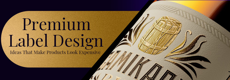
So did you ever pick up a product from the nearest aisle and immediately think, “Wow, this feels so fancy!”
Well, we know that feel. That’s actually the magic of a premium label design.
Your label isn’t just any random sticker. It is now the first impression that your product makes. Whether it’s your gourmet chocolate bar, or some high-end skincare serum, or even a bottle of craft whisky. Every well-designed label out there can quickly make your product feel valuable, trustworthy, and absolutely irresistible!
Premium labels are all about psychology, storytelling, and the right touch of elegance. These aspects tell your customer: “This is worth it, and here’s why.”
In a market flooded with countless options, your label design can actually be the ultimate differentiating factor between a casual glance and a purchase. So, buckle up. It’s high time now. Read this ultimate guide to designing labels that whisper luxury and make your products stand out!
Table of Contents
What Makes a Label Feel Like a Million Bucks?
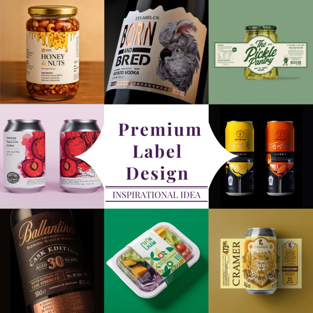
A premium label design is like a quiet conversation between your product and the person picking it up. So before they even read a word, it is already telling their mind, “This is something special.” Let’s break this down further!
a) Fonts & Breathing Space
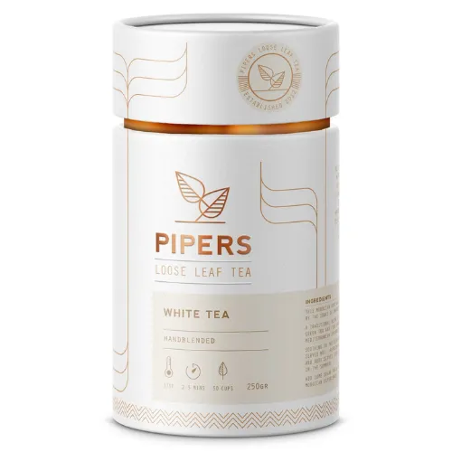
Elegant serif or clean, modern sans-serif fonts instantly feel refined. But when text is crammed together, it looks super cheap and rushed. White space always gives your label design room to shine and makes everything feel calm, confident, and premium!
b) Colours That Set the Mood
Shades like gold, black, deep green, navy, and soft pastels naturally feel rich and classy if you observe carefully. They create a sense of trust and luxury. But loud neon colours can indirectly feel more playful or mass-market than high-end!
c) Touch Matters Too
Finishes such as your matte textures, embossing, soft-touch lamination, or subtle metallic foils can add that extra “feel good in the hand” factor! When your label feels nice to touch, the product automatically feels way more valuable.
d) Keeping It Simple
Premium design doesn’t try too hard. Fewer elements, clear hierarchy, and thoughtful placement are the right way to go here!
Pro Tips From Reputed Brands That Know How to Do Premium Right
If you have ever held a bottle of artisanal wine, a luxury face cream, or a gourmet chocolate bar, you have probably also wondered, “How do they make it look so effortlessly classy?”
Well, the truth is, premium brands follow certain design secrets that make their labels instantly appealing. Here’s how you can do it too:
1. Match the Label to Your Product’s “Vibe”
Every product has its own personality, just like people do. And your labels? Well, the same applies here!
You wouldn’t really show up to a wedding in gym clothes, right? Same logic here.
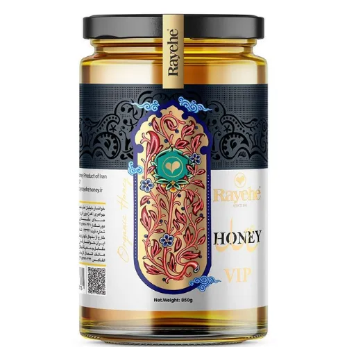
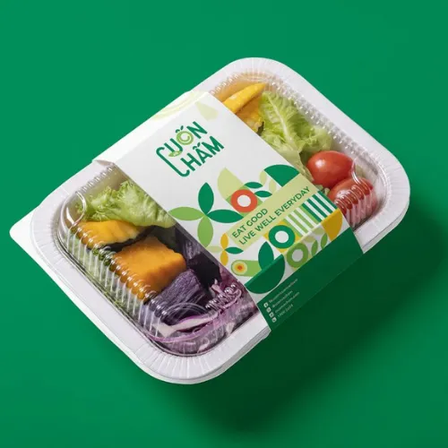
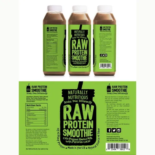
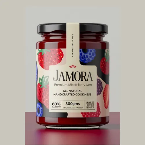
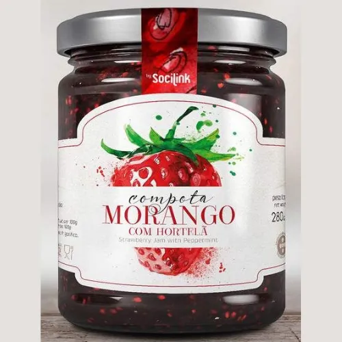
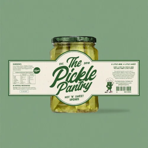
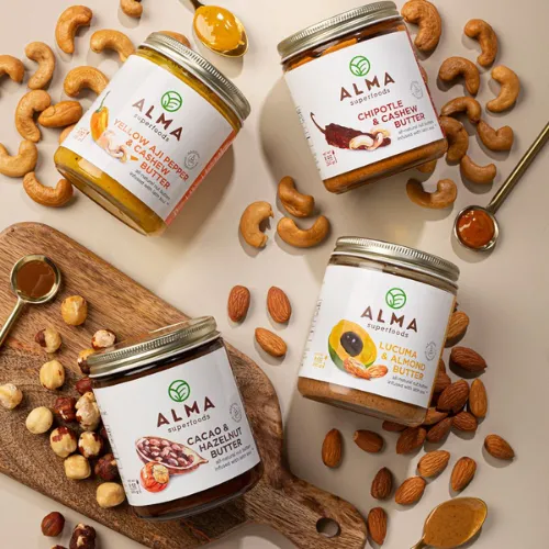
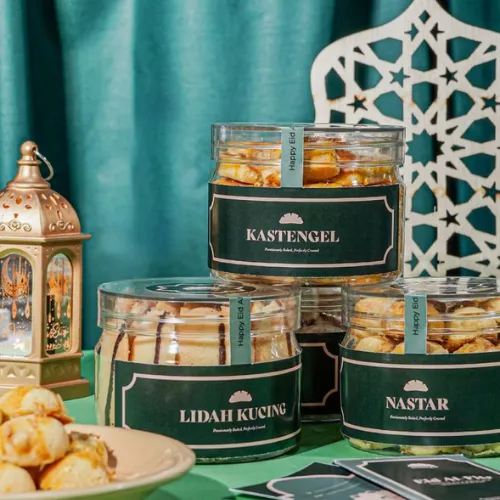
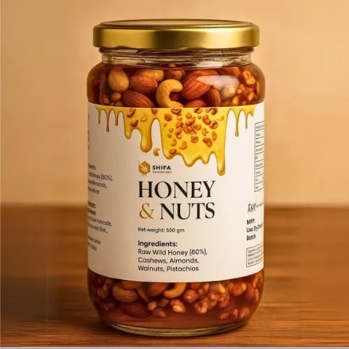
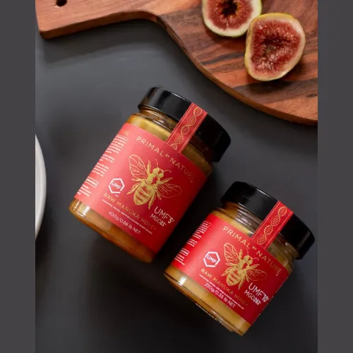
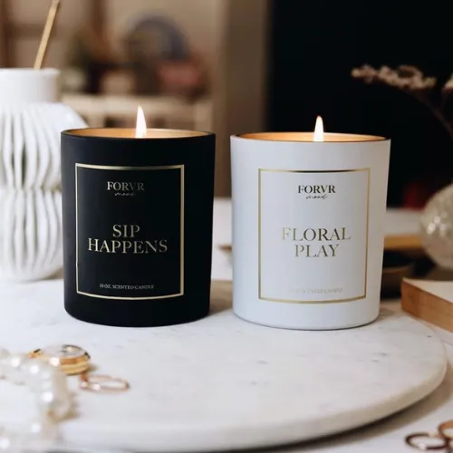
Gourmet foods love rich, cosy colours. Think of some deep browns, warm, earthy shades, and clean layouts that make you feel like you are about to treat yourself. A dark chocolate bar with a cocoa-toned background and a hint of gold. Simple, but oh-so-indulgent!
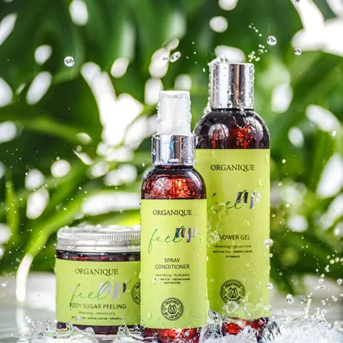
Skincare and beauty products usually keep things soft and calm. Pastels, lots and lots of breathing space, and smooth lines give that fresh, clean, spa-like feel.
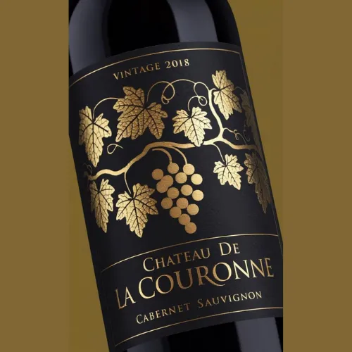
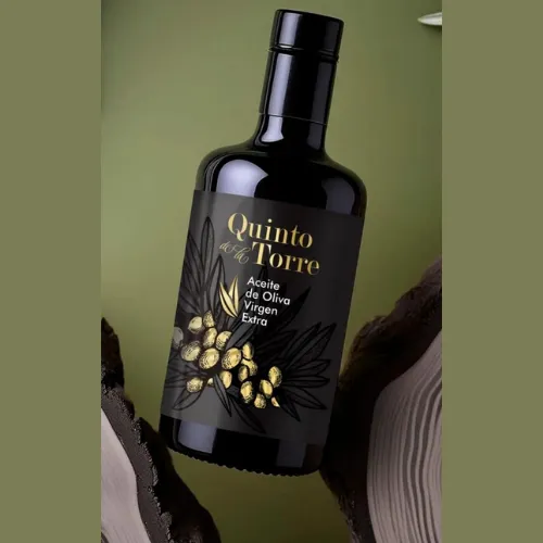
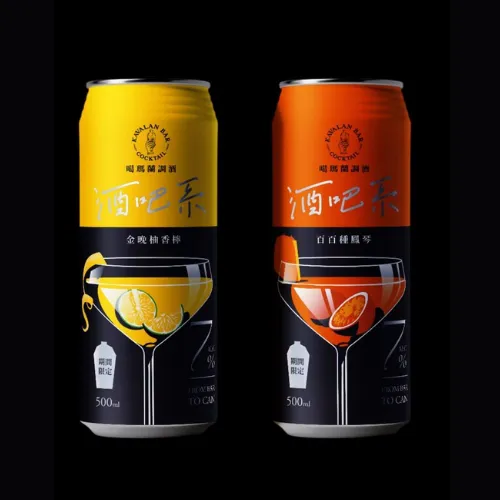
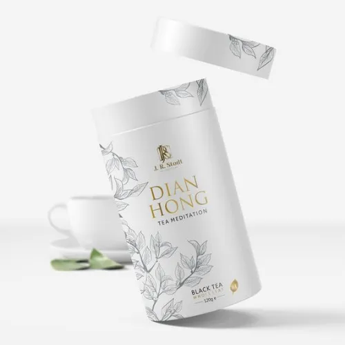
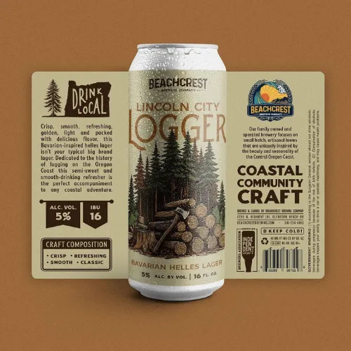
And what about liquor and beverages? Deep, bold colours, embossed details, and classy fonts make your bottle look like it has an interesting story, some age, and a whole lot of character. Basically, it looks like something you would proudly show off on your shelf!
When your label matches these visual moods, customers instantly get it. The product looks confident, premium, and totally aware of its own worth!
Source: https://in.pinterest.com/
Source: https://in.pinterest.com//p>
Source: https://in.pinterest.com/
Source: https://in.pinterest.com
Source: https://in.pinterest.com/

Source: https://in.pinterest.com//p>
Source: https://in.pinterest.com/
Source: https://in.pinterest.com
2. Keep Regulations from Killing the Luxury Feel
Let’s be honest. No one really picks up a product because they are excited to read the ingredients list. But since it has to be there, the trick is to make it behave and not steal the spotlight!
Instead of big, ugly text blocks screaming for attention, tuck the regulatory stuff neatly into soft colour panels, subtle borders, or clean side sections. Why not blend it into creative design elements so it actually feels like part of the layout, not an afterthought? That’s another smart move!
This way, your product surely looks polished, and the customer still gets that smooth, premium feel while keeping the regulations in check! So important!
Source: https://in.pinterest.com/
Source: https://in.pinterest.com//p>
Source: https://in.pinterest.com/
Source: https://in.pinterest.com
Source: https://in.pinterest.com/
Source: https://in.pinterest.com//p>
Source: https://in.pinterest.com/
Source: https://in.pinterest.com
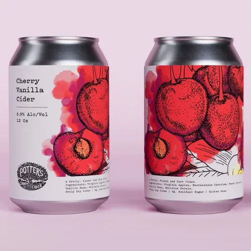
3. Customise Based On Your Packaging Type
A label that looks perfect on paper may eventually fall flat on your glass bottle or a plastic jar. A very common issue.
Well, glass, for example, usually has metallic foils, matte finishes, and subtle textures that look extra gorgeous when light hits them.
Flexible pouches, on the other hand, might get squeezed, folded, and twisted quickly, so the design always needs to stay readable and pretty even when the pack isn’t perfectly flat.
Tins and cans have curves, so you need to plan how the design wraps around without cutting off important elements!
That’s why mockups are your best friend here.
Always see your label on the actual bottle, jar, or pouch before finalising it for the consumers. Very important! It actually helps you catch things like tiny text, weird alignment, or colours that looked great on screen but look dull in real life. Real-world testing saves you from possible real-world embarrassment!
Source: https://in.pinterest.com/
Source: https://in.pinterest.com//p>
Source: https://in.pinterest.com/
Source: https://in.pinterest.com
Source: https://in.pinterest.com/
Source: https://in.pinterest.com//p>
Source: https://in.pinterest.com/
Source: https://in.pinterest.com
4. Tell Your Story Without Overcrowding
A premium label is more like a teaser trailer for your brand. Here you need to use only a few powerful visuals, a couple of well-chosen words, and some elegant icons. Stay assured that this can say more than a whole paragraph ever could!
Highlight your star ingredients, your key benefits, or what makes you special using subtle badges or small illustrations!
The ultimate goal is to make people feel the quality through your label. Let the design do all the talking for your brand. When the layout is clean and the elements are thoughtfully placed, your product’s story surely comes across naturally to them.
Source: https://in.pinterest.com/
Source: https://in.pinterest.com//p>
Source: https://in.pinterest.com/
Source: https://in.pinterest.com
Source: https://in.pinterest.com/
Source: https://in.pinterest.com//p>
Source: https://in.pinterest.com/
Source: https://in.pinterest.com
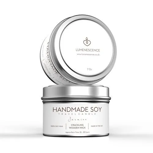
5. Pick Your Finishes Very Carefully
Foil, embossing, soft-touch, glossy, matte. All of these look super tempting to use everything because, well, everything looks cool. But premium design is all about being restrained.
One or two special finishes used smartly can look far more luxurious than throwing the whole sample book at your label!
A subtle gold foil logo, a gently embossed brand name, or a velvety matte texture can instantly elevate the look. Confidence always reads as premium!
Source: https://in.pinterest.com/
Source: https://in.pinterest.com//p>
Source: https://in.pinterest.com/
Source: https://in.pinterest.com
Source: https://in.pinterest.com/
Source: https://in.pinterest.com//p>
Source: https://in.pinterest.com/
Source: https://in.pinterest.com
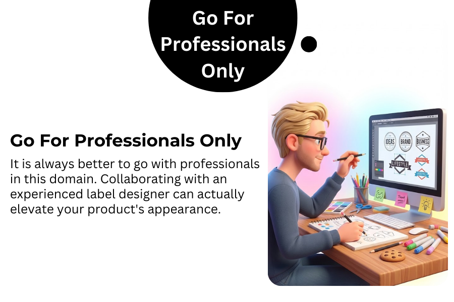
6. Go For Professionals Only
It is always better to go with professionals in this domain. Collaborating with an experienced label designer can actually elevate your product’s appearance. Trust us. Professionals always understand the right balance between design, print limitations, packaging materials, and market trends.
They already know what will work in stores and online, ensuring that your product not only looks luxurious in photos but also stands out on the shelf. Let us remind you that this additional experience can save you from so many possible label design errors in the future!
Premium Label Inspiration Across Industries
So here are some good ideas to get inspired by for your next label!
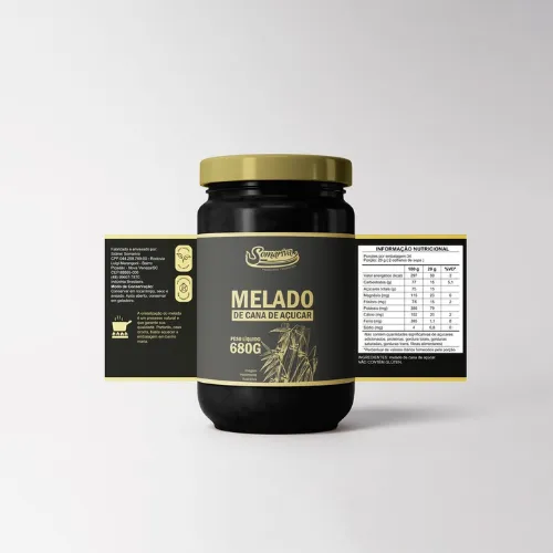
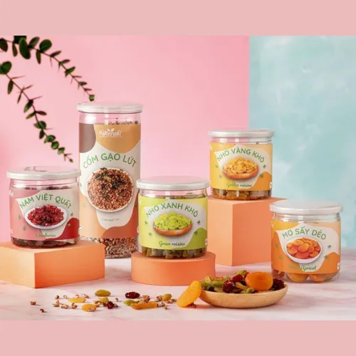
a) Fancy Food & Gourmet Goodies
Why not try this? A dark chocolate bar wrapped in matte black with a small gold-foiled logo and classy, no-fuss typography. Already feels like a treat, right?
What about a truffle oil bottle in deep green glass with embossed text and tiny, elegant icons? So premium! Such labels should always look rich and indulgent even before the first bite.
Source: https://in.pinterest.com/
Source: https://in.pinterest.com//p>
Source: https://in.pinterest.com/
Source: https://in.pinterest.com
Source: https://in.pinterest.com/
Source: https://in.pinterest.com//p>
Source: https://in.pinterest.com/
Source: https://in.pinterest.com
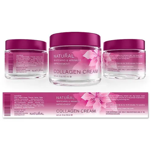
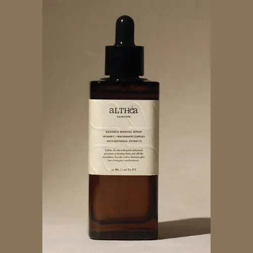
b) Luxe Beauty & Skincare
Skincare labels should always feel premium when everything feels calm, clean, and a little bit fancy. Soft pastel or muted shades, lots and lots of white space, and velvety soft-touch labels work like magic here. Why not try some frosted glass serum bottles, minimal text, a gently embossed logo, and delicate line drawings? Surely it will transform the bottle into something that belongs in a high-end spa, not just your bathroom shelf!
Source: https://in.pinterest.com/
Source: https://in.pinterest.com//p>
Source: https://in.pinterest.com/
Source: https://in.pinterest.com
Source: https://in.pinterest.com/
Source: https://in.pinterest.com//p>
Source: https://in.pinterest.com/
Source: https://in.pinterest.com
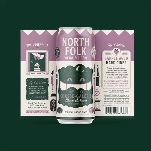
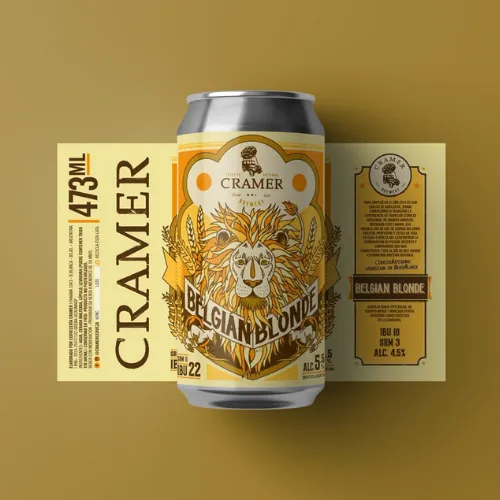
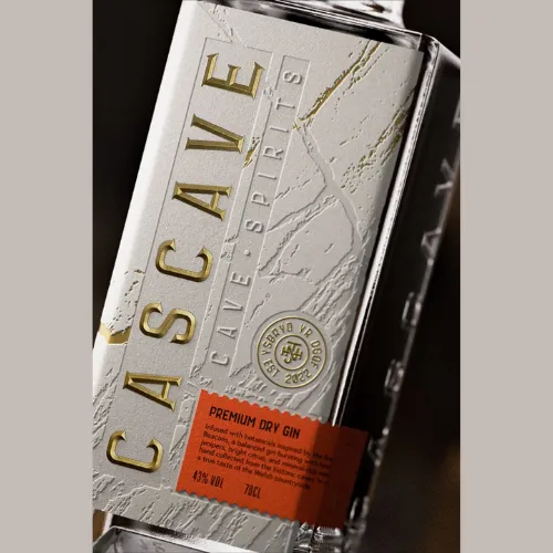
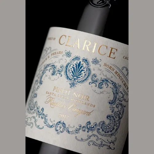
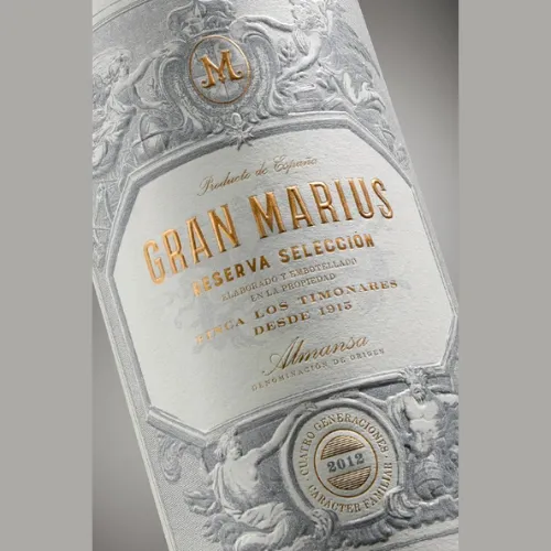
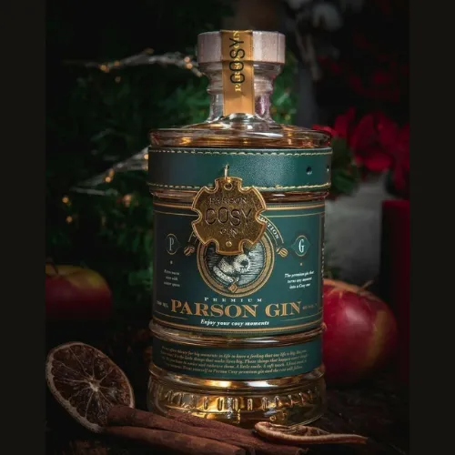
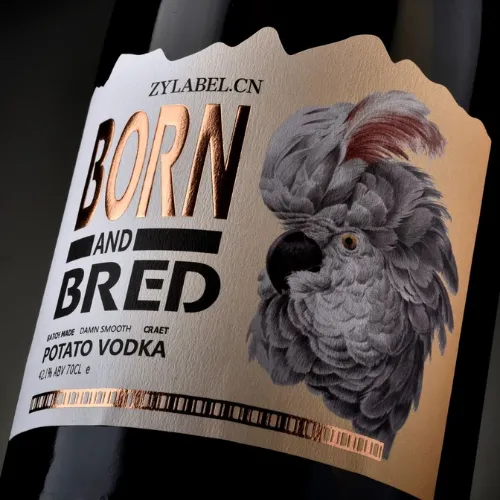
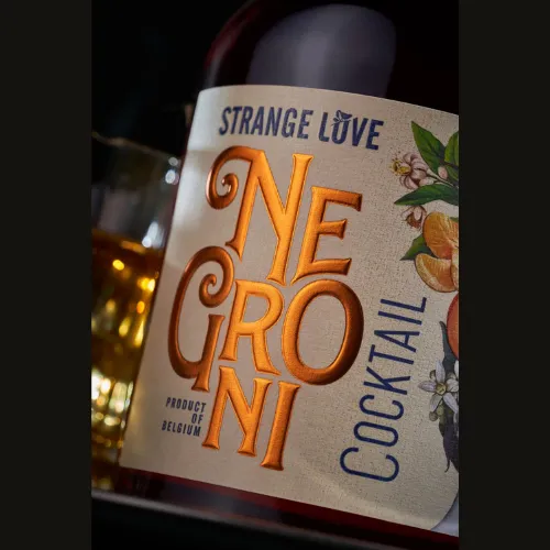
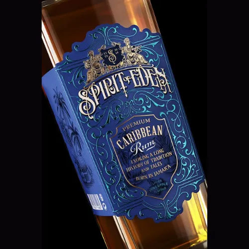
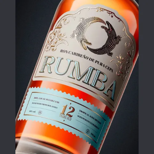
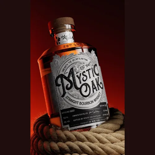
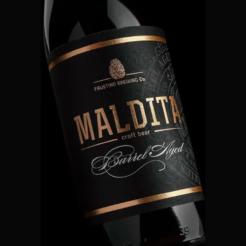
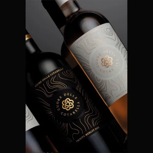
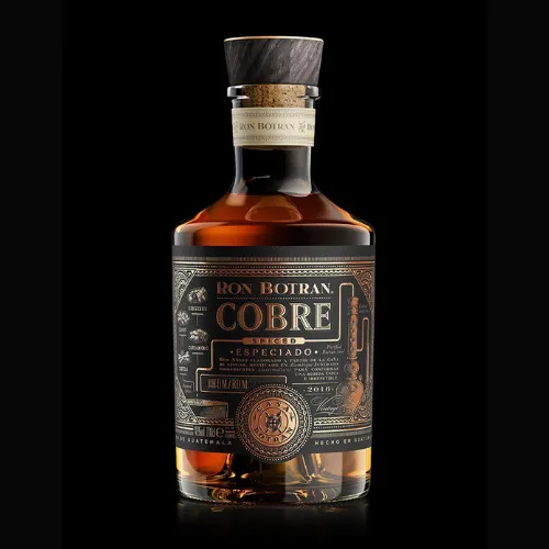
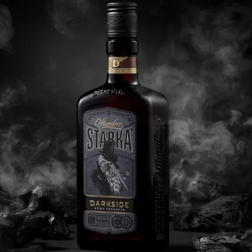
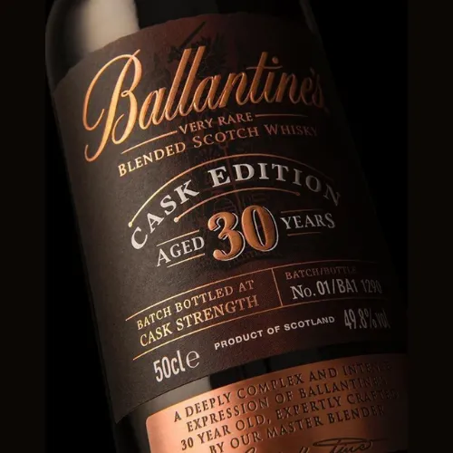
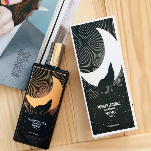
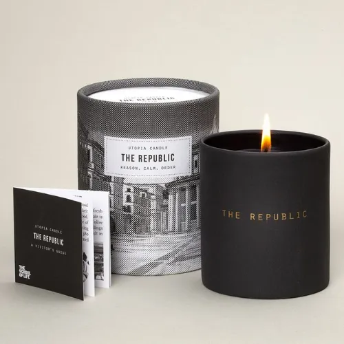
c) Alcohol & Craft Beverages
Whisky, wine, craft beer. All of these love deep colours, metallic foils, and textured finishes like embossing make bottles look rich and collectable. Wine labels with matte paper, flowing calligraphy-style fonts, and subtle vineyard illustrations instantly feel classy. It is not just a drink anymore. It feels like an experience waiting to be opened!
Source: https://in.pinterest.com/
Source: https://in.pinterest.com//p>
Source: https://in.pinterest.com/
Source: https://in.pinterest.com
Source: https://in.pinterest.com/
Source: https://in.pinterest.com//p>
Source: https://in.pinterest.com/
Source: https://in.pinterest.com
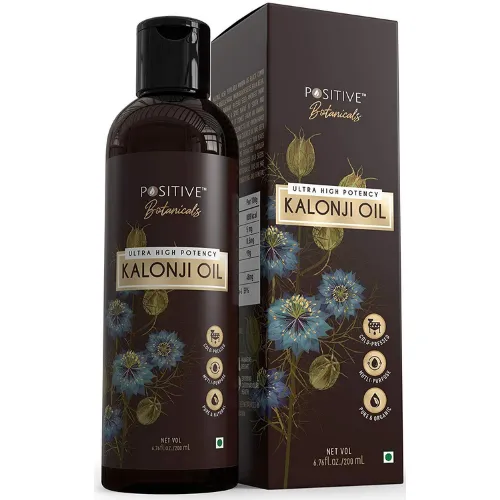
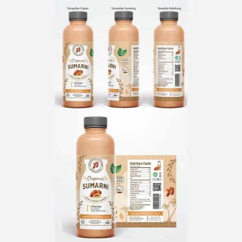
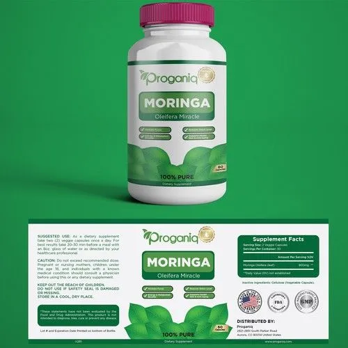
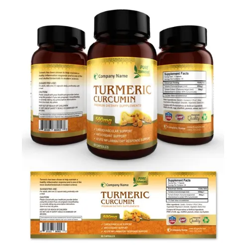
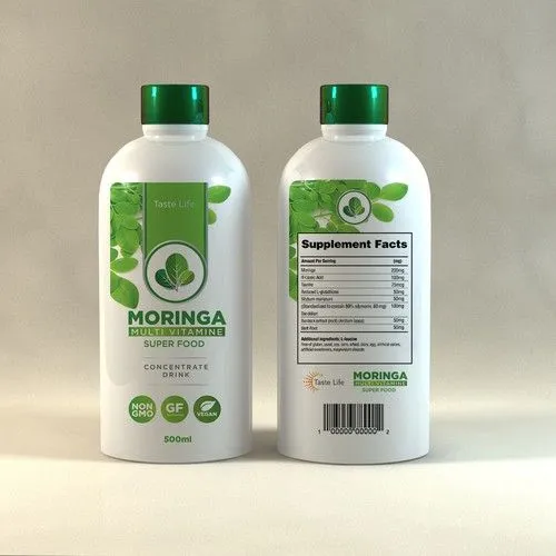
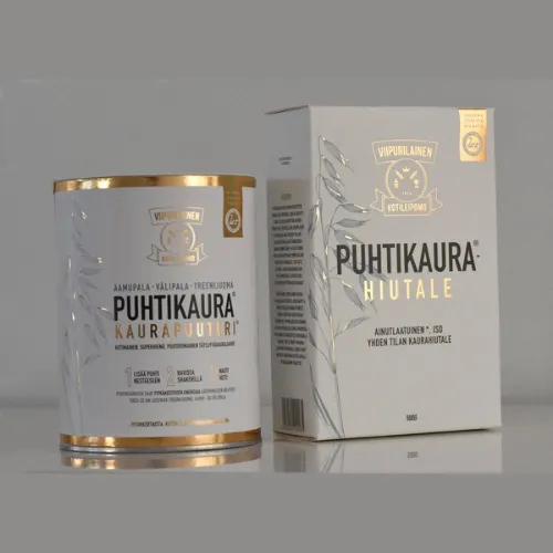
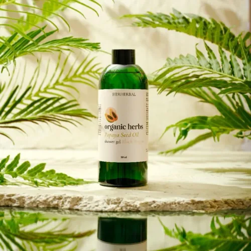
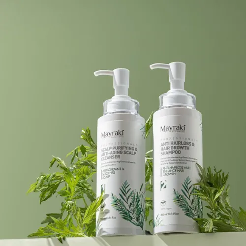
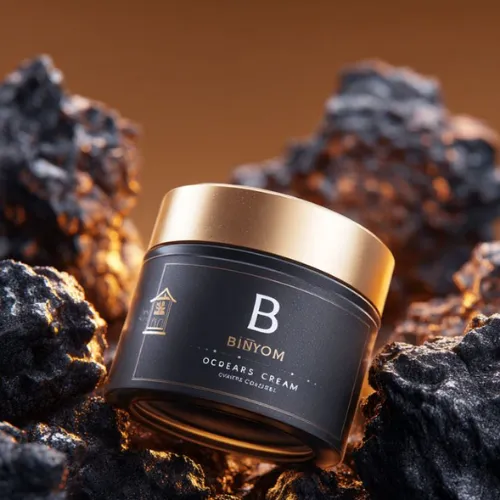
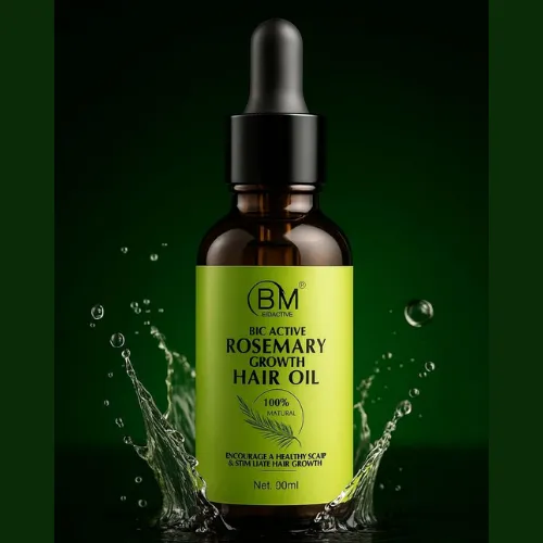
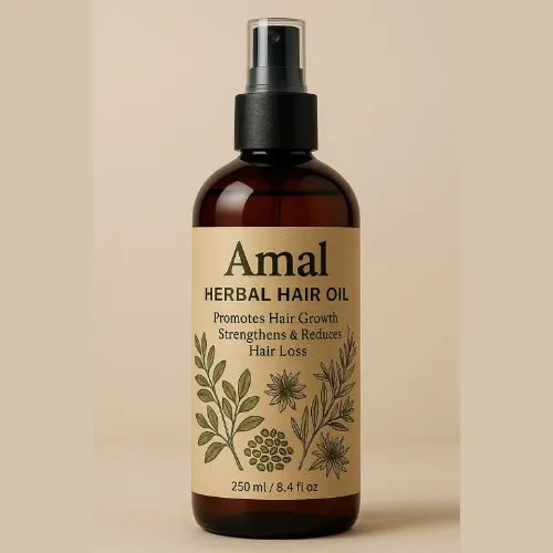
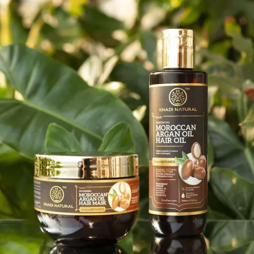
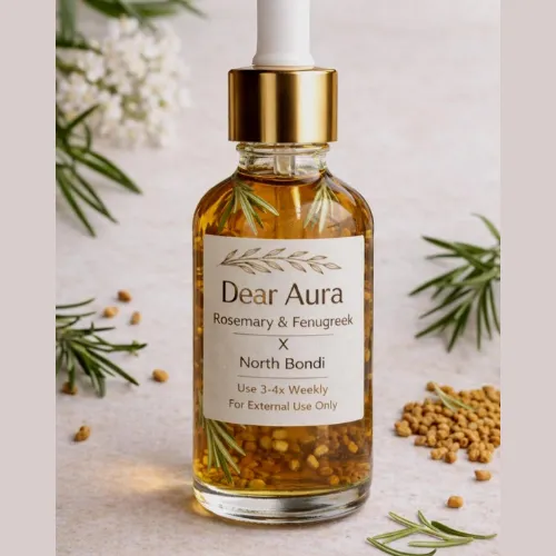
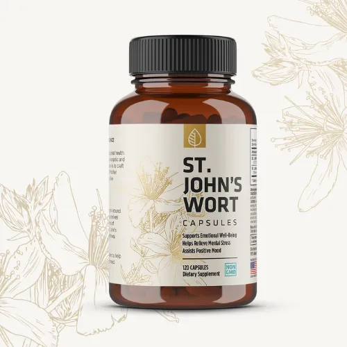
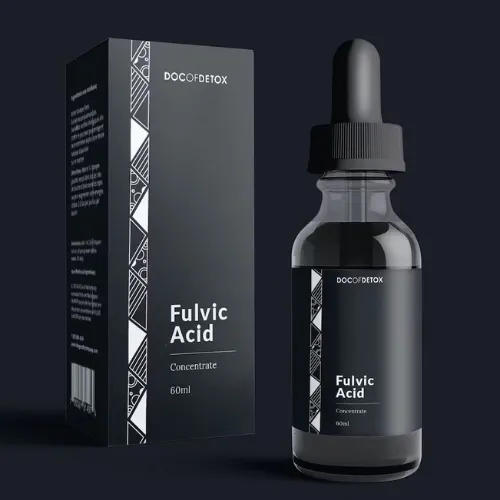
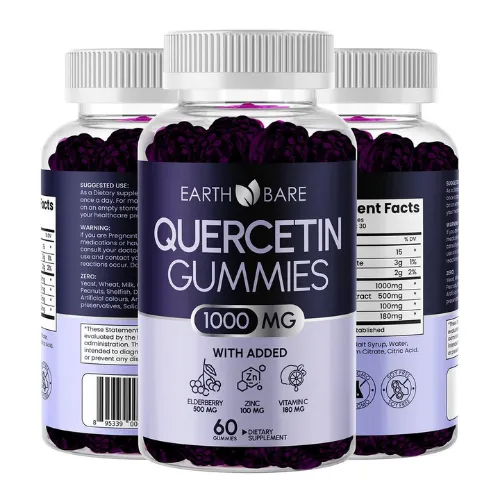
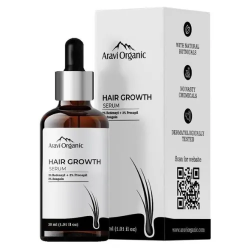
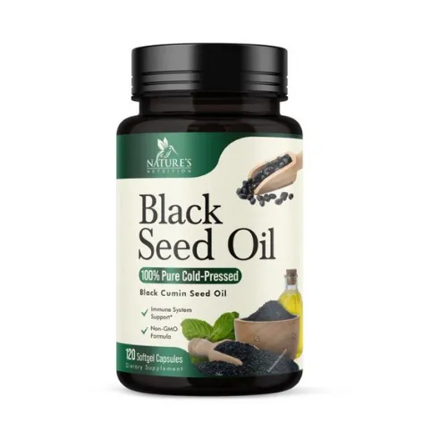
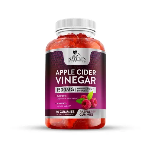
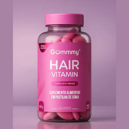
d) Health, Wellness & Ayurveda Products
Here, the look has to be pure but premium. Earthy colours, simple layouts, soft natural textures, and botanical illustrations create that perfect balance of trust and elegance. The packaging design should feel like calm in a bottle. Something you would totally expect to see in a luxury spa or wellness retreat, not just another shelf in the pharmacy!
Source: https://in.pinterest.com/
Source: https://in.pinterest.com//p>
Source: https://in.pinterest.com/

Source: https://in.pinterest.com
Source: https://in.pinterest.com/
Source: https://in.pinterest.com//p>
Source: https://in.pinterest.com/
Source: https://in.pinterest.com
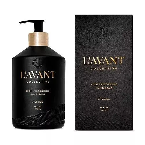
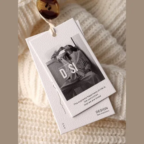
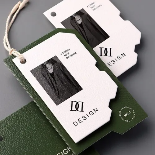
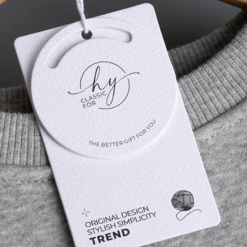
e) Fashion, Lifestyle & Home Décor
In this world, it is all about looking effortlessly stylish.
Here, you need to have clean fonts, super strong contrast, subtle metallic touches, and highly embossed logos that can quickly turn any ordinary product into something absolutely boutique-worthy. Your goal is to make the product feel curated, not factory-made.
Source: https://in.pinterest.com/
Source: https://in.pinterest.com//p>
Source: https://in.pinterest.com/
Source: https://in.pinterest.com
Source: https://in.pinterest.com/
Source: https://in.pinterest.com//p>
Premium Labels = Higher Sales. But how?
Think about it.
The moment someone picks up a product with a classy, well-designed label, their brain already goes, “Hmm… This looks good. This must be good.” It’s just how we are wired. We judge by what we see first. If it looks premium, we assume the quality matches too. Simple as that!
A clean, good-looking label shows that the brand cares about details. And when a brand cares about these small things like design, we automatically trust them with the bigger things too, right? Like what’s inside the pack!
In a store full of so many similar-looking products fighting for attention, a polished label surely feels like a calm and confident choice!
There is also an emotional side to it. People love buying things that actually feel special. A beautiful label can always make your chocolate bar feel like a treat, or a face serum feel like a little luxury ritual.
Isn’t this why we don’t really mind paying extra for the best artisanal chocolates or boutique skincare. Even before trying them, these products already feel worth it!
And let’s not forget trust. When the label design is clear, the information is always easy to read, and everything looks so thoughtful as a brand. This also reduces potential doubt within the consumer’s mind. They feel safe choosing it. Over time, this confidence turns into repeat purchases, recommendations to friends, and even those “Had to share this!” posts on Instagram!
So yes, a premium label isn’t just only about looking pretty. It is now your brand’s first impression, your silent salesperson, and your trust-builder. All rolled into this one good-looking piece of design!
Conclusion:
Make your next label firm, confident, and unforgettable for the consumers. Do not compromise. Right from typography and colour psychology to finishes and packaging considerations, every tiny detail counts here. Whether you are in the food, beauty, beverages, wellness, or lifestyle industry, investing in a thoughtful, professional label design is one of the smartest moves for long-term brand value!
If you really want your products to radiate luxury, attract more sales, and build lasting trust, it’s finally time to collaborate with expert label designers from Designerpeople who know how to translate your brand’s story into a visual masterpiece. Thus, don’t wait any further. Get in touch with our expert designers at DesignerPeople today and watch your products transform into a bestseller!
Author: Anush Malik

Being a strategist’s head and a long term visionary personality aims to achieve excellence in branding, packaging and digital marketing field. My 15 years of design experience and masters degree ais my strength which keeps me motivated and keep me going positively. I have participated in extensive branding design conquests in India, USA, Australia and New Zealand with winning zeal. My objective is to encourage start-ups and hence involves actively in the articles which will act as a productive intake of knowledge for them. Do connect me personally via my LinkedIn and I love to share my expertise with you.