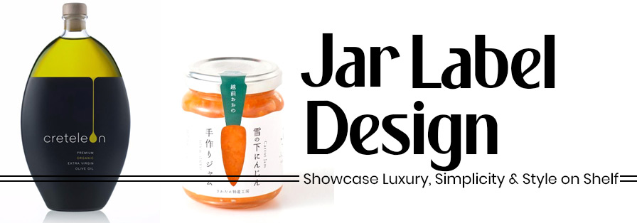
Ever stood in a store aisle, staring at the massive rows of jars, and found yourself instantly drawn to just one? Well, chances are, it wasn’t just the product inside, but the label that made you actually pause!
Whether it’s a basic jar of organic honey, artisanal pickles, or your luxe body butter, the jar label design is surely your silent salesperson. And with shelf competition hotter than ever, it is now the ultimate design on that label that turns a curious eye into a confident purchase!
So today, we are finally diving deep into what makes jar labels so irresistibly powerful, and we have rounded up 171+ stunning jar label designs that are sure to give your own brand a stylish edge.
Table of Contents
Why Jars and Labels Are a Match Made in Shelf Heaven?
Jars are super practical, premium, and downright charming when strategically paired with a great label design. Here’s more to it:
a) Easy to Label, And Easy to Stack
With jars, especially glass or PET ones, the surface is always super smooth, rigid, and forgiving. That means label application is usually seamless, and they stack neatly on shelves (or kitchen counters), looking oh-so-organised!
Source: https://in.pinterest.com/
Source: https://in.pinterest.com//p>
Source: https://in.pinterest.com/
Source: https://in.pinterest.com
b) One Jar, So Many Possibilities
From food to beauty to wellness, jars aren’t picky. A cosmetic brand can use the same jar shape as a gourmet jam company, just dressed differently. This versatility across industries makes jars the MVPs of packaging!
Source: https://in.pinterest.com/
Source: https://in.pinterest.com//p>
Source: https://in.pinterest.com/
Source: https://in.pinterest.com
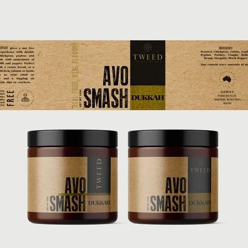
c) Designed for Premium Looks (and Sustainability)
Thanks to their shape and surface, you can go wild with design finishes: metallic foils, clear backs for a “floating text” effect, textured papers, and even compostable materials for that eco-chic vibe.
Source: https://in.pinterest.com/
Source: https://in.pinterest.com
Types of Products Packaged in Jars with Perfect Label Designs
We are all about design here, but the kind of product inside your jar really does influence the label. Let’s break down further.
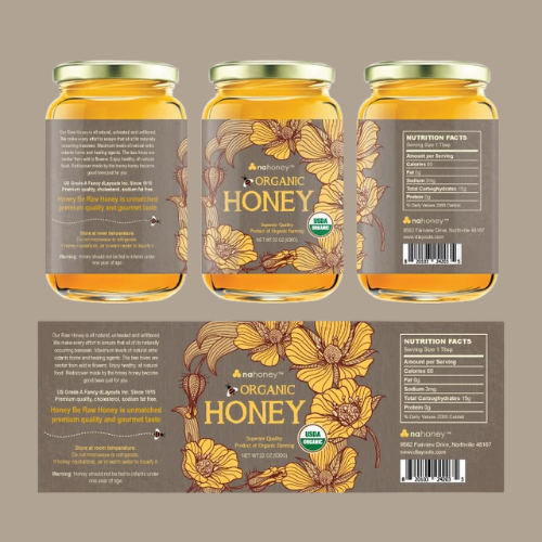
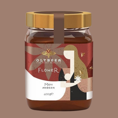
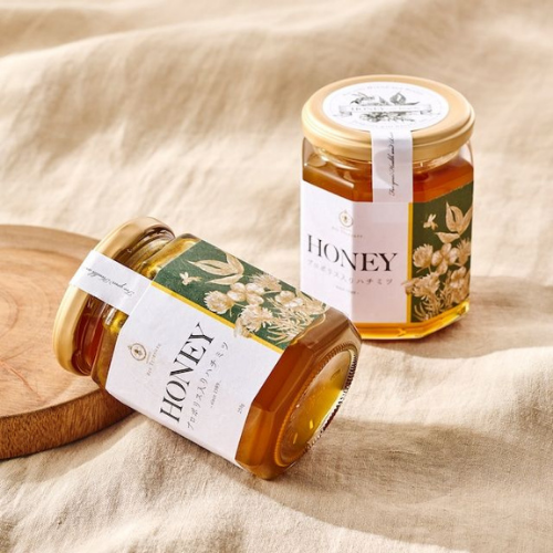
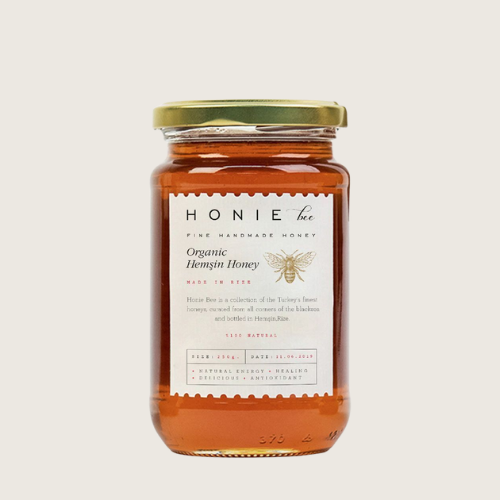
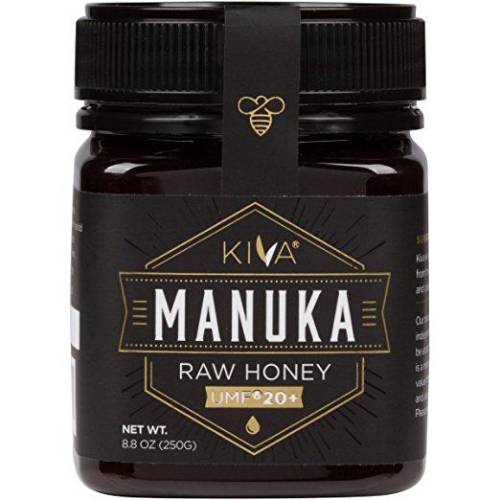
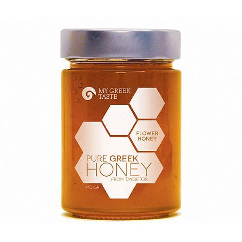
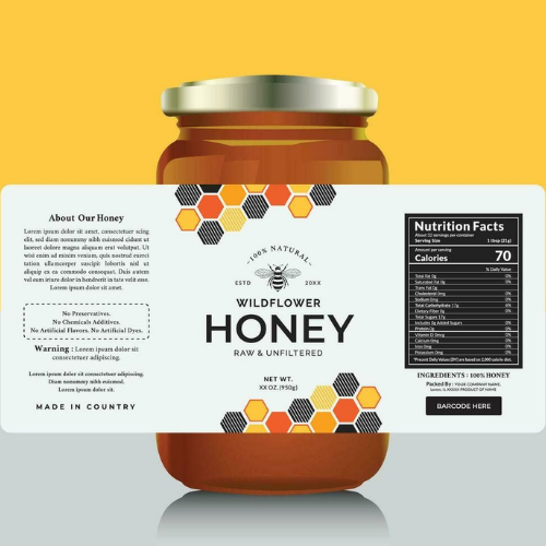
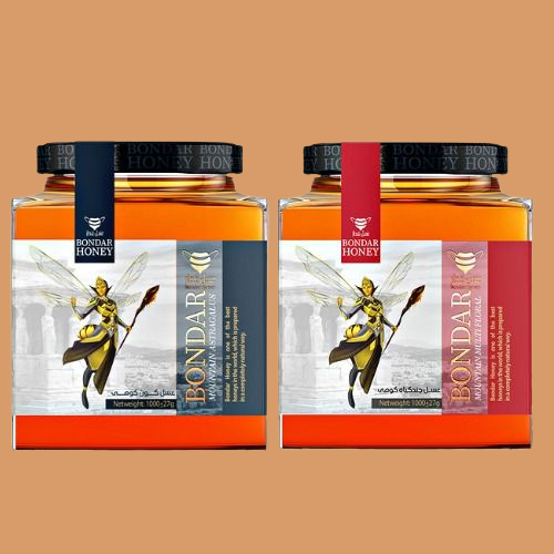
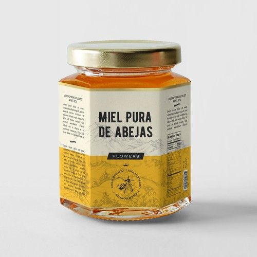
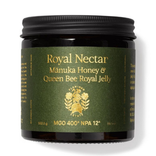
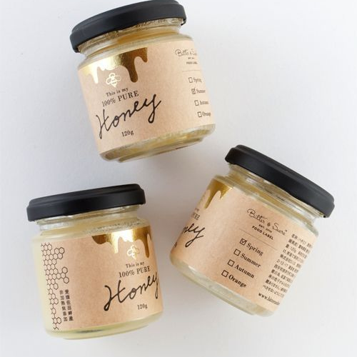
1. Honey Jar Label Design That Drip
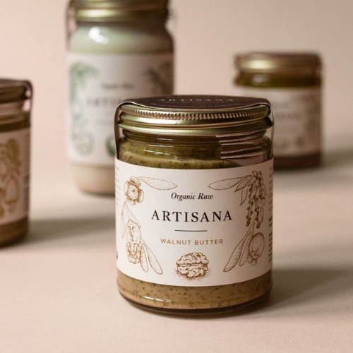
Think of some unique golden hues, elegant serif fonts, and nature-inspired illustrations like bees, hives, or even pretty flowers! Go creative here. Why not go for transparent labels with gold foil accents that give off a raw and pure vibe? So perfect for artisanal or organic honey brands!
Source: https://in.pinterest.com/
Source: https://in.pinterest.com//p>
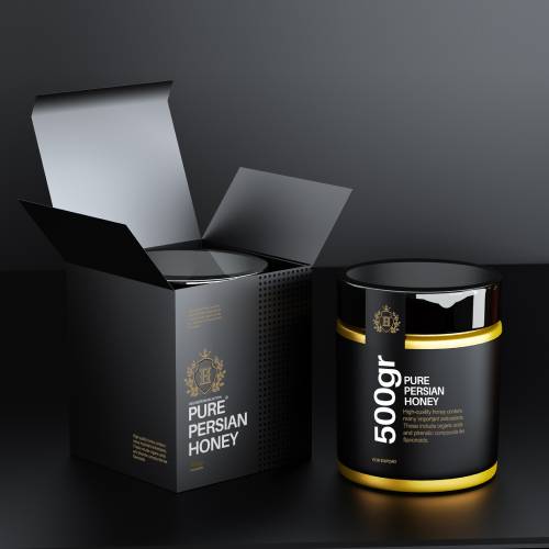
Source: packagingoftheworld.com/2020/03/persian-pure-honey.html
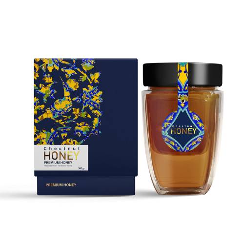
Source: packagingoftheworld.com/2019/10/chestnut-honey-concept.html
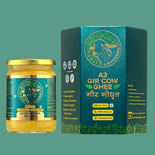
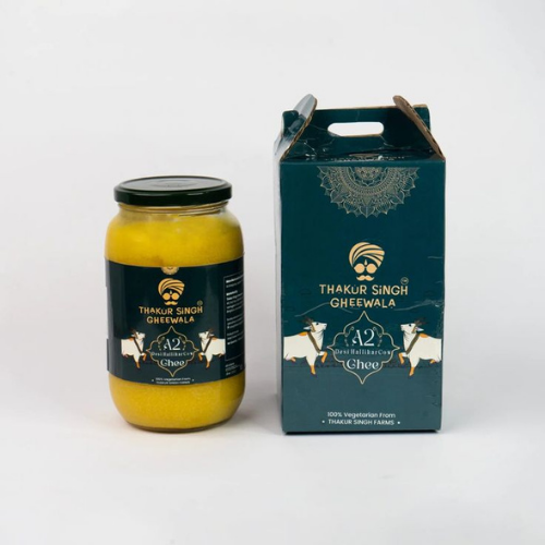
2. Ghee Jar Labels that Feel So Pure and Traditional
Indian ghee brands often balance tradition with modernity. Earthy colours like saffron, cream, and gold pair well with elegant Devnagari fonts. Minimal yet culturally rooted visuals like cows, temple bells, or diyas work so beautifully here!
Source: https://in.pinterest.com/
Source: https://in.pinterest.com//p>
Source: https://in.pinterest.com/
Source: https://in.pinterest.com
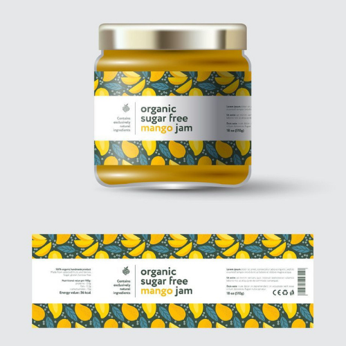
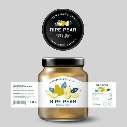
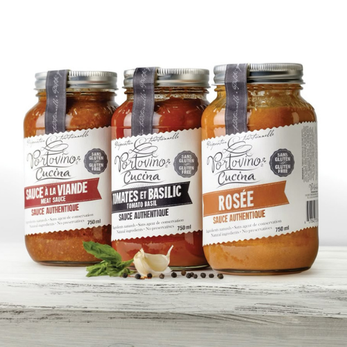
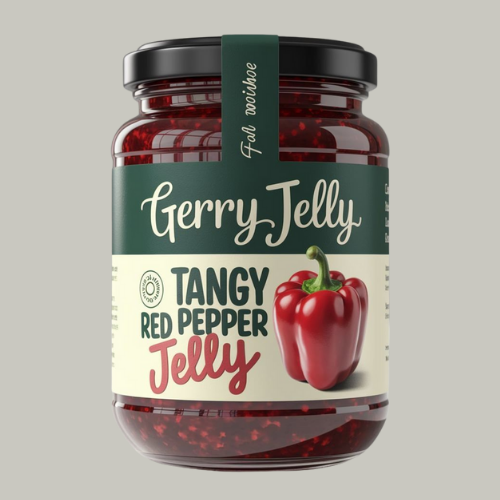
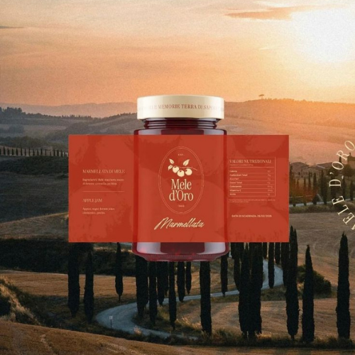
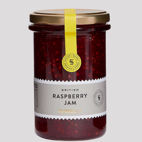
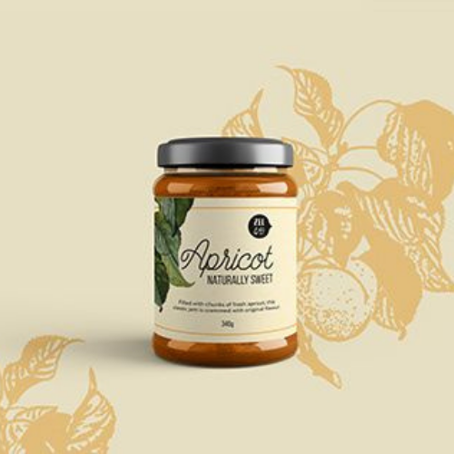
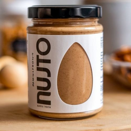
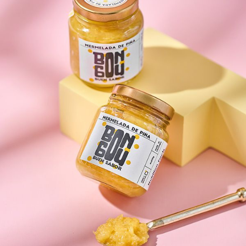
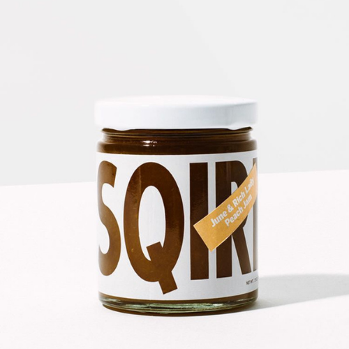
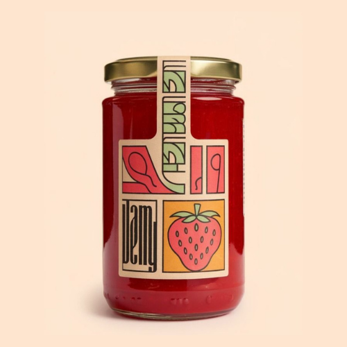
3. Jam Jar Label Design That Say ‘Made with Love’
Homemade or not, jam label design often scream “nostalgia.” Think hand-drawn fruits, gingham patterns, or watercolour splashes. Script fonts give them a warm, homemade touch!
Source: https://in.pinterest.com/
Source: https://in.pinterest.com//p>
Source: https://in.pinterest.com/
Source: https://in.pinterest.com
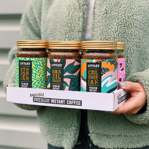
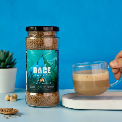
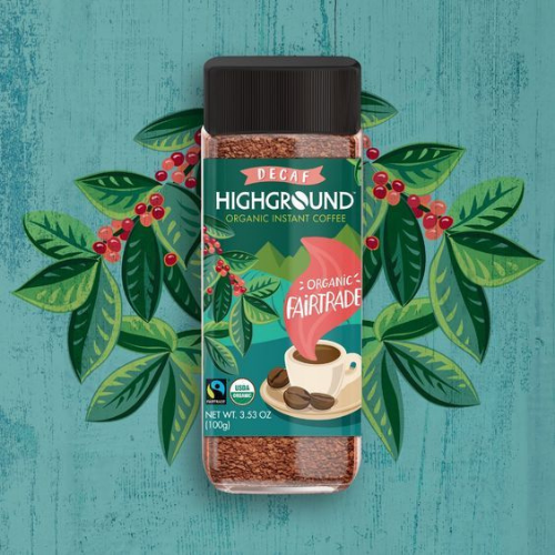
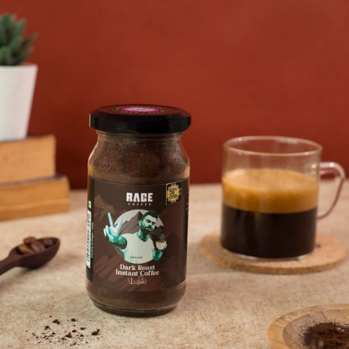
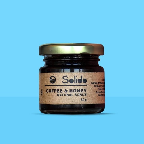
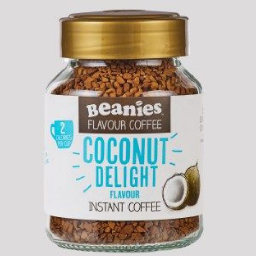
4. Coffee Jar Label Design with a Buzz
Coffee labels should always feel energetic, bold, and sleek without any doubt. Use rich browns, blacks, or forest greens with modern typography. Minimalism is key here. Let your bold brand name and roast info shine!
Visual Hack: Add QR codes linking to the farm story or roast profile. Coffee lovers of this era really care.
Source: https://in.pinterest.com/
Source: https://in.pinterest.com//p>
Source: https://in.pinterest.com/
Source: https://in.pinterest.com
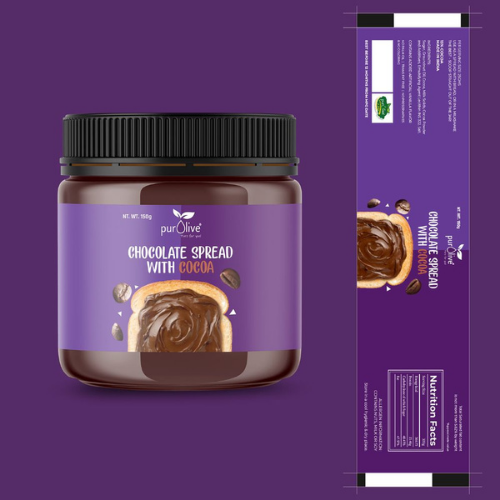
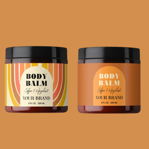
5. Cosmetic Jar Labels That Look Like a Spa
Here, it is all about calm colours (pastel pinks, creams, greys), botanical illustrations, and sans-serif typography. Less is always more for sure! Also, waterproof and oil-resistant jar label materials are a must for skincare jars.
Source: https://in.pinterest.com/
Source: https://in.pinterest.com//p>
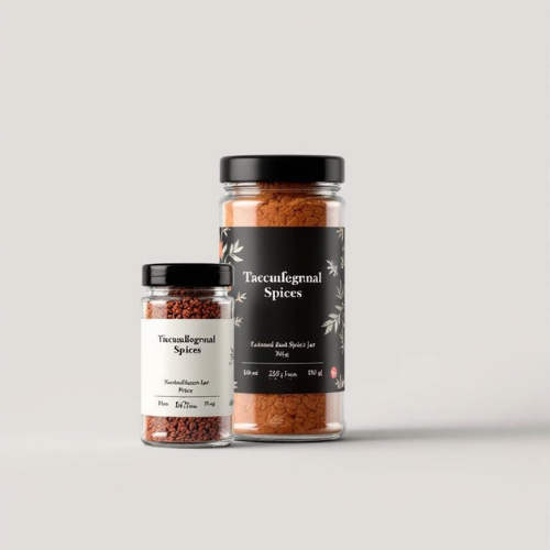
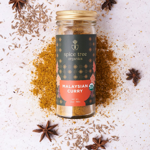
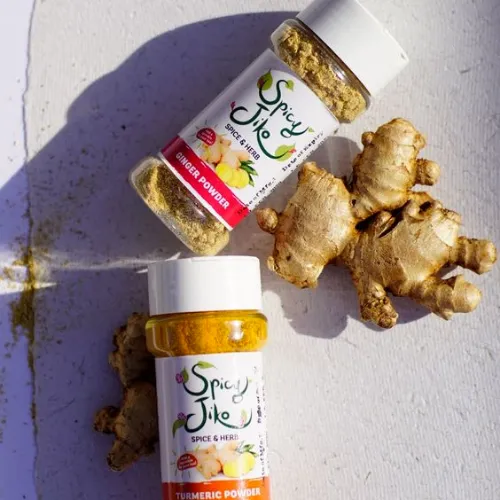
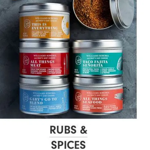
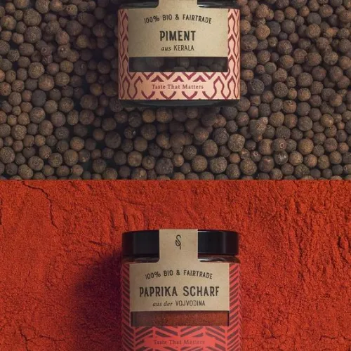
6. Spice Jar Label Design That Pack a Punch
Spices surely need bold colours and clarity. Clear labels with strong, legible fonts help customers spot the cumin from the coriander quickly!
Source: https://in.pinterest.com/
Source: https://in.pinterest.com//p>
Source:https://in.pinterest.com/pin/285908276336140169/
Source:https://in.pinterest.com/pin/903182900248694976/
Source:https://in.pinterest.com/pin/573857177540641807/
Source:https://in.pinterest.com/pin/301881981290540236/
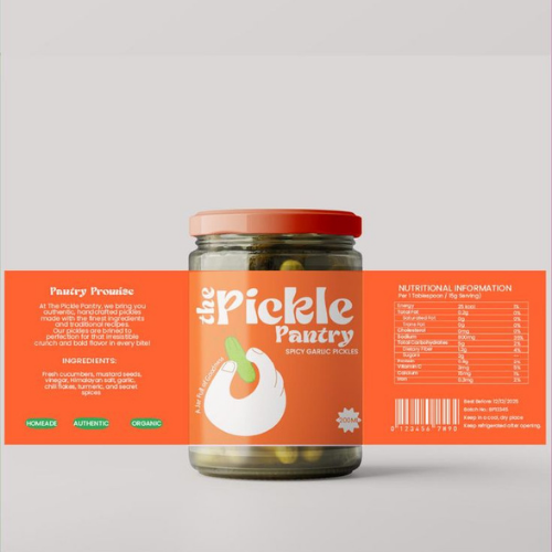
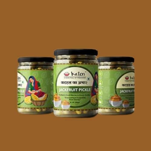
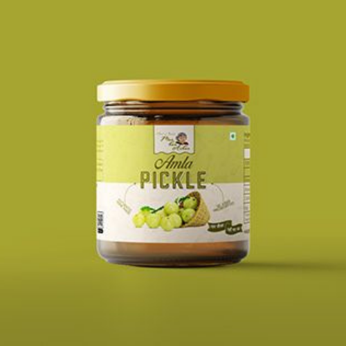
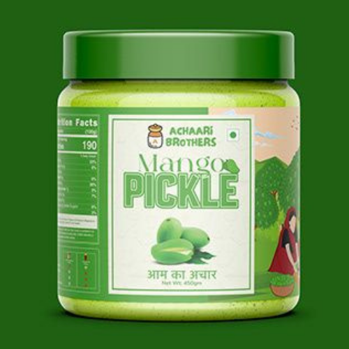
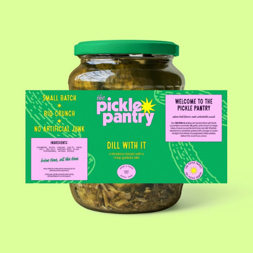
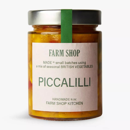
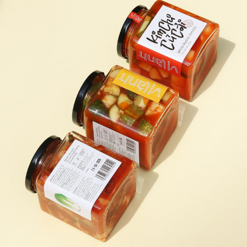
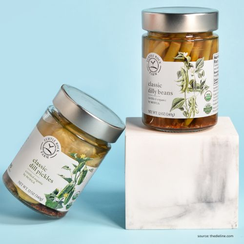
7. Pickle Jar Labels That Mix Quirk with Tradition
Think fun fonts, bright colours, and regional elements! Achar brands can experiment with humour and local art! But make sure vital info like ingredients and spice levels stays easy to read. Super important!
Smart Touch: Transparent centre windows let customers see the actual pickle mix, making it even more yum!
Source: https://in.pinterest.com/
Source: https://in.pinterest.com//p>
Source: https://in.pinterest.com/
Source: https://in.pinterest.com
Wanna Design a Jar Label That Wows? Here’s How to Start
Creating a jar label design that stops someone mid-scroll or mid-aisle isn’t just about pretty fonts and trendy colours. Here’s your go-to, no-fluff guide to designing a jar label that truly delivers!
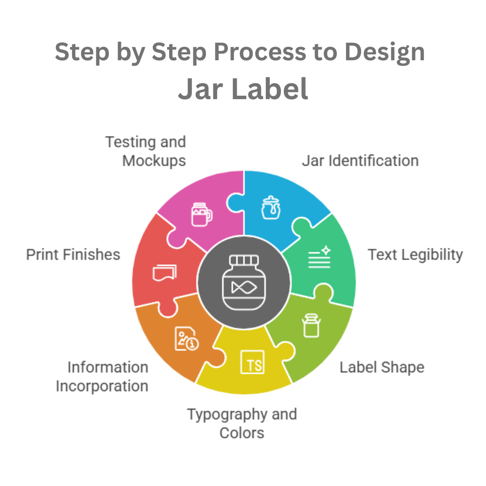
a) Understand Your Jar Well—Size, Shape & Material Matter
Before you even think of opening your design software, start with the jar in your hand. Is it glass, plastic, or metal? Is it round or square? Tall or squat?
- Glass jars allow for high-end finishes and clear labels.
- Plastic jars are often lighter and more affordable, but might need stronger adhesive labels.
- Curved or irregular shapes can make label application tricky, so consider wrap-around styles or front-back combos!
Source: https://in.pinterest.com/
Source: https://in.pinterest.com//p>
b) Prioritise Legibility Like Your Sale Depends on It (Because It Does)
People don’t buy what they can’t read.
- Make your product name pop. This is the first thing they should see, even from a distance.
- Use hierarchy. Your brand name, product name, quantity/weight, and key benefits or features should always be clearly distinguishable in font size and weight.
- Watch your font choices. Avoid overly decorative or script fonts for the main text. Save them for accents or taglines if you must!
Source: https://in.pinterest.com/
Source: https://in.pinterest.com//p>
c) Let the Jar Shape Guide Your Label Shape
The shape of your jar label should always complement the jar.
- Round jars? Why not go for oval or circular labels, or consider full wrap-around bands?
- Tall jars? Try vertical labels with a clean top-to-bottom flow, which can give a sleek, modern look!
- Square jars? Go for some geometric label shapes that mirror the container for a uniform look.
Source: https://in.pinterest.com/
Source: https://in.pinterest.com//p>
d) Choose Colours and Fonts That Speak Your Product’s Language
Your label should instantly give people a vibe, luxurious, organic, quirky, minimal, traditional, whatever it is.
- For premium brands: Use deep, rich tones (black, gold, navy) and serif or minimalist fonts.
- For organic or handmade products: Earthy shades like olive green, clay, beige, and soft pastels work beautifully with hand-lettered or sans-serif fonts.
- For children’s or fun food brands: Bold colours, bubbly typography, and playful illustrations are your friends!
Source: https://in.pinterest.com/
Source: https://in.pinterest.com//p>
e) Share Key Info, But Don’t Overload
Sure, you definitely want to tell your brand story, highlight ingredients, benefits, instructions, social media handles, and maybe a heartwarming anecdote too. But your label space is always limited, and your customer’s attention span is even more so.
- Stick to the essentials: Product name, net weight/volume, brand name, ingredients, usage instructions, and expiration/batch details!
- Use icons or infographics to simplify messaging (e.g., a small leaf icon for “organic” or a drop symbol for “moisturising”).
- Consider using QR codes to link to your story, product video, or customer reviews—so you don’t have to cram everything onto one side.
Source: https://in.pinterest.com/
Source: https://in.pinterest.com//p>
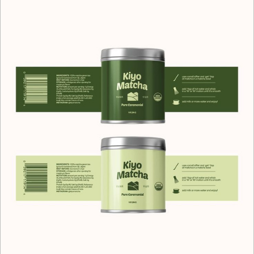
f) Pick a Creative Print Finish That Truly Matches Your Brand Vibe
The tactile feel and visual shine (or matte calmness) of a label can indeed make a massive difference in the overall perceived value.
- Glossy – Supremely bright, reflective, and perfect for those vibrant food products or anything playful!
- Matte – Super sophisticated and subtle. Ideal for skincare, candles, or wellness products.
- Foil stamping – Adds a metallic shine (usually gold, silver, or rose gold). Luxury brands love this.
- Embossing/Debossing – Adds texture. The raised or sunken effect gives a premium, touch-worthy feel.
- Transparent labels – Amazing for minimalist looks or to let the product colour shine through (perfect for honey, ghee, and cosmetics).
Source: https://in.pinterest.com/
Source: https://in.pinterest.com//p>
g) Always Prefer To Do a Mockup and Test on Real Jars
Print out a test label (even on basic paper), cut it out, and stick it on your actual jar. Look at it in natural light, under artificial lighting, and from multiple angles.
Ask yourself:
- Can you read it easily?
- Does it fit the jar properly without wrinkling?
- Is the logo centred and visible?
- Does it still look attractive once the jar is opened or half-empty?
- Would you buy this?
Bonus Tip: Snap a few photos of your test jars on shelves, tables, or in a styled setting. If it looks great on camera, it will look even better online (and that’s actually where a lot of buying decisions happen now).
Source: https://in.pinterest.com/
Source: https://in.pinterest.com//p>
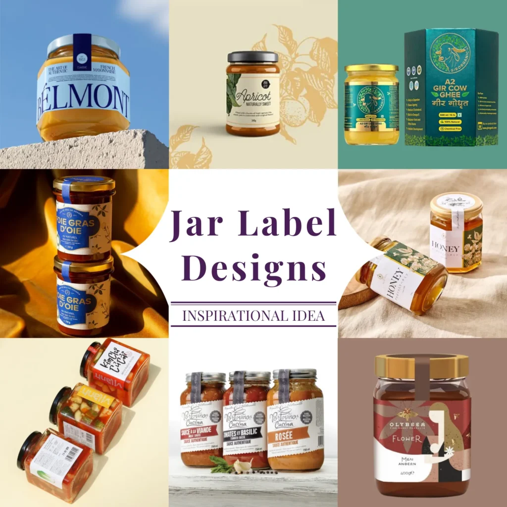
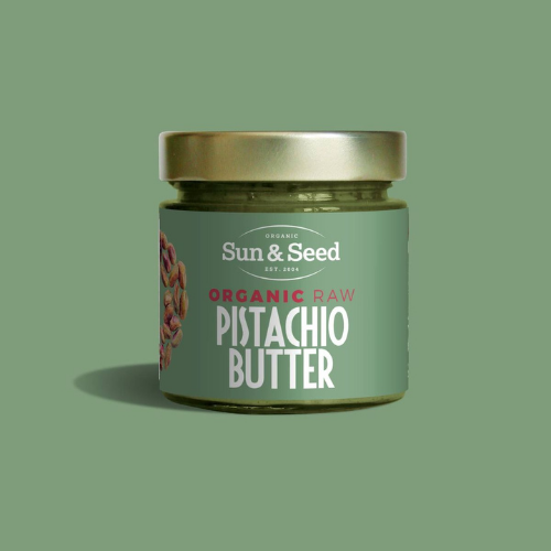
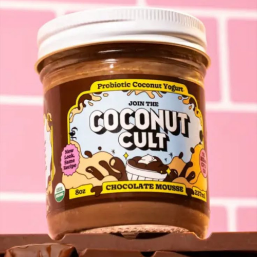
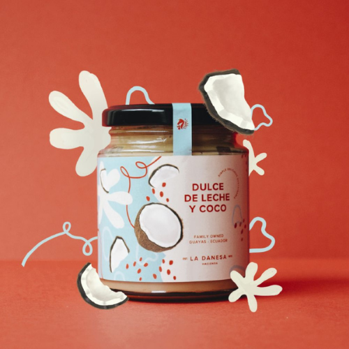
Peek Into Our Stunning Collection of 171+ Jar Label Designs
Source: https://in.pinterest.com/
Source: https://in.pinterest.com//p>
Source: https://in.pinterest.com/
Source: https://in.pinterest.com
Source: https://in.pinterest.com/
Source: https://in.pinterest.com//p>
Source: https://in.pinterest.com/
Source: https://in.pinterest.com
Source: https://in.pinterest.com/
Source: https://in.pinterest.com//p>
Source: https://in.pinterest.com/
Source: https://in.pinterest.com
Source: https://in.pinterest.com/
Source: https://in.pinterest.com//p>
Source: https://in.pinterest.com/
Source: https://in.pinterest.com
Source: https://in.pinterest.com/
Source: https://in.pinterest.com//p>
Conclusion:
At the end of the day, your jar label design isn’t just about fonts and foil. It is all about trust. It is about making your product look so good that people can’t resist picking it up (and sharing it online). The right design tells your story at a glance and helps your jar earn a permanent place on someone’s shelf, not just their shopping cart!
So, do you want to design a jar label that gets noticed, loved, and bought? Connect with our experts at DesignerPeople today! We create jar packaging designs that speak directly to your target audiences. Whether you are going minimal, luxe, playful, or earthy, we will surely bring your vision to life flawlessly.
Author: Anush Malik

Being a strategist’s head and a long term visionary personality aims to achieve excellence in branding, packaging and digital marketing field. My 15 years of design experience and masters degree ais my strength which keeps me motivated and keep me going positively. I have participated in extensive branding design conquests in India, USA, Australia and New Zealand with winning zeal. My objective is to encourage start-ups and hence involves actively in the articles which will act as a productive intake of knowledge for them. Do connect me personally via my LinkedIn and I love to share my expertise with you.