Let’s be honest for a second.
Most flyers nowadays end up in the dustbin, unread, unnoticed. Not because flyers don’t work. But it is because most of them look like they were designed in a hurry, for a deadline, with only one goal in mind: sell fast!
But when you actually pause and really think about it, a flyer is often the first physical or visual interaction someone has with a brand. That one piece of paper (or digital creative) silently answers so many questions about your brand, like:
- Is this brand serious?
- Does it look trustworthy?
- Would I remember it tomorrow?
That’s why flyers designed only for “limited-time offers” fail. They disappear as soon as the offer ends. Branding-focused flyers, on the other hand, stay relevant. They may promote something today, but they gradually build recognition for tomorrow.
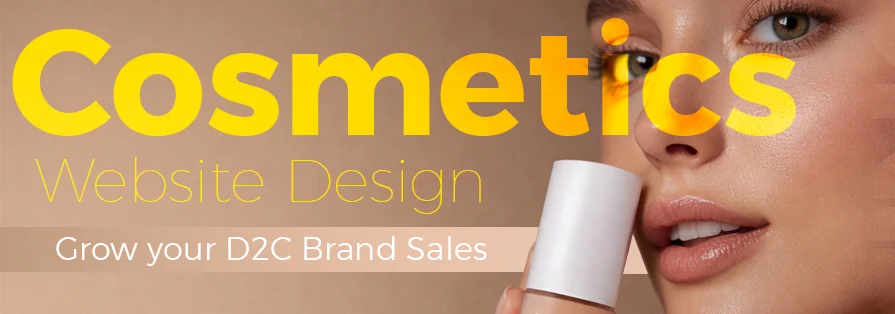
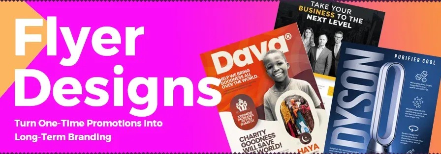
Today, we have created a comprehensive blog covering everything you must know about flyer designs, how they can impact your business and 154+ amazing flyer design inspirations to boost your long-term branding. Let’s get started!
Table of Contents
Why Branding-Focused Flyers Actually Make Business Sense?
Most businesses see flyers as an expense. Good brands see them as an actual investment. Very important!
A well-designed flyer doesn’t stop working when the campaign ends. Someone might not act immediately, but the colours, layout, and overall look stay in their mind. Later, when they see your Instagram ad, website, or storefront, something feels familiar, and familiarity builds comfort.
Another thing is, people usually underestimate visual discipline.
Brands that really look consistent across flyers appear way more reliable. Customers subconsciously assume: If they are this careful with design, they will probably be careful with their product or service too!
And finally, branding-led flyers save you from price wars. Whenever your brand looks strong, you don’t always need the biggest discount to win attention.
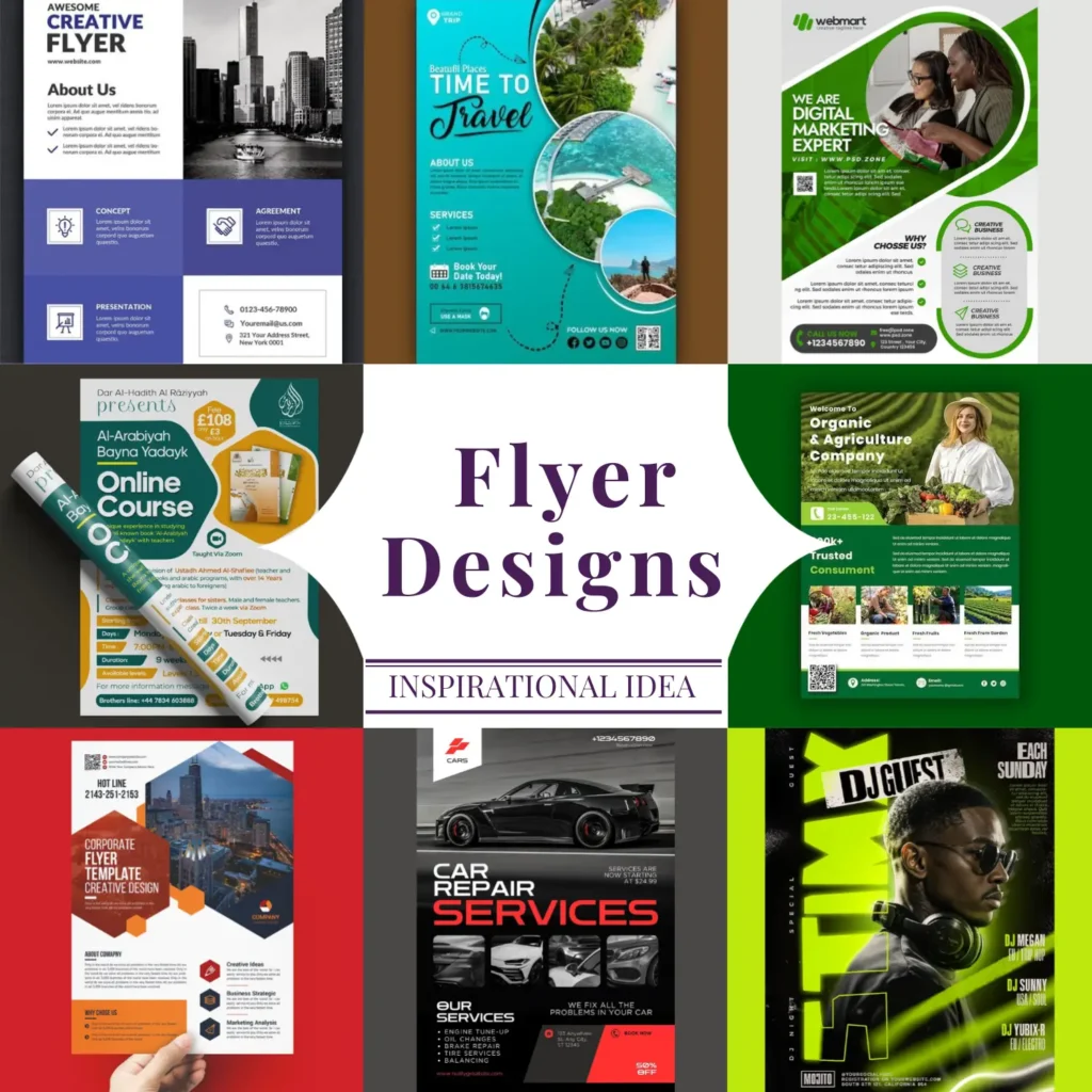
154+ Flyer Design Ideas: Sorted by Industry (So You Don’t Get Lost)
Every industry uses flyers differently. What ultimately works for a real estate brand will completely fail for a college. What looks exciting for a party will look unprofessional for a corporate event. Here’s how flyer design actually changes across industries when branding is taken seriously.
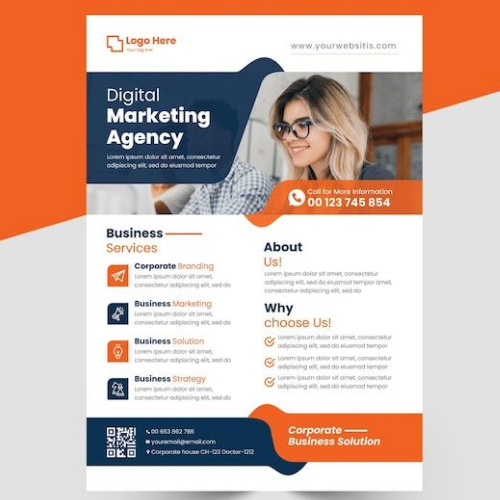
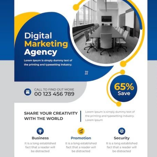
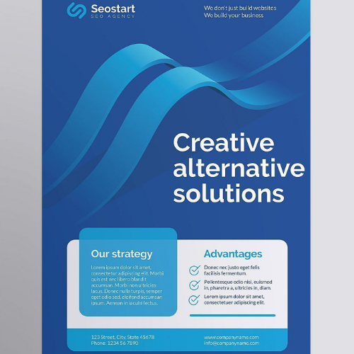
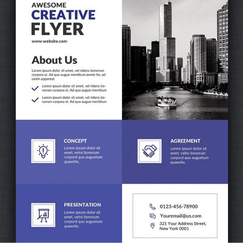
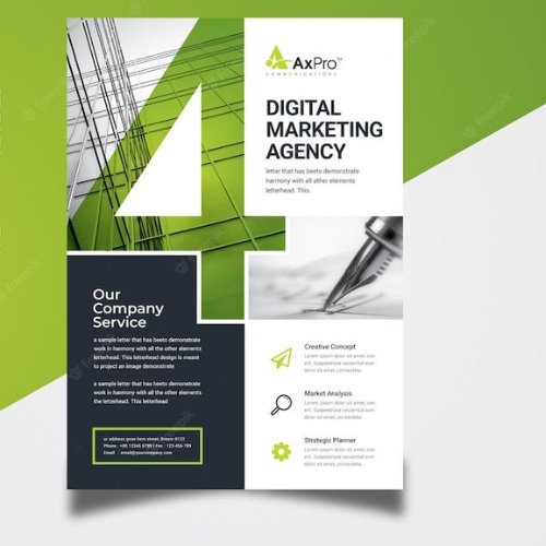
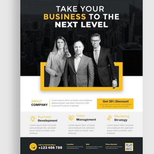
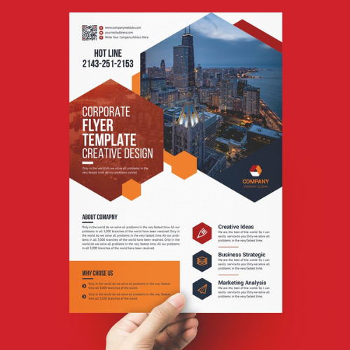
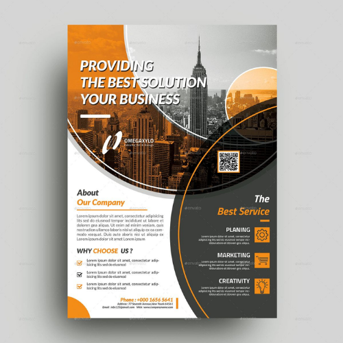
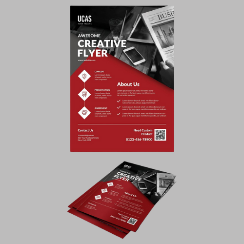
1. Corporate Flyers
Corporate flyers should never try too hard. When brands go flashy here, they instantly lose credibility. The best corporate flyers feel calm and organised. The goal is to always go for clean spacing, restrained colours, and fonts that look confident rather than decorative.
These actually make the entire flyer professional. These flyers are perfectly used for conferences, internal announcements, leadership events, annual meets, or company updates. If someone even glances at it from across the room, it should already feel trustworthy.
Source: https://in.pinterest.com/
Source: https://in.pinterest.com//p>
Source: https://in.pinterest.com/
Source: https://in.pinterest.com
Source: https://in.pinterest.com/
Source: https://in.pinterest.com
2. Communication Flyers
Believe it or not but clarity is supremely important here. Plan everything wisely. Start with the headline first, details later, gradually. Icons also help in navigation. White space helps even more!
Source: https://in.pinterest.com/
Source: https://in.pinterest.com//p>
Source: https://in.pinterest.com/
Source: https://in.pinterest.com
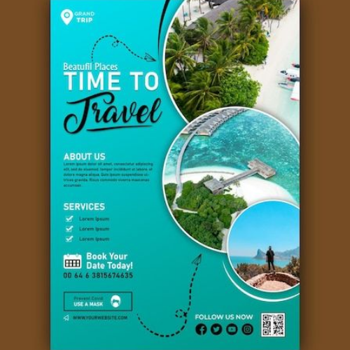
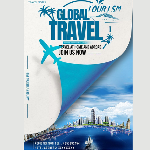
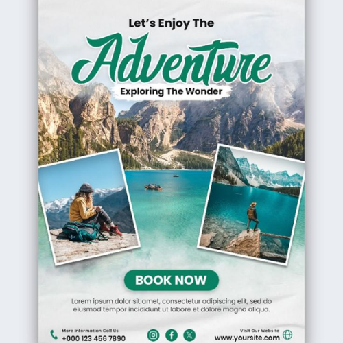
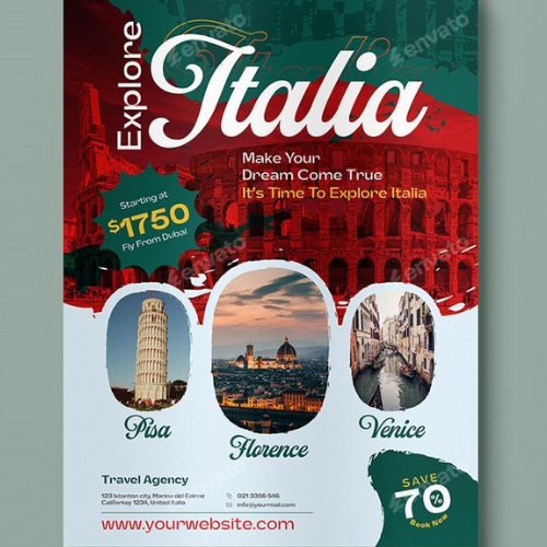
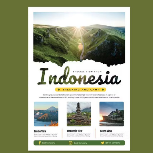
3. Travel & Tourism Flyers
Strong images, open layouts, and colours that feel alive do most of the work here. Pricing and details can come later. The job of a travel flyer is to actually make someone feel excited about it and imagine themselves already there!
Source: https://in.pinterest.com/
Source: https://in.pinterest.com//p>
Source: https://in.pinterest.com/
Source: https://in.pinterest.com
Source: https://in.pinterest.com/
Source: https://in.pinterest.com
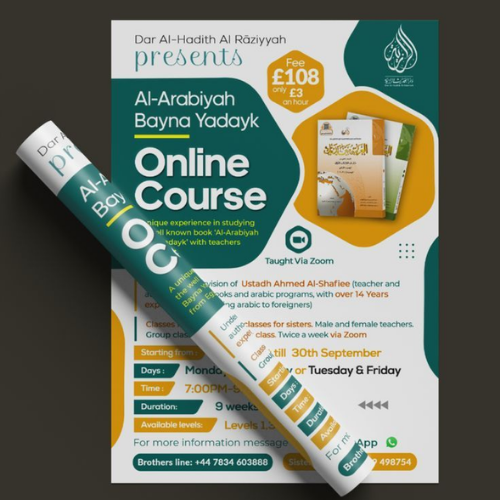
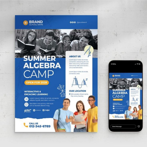
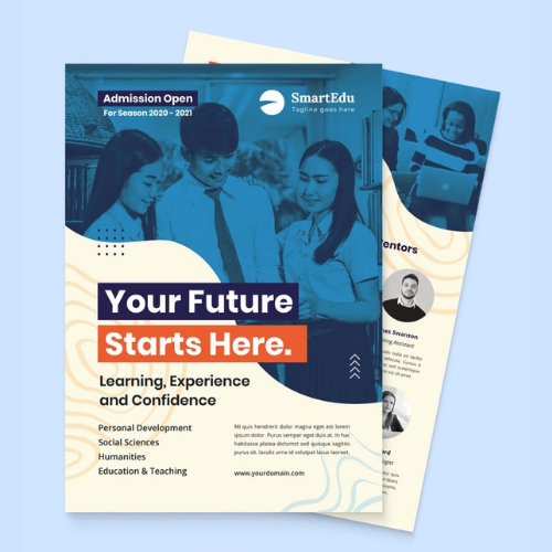
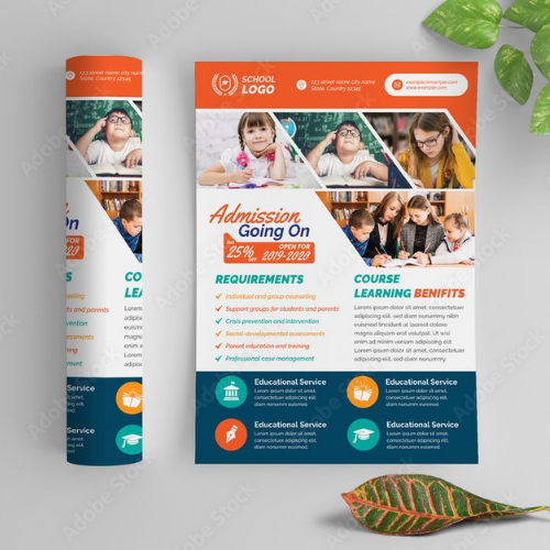
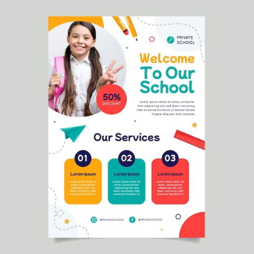
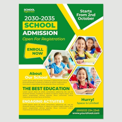
4. Education & Academic Flyers
Overdesign here is a massive mistake you must never make. Calm colours, readable fonts, and structured layouts work perfectly here! Whether it is a school admission, coaching institute, or workshop, the flyer should always feel serious, organised, and reliable, not salesy!
Source: https://in.pinterest.com/
Source: https://in.pinterest.com//p>
Source: https://in.pinterest.com/
Source: https://in.pinterest.com
Source: https://in.pinterest.com/
Source: https://in.pinterest.com
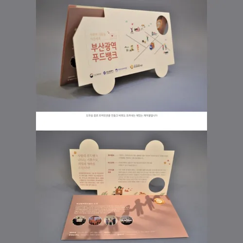
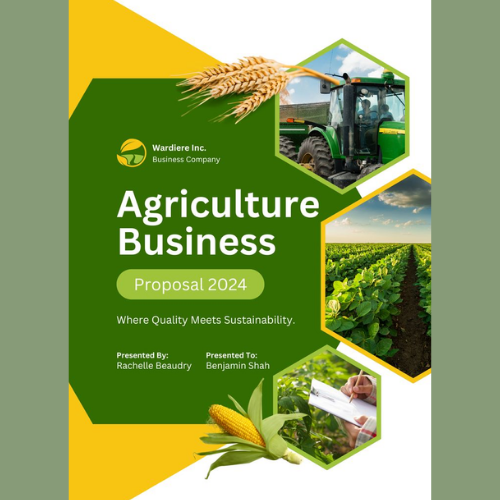
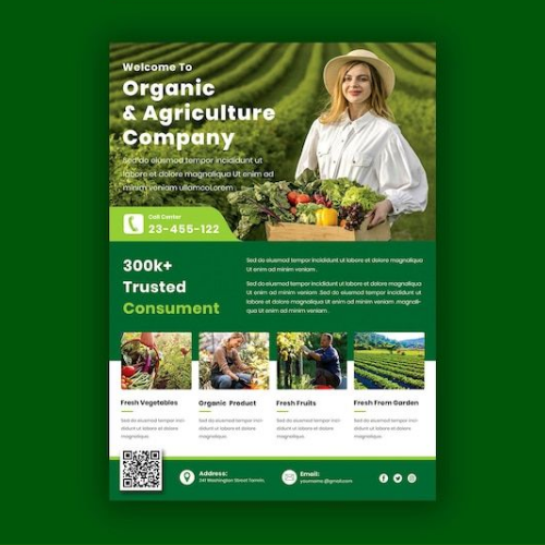
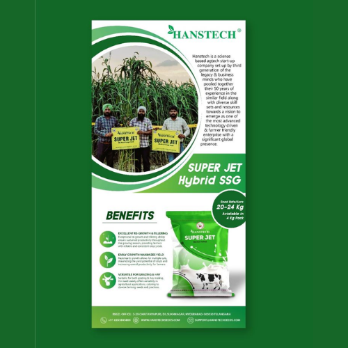
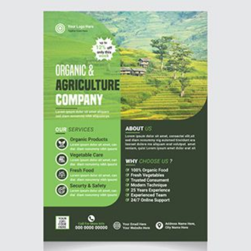
5. Agriculture Flyers
Glossy designs and fancy layouts will never really work here. People connect more with earthy colours, simple language, and visuals that feel real and useful. These flyers aren’t glanced at and thrown away. They are read carefully, passed around, and often kept for later. Hence, when brands design flyer with that in mind, trust doesn’t have to be forced. It happens on its own!
Source: https://in.pinterest.com/
Source: https://in.pinterest.com//p>
Source: https://in.pinterest.com/
Source: https://in.pinterest.com
Source: https://in.pinterest.com/
Source: https://in.pinterest.com
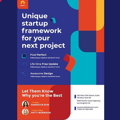
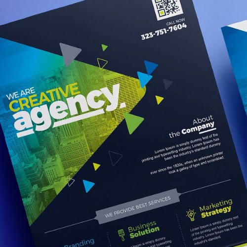
6. Startup Flyers
People don’t really have time to decode clever layouts. Make it super simple, interesting and quick! Bold headings, simple visuals, and clear value propositions work best here for startups. The design should feel modern and energetic, but never confusing. If someone can’t really understand what the startup does in five seconds, the flyer isn’t doing its job!
Source: https://in.pinterest.com/
Source: https://in.pinterest.com
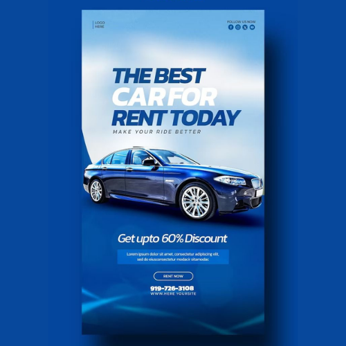
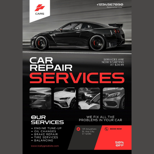
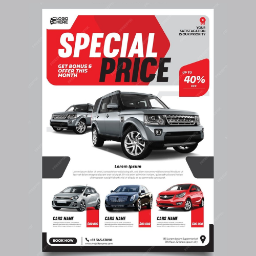
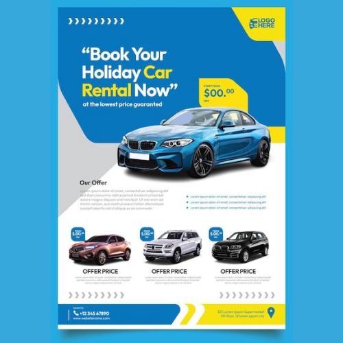
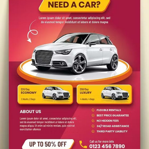
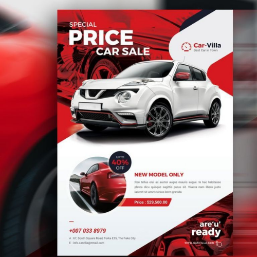
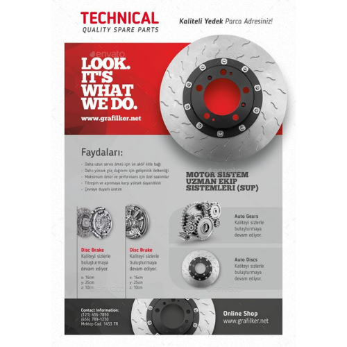
7. Automobile Flyers
In automobile flyers, people mostly want to see the machine first. Here, there are several aspects you must consider. Strong photography, contrast, and focused layouts. Only highlight design, performance, or new features here.
Source: https://in.pinterest.com/
Source: https://in.pinterest.com//p>
Source: https://in.pinterest.com/
Source: https://in.pinterest.com
Source: https://in.pinterest.com/
Source: https://in.pinterest.com
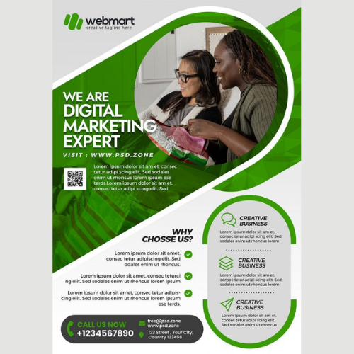
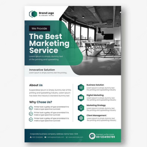
8. Company Flyers
Be it service updates, announcements, or small campaigns. The key here is consistency again. Nothing really fancy. Just very simple, reliable, clean, and recognisable!
Source: https://in.pinterest.com/
Source: https://in.pinterest.com//p>
Source: https://in.pinterest.com/
Source: https://in.pinterest.com
Source: https://in.pinterest.com/
Source: https://in.pinterest.com
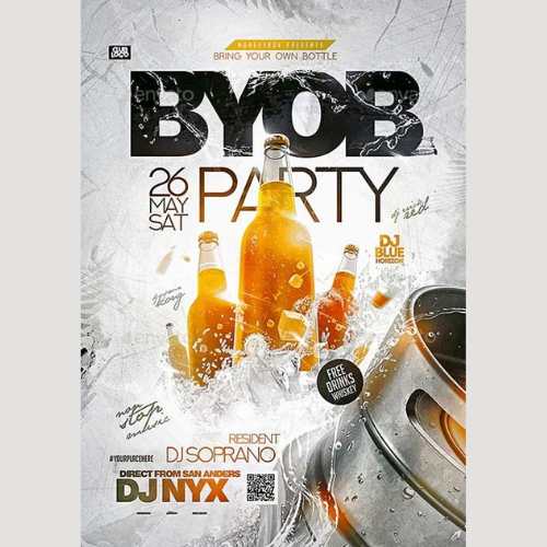
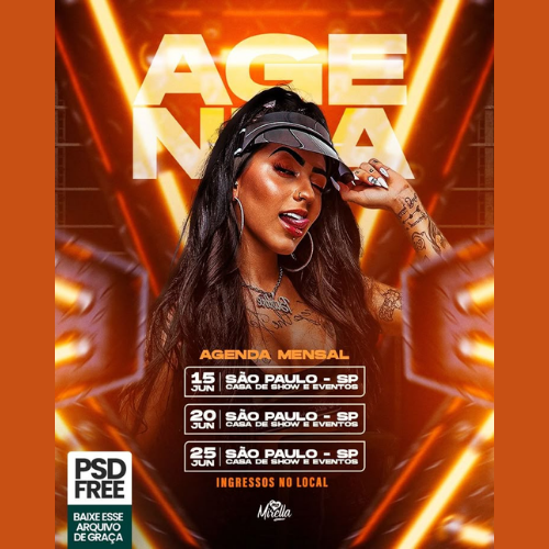
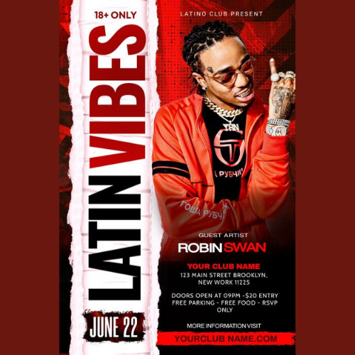
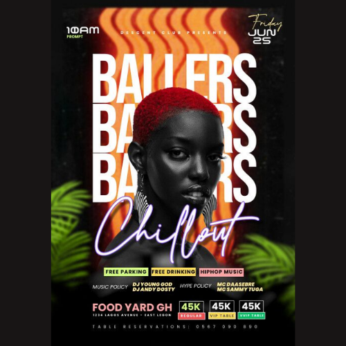
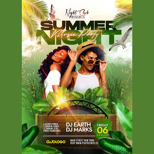
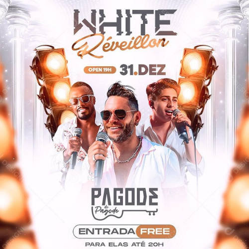
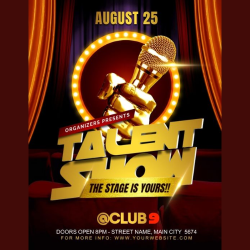
9. Party Flyers
Party flyers are allowed to be loud, but there is always a difference between loud and messy. Colours, typography, and layout should match the vibe of your event. Very important!
Source: https://in.pinterest.com/
Source: https://in.pinterest.com//p>
Source: https://in.pinterest.com/
Source: https://in.pinterest.com
Source: https://in.pinterest.com/
Source: https://in.pinterest.com
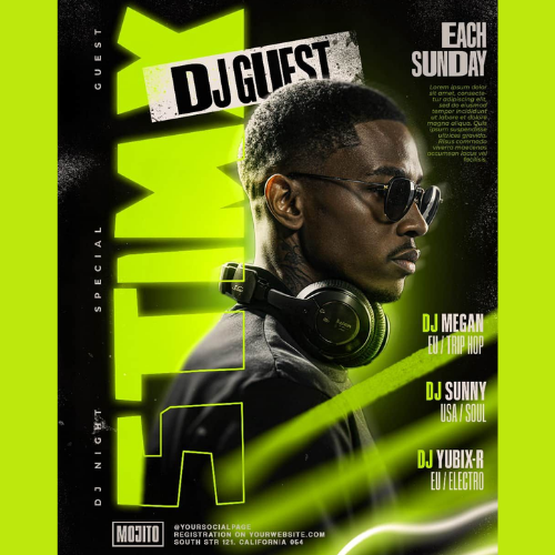
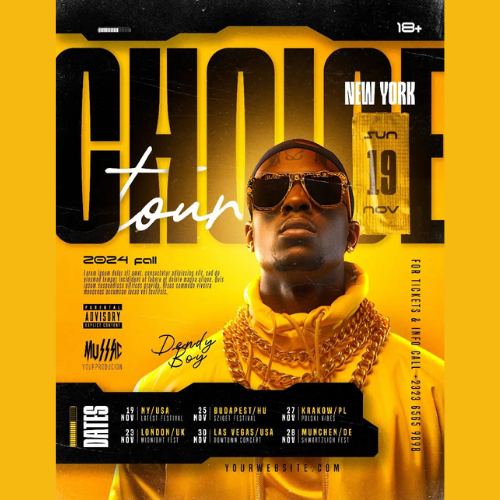
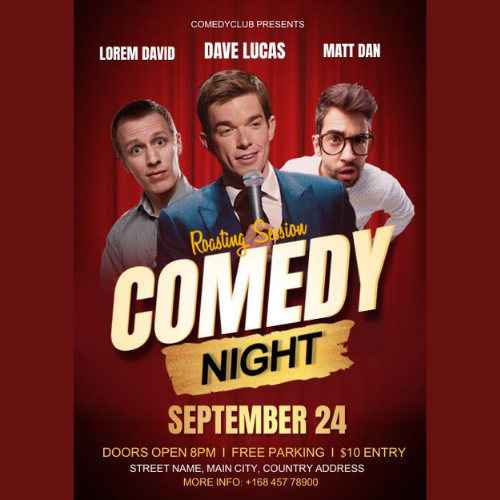
10. Entertainment Flyers
A movie poster, a show announcement, or an OTT launch flyer works when it creates curiosity. Strong visuals, dramatic composition, and mood-setting design matter more than details here. Make all of it look interesting and exciting!
Source: https://in.pinterest.com/
Source: https://in.pinterest.com//p>
Source: https://in.pinterest.com/
Source: https://in.pinterest.com
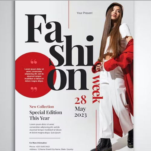
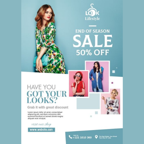
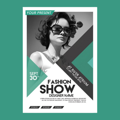
11. Fashion Flyers
Some brands go minimal, others experimental. What matters is whether the design matches your brand’s personality. Fashion flyers sell taste, not just the offers. When they get this right, even a simple design feels expensive.
Source: https://in.pinterest.com/
Source: https://in.pinterest.com//p>
Source: https://in.pinterest.com/
Source: https://in.pinterest.com
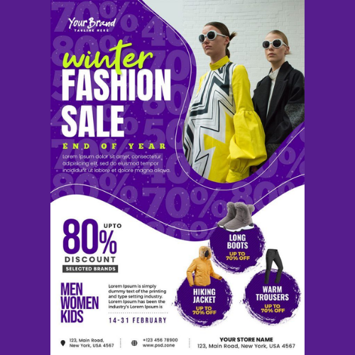
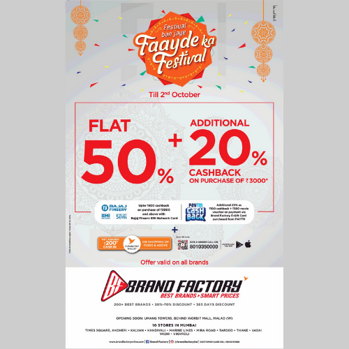
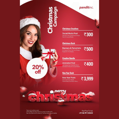
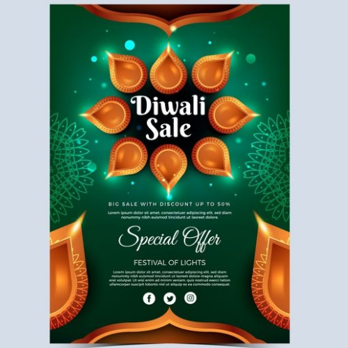
12. Festival Offer Flyers
Festive flyers often get overloaded with colours and elements. The smarter ones use festive cues very carefully while keeping the brand visible. The goal here isn’t just any celebration. It is a brand recall even after the festival ends.
Source: https://in.pinterest.com/
Source: https://in.pinterest.com//p>
Source: https://in.pinterest.com/
Source: https://in.pinterest.com
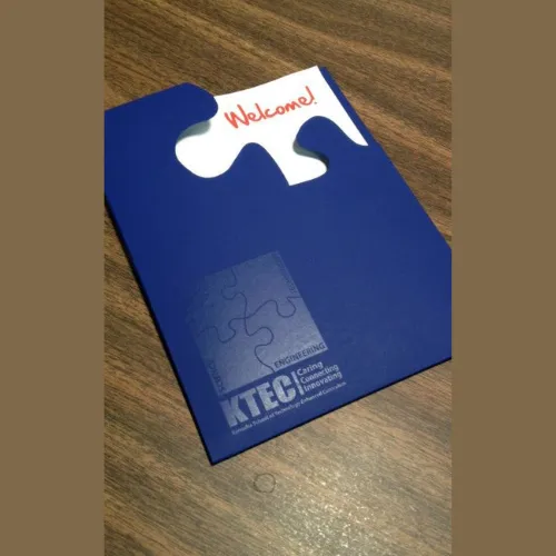
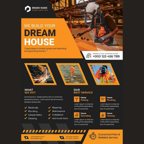
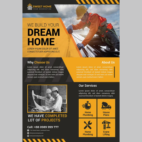
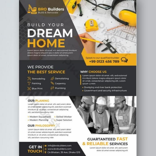
13. Engineering Flyers
Clean grids, technical visuals, and well-organised information should always be your goal here. Way better than those flashy designs! Keeping things simple and subtle truly builds confidence in this industry. Here, clarity always matters way more than creativity.
Source: https://in.pinterest.com/
Source: https://in.pinterest.com//p>
Source: https://in.pinterest.com/
Source: https://in.pinterest.com
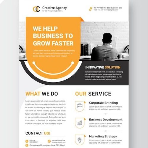
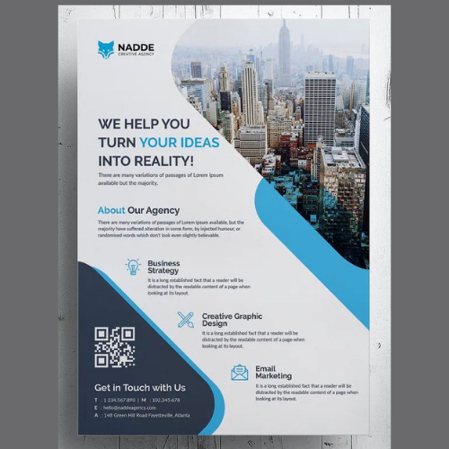
14. Business and Office Flyers
The key here is to give a quick answer: Why should I even care? This is for the readers! Clear benefits, straightforward layouts, and no unnecessary decoration should be your direction.
Source: https://in.pinterest.com/
Source: https://in.pinterest.com//p>
Source: https://in.pinterest.com/
Source: https://in.pinterest.com
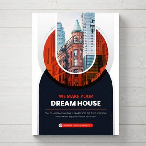
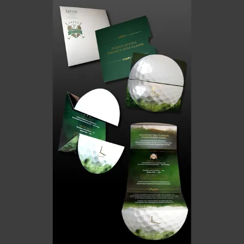
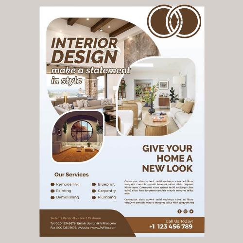
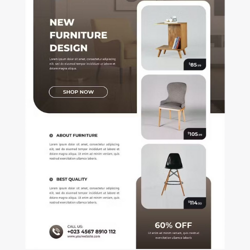
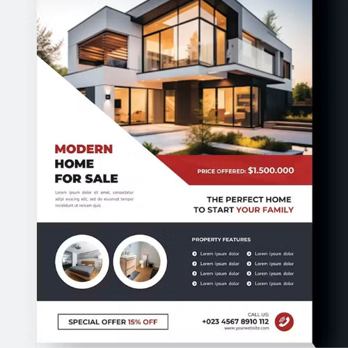
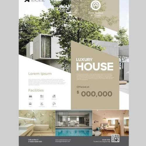
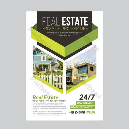
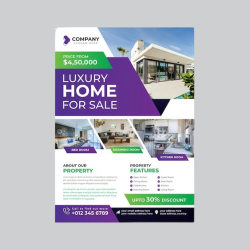
15. Real Estate and Property Flyers
Spacious layouts, high-quality images, and elegant typography surely make all the difference here. Something you must consider! The design should always mirror the experience you are ultimately selling. Open, refined, and premium from the very first glance!
Source: https://in.pinterest.com/
Source: https://in.pinterest.com//p>
Source: https://in.pinterest.com/
Source: https://in.pinterest.com
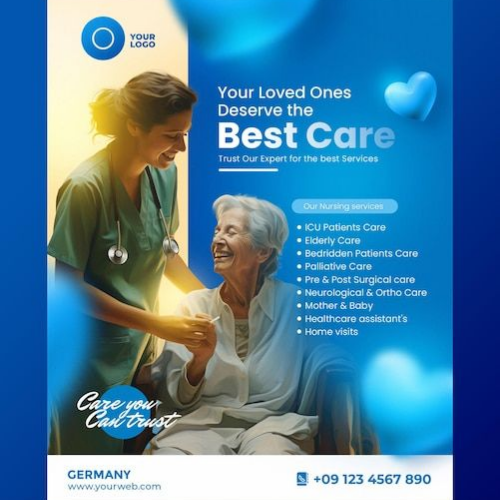
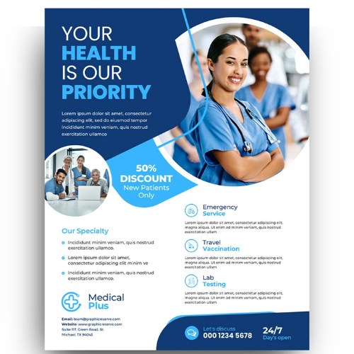
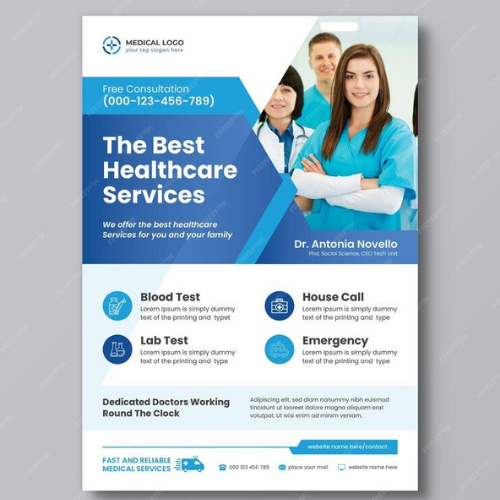
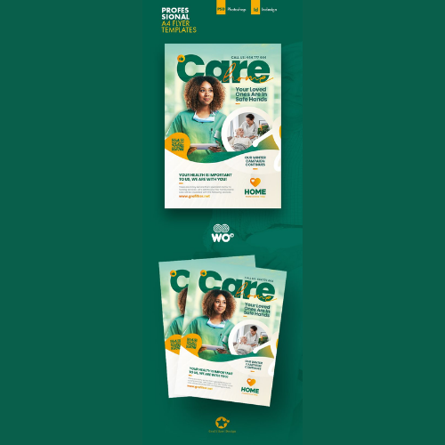
16. Beauty & Healthcare Flyers
Go for soft colours, clean visuals, and calm layouts to gradually build trust. Whether you own a clinic, salon, or wellness brand now, your flyer should always feel premium and trustworthy!
Source: https://in.pinterest.com/
Source: https://in.pinterest.com//p>
Source: https://in.pinterest.com/
Source: https://in.pinterest.com
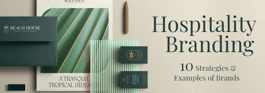
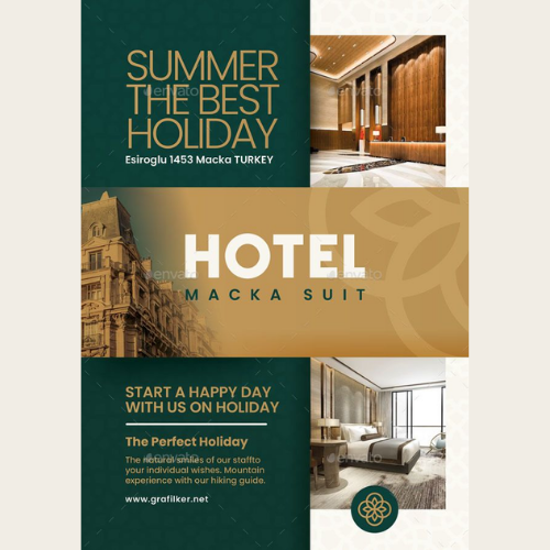
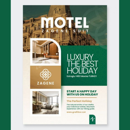
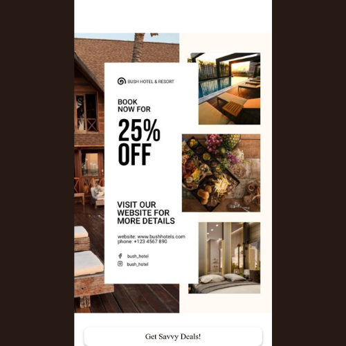
17. Hospitality Flyers
Hospitality flyers are about comfort and experience. Warm colours, inviting images, and relaxed layouts always work way better than the usual hard selling.
Source: https://in.pinterest.com/
Source: https://in.pinterest.com//p>
Source: https://in.pinterest.com/
Source: https://in.pinterest.com
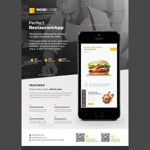
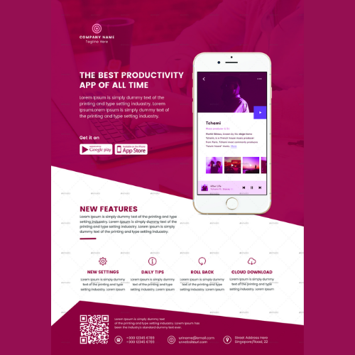
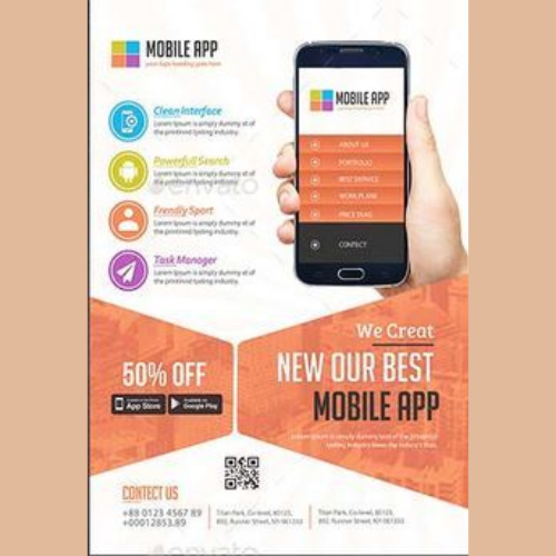
18. Digital Flyers
If it is not really readable on a small screen, it is ultimately useless. Strong contrast, simple layouts, and clear messaging matter more than fancy effects.
Source: https://in.pinterest.com/
Source: https://in.pinterest.com//p>
Source: https://in.pinterest.com/
Source: https://in.pinterest.com
Flyer Design Tips That Go Beyond “Limited Time Offer”
So, how can you create the ideal flyer for your brand this year? Here are some tips to ensure that your flyer actually makes an impact among the readers and is not just thrown away!
a) Start with Brand Thinking, Not Layout Thinking
Most flyers fail because design starts with “Where do we put the offer?” instead of “What does our brand stand for?” Before choosing colours or fonts, ask:
What emotion should this flyer create? Trust? Excitement? Premium quality? Simplicity? Once that’s clear, design decisions become easier and more consistent!
b) Consistency Is Not Boring: It is Powerful
Using the same colour palette, font family, icon style, and visual tone across flyers doesn’t limit creativity. It builds recognition. Familiarity surely creates comfort, and comfort drives action!
c) Always Design for Quick Scanning
People give flyers only 3–5 seconds. That’s all you have! So, your design should always instantly answer:
- Who is this for?
- What is it about?
- Why should I care?
Use your visual hierarchy intentionally. As we said, go for bold headlines, supporting subtext, and clean spacing!
d) One Core Message Beats Five Weak Ones
If you are trying to communicate multiple offers, benefits, and CTAs in one flyer almost always backfires. Strong flyers focus on one main idea and support it visually. Otherwise, it may look way too salesy! Simplicity doesn’t really reduce impact. It amplifies it.
e) Choose your Typography Carefully
A luxury brand using playful fonts quickly breaks trust. But imagine a youth brand using stiff corporate fonts? Looks so disconnected with the brand, right? Ultimately, typography selection of your flyer design should always match your brand voice through and through!
f) Visuals Should Always Feel Real, Not Just Random
Every image you add to your flyer should add meaning. Show real products, real people, or real experiences wherever possible. The key here is to go only for authentic visuals. Focus primarily on building emotional connections through your flyers!
g) Material & Finish Really Matter
Your Flyer’s paper quality, thickness, texture, and finish communicate value instantly. A premium brand on cheap paper creates doubt. Digital flyers need the same care. Pixel clarity, spacing, and responsiveness definitely matter.
h) CTAs That Always Invite
Instead of forcing urgency, guide curiosity. Why not try
- Explore More
- Visit Our Store
- Know Our Story
And more such powerful CTAs…
A good CTA should never ever sound desperate! The key here is to focus only on building relationships, not pressure clicks!
Want Flyers Design That Get Remembered? Let Design Experts Handle It!
Designing a flyer that actually builds a brand? Here, experience takes the upper hand. It takes a complete strategy, experience, and a deep understanding of consumer psychology.
Professional design experts don’t just make things look good for you. They actually make them work. From layout balance to brand alignment, expert-designed flyers ensure your promotions don’t fade after one use. They must always stay relevant, recognisable, and impactful across campaigns. Otherwise, what’s the use of even designing any flyers for your brand in the first place?
Conclusion
Flyers shouldn’t end up in dustbins. When designed with branding in mind, flyers become long-term marketing assets, not short-term noise. If you are serious about creating flyers that look premium, feel consistent, and strengthen brand recall, it is now time to reconsider your flyer designs!
DesignerPeople specialises in branding-focused flyer design that blends creativity with strategy for years. From concept to execution, our expert designers always ensure every flyer speaks your brand’s language. Clearly, confidently, and consistently! So, connect with our experts right now. Let DesignerPeople design flyers that truly stay remembered!
Author: Anush Malik

Being a strategist’s head and a long term visionary personality aims to achieve excellence in branding, packaging and digital marketing field. My 15 years of design experience and masters degree ais my strength which keeps me motivated and keep me going positively. I have participated in extensive branding design conquests in India, USA, Australia and New Zealand with winning zeal. My objective is to encourage start-ups and hence involves actively in the articles which will act as a productive intake of knowledge for them. Do connect me personally via my LinkedIn and I love to share my expertise with you.