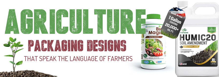
Agriculture isn’t just about crops and yields. It is so much about an overall connection. A connection between the farmer and his field, between nature and nourishment, and yes, between the product and the person who actually uses it every day!
In India, where over 60% of livelihoods depend on agriculture, packaging design isn’t really some random afterthought. It is the first handshake between a brand and the farmer!
A smartly designed agricultural packaging doesn’t just hold seeds, fertilisers, or bio-products. It actually sells a story. A story of trust, usability, and authenticity. From keeping fertilisers moisture-free in humid climates to ensuring crop images match regional preferences, agriculture packaging design in this space is both science and emotion!
Today, we will be diving deep into how agricultural packaging designs are evolving and how brands can create designs that speak the local language of farmers, both literally and visually!
Table of Contents
Why Does Packaging Design Even Matter So Much in Rural Agriculture Markets?
Imagine this: A farmer walks into a local agro shop. The shelves are properly stacked high with fertilisers, seeds, pesticides, and growth supplements. What catches his eye first? Has to be the packaging design of agricultural products!
In rural markets, packaging is not just only about aesthetics. It is a major decision-maker. Most farmers don’t really rely on lengthy ads or online product listings. Their buying choices come from trust, familiarity, and visual cues!
Here’s why agricultural packaging design matters so much in these markets:
- First Impressions Rule: In areas with lower literacy levels, visual appeal and colour play a huge role in communication!
- Durability Counts: Agricultural packs go through harsh transport, sun exposure, and moisture. A strong pack earns respect.
- Trust Through Clarity: Clear instructions, visible branding, and authentic visuals build long-term trust among farmers.
- Local Relevance: Designs that reflect regional crops, languages, and culture connect instantly!
Must-Have Features for Farmer-Approved Agriculture Packaging Design
Every successful agro brand design has this one thing in common: its packaging design feels made for the farmer. Let’s look at what makes a design truly farmer-friendly and field-ready!
a) Colours That Actually Speak Their Language
Colours have their own dialect in rural India. Green feels fresh and trustworthy. Yellow signals growth. Red shows power and protection. Blue stands for purity and reliability.
For example, Fertilisers often use green and yellow tones to reflect growth and soil vitality.
- Pesticides and insecticides may feature red or orange to show strength and defence.
- Organic products usually go well with earthy greens and browns to showcase sustainability.
The ultimate trick is to choose shades that always resonate emotionally and stand out on local shop shelves without really overwhelming the farmer!
Source: https://in.pinterest.com/
Source: https://in.pinterest.com//p>
Source: https://in.pinterest.com/
Source: https://in.pinterest.com
b) Typography That Actually Talks Straight
Rural buyers actually prefer clear, bold, and bilingual text. Farmers should be able to read product names, dosages, and directions easily, whether in Hindi, Bengali, Tamil, or Marathi.
A mix of English and regional scripts works beautifully. Plus, using symbols and icons (like plant growth stages, droplets, or leaves) helps even when literacy is a barrier.
Typography in agro packaging isn’t just design—it’s communication clarity.
Source: https://in.pinterest.com/
Source: https://in.pinterest.com//p>
Source: https://in.pinterest.com/
Source: https://in.pinterest.com
c) Visuals That Feel Familiar
Ever noticed how seed and fertiliser packs often have pictures of crops like rice, wheat, maise, or vegetables? That’s not really random. These visuals create instant recognition and build confidence that the product will work for their specific crop!
Farmers actually connect better with designs showing real fields, textures, and results rather than abstract graphics. When a product “looks like it belongs” to their soil, it wins hearts (and sales).
Source: https://in.pinterest.com/
Source: https://in.pinterest.com//p>
Source: https://in.pinterest.com/
Source: https://in.pinterest.com
d) Structure That Works Hard
Agricultural packaging isn’t meant to sit prettily on a shelf. It has to survive trucks, fields, and sunlight!
That’s why usability is supremely important:
- Strong material: HDPE, laminated paper, or eco pouches that resist moisture and tearing.
- Easy-to-carry handles for bulk bags.
- Resealable packs for products like seeds or feed supplements.
- Size options, because a small farmer’s needs differ from a commercial grower’s!
An agricultural packaging design that feels practical in the field earns long-term loyalty.
Source: https://in.pinterest.com/
Source: https://in.pinterest.com//p>
Source: https://in.pinterest.com/
Source: https://in.pinterest.com
e) The Info Layout That Simplifies Everything
Farmers don’t really have time to read through blocks of text. Keep info clean and sectioned with icons, boxes, or colour-coded areas!
Essential details, such as dosage, usage time, crop compatibility, storage tips, and safety instructions, should be neatly arranged and easy to spot.
And don’t forget. Many rural farmers rely on visual instructions. Step-by-step pictorial usage guides can make your pack a favourite!
Source: https://in.pinterest.com/
Source: https://in.pinterest.com//p>
Source: https://in.pinterest.com/
Source: https://in.pinterest.com
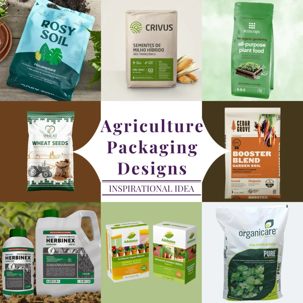
91+ Agriculture Packaging Designs That Inspire and Impress
Now for the exciting part. The visual world of agricultural packaging done right! From amazing bold fertiliser bags to eco-friendly packaging bio-agro packs, here’s a quick peek at designs that sow inspiration and harvest trust!
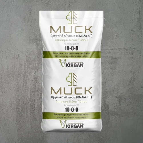
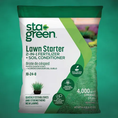
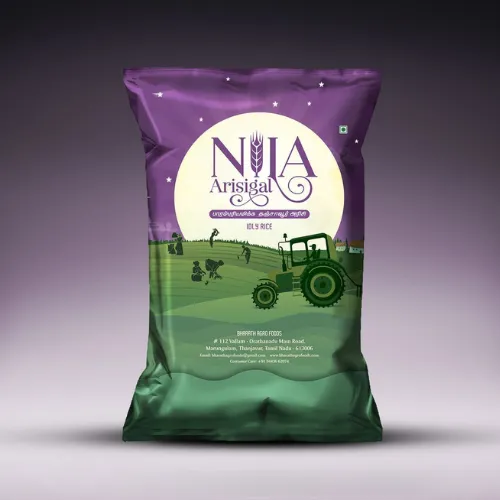
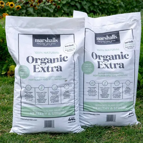
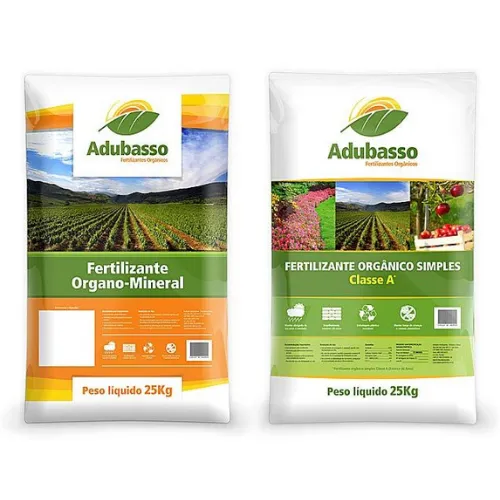
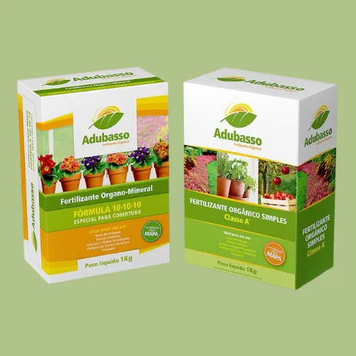
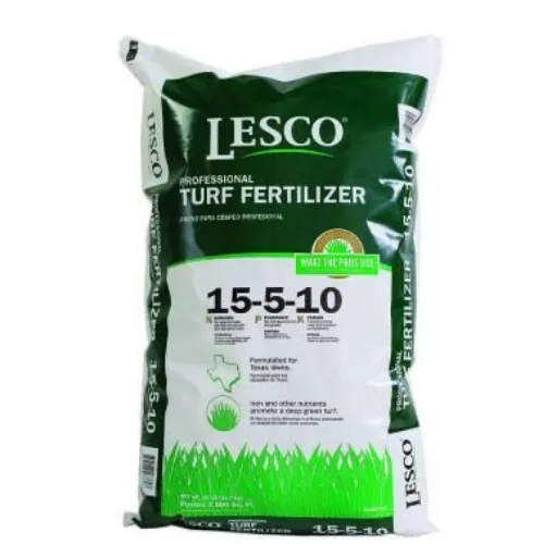
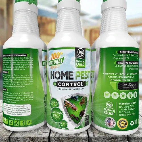
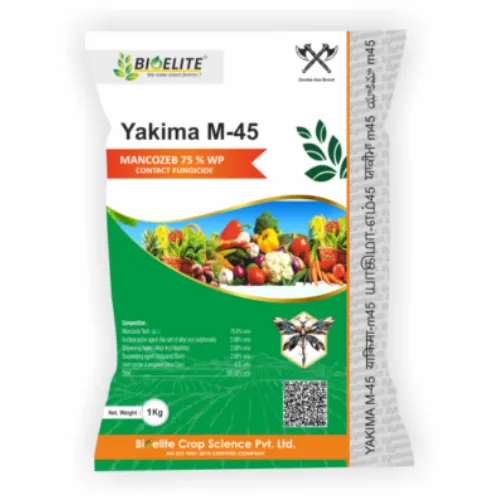
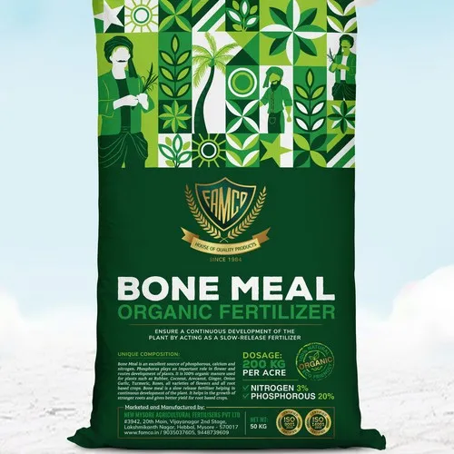
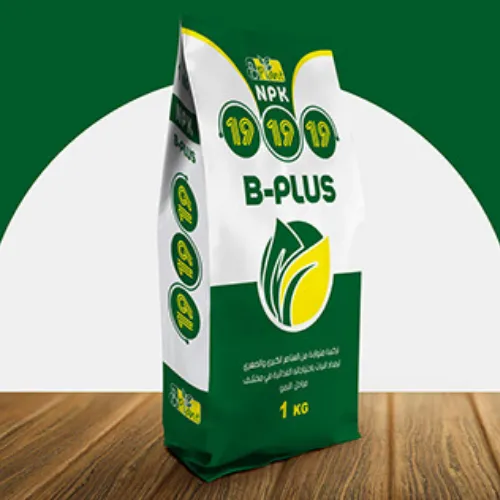
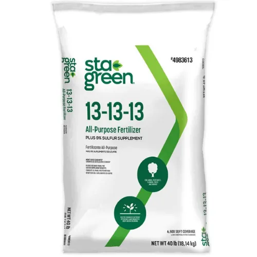
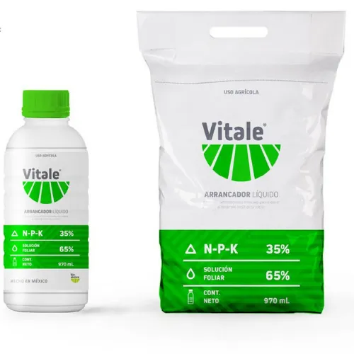
i) Fertiliser Packaging Designs
These packs combine strength and simplicity. Bright greens and yellows paired with crop visuals make farmers instantly recognise what’s inside. Think moisture-resistant bags with earthy tones with a proud branding presence.
Source: https://in.pinterest.com/
Source: https://in.pinterest.com//p>
Source: https://in.pinterest.com/
Source: https://in.pinterest.com
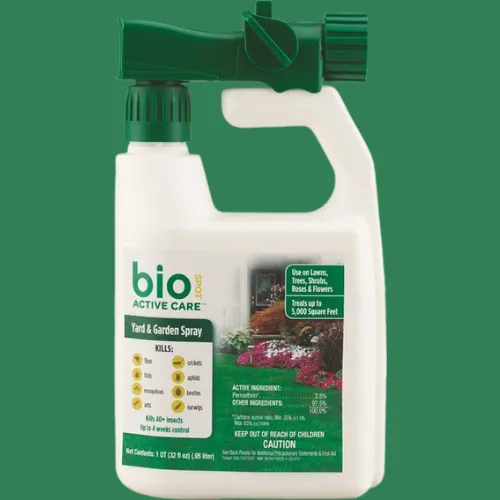
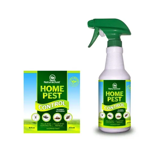
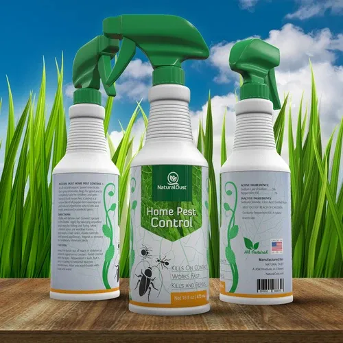
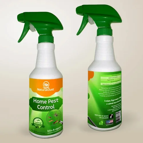
ii) Pesticide Packaging Designs
Strong reds, blacks, and oranges dominate here. Try something different here. Symbolise protection and power! Crisp typography and shield or leaf motifs help communicate reliability against pests.
Source: https://in.pinterest.com/
Source: https://in.pinterest.com//p>
Source: https://in.pinterest.com/
Source: https://in.pinterest.com
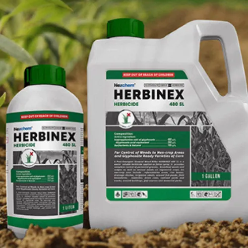
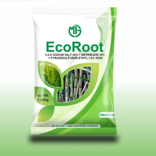
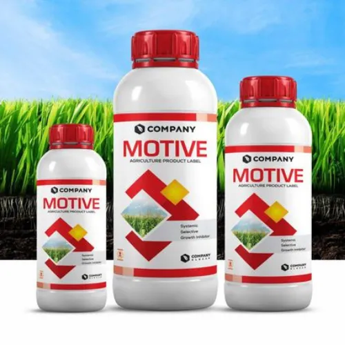
iii) Herbicide Packaging Designs
Minimalist yet bold, herbicide packs use contrast. This is where you can play with various hues. Green for crops, dark backgrounds for weed control. Clean layouts and strong icons make them look both premium and practical!
Source: https://in.pinterest.com/
Source: https://in.pinterest.com//p>
Source: https://in.pinterest.com/
Source: https://in.pinterest.com
iv) Insecticide Packaging Designs
Visuals of leaves free from pests, paired with energetic blues or fiery reds, help farmers see the result before they buy. Clarity in dosage and safety always stands out.
Source: https://in.pinterest.com/
Source: https://in.pinterest.com//p>
Source: https://in.pinterest.com/
Source: https://in.pinterest.com
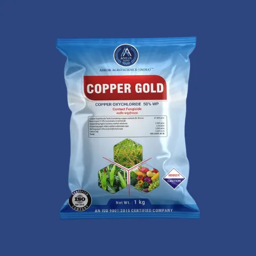
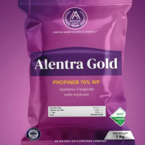
v) Fungicide Packaging Designs
Soft blues and greens with crop imagery create a “protective but gentle” impression. Super important here! Why not play a little more with the graphics here? These packs can also often highlight shield graphics and easy-to-read symbols for fungal prevention. Another major aspect to consider!
Source: https://in.pinterest.com/
Source: https://in.pinterest.com//p>
Source: https://in.pinterest.com/
Source: https://in.pinterest.com
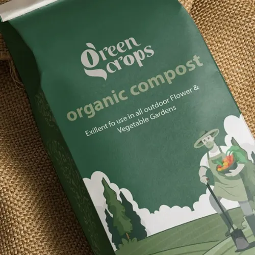
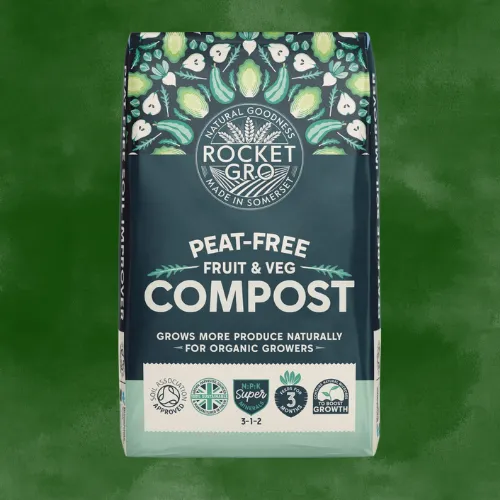
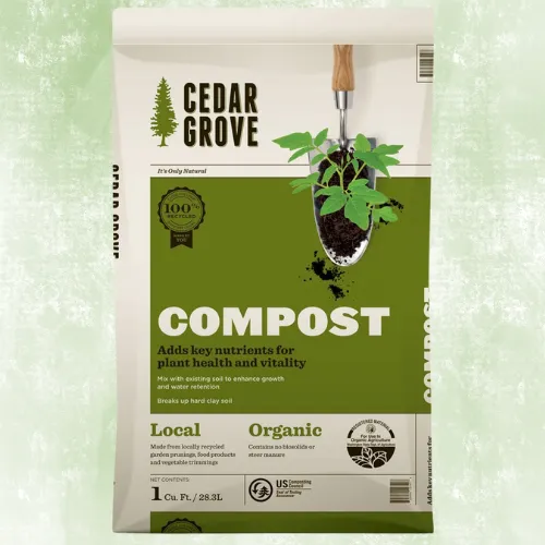
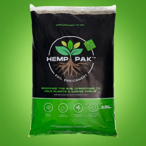
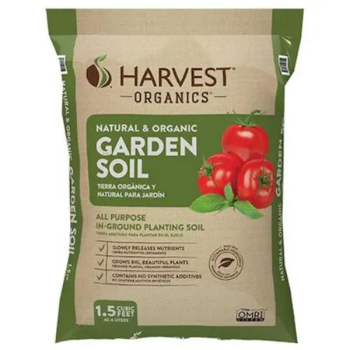
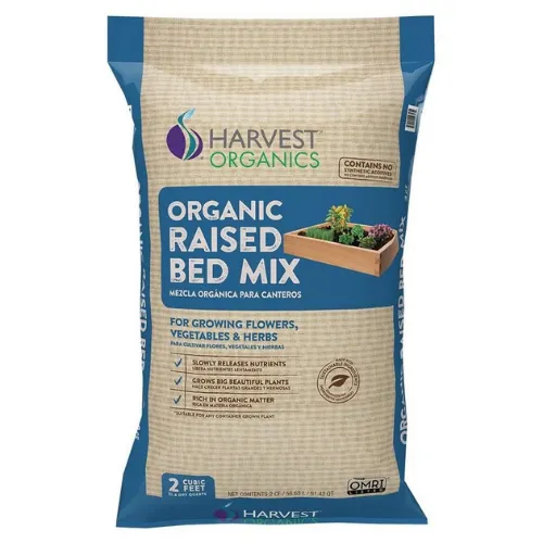
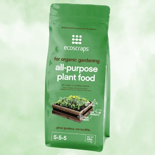
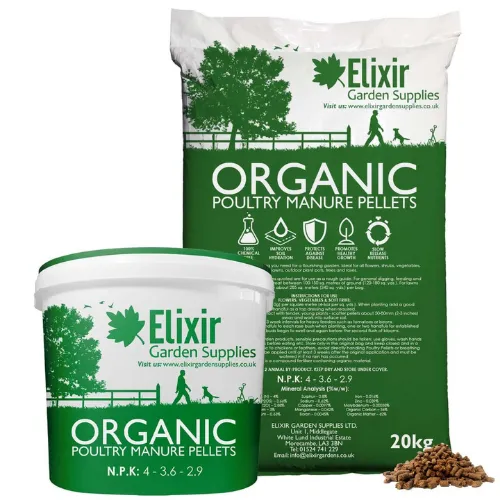
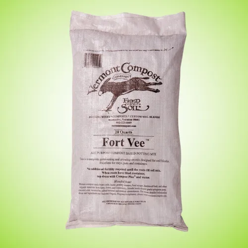
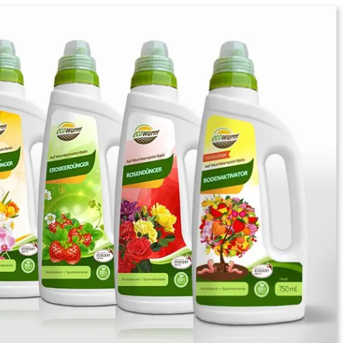
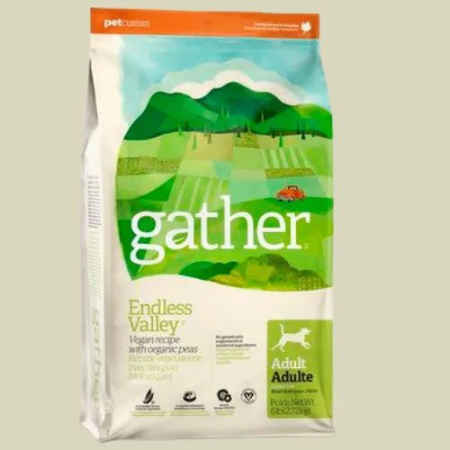
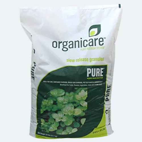
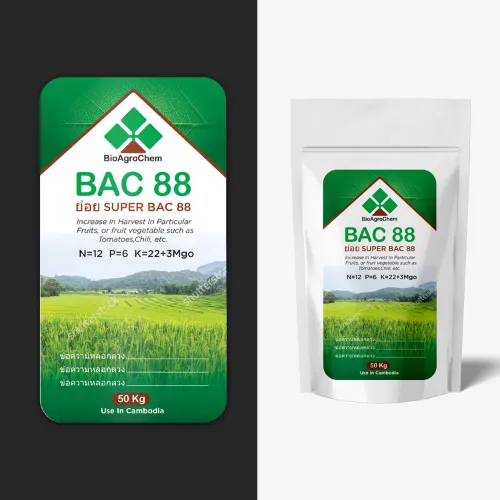
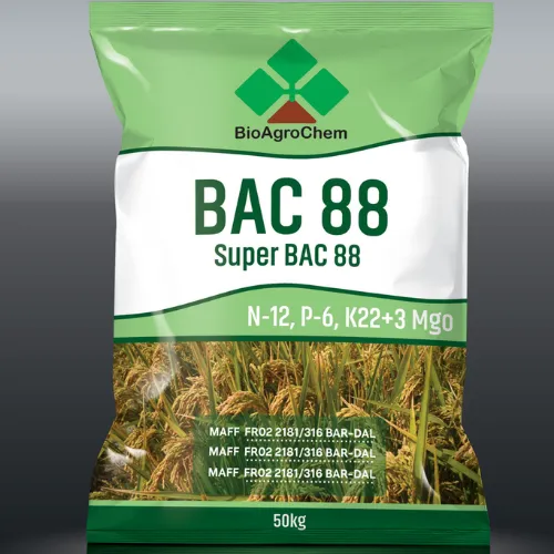
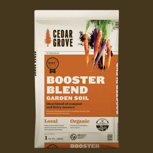
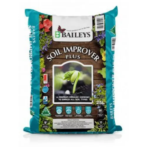
vi) Bio-Agro (Organic & Eco-Friendly) Designs
These eco-warriors can leverage Kraft tones, leafy textures, and minimalist icons in the most unique way possible. Why not try this? Compostable packaging or paper pouches paired with natural greens send a sustainability-first message!
Source: https://in.pinterest.com/
Source: https://in.pinterest.com//p>
Source: https://in.pinterest.com/
Source: https://in.pinterest.com
vii) Agriculture Combo Kits / Multipacks
For brands offering multi-use solutions, combo kits usually shine with bright visuals and smart segmentation. Get creative with every section here. Each section clearly shows its specific crop benefit! This can work amazingly for your agri sales!
Source: https://in.pinterest.com/
Source: https://in.pinterest.com//p>
Source: https://in.pinterest.com/
Source: https://in.pinterest.com
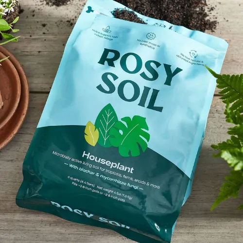
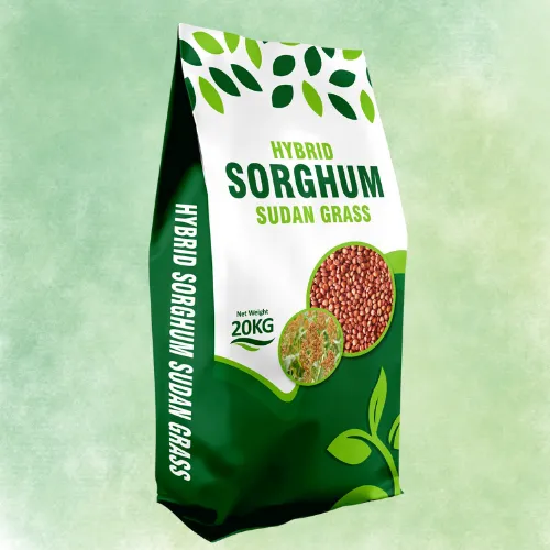
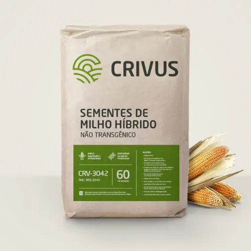
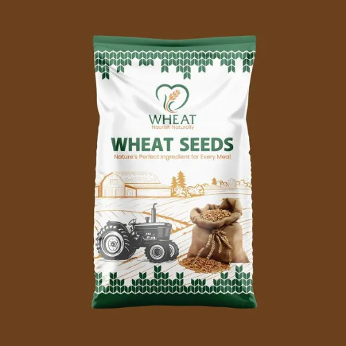
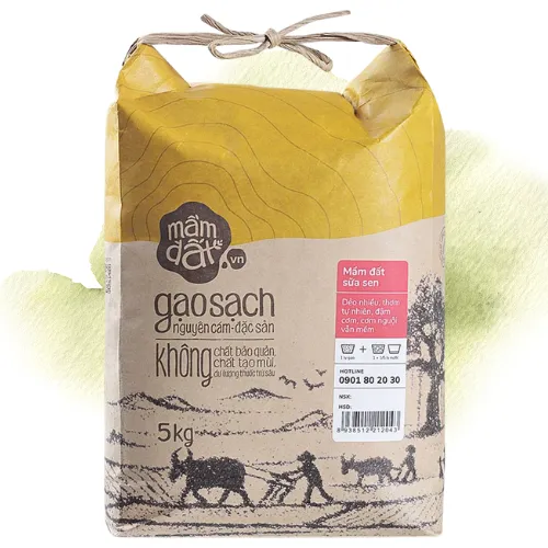
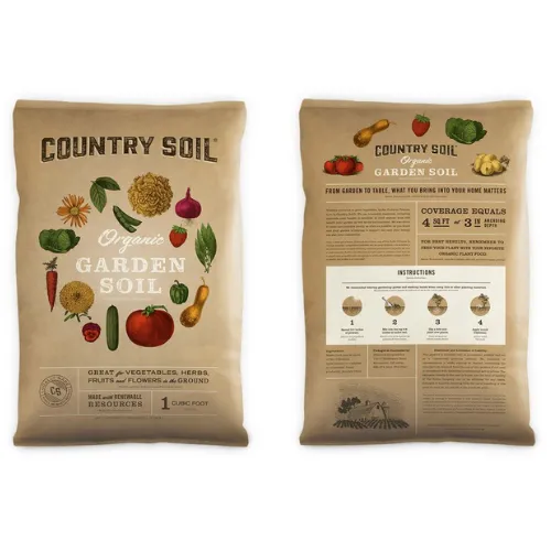
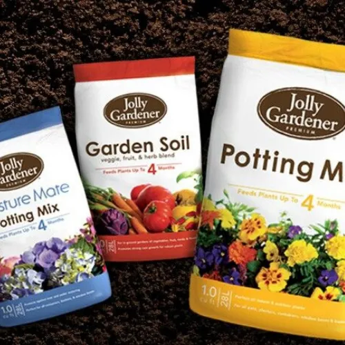
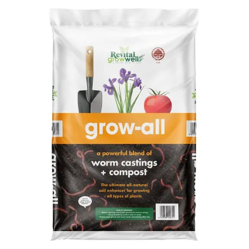
viii) Seed & Crop Nutrition Packaging
These packs can actually use high-resolution crop visuals, resealable zip locks, and bold branding. Again, you need to find aspects that are able to connect well. Farmers connect instantly when they can actually see their crop right on the pack!
Source: https://in.pinterest.com/
Source: https://in.pinterest.com//p>
Source: https://in.pinterest.com/
Source: https://in.pinterest.com
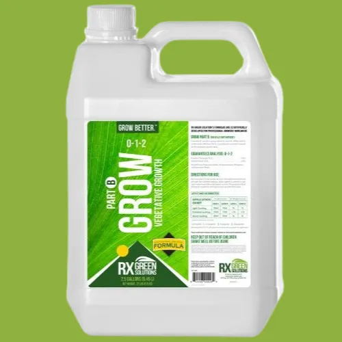
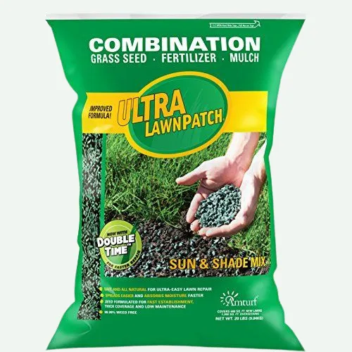
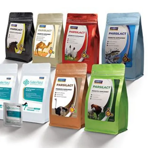
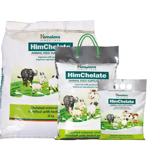
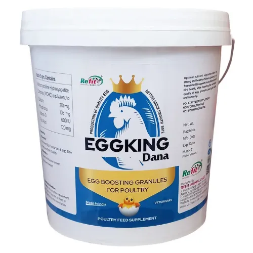
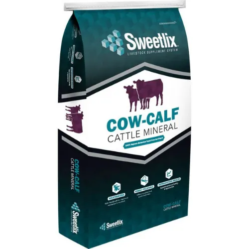
ix) Animal Feed & Growth Supplement Designs
Vibrant colours, animal illustrations, and durable sacks make these packs both functional and visually appealing. The best designs mix practicality with emotion, showing healthy animals on lush farms!
Source: https://in.pinterest.com/
Source: https://in.pinterest.com//p>
Source: https://in.pinterest.com/
Source: https://in.pinterest.com
Ready to Design an Agriculture Packaging That Speaks “Farmer”? Here’s How You Start
Now, let’s dig into the process behind creating one. A truly successful agricultural pack isn’t designed. It is actually well researched, tested, and refined with farmers in mind! Let’s learn more about it!
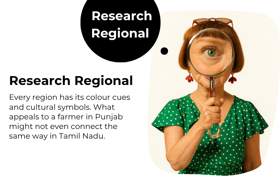
1. Research Regional Preferences
Every region has its colour cues and cultural symbols. What appeals to a farmer in Punjab might not even connect the same way in Tamil Nadu. Study local languages, crops, and imagery preferences before you even sketch a line!
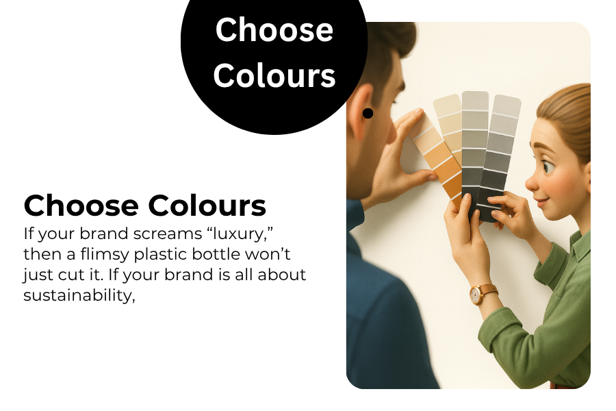
2. Sketch, Test, and Choose Colours
Begin with pencil sketches or digital drafts. Always keep it visual-heavy and text-light. Test different colour palettes in local shops. Observe which pack the farmer picks up first.
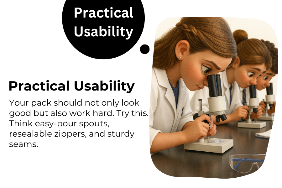
3. Focus on Practical Usability
Your pack should not only look good but also work hard. Try this. Think easy-pour spouts, resealable zippers, and sturdy seams. Functionality actually builds trust way more than gloss.
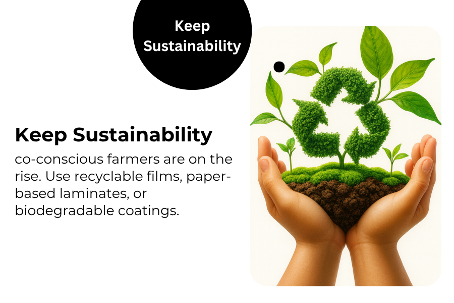
4. Keep Sustainability in the Soil
Eco-conscious farmers are on the rise. Use recyclable films, paper-based laminates, or biodegradable coatings. When your design supports both the planet and the farmer, you definitely win both markets.
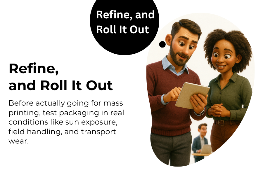
5. Test, Refine, and Roll It Out
Before actually going for mass printing, test packaging in real conditions like sun exposure, field handling, and transport wear. Again, supremely important before you finally deploy the design! Gather various farmer feedback and refine the layout, language, or imagery accordingly! Great agricultural packaging is indeed a conversation, not a one-time design.
Conclusion:
Farmers are ultimately the heart of our land, and the packaging they trust becomes part of their daily routine. You don’t really just sell products to farmers here. Remember this. You ultimately build loyalty through your brand that actually lasts generations!
So if you are finally ready to create packaging that speaks the language of the soil, it is time to actually collaborate with design agency experts who understand rural emotion and brand psychology! Partner with DesignerPeople today. Our experts are the best in this industry. We craft agriculture packaging design that doesn’t just look good but truly connects with the farmers who feed the nation!
Author: Megha Malik

As a passionate entrepreneur and creative brand consultant with experience of 18 years in digital, branding and packaging industry, it is my honest effort to put my experiences and knowledge of industry towards readers. A chartered accountant by degree but a marketing personality in blood has motivated her to take in designing industry as a career. With her fun-loving personality and sharp branding skills, she is a great motivational speaker on her YouTube channel, an active member in various business channels offline as well as online. Do connect me personally via my LinkedIn and I love to share my expertise with you.