If silence is golden, art of expression is a priceless asset to have. Words – written or oral – are powerful way of expression. Text or words help you in articulation but ‘Typography’ goes beyond word representation or text articulation. It is an art form that involves text and creative application of design elements to convey a deeper message. Technically, typography is an art of arranging text to make it legible and appealing to look at.
“Digital platforms and vernacular flavor gives an interesting twist to typography”
Typography carries a glorious legacy behind it and today with the intervention of technology; a designer’s capability to experiment with typography has improved. Moreover, the content producers of both online and offline platforms pay special attention to font designing or typography as it is the crucial part of content consumption by the end reader.
Apart from technology intervention, the rising demand for text availability in regional languages has also expanded the possibilities to produce remarkable typographical designs. In recent past, many brands, both home-grown and international, have presented their logos in Hindi script. Some examples are Chalo Padho (Indian Edutech Brand), Coldplay (World renowned music producer) and many more.
Table of Contents
Here are some Interesting Hindi logo design typography:
![]()
This Image of the Hindu lord ‘Ram’ is carefully designed with following elements:
1. Saffron background and white text – Both the colors are auspicious to followers of lord ram representing strength and peace respectively.
2. Font style, bow and arrow – Ancient font style to represent the era of lord Ram. Bow and arrow is symbolic as it was used by lord Ram to win over Evil.
The image creates an instant connection between the text and the reader due to above mentioned qualities presented in a simple and readable manner. Similarly, the other topographies display a term along with design elements that the readers can easily relate to.
Lord Rama Typography: We converted the upper horizontal line ‘Shirorekha” into a bow and arrow which is clear symbolic of load RAMA to win over evil.
Download Free Lord Rama Hindi Typography
——————————————————————————————————————————
![]()
Lord Shiva Typography: Mahadeva written in devanagari script with trident means lord is beyond all the TRIGUNAAS (NIRGUN). The crescent moon signifies his control over time (beginning and the end of all things in the universe)
Download Free Lord Shiva Hindi Typography
——————————————————————————————————————————
![]()
Goddess Ambay Maa Typography: Script says MAA with beautiful crown depicts unshakeable inner strength with love and harmony.
Download Free Ambay Maa Hindi Typography
——————————————————————————————————————————
![]()
Radha Krishna Typography: Radha Krishna together bonded with love and flute music. FLUTE is the human heart, and a heart which is made hollow will become a flute for the God of love to play upon. When the heart is not empty, in other words, when there is not scope in the heart, there is no place for love.
Download Free Radha Krishna Hindi Typography
——————————————————————————————————————————
![]()
Lord Hari Typography: Hariom script with HARI (NAMA) Tilak. Single, double, or triple vertical lines in Tilak – This is for those who have Vishnu as their primary worship deity.
Download Free Lord Hari Hindi Typography
——————————————————————————————————————————
![]()
Om Shanti Typography: This typography is clear depiction of OM=I and Shanti = Peace, This means I’m a Peaceful soul.
Download Free Om Shanti Hindi Typography
——————————————————————————————————————————
7 GOLDEN RULES FOR EFFECTIVE TYPOGRAPHY
If you want information on any brand, the first thing you do is open their website and read content mentioned inside website pages. Now imagine if the content is missing on a website or if it is confusing, then it makes you go through the worst experience. A person who intended to read can switch off-link due to frustration. Hence, the brand has lost its potential for getting established.
Typography as the name suggests it should be a combination of both text and graphics. Content is made interesting with the supporting elements of graphics.
We cannot imagine whatsapp, reading the magazine, playing on app and watching TV without the content, it is horrifying. Usage of effective typography in package designing, logo designing and digital marketing campaigns are vital. So let’s understand what is typography and its importance is.
1.BRUSH YOUR BASICS
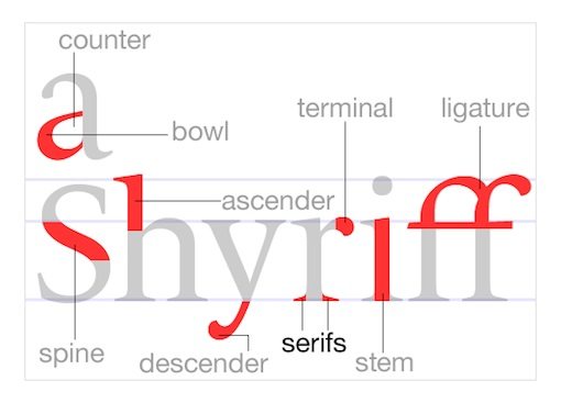
As it’s said, a ‘Well plan is half battle Won’, and to build a healthy plan, it is essential that we go in-depth and understand basics. Typography is a combination of science and art and utilizing its productive elements which will lead to an effective outcome.
Body of typeface involves precise measurement, jargons and specific standards which should be maintained and respected.
source: lttmacleod.wordpress.com/2015/09/22/typography-use-in-graphic-design/
If you observe image its self-explanatory, where simple-looking alphabets get quickly complicated, technical terms lead to clarity of thinking for productive constructing of text.
Take some time to learn the basic principles which will create awareness of the characteristics of the typefaces.
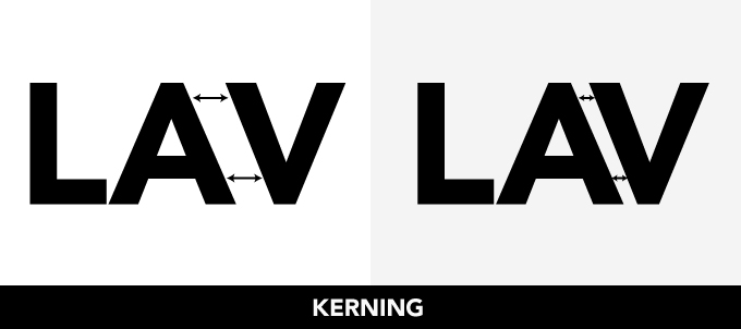
2.KERNING AND TRACKING
Often these two terms are confused and used as one while both have a different meaning.
Kerning is a process of adjusting space between two letters. If placed too close can be challenging to read, if set too far, then it’s awkward to read, and if space is wider, then it’s frustrating to read.
source: creativemarket.com/blog/7-step-plan-typography-expert
For successful kerning, there should be proportional spacing between each letter by taking into considerations of serifs and stylistic, which might need attention.
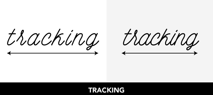
When we talk about tracking, it’s a process of adjusting space throughout the complete word. Tracking is done to fill an area that’s larger or smaller than currently, which suits the type of parameters. The single world can be impressive with the process of active tracking.
source: creativemarket.com/blog/7-step-plan-typography-expert
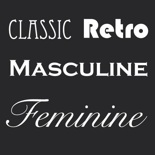
3.FONT COMMUNICATION
The font is a crucial aspect of typography because font selection should address its visual personality. We don’t prefer Cooper black on our wedding invitations, nor we like to see fight competition hoarding with pretty script fonts. The reason for this is there is inherent psychology associated with certain types of fonts.
Feminine font, it is represented with curvy, thin fonts which appears to be girly while Masculine font is thick with hard edges which tend to look masculine and strong.
source: zoneoutzombie.wordpress.com/page/3/
4.ALLIGNMENT
In life, we assume if something is centred than everything is balanced with this concept lot of non-designers align content at the centre, which makes it the hardest to read. If there is no consistency with starting and ending point for each line, then for each new start, your eyes will take time to get adjusted.
We all tend reading books or magazines from left to right, so left alignments are most comforting for the human eye. But this doesn’t mean that always left alignments work best because, before alignment planning, one should decide if they are giving priority to readability or aesthetic look. Then design alignment accordingly, ideally both should go together, but in reality, one factor has to compromise one way or the other.
Make sure consistency flows in your alignment style as the mixing of alignments will lead to clustered and confused pages.
source: sites.google.com/site/meganwinkeler96/notes/3-design-principles
5.SIZE MATTERS
In any type of media, there are very few seconds to communicate about brand values and what they intend to focus on. So if you observe below shown example you will see significant attraction is about winning a trip to the Bahamas so they have differed font sizes as per the level of importance.
Primary importance is on WIN, so size is most significant while secondary importance is for the Bahamas. The motive of size change is to attract audience focus on those essential points.
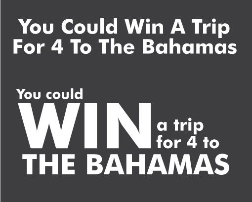
source: lttmacleod.wordpress.com/2015/09/22/typography-use-in-graphic-design/
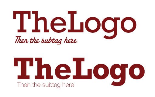
6.SECONDARY FONT
Choosing a second font is like spraying air freshener because you want to draw attention to the smell of the room. While now you want people to notice what a place smells like. While selecting secondary text font, concord and contrast are fundamental aspects. It brings a voice to the text in terms of emphasizing or de-emphasize, can provide the voice of reason or create a dreamlike state. Title and secondary font should not be too similar to each other or else it won’t create the impact as expected.
source: sites.google.com/site/meganwinkeler96/notes/3-design-principles
7.TYPOGRAPHY AS ART
It is one of the cornerstones including of good graphic design, and art of font which can go a long way. Typography and art design are no more two different aspects they are creatively utilized for communicating the type of business and their values.
Designers have taken the art of letters into displaying innovative designs of beautiful images, or their piece of craftsmanship.
Art here is concerned with design elements that can apply to letters, text in the form of image, table or any other visual enhancements on the printed page.
Few beautiful examples are shown below:
source: in.pinterest.com/pin/543457880005698401/
![]()
source: teahub.io/viewwp/wwiwwx_batman-typography/
IMPORTANCE OF TYPOGRAPHY
- Typography will communicate the mood and feeling of the brand towards the audience.
- Consistency in your typography will lead to harmony
- Builds strong brand recognition
- Helps to attain and hold audience attention
- It is reader-friendly
- Information communicating through the systematic format of hierarchy
- Reflects positively on brand professionalism
How can you leverage typography to enhance brand visibility?
Headquartered in Delhi/NCR, DesignerPeople is a leading design communication consultancy that has delivered award winning design and Packaging Design campaigns. Our team is a set of highly skilled, experienced and hungry for success professionals. Typography assignments provide us a unique opportunity to understand a brand deeply and unite its legacy or genesis with the latest design trends. We work with both young brands and large enterprises, and understand various dynamics that goes in design communication from various perspectives.
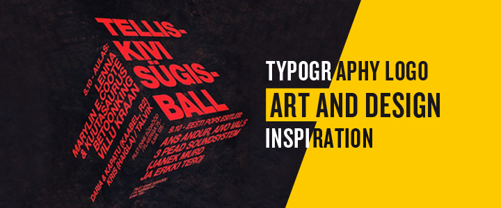
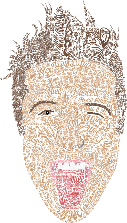
Some Typography Designs for Inspiration:
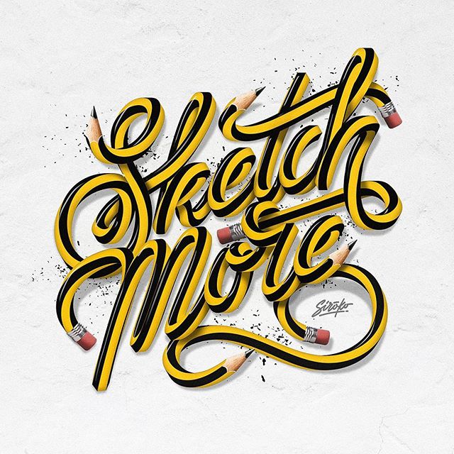
source: typegang.com/inspiration/lettering/sketch-more/
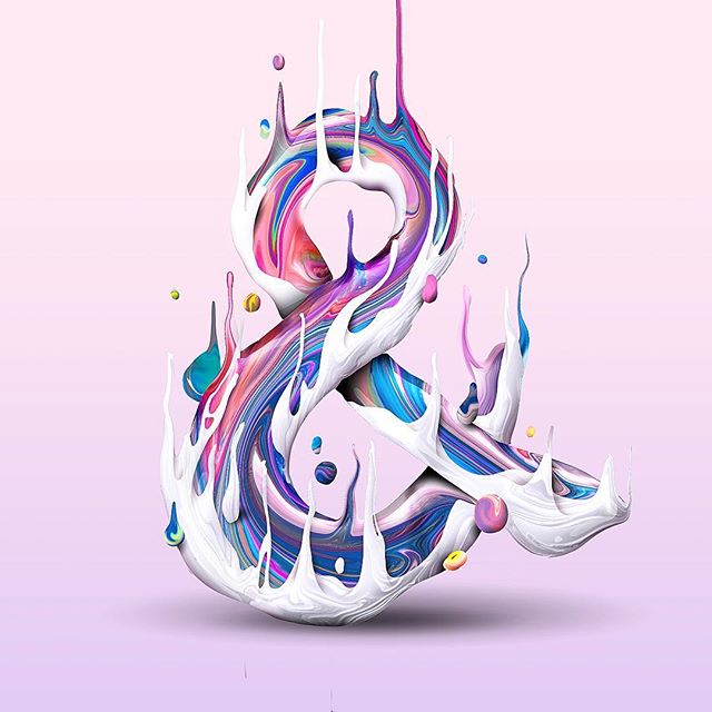
source: pinterest.es/pin/495255290271309082/
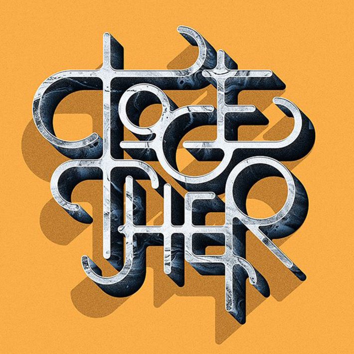
source: www.instagram.com/siroko_studio/
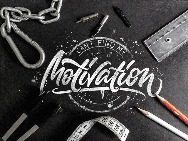
source: graphicdesignjunction.com/2018/12/lettering-typography-2019/
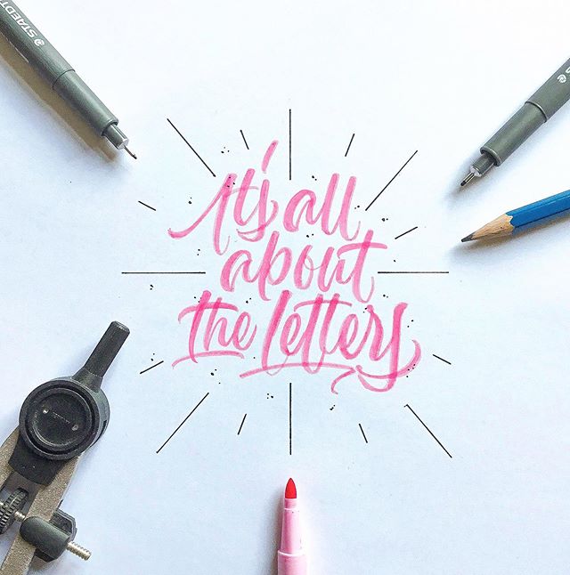
source:www.instagram.com/albi.letters/
CONCLUSION
As discussed typography should satisfy your senses of aesthetics while appealing to the right emotions and subtly enhancing the text. To gain that competitive edge brand should ensure its structure of typography is communicating the same emotions and feelings as are their brand values. In Logo designing, package designing or brand identity typography plays a vital role in all sectors.
So next time you are planning out for design, make sure you give a moment of thought on principles explained above and then execute. You can contact DesignerPeople who have been designing branding elements keeping in aligned with above-said points.
![]()
![]()
Author: Megha Malik

As a passionate entrepreneur and creative brand consultant with experience of 18 years in digital, branding and packaging industry, it is my honest effort to put my experiences and knowledge of industry towards readers. A chartered accountant by degree but a marketing personality in blood has motivated her to take in designing industry as a career. With her fun-loving personality and sharp branding skills, she is a great motivational speaker on her YouTube channel, an active member in various business channels offline as well as online. Do connect me personally via my LinkedIn and I love to share my expertise with you.
super and cool
Awesome
Thanks for this content such a useful articles